- Home
- Watercolour pencils
- Line and Wash
A Beginner's Guide to Line and Wash with Watercolour Pencils
Welcome! If you're a coloured pencil artist who loves the control and precision of dry pencils but feels a spark of curiosity about the lively, flowing world of watercolour, you are in the perfect place.
For this tutorial, we will be working with a beautiful line and wash scene of Polperro harbour, originally created by the site's founder, Peter Weatherill. His piece is a perfect example of how to bridge the gap between drawing and painting.
I'm going to walk you through the process he used, breaking down each stage so you can understand the techniques and apply them with confidence to create your own wonderful results.
You can also learn more about this medium in my complete guide to watercolour pencils.
Essential Supplies for This Project

For this tutorial, the key is not the exact brand, but understanding how watercolour pencils work. Here are my recommendations for a good experience.
- Watercolour Pencils: A basic set of good quality watercolour pencils will work perfectly. The original piece used Staedtler Karat Aquarelles. Other excellent choices readily available in the UK include the true watercolour feel of Faber-Castell Albrecht Dürer pencils, or the more subtle Caran d'Ache Supracolour and Derwent Watercolour ranges.
- Paper: Hot-Pressed (HP) watercolour paper is ideal as its smooth surface is lovely for the initial drawing. The original used Hahnemühle Bamboo, a 270gsm paper made from 90% bamboo fibres. A pad of Derwent Watercolour Paper (HP, 300gsm) is another great, accessible option.
- Brushes: A small, round nylon brush (size 4 or 6) with a good spring to it is perfect for this work.
Essential Tools:
- Your pencil sharpener
- A kneaded eraser for lifting colour gently.
- Two jars of clean water (one for rinsing, one for clean water)
- A paper towel or sponge for blotting excess water from your brush
Downloads: You can download the reference photo and Peter's original outline drawing to trace if you want to get straight to colouring.
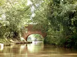
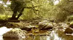
 The source photo which was used as a reference
Key Principles for a Successful Wash
Before we begin, keeping these three golden rules in mind will help you avoid frustration and achieve a beautiful result.
- Use Light Pressure: When applying the dry colour, use a gentle touch. This avoids creating harsh, indented lines that won't dissolve properly with water.
- Keep the Point Flat: To avoid scratching or indenting the paper surface, try to keep your pencil point relatively flat to the paper as you shade.
- Protect Your Lightest Areas: To keep an area bright, like a sunlit wall, apply a protective layer of a white or cream watercolour pencil first. When you add your main colour on top, the white layer will create a softer, more pastel-like effect and limit how much dark pigment the paper absorbs.
Step 1: The 'Line' - Applying Your Dry Colour
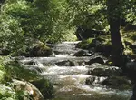
 The dry colour application. Notice how light the pressure is. This is the perfect base for our wash.
Our first goal is to lay down all the dry colour, thinking of it as an underpainting for the wash to come. Remember to use light, gentle strokes.
- Trees and Foliage: Use a light, scribbling motion with your greens and a touch of sepia to create a dappled, uneven texture for the trees. For the background grass and nearer hillside, you can use more of a smooth shading stroke. Build up several light layers of greens and golds to get a good depth of pigment.
- Buildings and Walls: Keep your strokes smooth and follow the direction of the surface (horizontal or vertical, not diagonal). Remember to use your white pencil to protect sunlit areas first. An ivory or light cream pencil works wonderfully to warm up walls in sunlight.
- Harbour and Boats: Carefully shade the harbour walls, leaving small strips of white for details like steps or ropes. To protect the white registration numbers on the boat, you can use a white wax-based pencil to trace over them first. The wax will act as a resist when you add water later.
At this stage, your drawing will look light and may show white flecks from the paper texture. This is exactly what you want! It's better to apply two light coats of dry colour than one heavy one.

Step 2: The 'Wash' - Activating the Colour with Water
This is where the real transformation happens. Remember to work with a damp, not dripping, brush.
- Prepare Your Brush: Dip your brush in clean water and dab it on a paper towel. You want it damp, not soaking.
- Start with Lightest Areas: It’s often best to work from the top of the picture down.
- Match Brushstroke to Texture: Use a small, scribbling motion with your damp brush on the trees to merge the colours naturally. For the grass and water, change to a more even, horizontal brush stroke. For buildings, you can use horizontal or vertical strokes for an even finish.
- Rinse and Repeat: Clean your brush thoroughly before moving to a new colour section to avoid creating mud.
Mistake Correction Tip: Before you add any water, double-check for any colour that has gone into an area that should be white.
It is much easier to erase the dry pencil pigment now than to lift the colour once it's wet.
If you do apply too much colour with the water, you can often lift most of it by immediately blotting the wet surface with a clean paper towel.
 The painting after adding water. The colour is now much more intense as the pigment has dissolved into the paper.
Step 3: The 'Line' Returns - Refining with Dry Pencil
Once your painting is completely dry, you can assess it. You might feel the picture is finished at this point, and that is perfectly fine.
However, to add extra definition and clarity, we can now add final details with our pencils used ‘dry point’. This is where you can use your core coloured pencil skills.
- Sharpen your pencils for this stage to add crisp details.
- Add fine lines on the roofs to indicate tiles, or define the boat rigging.
- Deepen the darkest shadows, for instance, under the eaves of the roofs, to add more contrast and form.
- You can use the same colours as before or introduce others from your set to fine-tune the picture. You could also use a black fineliner pen for a more traditional look.
Your Wonderful Result
 The finished piece. Notice the extra detail in the roofs and boat rigging, added with sharp, dry pencils after the wash was dry. This final step adds clarity and depth.
And there you have it. You've successfully combined the control of drawing with the beauty of a watercolour wash.
This piece, which took between 5 and 6 hours of focused work, shows how dedicating time to a project can lead to a detailed and satisfying result.
I hope this has demystified the line and wash technique and inspired you to continue exploring the amazing possibilities of watercolour pencils.
If you would like more information on drawing a boat on water check out this helpful guide.

I'm Carol Leather, a coloured pencil artist for over 15 years. Most of my teaching comes back to the same idea: realistic coloured pencil starts with structure, light and observation long before the colour goes down.
My work has featured in Ann Kullberg's Color Magazine, CP Magic and Color Pencil Treasures (vol 7). I'm a member of the UKCPS and was a prize winner in the Nature section of their Annual Open Exhibition in 2020.
You might like these
Coloured pencil drawing step by step
Coloured pencil drawing step by step demonstrations by Peter Weatherill - watch how he tackles different drawings
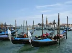
Coloured Pencil Drawings: Composing a Beautiful Canal Scene
Coloured Pencil Drawings: how to alter and adapt your reference photos to improve the composition of your artwork. A step by step walkthrough
Creating a Venice Gondola Scene: An Artist's WIP & Tips
Follow artist Daryl Cogavin's process creating a Venice gondola scene in mixed media (ink, watercolour, coloured pencil). Insights & tips from a real project.
Copyright © 2009- pencil-topics.co.uk All rights reserved
Home | About Us | Contact Us | Privacy Policy