Watercolour Pencil Tutorial - Italian Street Scene
 Original photo copyright 2006 - Peter Weatherill
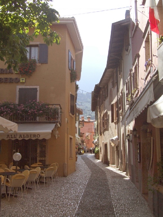
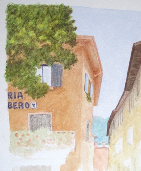
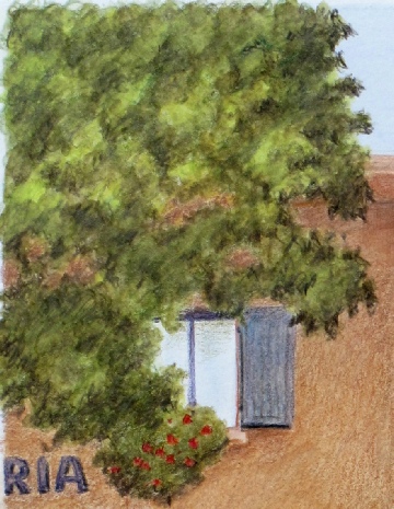
Capture the beauty of Malcesine, Lake Garda, in this watercolour pencil tutorial. Using Caran d'Ache Supracolour Soft pencils, I created a 9x12-inch drawing that showcases their versatility.
Points for consideration before we start
- To add depth to the picture, consider incorporating a human element. Even if the original photo is empty, we can still introduce a figure. The question is, where should we place the person to create the most impact?
- If we proceed, we'll need to consider the interplay of light and shadow, as well as the placement and height of the person in relation to the surrounding buildings. I have some reference photos - what's your take on this?
- The areas of shadow on the right-hand side and in the doorway of the left-hand side cafe are quite deep. Should we maintain this level of depth or aim for a lighter overall scene?
- Those chairs outside the cafe have remarkably slender legs. How can we accurately capture their delicate shape in pencil?
- Should we incorporate the Italian flag, and if so, how can we strike a harmonious balance of colours?
- What are the key steps in the painting process, and what potential pitfalls should we be aware of at each stage?
- What can we safely leave out?
Let's examine Peter's thoughts on these questions.
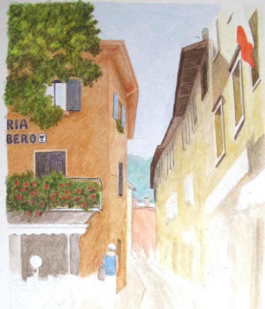
To add a touch of human interest to this watercolour pencil tutorial, I've included a photo from R.E. that captures the same scene with a lively pedestrian presence.
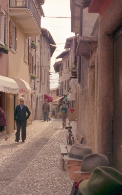 Human interest - male
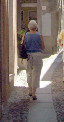 Human interest - female
Adding Human Interest
To create a more engaging scene, let's introduce a human element. Placing a figure just outside the cafe, partially concealing the uninteresting corner of the building, can add depth and visual appeal.
Balancing Light and Shadow
For the shadow areas, I'll opt for a lighter tone, particularly around the cafe doorway and the right-hand side of the foreground. This will allow for easy adjustments later, as it's simpler to darken than to lighten.
Protecting Delicate Details
To preserve the light chair legs from unwanted aquarelle color, consider using impressed lines with a wax-based pencil early on. This technique will provide a safeguard and maintain the chair's subtle appearance.
Balancing the Composition
To balance the picture, I think we need the flag, but we'll also need to incorporate other bright red elements on the left side. The flowers on the balcony are a good starting point, but they're currently in shadow. If we lighten the shadow, the reds will pop out and provide the necessary balance.
The Painting Process
I'll begin by establishing the picture base with a colour wash, primarily using watercolour pencils. Next, I'll remove any excess pencil lines, deepen the wash colours as needed, and apply dry colour to the dried wash surface. To build up colour depth, I can settle the dry watercolour pencil into the paper with a damp brush and add more colour as necessary. The final touches may involve wax-type pencils, but I'll assess as I go.
Refining the Composition
I plan to omit the white blind on the far left, which cuts across the cafe front, to simplify the composition. Otherwise, I'll stick with the existing elements.
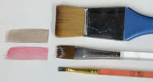
Getting set up for the watercolour pencil tutorial
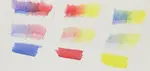
To create delicate wash colours, a white plate serves as a makeshift palette. A simple card palette, crafted from a piece of white card, offers additional hues.
Pigment is carefully scraped from a pencil onto the plate, then blended with water to produce the desired washes.
For more intricate details, a wet brush is used to pick up pigment from the card palette, allowing for precise application.
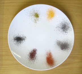 White plate as palette
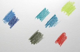 White card as palette
It is not vital that your colours are the same, as much will depend on the hues in your brand of pencils.
There is an Olive Green, a yellow orange (an ochre would do), a blue, a medium cold grey, Venetian red, a purplish red, and Paynes Grey on the plate. The additional colours provide some further hues to get the full range.
 Initial washes
The image above shows the initial watercolour pencil washes. This step establishes the tints and contrasts in the picture, allowing us to remove the original graphite drawing once the wash is dry.
With the shapes in place, we can now add details freehand using dry watercolour pencils or wax pencils. The sky is already set, saving us the challenge of achieving an even tone with dry pencils.
The only remaining wet process is developing the tree foliage, balcony, and window boxes. These areas of green leaves and flowers are best tackled with dry Aquarelle pencil and a damp brush – a technique we'll explore next.
Using watercolour pencils directly on the paper
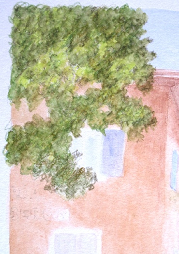 Dry pencil for foliage
Begin with the tree in the upper left corner of the picture. The first image shows the dry watercolour pencil applied in loose, scribbled strokes.
A mix of Greens, Ochre, and Browns, with touches of Sepia for depth, brings the tree to life. Don't worry if your initial attempt doesn't match the example – this process can be repeated, and it's a good idea to practice on scrap paper before starting the full tutorial.
Leave gaps in the green to suggest holes in the tree's foliage. Consider the light source, using lighter Greens and Ochres on the sunlit side and darker tones on the shaded side. Dark green areas will also appear within the tree's canopy, adding depth and dimension.
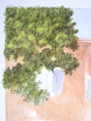 Adding water to the foliage
Using a damp brush with springy bristles - a nylon or prolene watercolour brush is ideal - work the dry pigment into the paper with scribble strokes that mirror your original pencil marks.
Vary the pressure to create areas of thin tint and thicker colour, as shown in the image to the left, where the upper part of the tree cover has been completed.
 Completed tree foliage
Here, the tree foliage is nearly complete, achieved through brushwork. I'll likely revisit this area later in the tutorial to add more dry colour to the leaves, but for now, it's sufficient.
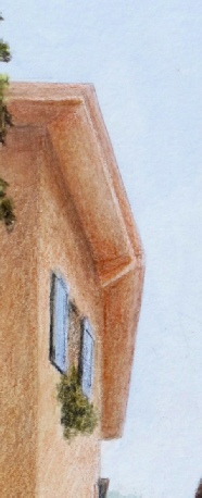
I've begun working on the roof line and upper windows using dry pencil. My tool of choice is the Caran d'Ache Supracolor, but any wax-based pencil will do for these later stages, as water is no longer involved.
To build up the wall and roof edge colour, I'm using a combination of warm grey, light red, and dark ochre shades. This balances the effect of the wall in shadow.
To create visual harmony, I've introduced bright red to the balcony flowers, echoing the flag in the upper right corner. The red elements on the left wall, although more prominent than in the original photo, also contribute to a unified colour scheme.
The lettering on the wall will be developed further as we progress.
 Completing the window shutters
Initially, I mentioned that only the Green elements would require a water brush. However, I've since decided to use a damp brush to achieve a smooth, even colour on the closed lower left window shutters.
As you can see, adding water to the dry colour has eliminated the white speckles, creating a uniform base for further colour development.
This versatility is a significant advantage of working with watercolour pencils. They can be used as both dry colour pencils and soluble ones, keeping our options open throughout the process.
 Adding the window box foliage
The balcony flowers are now complete, mirroring the technique used for the tree foliage. I began by applying the red paint to secure its placement, then muted it to deepen the colour, just as I did with the window above.
Next, I finished the leaf area and reapplied the red to intensify the flower's vibrant hue. I also added shadows to the upper-right windows, which now reveal the warmth of the sunlight.
As I often say, "the darker and sharper the shadows, the brighter the sunlight."
 After working the window box
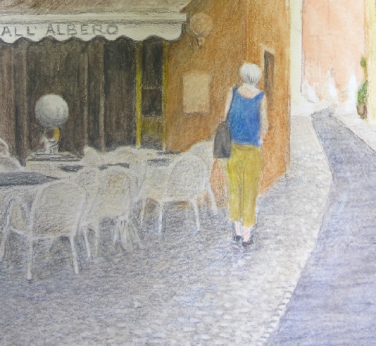
To enhance the scene, I started by sharpening the shadows on the left side of the picture with a dark grey pencil. I darkened the wall facing us and erased a light fitting and menu board to create a sense of depth. This revealed the base wash tint, adding warmth to the scene.
Next, I worked around the white chairs, using a range of grey pencils to capture their delicate shapes. Instead of using white pencil, which can indent the paper, I opted for a sharp-pointed grey pencil to preserve the white tones. This allowed me to erase the colour back to near white using a battery-powered eraser, giving me greater control over the shading.
I also added more detail to the walking figure, using dry colour to bring out its features. To create texture in the cobbled area, I applied small, flat circular shapes in grey, which I then erased in places to create highlights. The result is a more nuanced and engaging scene, with a greater sense of depth and dimension.
 Close up of cobblestones
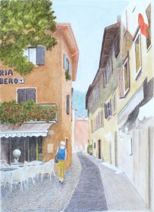 Developing the road surface
"I've been refining the road surface and cobbles, aiming for a grey tone with a hint of underlying purple.
To achieve this, I applied a series of circular shadings with an indigo pencil, creating a fresh base layer over the previous colours. This process was repeated across the road surface and in the shadows of the right-hand buildings.
Next, I added circular shadings with a cold grey to neutralize some of the purple undertones. You can see the detail in the smaller image below, where the grey shading is partially complete. I also deepened the shading on the buildings to accentuate the contrast between shadows and sunlight.
Additionally, I used a darker grey to enhance the shading around the left-hand chairs and define the chair legs more clearly. This shading process is time-consuming, as the colours are built up in delicate layers.
 Close up of road
Our watercolour pencil tutorial is taking shape. Take a closer look at the full-sized image below to see the details that bring the picture together.
Key additions:
A small roof section has been added to the top right corner, enhancing the composition despite not being in the original reference.
A touch of green in the distance defines the building at the far end of the street.
The building on the near right now features small lights outside the restaurants, adding depth and character.
 Our progress so far
More work has been done on the various doorways down the street and the edge of the buildings at pavement level have been defined.
Where necessary, colour has been lifted out using a battery eraser which removes up to 75% of the original wash colour and virtually all the dry colour added since. We don’t get back to white paper, but we are very close to it and once the darker layers go down, the near white will read as white.
The shadowed area in the Cafe front on the left has been further darkened.
I am reaching the point where I have to decide whether to continue using watercolour pencils in their dry form, or change over to the wax pencil equivalent (Pablo) which will handle better as more and more colour goes down.
Doing the picture in steps like this, I can get all the right shapes in position whilst the colours are still fairly light, and colour can still be removed if required.
Switching to Pablo pencils
Why switch pencils mid-tutorial? In this case, it's not necessary - the Aquarelles are soft watercolour pencils that work well dry.
However, I'm opting for the matching set of Pablo non-soluble pencils, which share identical colours with the Supracolour.
The Pablos have the same pigments in a smooth oil-based carrier, making them more transparent and better suited for layering over dry Supracolour. They also sharpen to a finer point, ideal for detail work.

The scan above shows three hours of work with the Pablos, building up colour depth and defining shadows on top of the watercolour pencil layers. Let's break it down:
- The tree: I added approximately five layers of transparent Pablo in four colours (Olive Grey, Spring Green, Grass Green, and Sepia), starting with Sepia to define the darkest areas. I also separated the tree from the window box and added a few red flowers to match the one below.
- The walls: I applied around four layers of ochres and warm, light reds (Ochre, English Red, Hazel, and Brownish Orange) to enhance the shade effect.
I've included a close-up of the tree foliage to showcase the detail. By switching to the Pablos, I've achieved greater depth and definition in my artwork.
The final layer, a warm light grey (such as Beige or Ash Grey), burnishes the paper's surface and evens out the pigment. I avoid using white, as its opacity would overpower the warm underlayers. A blender pencil would seal the surface, but might require additional final touches.
With Ivory Black, I define the shadow under the shutter. The Pablo's sharp point allows me to precision-draw the corner of the wall and overhanging roof, then darken the wall below to create a subtle shadow. I use light reds and grey-reds, avoiding actual greys and blacks, which can muddy the colour.
To define the building's near corner, I darken the facing wall (on the left) with a sharp pencil point. Fine lines of black are added to the shutters to create depth and shadow.
NOTE: All the smaller, detailed images shown are around 50% larger than actual size.
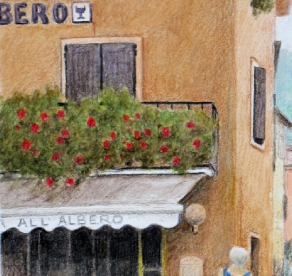
The balcony foliage has been enhanced with additional sepia tones and a layer of dark green. The railings are now defined with black fine point, and the wall behind is filled in.
On the wall below the blind, grey and light red hues accentuate the shadow, while black is used to define the scalloped edge.
Notice how the door and window frames are subtly shaded, with darker tones at the top and lighter tones below, to capture the shadow's effect.
The upper window on the right and the street-level window behind the pedestrian have also been refined for added clarity.
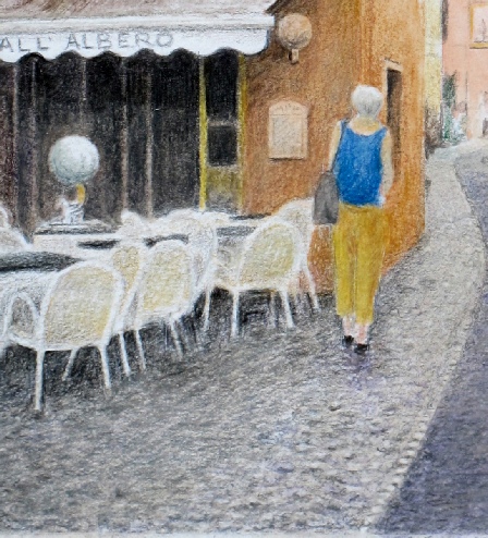
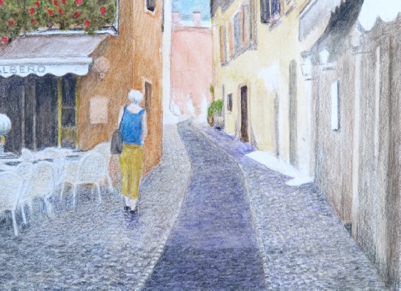
Let's revisit the left side of the picture, focusing on the cafe doorway, chairs, tables, and the pedestrian walking away from us.
Using the fine point of the Pablo pencils, we can define the chair legs and darken the cobbled pavement beneath them. We can also add subtle colour to the chair arms and backs. A warm grey shading on the cobbles enhances the chair legs and blends the cobblestones, while small black marks create deeper shadows.
With the transparent Pablos, we add more colour and depth to the walker's clothing, defining their shape. The surrounding paving receives darker shading to highlight the walker. To create a sense of depth, horizontal shading strokes are applied to the centre dark strip in the road, subtly cutting back the purple shade.
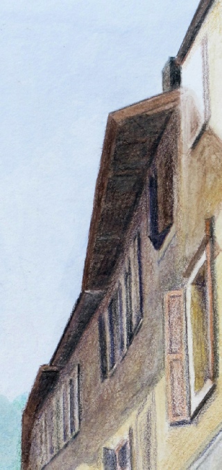
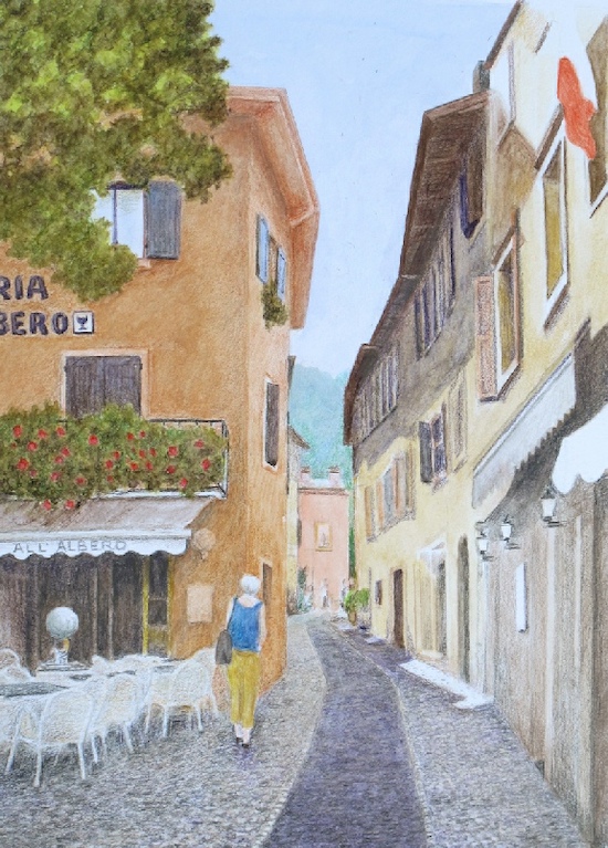
Now, let's focus on the top centre and right-hand roof line.
Notice how the fine-pointed Pablo coloured pencils allow for crisp detail in the shadow areas, defining the shutters and windows on the upper level.
I've also refined the perspective of the small roof section at the very top.
Initially, the shadow on the walls had a purplish hue, but a light layer of Venetian Red creates a more accurate representation of the cold light on the light brown wall.
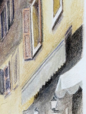
My attention has turned to the blind above the doorway on the bottom right of the picture.
I've used a power eraser to level the scalloped edge, ensuring it's even along its length. I've also added shading to the small section of blind visible in the corner.
Next, I'll focus on the road surface, the remaining doors and openings on the right, and the distant view at the end of the street.
To draw the viewer's eye down the street, I need to infuse this area with as much light and detail as possible. This may require darkening the road surface near the end of the street to create depth and contrast.
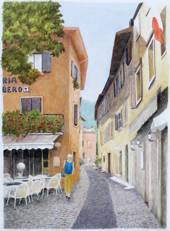
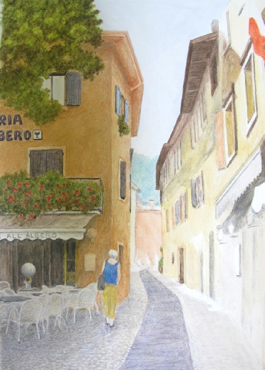
Compare the image above, taken before we refined our watercolour pencil tutorial with the Pablos, to the finished picture below. The difference is striking.
The flat, cloudy daylight in the final version allowed us to capture accurate colours.
Approximately three hours of work separate the two images, with some finishing touches added using the softer, wax-based Caran d'Ache Luminance pencils.
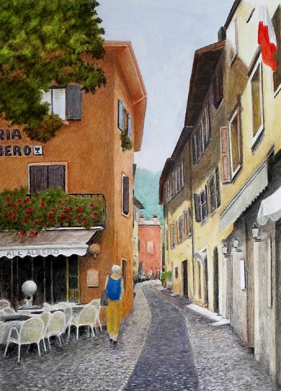
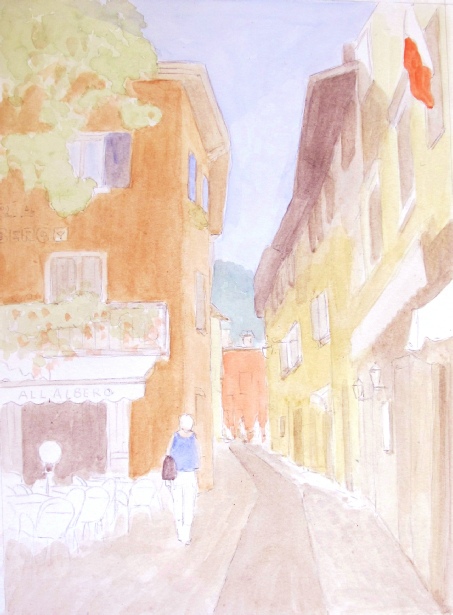
Italian Street Scene in Malcesine, Lake Garda Italy. Picture from a photo reference © 2006 Peter Weatherill
Worked with Caran d’Ache Supracolor Soft watercolour pencils on Hot Pressed watercolour paper, Followed by detail worked with Caran d’Ache Pablo and Luminance Coloured Pencils.
Artwork © 2012 Peter Weatherill

I'm Carol Leather, a coloured pencil artist for over 15 years. Most of my teaching comes back to the same idea: realistic coloured pencil starts with structure, light and observation long before the colour goes down.
My work has featured in Ann Kullberg's Color Magazine, CP Magic and Color Pencil Treasures (vol 7). I'm a member of the UKCPS and was a prize winner in the Nature section of their Annual Open Exhibition in 2020.
You might like these
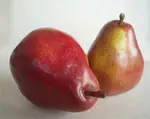
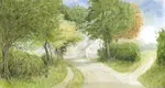
Beginner Easy Watercolour Pencil Art: Paint Pears Step-by-Step
Create beautiful, easy watercolour pencil art with our beginner pear tutorial! Learn step-by-step how to layer, blend & paint fruit. Perfect first project!
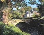
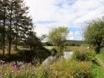
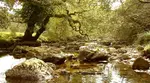
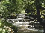
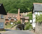
Watercolour Pencil Landscape Tutorial – Brokken Bridge
A complete step-by-step watercolour pencil tutorial. Paint an English packhorse bridge using washes, scribbles, and layering techniques. Includes free outline.
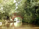
Beginner's Line and Wash Tutorial (Watercolour Pencils)
Transform your pencil drawings with water! Our beginner's line and wash tutorial guides you step-by-step from dry pencils to a lively, colourful scene.

Copyright © 2009- pencil-topics.co.uk All rights reserved
Home | About Us | Contact Us | Privacy Policy