- Home
- Watercolour pencils
- Watercolour background
Scottish Landscape in Watercolour Pencil: Mood and Backgrounds
In short
A real process study of Peter Weatherill's Scottish hillside in watercolour pencil. Learn his wash-palette method for soft, atmospheric backgrounds, and the honest composition lesson from a painting he chose to abandon. Usable technique, plus the underrated skill of knowing when to stop.
Most tutorials show you a finished painting and walk you back from the win. This one is different, and more honest. It follows a real watercolour pencil painting that did not quite come together, and shows you what it teaches about washes, atmosphere, and knowing when to stop.
The painting is a Scottish hillside by Peter Weatherill, who founded Pencil Topics before I took it over. He worked it during a workshop at Knuston Hall, composing from memory as he went, and photographed each stage. The background washes are lovely. The composition, by his own honest account, ran into trouble. Both halves are worth your time.
What this is: a process study, not a copy-this-scene tutorial. The focus is the how and why behind each decision. For the wider method, start at the Watercolour Pencils Hub.
Setting the Scene: Peter's Materials
Peter painted scenes like this from memory, letting the picture compose itself as he went. It is a spontaneous way to work, and as you will see, it cuts both ways. Here is what he used for the demonstration:
- Paper: a fresh sheet of stretched Fabriano Classico 5 Hot Pressed. (More on this in my guide to choosing paper.)
- Water and palette: a row of small bowls of clean water, and a sheet of rough paper to scribble pigment onto, making a dry palette to lift washes from.
- Brushes: a nylon no. 6 and a watercolour wash brush. (See my guide to brushes.)
- Pencils: Caran d'Ache Supracolor watercolour pencils, which Peter favoured for their quality.
The Supracolor link is an affiliate link: if you buy through it I may earn a small commission at no cost to you. I only recommend kit I rate.
The Wash Palette: Lifting Colour From Dry Pigment
The heart of Peter's method, and the most useful thing to take from this page, is making a temporary palette of dry pigment to lift washes from. It lets you mix a wash to exactly the strength you want before it ever touches your painting.
In Peter's words: Scribble your chosen pencils onto rough watercolour paper. Moisten those patches, then lift the colour with a brush and mix it with water into thin, pale washes. Prepare more pigment than you think you need. You use very little, and it is easier to make extra than to match a colour later.
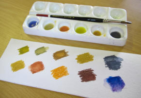
Peter's setup. Dry pencil swatches on rough paper below, the activated liquid washes mixed and ready above.
A few things make this work better:
Use rough paper for the palette. Its texture grabs more pigment as you scribble, so you have a richer source to lift from.
Control the strength as you go. A dense, dark scribble gives a stronger wash. For pale background layers, scribble lightly or dilute the lifted colour with more water.
Mix on the palette, not the painting. Lift pigment from two different swatches and blend them in a well before you commit anything to your paper.
It is watercolour pencil used almost exactly like pan watercolour, which gives you lovely, flexible control over delicate washes.
Building Atmosphere, Layer by Layer
With the palette ready, Peter began the background as a series of thin, pale washes.
In Peter's words: I apply thin layers of wash to dampened, stretched paper and let the colour flow over the surface. The colour is very thin, so it takes several layers to build a soft background. I started the hills with no fixed plan, leaving white paper that might become a road or a stream. For the sky I used two pale layers from a purplish ultramarine. Remember that watercolour looks darker wet than it will dry.

The first pale washes. Soft, layered colour for the sky and emerging hills, with white paper left for a possible road or stream.
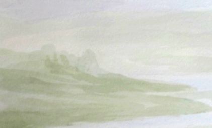
A scaled-up portion, colours boosted, so you can see how each thin layer builds on the last.
Three things are worth lifting out of this stage:
Thin layers make the depth. Each transparent wash interacts with the one below it, giving luminous, complex colour and soft gradations you cannot get from one heavy application.
Dampened paper softens edges. Lightly and evenly moistening the sheet first (then letting the shine go) helps washes flow and keeps edges soft, which is just what you want for skies and far hills. Your paper does need to be properly stretched to take this without buckling.
Judge values only when dry. Because watercolour dries lighter, let each wash dry fully before you decide whether to add another. And a gentle warning that the rest of this page bears out: composing with no plan at all is freeing, but it is easy to lose direction. A rough idea of your main shapes and light will save you later.
Developing the Landscape: Decisions on the Fly
From soft washes, Peter began making firmer choices.
In Peter's words: I developed the washes, defining the left-hand hills as mountains and adding a darker line of hills on the right, then shadows along the road and stream edge. The hillsides are taking on a Scottish feel, with warmer golden colours in the foreground. Later I added ochre over the green, introduced Highland cattle on the right and trees in the middle distance, and decided to replace the road with a stream for more interest.
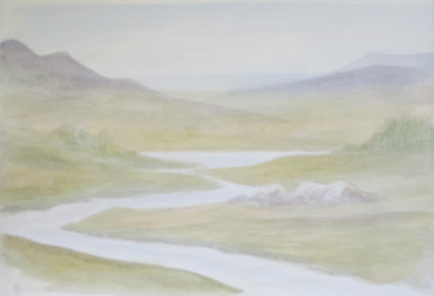
Forms taking shape: distant mountains, warmer foreground colour, and the stream beginning to read.
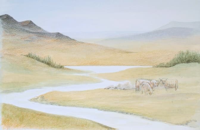
Highland cattle and a foreground stream go in, with darker tones building contrast in the distance.
This is the part where technique meets judgement. The useful lessons:
Warm advances, cool recedes. Golden tones in the foreground and cooler blues in the far hills create atmospheric perspective, a real sense of depth and space.
Set the light early with shadows. Those first soft shadows along the stream do more than describe the land, they fix your light direction, which makes every later highlight and shadow decision easier.
A stream is a leading line. Swapping the road for a stream was a bold mid-painting change, but a stream draws the eye into the scene and adds reflective foreground interest. A painting will often tell you what it needs if you stay open to it.
Greens are never one green. The ochre warmed the grass and broke up a flat green. Landscape greens almost always want layering and variation to feel believable.
The "Oops" Moment: When It Stopped Working
Here is where the honesty earns its place. Peter re-wet the dry pencil to intensify the background, then added more green to the grazing areas, and immediately doubted it. Then came the decision that ended the piece.
In Peter's words: I experimented with adding trees on either side, but it was a mistake. They overpowered the subtle hills on the right and disrupted the balance. Despite my best efforts to correct it, I abandoned the piece. It still serves its original purpose, demonstrating underpainting for a watercolour background. The composition issues were entirely my own doing.
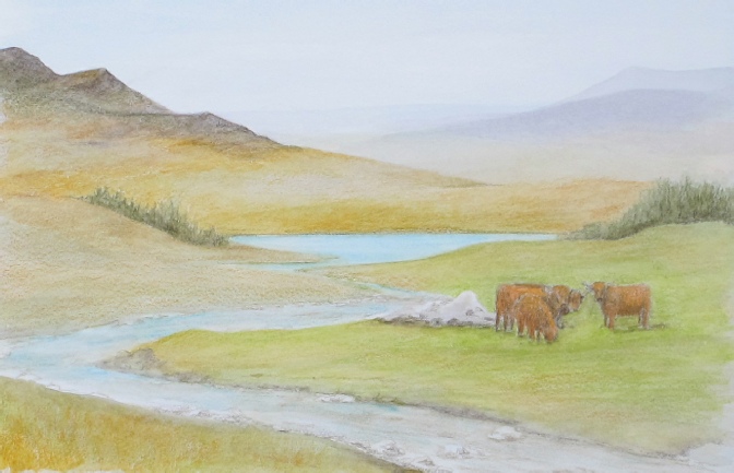
Colours intensified with a damp brush, and more green added to the foreground, the addition Peter was unsure about.

The final stage before Peter set it aside. The added trees overpowered the delicate hills.
What this teaches is as valuable as any technique:
Re-wetting revives. A damp brush over dry pencil wakes earlier layers up and melds washes together, which is genuinely useful, just expect intensified colour.
The doubt is universal. "Have I taken this too far?" is part of every painting. Note Peter felt it the moment he added the green, before the trees finished the job.
Balance the whole, not the part. Strengthening one area can quietly unbalance another. Darker, prominent elements added late (those trees) easily steal attention from the soft, distant passages you meant to keep delicate. Step back often and judge the picture as a whole.
What This Study Teaches You
The painting never reached the framing wall, and that is exactly why it is worth studying. Four things to carry into your own work:
Know when to stop. Trying to "rescue" a piece often overworks it. Recognising that a painting has reached its natural end, even an unintended one, is a real skill.
Every piece is a lesson. Peter did not call this a waste. He saw it as a clean demonstration of the wash technique and a lesson in composition. We learn at least as much from the ones that do not quite make it.
Composition is king. On-the-fly painting is exciting, but it needs constant checking against the whole. A couple of quick thumbnail sketches before you commit to permanent layers can save a piece like this one.
Separate technique from composition. Here the wash technique was a success and the trees were not. Pulling those apart is what turns a setback into targeted learning.
Had a painting go sideways and teach you something instead? I would genuinely love to hear it, you can tell me here.
Copyright © 2009- pencil-topics.co.uk All rights reserved
Home | About Us | Contact Us | Privacy Policy