- Home
- Landscape drawing
How to Draw a Landscape in Coloured Pencils (From Your Own Photo)
Landscapes in coloured pencil can feel like “too much”: too many leaves, blades of grass, rocks, clouds… and a whole lot of green.
This page breaks that big scene into small, learnable parts so you can build one finished landscape from your own photo, using only the pencils in your starter tin.
Pick a photo you like, then use the sections below to practise each element - composition, light, trees, grass, clouds, stone and water. Work through them and you’ll have the skills to redraw your photo as a coloured pencil landscape.

Planning Your Landscape Scene
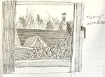
Start small. Before you touch colour, sketch a quick tonal thumbnail to sort out big shapes and composition.
Don’t chase every leaf or brick at this stage. Decide what fits in the frame, what you’ll leave out, and where your main focal point sits (usually where the lightest light meets the darkest dark, slightly off-centre).
You can do this outside or from a photo. If you use a photo, treat it as a starting point, not a prison - you can move or remove objects to improve the scene.
Starting Simple: Your First Coloured Pencil Landscape
The first time I tried a full landscape, I stared at my reference photo for about ten minutes and then put my pencils away. There was just too much going on. Where should I even start?

The answer, I discovered, is that you don't tackle it all at once. You break the scene into separate elements and work through each one on its own. That's what this page is for.
You don't need a huge set of pencils, either. A basic starter tin of 12 or 24 colours is plenty. And you don't need a perfect reference photo.
Any snapshot from your phone that has a bit of variety in it (some sky, a few trees, maybe some grass) will give you more than enough to work with.
Each section below walks you through one landscape element at a time: what to look for, how to approach it, and why the technique works. Not so you can copy my drawing, but so you can understand what's happening in yours.
Getting the Light Right in Your Landscape
Light tells the viewer what matters.
In rural scenes, light often comes from one main direction, softened by trees or hills. In town scenes, you might juggle street lamps, windows and signs, all casting different pools of light.
Notice where the light comes from and what colour it is: warm at sunrise and sunset, cooler under a clear blue sky.
If you want to go deeper into warm vs cool colours, head to our colour theory section, then come back here to apply it to your landscapes.
Drawing Trees with Coloured Pencils
Landscapes often include trees, and they can feel overwhelming if you try to draw every leaf.
I used to do exactly that, and ended up with something that looked more like a green cloud than a tree.
Start with the overall shape of the tree (or mass of trees), not twigs. Our How to Draw Trees and Foliage page walks you through this.
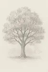
 A watercolour pencil tree
Think in layers: trunk and main branches, then clumps of foliage that form a soft mass rather than a sharp outline. Use your eraser to pull out sky holes and soften the top edge so the tree doesn’t end in a hard line.
Season matters: spring needs light and olive greens, summer is deeper greens, autumn leans into yellows and browns, winter might show bare branches and even snow lifted out with an eraser.
We also have step-by-step workshops on a tree-covered hillside and a single tree drawn with watercolour pencils if you want to practise different approaches.
Drawing Grass, Weeds and Wildflowers
Foreground grass is where most people panic.
Start by blocking in the shadows dark enough to push the lighter blades forward. Vary your pencil pressure so your darks still have subtle colour shifts, not flat black bands.
Let grass overlap, bend and criss-cross. If every blade is the same height and direction, it will look like a green fence. Closer blades can cast shadows across those behind them, which adds depth.

Colours change with the season: summer grass often leans towards yellow-greens and browns rather than pure light and dark green.
Our Brokken Bridge tutorial (below) shows foreground grass worked in watercolour pencils, and Peter’s Garden Archway shows how flowers can become the main focus in a more intimate scene.

Drawing Skies and Clouds
Skies are more than “one blue”.
Look up and notice how the blue is usually deeper overhead and lighter near the horizon. Light, even pressure makes it easier to lift out clouds with an eraser so they have soft edges, not hard cut-outs.
A hint of shadow under the base of clouds tells us the sun isn’t hitting them directly - but go too dark and they’ll look heavy and stormy when you didn’t mean them to.
If you can, lie back and watch the clouds for a few minutes. Notice how their shapes change overhead versus near the horizon. That kind of observation feeds straight into your drawings.
For a deeper dive, check out the page on different ways to draw clouds.
 Clouds created with watercolour pencils
Drawing Stone and Brick
Rocks, walls and buildings give your landscape structure.
Use scribbled or broken strokes to suggest rough texture, but still pay attention to where the light hits and where the shadows fall. Wet stones after rain may need smoother, burnished layers to look shiny; in dry weather, let some paper texture show to suggest grit.
Our pages on brick and stone walls, plus our linear perspective guide, will help you avoid leaning buildings.
I spent ages on a stone wall once, carefully rendering every crack, and then realised I'd ignored the light completely. The wall looked flat despite all that detail. Light first, texture second.
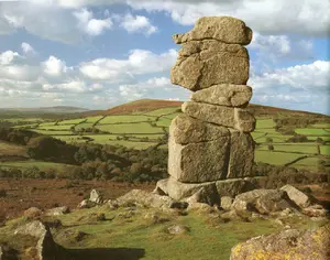
The Dartmoor Bowerman Stone tutorial shows how to combine rough rocks with softer fields and sky in one scene.
 An enlargement of a dry stone wall drawing
Drawing Water with Coloured Pencils
Rivers, ponds, lakes and sea all behave differently, but they share one rule: water reflects what’s around it, not just “blue”.
Calm water mirrors shapes and colours quite clearly; wind breaks those reflections into broken, shifting patterns. Look at your reference and copy the shapes of the reflections, not what you think "water" should look like. Our page on drawing water reflections goes deeper into how this works.
If you’re struggling, turn your reference and drawing upside down so you only see abstract shapes and colours. This stops your brain from correcting things into “tree” or “boat” and helps you draw what’s really there.
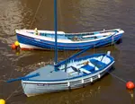
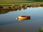
 An illustration showing boat reflections
Water features bring life to landscapes, and if your scene includes a harbour, canal, or lake, you may want to add a boat. Here's how to draw one that looks like it's actually floating.
Feeling more confident? Try out this tutorial to learn how to paint a river in Dartmoor, England.
Work through these sections with one favourite photo beside you. You probably won't nail every element first time, and that's fine. The point is to understand how each part of the scene works so you can keep coming back to it with fresh eyes.
Looking for more complex water tutorials?
Realistic water: 3-part tutorial series | Part 2 | Part 3
Grand Union Canal: composing and painting a landscape | Part 2 | Part 3

I'm Carol Leather, a coloured pencil artist for over 15 years. Most of my teaching comes back to the same idea: realistic coloured pencil starts with structure, light and observation long before the colour goes down.
My work has featured in Ann Kullberg's Color Magazine, CP Magic and Color Pencil Treasures (vol 7). I'm a member of the UKCPS and was a prize winner in the Nature section of their Annual Open Exhibition in 2020.
You might like these
How to Use Thumbnail Sketches to Plan Better Drawings
Most drawings fail at the planning stage. Thumbnail sketches catch composition mistakes before you commit to a full piece. Here's how to use them.
How to Draw Realistic Stone & Rock Textures in Coloured Pencil
Learn how to draw realistic stone and rock textures in this step-by-step coloured pencil landscape tutorial. Perfect for beginners wanting to create impressive results.
Why Your Trees Look Like Blobs — And What to Do About It
Most trees look like blobs because we try to draw the leaves. This 5-step method starts with shape and structure. It changes everything.
Copyright © 2009- pencil-topics.co.uk All rights reserved
Home | About Us | Contact Us | Privacy Policy