- Home
- Drawing stone and rocks
A Step-by-Step Guide to Drawing Realistic Stone with Coloured Pencil
Welcome to this guide drawing a truly characterful stone landmark: The Bowerman's Nose on Dartmoor.
This tutorial is based on a wonderful landscape drawing by the site's founder, Peter Weatherill. We'll be using his beautiful artwork as a case study to break down the professional techniques he used, so you can apply them to your own coloured pencil landscape drawings with confidence.
I know that tackling a full landscape, especially one with a complex texture like ancient granite, can feel intimidating. You might look at a reference photo and wonder, "Where do I even begin? How can I make that stone look solid and real, not like a flat, grey blob?"
In this guide, we will break down the process used to create this piece. We'll go step-by-step, from the sky to the foreground, so you can learn not just how to draw this specific scene, but how to approach any complex landscape with a clear plan.
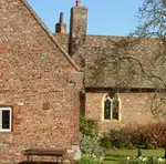
If you'd also like to apply these texture skills to built surfaces, this guide on drawing buildings shows how brick and stone walls work in landscape scenes.
 The original reference photo (you can download it below along with the outline drawing)
What You’ll Learn in This Tutorial
- How to choose the right paper to create realistic stone textures
- Two different methods for creating a soft, believable sky.
- A simple technique for building rich, layered colour in a landscape.
- How to use a "scribble stroke" to render the rough, sunlit surface of granite.
- How to use shadow to ground your subject and make it feel three-dimensional.
Supplies Used in This Example
Pencils: The original piece was created with Faber-Castell Polychromos, but any good quality artist-grade wax or oil-based set will work. Key colours will be a range of warm and cool greys, earth tones (like Brown Ochre), a dark brown (like Dark Sepia), and various greens and blues.
Paper: This is important! For stone, you need a paper with some texture, or "tooth."
- Recommendation: A 300gsm Hot Pressed (HP) watercolour paper, like Daler Rowney Langton, was used here. It's smooth enough for details but has enough tooth for layering.
- Budget-Friendly Alternative: A heavyweight cartridge pad (200gsm+) will also work well for dry coloured pencil work
Watercolour Pencils (Optional, for the Sky): If you wish to try the watercolour wash sky, you'll need a few blues and greys from a set like Staedtler Karat Aquarell or Derwent Watercolour.
Other Tools: A good sharpener, a putty eraser, and a soft brush (if using watercolour pencils).
Downloads:
The Sky (Choose Your Method)
The sky sets the mood. For this piece, a soft sky with gentle clouds works best to avoid distracting from the stone. You have two excellent options.
Option A: The Watercolour Pencil Wash (For a soft, vibrant look)
 This version was worked with a watercolour pencil sky
This method can produce beautiful, seamless results, but it requires watercolour paper.
- Stretch Your Paper: If using a wash, it's best to stretch your 300gsm paper first to prevent buckling.
- Apply Dry Colour: Lightly scribble shades of blue and grey onto the paper where you want your sky. Don't worry about being neat.
- Activate with Water: Take a clean, damp (not soaking!) brush and gently wash over the dry pigment, blending the colours together. Let it dry completely before moving on.
Option B: The Dry Pencil Method (Reliable and controlled)
 Here coloured pencil was applied with felt for the sky
This is a more controlled method that works on any paper type.
- Create a Palette: On a scrap piece of paper, scribble your blue and grey pencils to create a palette of colour.
- Apply with Felt: Using a small piece of felt or a cotton ball, pick up the pigment from your palette and gently rub it onto the sky area of your drawing in soft, circular motions.
- Lift the Clouds: Use a putty eraser to gently lift out the cloud shapes.
Carol's Key: The sky is the background actor, not the star. Whichever method you choose, keep the colours gentle. The goal here is to support the main subject, not overpower it.
You might also like to check out the page on drawing clouds.
The Distant Background and Foreground
 The background before the pencil was activated with water
Now, let's build the world around our stone. We will work from the back to the front, leaving the Bowerman Stone and the other rocks as white paper for now.
- Establish the Moors: Using the sides of your pencils, lightly layer blues, greens, and ochres for the distant hills and grassy areas. Keep your strokes loose and follow the general contours of the land.
- Add Depth to the Background: For the hills furthest away, use cooler blues and greys. This is a crucial trick for creating depth – cool colours recede, and warm colours come forward. If a background area becomes too intense, you can gently glaze over it with a white or pale grey pencil to push it back.
- Work the Foreground Grasses: As you move closer, you can use warmer, more vibrant greens and earth tones. Continue to leave the areas for all the granite stones completely white.
- Erase Stray Lines: Before moving on, gently erase any remaining graphite outline marks from the landscape areas, leaving only the essential lines on the stones themselves.
 The background after brushing with water
Pro Tip: Don't get bogged down in detail here. This is all supporting scenery. Focus on creating broad areas of colour that establish the setting. The detail work comes later.
 Close up of left hand side of the drawing
 Close up of right hand side of the drawing
How To Draw Realistic Stone With Coloured Pencil
This is where the magic happens! The key to realistic stone is building up texture through many light, overlapping layers.
First, Practice the "Scribble Stroke"
On a scrap piece of your drawing paper, we're going to practice the main texture technique. It's a method of applying light, overlapping, slightly circular strokes.
- Start with your lightest colour (a cream or light warm grey).
- Apply it with very light pressure in gentle, circling motions.
- Layer a slightly darker warm grey on top, allowing the first colour to show through.
- Continue building up layers, moving from your lightest to your darkest colours.
This light, layered approach is what will create the mottled, uneven texture of granite.
 This image is colour enhanced to show the method
 Keep the colour application very light as shown here
Now, Apply it to the Drawing:
- Map Your Shadows: Look at your reference and identify the main shadow shapes on the stone. With a light warm grey, gently block in these areas. Don't add any colour to the sunlit areas yet.
- Build the Mid-Tones: Continue building up the shadow areas with more layers of warm greys and perhaps a very light touch of an earthy green or brown ochre to suggest moss or lichen. Keep the pressure light!
- Work the Sunlit Areas: Now, move to the areas hit by light. Start with a white or cream pencil and use the same scribble stroke. Gently layer in a very light warm grey to create subtle form.
- Define the Darks: For the deepest cracks and shadows, use your darkest pencil (like Dark Sepia). Use a sharp point and firm pressure, but only in these small, specific areas. Avoid using black if you can, as a mixed dark is much more natural.


Troubleshooting: If an area gets too dark, you can gently lift some pigment with a sticky putty eraser. If it looks too flat, you can often add life by burnishing with a cream or white pencil to blend the layers and add a subtle sheen.
A Note on Different Outcomes


To show how the same subject can be interpreted differently, here are close-ups of two versions of the Bowerman's Nose from the original artist, Peter Weatherill.
Your first instinct might be to compare them and decide which one is "better" or "more correct." I encourage you to see it differently.
Look closely at the artistic choices:
- Colour Palette: The version on the left uses a warmer, more golden selection of colours, suggesting a different time of day. The one on the right uses cooler tones, creating stronger contrast in the shadows.
- Texture and Detail: Notice how the cracks and lighter areas are rendered with slight variations in each piece, giving the stone a unique character in both drawings.
The important lesson here is that there is no single 'correct' way to draw this scene. Both versions are successful because they are built on the same solid foundation of layering and texture that we've covered.
Your version will, and should, look different again. It will reflect your hand, your eye, and the colours you choose. Focus on applying the techniques of layering and creating texture. If you do that, your finished piece will be a success in its own right.
Finishing Touches
Your landscape drawing is almost complete! These final steps will unify the piece.
- Draw the Smaller Stones: Use the same layering and texturing technique for the smaller rocks scattered in the grass. Make sure the light source is consistent—if the light is hitting the Bowerman Stone from the left, it should hit all the other stones from the left, too.
- Add Cast Shadows: This is crucial for making the stones feel grounded. At the base of each stone, on the side opposite the light, add a dark shadow. This shadow should be darkest right next to the stone and soften as it moves away.
- Final Review: Step back from your drawing. Does the main stone stand out? Are the background hills pushed back? Does the whole scene feel unified? Make any final tweaks to colour or value to enhance the overall impression.
And there you have it! You've tackled a complex landscape and created a piece with texture, depth, and character.
Remember, every drawing you do is a learning experience. The more you practice these layering and texturing techniques, the more intuitive they will become.
Ready to Build on Your New Skills?
If you enjoyed drawing the textures of the Bowerman Stone, I have another tutorial from the same beautiful part of the world that you might love.
Discover how to capture a different mood with our guide to drawing the River Tavy. It prominently features rocks within the water, giving you another chance to practice your texturing skills while learning how to render the unique challenge of a moving river.
View the River Tavy Coloured Pencil Tutorial

I'm Carol Leather, a coloured pencil artist for over 15 years. Most of my teaching comes back to the same idea: realistic coloured pencil starts with structure, light and observation long before the colour goes down.
My work has featured in Ann Kullberg's Color Magazine, CP Magic and Color Pencil Treasures (vol 7). I'm a member of the UKCPS and was a prize winner in the Nature section of their Annual Open Exhibition in 2020.
You might like these
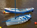
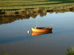
How to Draw a Boat That Actually Looks Like It Floats
Learn why boat drawings hover above the water and how to fix it. Hull shape, waterline placement, and reflections - the three principles that make boats float.
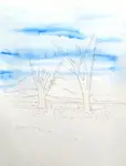
How to Draw Clouds with Coloured Pencils: 3 Methods That Work
Pencils make lines, clouds don't. Learn 3 methods that actually work: felt transfer, watercolour pencils, and soft pastel. Step-by-step for each technique.
Colored Pencil Landscape Drawing: A Beginner's Guide
Break any landscape into simple sections and draw each one with colored pencils. Covers trees, skies, water, grass and stone using just your starter set.
Copyright © 2009- pencil-topics.co.uk All rights reserved
Home | About Us | Contact Us | Privacy Policy