- Home
- Landscape drawing
- How to draw trees
Why Your Trees Look Like Blobs — And What to Do About It
If you’ve ever tried to draw a tree and ended up with something that looked more like broccoli on a stick, you're not alone.
This guide is here to help you move past that stuck feeling. To take you from “Where do I even start?” to sketching trees that feel grounded, organic, and alive.
You’ll start by nailing the overall silhouette and trunk structure, then build convincing foliage, bark texture, and shadows. By the end, you’ll have a reliable process you can repeat for any tree you want to sketch from life or from photos.
 This simple graphite sketch shows the goal we are aiming for: a believable tree with good shape, structure, and texture.
Structure First, Colour Second
You might have noticed the sketch above is in graphite (a regular pencil), even though this guide mentions coloured pencils. This is intentional.
All great drawings, whether in monochrome or full color, are built on a solid foundation of shape and form. This tutorial focuses on mastering that foundation. The steps we will follow work perfectly for both graphite and colored pencils.
We will first focus on getting the structure right. Once you are confident with that, applying color becomes a much simpler and more enjoyable final layer.
Whether you’re using a single pencil for the first time, or coming back with a full set of colors, we’ll take it step by step.
No pressure. No guesswork. Just clear guidance, quiet wins, and skills that grow with you
Step 1: Start with Shape by Sketching the Tree’s Silhouette
Your very first mark on the paper should not be a trunk or a leaf. It should be a faint, light outline of the tree's entire silhouette. This single step is the key to creating a tree that doesn't look like "broccoli on a stick."
What to do:
- Look at your tree and simplify its overall shape into a basic form, like an oval, circle, or a cone. We'll make it more realistic shortly.
- Using a pencil with light pressure, sketch this basic shape onto your paper. This is just a guide for you to build on, so don't worry about making it perfect.
Now, let's focus on what you should be seeing. As you observe, remember that every tree has its own character defined by its overall form.
Before you get caught up in texture or tiny details, take a step back. Start with the shape... Some trees shoot straight up with narrow angles, like pines or poplars. Others spread wide and low, like oaks. Some have a loose, airy shape, while others are dense and compact.
Look at the image below. See how each tree can be simplified into a basic shape? That is your goal for this step. You are not drawing details yet; you are just getting a feel for how the tree is built and how much space it occupies.
 Notice how different branching patterns create unique overall shapes. This simple silhouette is your starting point.
Quick variations: Adjust the method for different trees
This five-step process stays the same — you just change what you look for.
- Conifers (pine, fir): Start with a tall triangle or column silhouette. Foliage masses stack in layers, with fewer sky holes.
- Deciduous (oak, beech in summer): Start with an uneven cloud silhouette. Break the canopy into clumps, and leave clear “sky holes” between them.
- Winter trees (bare branches): Your silhouette becomes the branch network. Step 3 isn’t leaf clouds — it’s clusters of twigs and branching patterns grouped into simple shapes.
Same steps. Different observations.
Step 2: Build the 'Skeleton' with the Trunk and Main Branches
Now that you have your faint silhouette, it's time to build the framework inside it. This is the underlying structure that gives the tree its strength and character.
What to do:
- Draw the Trunk: Inside your silhouette, draw two lines for the trunk. Make sure they are wider at the bottom where they meet the ground and get slightly narrower as they go up.
- Add the Main Branches: Start drawing the largest branches growing out from the trunk. Pay attention to the joints; branches should grow out from the trunk smoothly, often forming a "Y" shape, rather than looking like they are "stuck on" the side.
- Remember to Taper: Just like the trunk, each branch should be thickest where it starts and get progressively thinner as it stretches outwards.
- Remember: some branches point toward you. Those will look shorter and more compressed (foreshortened), and that’s what makes the tree feel real.
This structure is the most important part of a believable tree. Think of it as the tree's backbone, which is exactly what you should be trying to capture.

The trunk is your anchor. It’s the backbone of the tree, thicker at the base, slowly tapering as it rises toward the sky. From there, the branches stretch and shift. Some reach straight up. Others bend low or curve gently outward, shaped by wind, light, and time.
As you draw, let your pencil follow the flow of that growth. Don't feel like you need to capture every limb exactly right. This isn't about creating a perfect copy; it's about capturing a feeling.
It’s not a formula. It’s a gesture.
Notice in these photo examples how the main branches are thick and strong at the trunk, and they split into smaller, thinner branches as they reach for the sky.
The most powerful mental shift you can make right now is this:
Stop thinking in lines. Start seeing the tree as a shape in space, full of weight, balance, and movement.
Follow this advice, and your drawing will immediately start to feel more real and alive.
Step 3: Block In the Leaves as 'Foliage Masses'
his is where your tree truly comes to life. The biggest mistake most beginners make is trying to draw hundreds of individual leaves. The secret is to suggest them by drawing masses of foliage, or "leaf clouds."
What to do:
- Look at your tree and squint your eyes. Notice how the leaves clump together into larger shapes.
- Using a soft, looping, or scribbling pencil stroke, lightly block in these main "cloud" shapes. Let them follow the structure of the branches you drew in Step 2.
- Don't fill everything in! The gaps you leave are just as important as the marks you make.
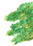
You are not just drawing green blobs; you are capturing the personality of the foliage. As you draw these masses, ask yourself: is the canopy dense or is it airy?

The canopy can be dense or airy, with "sky holes" between leaf clusters. By capturing these characteristics, your drawing and painting skills will improve.

Look at the difference in the photos above. The oak tree's canopy is a solid, heavy mass, while the other tree has a much lighter, more open feel. You can show this difference by how you draw your foliage clumps—either tightly packed together or with more space and sky showing through.
If those open areas of foliage leave you wondering what to do with the sky behind them, this guide on how to draw clouds will help you keep those spaces soft and believable.
The most valuable piece of advice for this entire step is this:
You don’t need to draw every leaf... Group the leaves into clusters, shapes of tone and colour rather than individual outlines. Suggest volume through contrast. Let your eye, and your viewer’s, do some of the work.
Choosing your colours
As you block in your foliage, think about the season you want to portray.
The colours you choose will instantly set the mood of your drawing. While some leaves are smooth and glossy, others are jagged or curled—you can hint at these textures by varying your pencil marks.
Each season brings its own palette to the foliage. Spring and summer bring deep greens and fresh yellows. Autumn shifts into fiery reds, soft golds, rich browns. Even winter, when trees are bare, has colour—silvery branches, pale light, cool shadows.
 As you see here, the colour of the leaves is one of the most powerful ways to show the season and tell a story.
Before you move on: quickly choose a light direction.
Pick something simple — light from the top left, for example — and stick with it for the rest of the drawing. This one decision will make your shadows in Step 4 feel consistent, and your ground shadow in Step 5 instantly believable.
Step 4: Add Realism with Texture and Detail
You’ve built the shape, the skeleton, and the foliage masses. Now it's time to add the personality. This step is about transforming your flat shapes into 3D forms by suggesting texture and shadow.
Creating Believable Bark
The key to drawing bark is to suggest its texture, not copy every single line.
What to do:
- Decide on the texture: Look at your tree. Is the bark rough with deep grooves, or is it relatively smooth?
- Use contour lines: Instead of just drawing straight vertical lines, use short, curved lines (hatching) that wrap around the trunk and branches. This simple trick instantly makes them look round and three-dimensional.
- Vary your marks: For rough bark, use darker, more varied lines. For smoother bark, use softer shading and fewer distinct lines. Add darker pressure to one side of the trunk to create a shadow, which gives the tree weight.
The goal is not perfection, but believability. You want to capture how the bark feels.
Learn more about the different colored pencil strokes you can use here.
What matters is how the bark feels. Rugged. Ancient. Peeling. Patterned. Your pencils can echo that feeling through the rhythm of your marks. You don’t need to draw every groove.
 For deeply grooved bark like this, use confident, dark marks that follow the shape of the trunk.
Adding Colour and Character
Tree trunks are never just one shade of brown. Looking closer reveals a surprising range of colours that you can use to add richness and life to your drawing. You can learn more about using colour on my colour basics page.
The colours of bark might surprise you... Silvers, ochres, soft greys, rusty reds. Even hints of violet hiding in the shadows. Tree trunks aren’t just brown, they’re layered with subtle, shifting tones.
Finally, look for the unique details that tell the tree's story. These are the marks of a life lived.
Does it have scars from fallen branches? Knots? Hollows where creatures might live? Adding just one or two of these features makes your drawing feel like a portrait of a specific, individual tree.
 Details like knots or hollows give your tree a history and make it more interesting to look at.
 Notice details like fungus or moss clinging to the trunk. These small textures tell a story about the tree's age and environment.
Weathered trunks often carry the marks of age, darkened knots, hollows, rough scars, twisted grain. Signs of a life shaped by seasons, storms, and slow change. All of that tells a story. Let your pencils tell it too.
 Cracks and knots in rusty-coloured trunks
 Rough textured trunk
Step 5: Ground Your Tree in an Environment
Why This Step Matters More Than You Think
I used to skip this step. I'd spend an hour on a beautifully rendered tree, then wonder why it felt... off. Flat. Disconnected.
The answer was always the same: it had no home. A tree without context is a study. A tree in a place — even a suggested place — becomes a scene. The viewer's eye has somewhere to travel, something to understand.
And if that scene includes water, this tutorial on drawing reflections shows how trees and other landscape elements change once they appear on the surface.
You don't need much. A shadow. A hint of grass. A distant shape. Just enough to answer the question: where does this tree live?
Trees are one of the most important elements in any landscape composition.
Our landscape drawing guide shows how trees work alongside skies, water, stone and grass to build a complete scene.
What to do:
- Establish the Ground: At the very least, draw a simple line or some soft shading at the base of the trunk to show the ground it's growing from. Add a few blades of grass or some texture for dirt.
- Add Foreground or Background Elements: Place one or two simple objects nearby. This could be a few rocks, a small patch of wildflowers in front of the tree, or a distant hill or another, smaller tree in the background.
- Create a Shadow: Think about where your light is coming from (the opposite of your highlights in Step 4) and draw a simple shadow on the ground, stretching away from the base of the tree. This instantly anchors it to the spot.
The purpose of this step is to give your tree context and tell a bigger story.
Trees don’t live in a vacuum. They’re part of a bigger story... a few small hints can give your tree a sense of place, helping the viewer feel the scale, the mood, the season.
Adding these small surrounding details is what makes the difference between a study of a tree and a picture of a world.
Context doesn’t just frame the tree. It helps it breathe.
A Quick Note on Perspective:
If you add other trees or hills in the background, remember this simple rule: objects that are further away should appear smaller and less detailed. This is a fundamental principle of basic perspective that will add a great sense of depth to your drawing.
Bringing It All Together: From Steps to Skill
There you have it. A complete, five-step method to take you from a blank page to a believable tree drawing. You now have a reliable process for sketching the shape, building the structure, adding foliage, applying texture, and grounding your tree in its world.
But the goal of these steps was never to teach you a rigid formula. It was to give you a framework to practice what this guide is truly about: learning to see.
The real magic happens when you take these steps out into the world and let the subject itself become your teacher.
Drawing trees isn’t about getting it perfect, it’s about learning to see. The more you observe, the more you’ll notice: the curves, the cracks, the colours. The quiet rhythm of how a tree grows. Sketch what you see, not what you think a tree should look like. Over time, your drawings will start to feel more confident. More expressive. More real.
And if your first few drawings don’t turn out the way you hoped? That’s okay. That’s part of it. Each sketch is a step forward.
Your First Assignment: A Sketching Prompt
The best way to make these five steps feel natural is to put them into practice immediately. Find a tree you can sit with for a little while, something close to home. It doesn’t need to be grand or unusual. Just present.
- Step 1: Start by drawing its overall shape. The silhouette.
- Step 2: Look closer. Notice how the trunk meets the ground. How the branches split. Add a few hints of bark texture.
- Step 3: Where does the light hit, and where do the shadows gather on the leaf masses?
- Step 4: Add one or two hints of its surroundings—a patch of grass, a fence, a passing bird.
Take your time. This isn’t about finishing a perfect drawing. It’s about learning to see and letting your pencil follow.
Ready to Put These Observation Skills to Work?
If you’d like to keep going, the tutorials below will give you more chances to practice drawing trees in context, one scene at a time. They are the perfect next step to translate your new observation skills into expressive artwork.
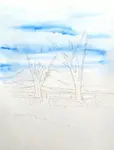
Master watercolour pencil tree methods - perfect for capturing the natural flow of growth.
Master this Yorkshire bridge landscape tutorial - see how your tree observation skills translate into a full watercolour pencil scene.
Learn to compose multiple trees in hillside scenes - apply everything you've learned to create convincing landscapes.
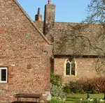
Follow this step-by-step English village landscape - see how trees work within a full composition with buildings and a bridge.
Follow this Coventry Canal watercolor pencil painting - combine tree skills with advanced techniques like water reflections.

I'm Carol Leather, a coloured pencil artist for over 15 years. Most of my teaching comes back to the same idea: realistic coloured pencil starts with structure, light and observation long before the colour goes down.
My work has featured in Ann Kullberg's Color Magazine, CP Magic and Color Pencil Treasures (vol 7). I'm a member of the UKCPS and was a prize winner in the Nature section of their Annual Open Exhibition in 2020.
You might like these
Draw Trees with Watercolour Pencils (No Green Blobs)
Draw realistic trees with watercolour pencils: sketch structure, scribble foliage masses, add a light wash, then glaze dry layers for texture
How to Use Thumbnail Sketches to Plan Better Drawings
Most drawings fail at the planning stage. Thumbnail sketches catch composition mistakes before you commit to a full piece. Here's how to use them.
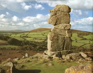
How to Draw Realistic Stone & Rock Textures in Coloured Pencil
Learn how to draw realistic stone and rock textures in this step-by-step coloured pencil landscape tutorial. Perfect for beginners wanting to create impressive results.


Copyright © 2009- pencil-topics.co.uk All rights reserved
Home | About Us | Contact Us | Privacy Policy