- Home
- Watercolour pencils
- Draw trees
How to Draw Trees with Watercolour Pencils (No Green Blobs)
Trees are where good landscape drawings go to die.
You’ve got everything else working, then you add foliage… and it turns into a lollipop tree or a green blob that screams “beginner”.
The fix isn’t more detail. It’s the opposite.
Convincing trees come from:
- a clear trunk/branch structure,
- foliage grouped into clumps (not leaf-by-leaf),
- and a light/shadow plan that gives the whole thing form.
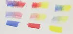
In this watercolour pencil trees guide, I’ll walk you through my “messy on purpose” method: scribbly marks to place foliage masses, a light water wash to unify colour, then dry pencil layers to sharpen texture where it matters.
It’s quick, controllable, and it stops the green-blob problem for good.
For a broader overview of techniques, materials, and project ideas, see my complete guide to watercolour pencils.
What Kind of Tree Drawing Approach Do You Need?
Different tree problems need different solutions.
If your trees look like green blobs, you don’t need more detail — you need a better way to block in foliage masses and control light and dark. If your trees look flat, the issue is usually contrast, edge softness, and where you place detail.
So before we start, choose the approach that matches what you’re trying to draw.
Once you pick the right approach, trees get much easier.
Use This Watercolour Pencil Technique When You Want To...
- Create realistic foliage texture without drawing individual leaves
- Show light and shadow moving through the canopy
- Add trees to a landscape that support the scene instead of stealing attention
- Work efficiently with layers that build up gradually
- Handle complex shapes (mature oaks, dense hedgerows, mixed woodland)
- Create depth and atmosphere outdoors with softer edges and controlled contrast
Perfect for: UK countryside views, garden studies, coastal paths, woodland edges — any scene where trees are the supporting cast or the main subject.
When This Approach May Not Be Right
This method is designed for natural-looking trees in landscapes, but it isn’t the best fit if you need:
- Botanical illustration where individual leaf shapes and species accuracy matter
- Architectural drawings where trees are simplified background fillers
- Quick gesture sketches where speed matters more than realism
- Highly stylized or graphic work where natural texture isn't the goal
The Reality About Drawing Trees
Trees trip people up for one simple reason: we try to draw them leaf-by-leaf.
But in real life, you don’t see individual leaves first — you see clumps of foliage, gaps of sky, and bigger shapes of light and shadow.
This technique is built around that idea: suggest detail convincingly instead of chasing it.
One thing to know before you start: it’s a layering method. The early stages can look messy, flat, or “wrong”. That’s normal. You’re putting down scaffolding.
Keep going. When the darker layers and a few crisp accents go in at the end, the whole tree clicks into place.
What Trees Should UK Artists Know How to Draw?
If you sketch British countryside often, you’ll keep seeing the same “usual suspects.” The good news is you don’t need to memorise dozens of species — you just need to recognise a few silhouette + branching + foliage patterns, then adapt your light/shadow and texture.
Below are the trees you’re most likely to meet in UK landscapes, and the quick “what to look for” cues that make them easier to draw.
Oak
How it reads: strong, weighty, characterful
- Silhouette: broad, irregular crown; often looks “lumpy” with big clumps
- Branching: thick, twisting limbs that spread sideways before going up.
- Foliage texture: chunky masses with broken edges (avoid smooth “cloud” shapes)
- In this technique: make a few bold, darker masses first, then add smaller mid-tones to break the outline and suggest depth.
Silver Birch
How it reads: light, airy, delicate
- Silhouette: wispy canopy; often see-through in places
- Trunk: pale trunk with dark marks; multiple trunks are common
- Foliage texture: small, scattered clumps with lots of sky gaps.
- In this technique: preserve highlights early, keep foliage marks lighter, and add a few crisp dark “dashes” on the trunk at the end.
Scots Pine
How it reads: bold trunks with clustered needles
- Silhouette: irregular; “pom-pom” clusters rather than an all-over canopy.
- Branching: strong trunk, branches often step upward.
- Foliage texture: clumps at branch ends; lots of negative space.
- In this technique: block 2–4 main needle clusters per tree, keep edges jaggier, and don’t overfill—pines look wrong when they’re too solid.
Beech
How it reads: tall, elegant, smooth
- Silhouette: more oval/column-like; crown can be neat and domed.
- Branching: finer branching pattern; less gnarly than oak.
- Foliage texture: softer, more unified canopy (less “chunky”).
- In this technique: keep edges cleaner than oak, use subtler shifts in value, and let the wash unify the canopy before adding dry-pencil accents.
Sycamore
How it reads: full, rounded, “leafy”
- Silhouette: rounded crown with a fairly even outer edge.
- Branching: sturdy but less dramatic than oak.
- Foliage texture: medium clumps; not as tight as beech, not as wild as oak.
- In this technique: aim for a simple big-shape canopy, then carve a few sky holes and deepen interior shadows to stop it looking flat.
Hawthorn / Blackthorn (hedgerow trees)
How it reads: scruffy, spiky, tangled
- Silhouette: uneven and bristly; often wider than you expect.
- Branching: twiggy, chaotic.
- In this technique: use smaller, more broken scribbles and sharper edge accents. Let it stay a bit “messy” — that’s the point.
A simple rule that helps instantly
- Big, ancient trees (oak/beech): fewer, larger foliage masses; stronger shadow design.
- Light, airy trees (birch/ash): more sky gaps; lighter values; less “solid fill.”
- Conifers: foliage lives in clusters, not everywhere.
What Supplies Work Best for UK Artists Drawing Trees?
Drawing trees outdoors (or from UK landscape photos) is all about layering, subtle colour shifts, and having tools that behave predictably when you add water. You don’t need loads of kit — but you do want pencils that:
- activate smoothly with water (without turning gritty)
- keep a decent point for twig/branch detail
- layer well for bark texture and canopy shadows
- give you believable UK greens (not neon)
Watercolour Pencils That Handle UK Subjects Well
Derwent Watercolour Pencils
Where to buy (UK): Hobbycraft, local independent art shops, many online retailers
Typical Price range: £12-£115 depending on set size
Why I recommend them: A dependable choice for UK landscape work — they layer cleanly, activate well, and are easy to control when you’re building tree texture gradually.
Best for: Everyday sketching, garden studies, countryside views, and general “supporting cast” trees in landscapes.
Faber-Castell Albrecht Dürer
Where to buy (UK): Jackson’s Art Supplies, Amazon UK, specialist art suppliers
Typical Price range: £35-£150 depending on set size
Why I use them: Rich colour, excellent layering, and strong lightfastness if you’re making finished pieces you want to keep or frame.
Best for: Detailed tree studies, careful bark texture, and work where subtle colour mixing really matters.
A simple “trees” palette tip (works with any brand)
If your greens keep going artificial, don’t buy more greens — neutralise what you’ve got:
- Add a touch of burnt sienna or raw umber into foliage shadows
- Use yellow ochre to warm sunlit areas
- Keep your darkest darks slightly brown/neutral (trees rarely go pure black-green)
- Try ultramine blue in cool shadows and distant trees
- Add a touch of cadmium yellow for bright highlights or spring green mixes
Paper That Works in British Conditions
Watercolour pencils ask more of paper than dry coloured pencil. You want something that can take light washes, repeated layering, and the odd bit of enthusiastic water without buckling, pilling, or going furry.
As a rule of thumb: heavier paper + a slightly textured surface makes tree work easier (especially for bark and foliage texture).
Bockingford Watercolour Paper
Why it works: British-made and very forgiving — handles moisture well and stays workable as you build layers.
Best for: Outdoor sketching, practice-to-finished pieces, and tree studies where you’ll lift/add repeatedly.
Tip: Choose NOT (cold pressed) if you want helpful texture for foliage and bark.
Langton Watercolour Paper
Why it works: Budget-friendly and good for practice runs while you’re learning the scribble + wash approach.
Best for: Warm-up sketches, studies, and experimenting with colour mixes.
Tip: Use lighter water applications and build in more dry-pencil layers to avoid overworking the surface.
Arches Watercolour Paper
Why it works: Premium, tough, and handles multiple wet layers beautifully — ideal when you want your tree drawing to look “finished”.
Best for: Framing-worthy landscapes, detailed foreground trees, and anything you want to last.
Tip: It’s so absorbent that washes can spread nicely — test a small area first so you don’t lose edge control.
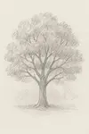
Tutorial: How Do You Draw Trees That Look 3D?
This is my “No Green Blobs” method for watercolour pencils. It works for a single specimen tree or a whole woodland edge.
Step 1: Read the tree before you draw it
Spend a minute studying your reference (or the tree itself):
- Overall silhouette: tall/narrow, rounded, windswept, spreading?
- Foliage masses: look for 3–5 main clumps (not one big ball)
- Light direction: where are the highlights and the core shadows?
- Sky gaps (sky holes): where does the sky show through? These sell realism
If you can see the big shapes, the rest becomes much easier.
Step 2: Sketch the simple structure
With a light touch, map in:
- he trunk and a few main branch directions (very simplified)
- he outline of each major foliage mass
- the largest sky gaps
No detail yet — this is just the architecture that stops the tree turning into a blob.
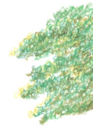
Step 3: Block in the light and dark pattern (scribbly stage)
This is where watercolour pencils shine:
- Choose your base green (e.g. Sap Green)
- Using loose, scribbly strokes, shade the shadow sides of each foliage mass.
- Leave the light-struck areas mostly as paper (you can glaze colour later).
- Keep the canopy edge broken and uneven.
Don’t chase leaf texture. Your job here is big shapes + value pattern.
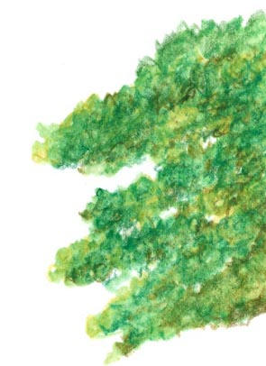
Step 4: Add the first water layer (light wash)
Now unify those scribbles without overworking them:
- Use a clean, slightly damp brush (or waterbrush)
- Gently activate the pencil—just enough water to move pigment.
- Work in sections so you stay in control.
- Keep your light/dark design intact.
- Let it dry completely before you layer again.
Tip: if you scrub, you’ll lose texture and turn everything to mush.
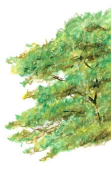
Step 5: Build colour variety (the “realism” stage)
This is where trees start to look natural instead of flat green.
- Warm the lights: add Yellow Ochre over sunlit areas (glaze it).
- Deepen shadows: mix your green with a cooler note (e.g. Ultramarine) for depth.
- Neutralise overly bright greens: touch in Burnt Sienna / Raw Umber in the darkest areas.
- Work mostly dry over dry to keep texture
Aim for subtle shifts — real foliage is varied.
Step 6: Suggest the branch structure
Branches add logic, but they shouldn’t become an outline drawing.
- Use Raw Sienna / Burnt Sienna for main branch hints.
- Let branches break and disappear behind foliage.
- Vary thickness: thicker near the trunk, thinner as they extend.
- A few branches crossing sky gaps is great — not every gap needs one.
Step 7: Final pass: integrate + select detail
Finish by choosing where you want the viewer to look.
- Add a final light water pass only where you need to integrate colour.
- Reinforce a few dark accents inside the canopy (not around the outside edge).
- Add small twigs with dry pencil.
- Refine sky gaps so they vary in size and shape.
Less detail overall, more detail where it matters.
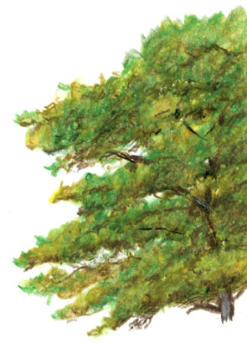
Ground the tree: darken where the trunk meets the ground, add a small cast shadow, and overlap a few grass marks. It instantly removes the “stuck-on” look.
Key Points to Remember
- General → specific: big shapes first, details last
- Sky gaps are essential - No tree is a solid mass
- Light must be consistent: it’s what makes trees feel 3D
- Branches have logic: they taper and they vanish behind foliage
- Texture comes from variation: don’t detail everything equally
Why Do My Trees Still Look Like Green Blobs
If your trees still look flat or cartoony, it’s almost always one of these:
Problem 1: No clear light/dark pattern
- Signs: Your tree looks flat, like a cutout stuck onto the page.
- Cause: Everything is the same value because you “coloured it in.”
- Fix: Squint at your reference. You should see big light and dark shapes. Copy those first and ignore leaf detail.
Problem 2: Not Enough Sky Gaps
- Signs: The canopy looks solid and heavy,
- Cause: You’re afraid to “break up” the silhouette.
- Fix: Put in sky holes early. Real trees have gaps—especially around the outer edge and between clumps.
Problem 3: You’re thinking leaf-by-leaf
Signs: You get stuck adding tiny marks and it still looks wrong.
Cause: Drawing what you know (“leaves”) instead of what you see (masses).
Fix: Group foliage into 3–5 main clumps, then add smaller clumps only at the end.
Problem 4: Branches with no logic
Signs: Branches feel decorative or random.
Cause: Adding lines on top of foliage instead of building structure first.
Fix: Indicate a simple “skeleton” early. Branches should connect, and they taper as they extend.
Quick Fixes for Common Tree-Drawing Problems
"My foliage looks too uniform and artificial"
- Vary pressure (soft → firm) inside each foliage mass
- Change stroke direction
- Mix greens with a neutral (burnt sienna / raw umber) in shadows
- Leave some areas softer and less finished
"I can’t get texture with watercolour pencils."
- Layer dry → light water → dry (don’t dissolve everything)
- Leave some pencil marks visible for texture
- Use slightly textured paper (NOT/cold press helps)
"My trees look too dark and heavy"
- Start lighter than you think
- Push your darkest darks inside the canopy, not on the outline
- Remember: distant trees are usually lighter and cooler
"All my tree species look the same."
- Prioritise silhouette (oak vs birch is obvious at a distance)
- Look for branch “gesture” (drooping vs reaching)
- Vary leaf density (open vs dense canopy)
- Adjust colour temperature (warmer vs cooler greens)
Working Outdoors in the UK
Dealing with British Weather
- Use shelter or a small umbrella to protect paper
- Watercolour pencils cope better than paint in light drizzle
- On overcast days, light is more consistent—work faster and simplify
Best time to sketch trees
- Early/late day = clearer light direction
- Overcast = softer shadows (often easier)
- Avoid harsh midday sun (confusing shadow shapes)
- Spring/autumn = best colour variety
What Should You Practice After Learning This Tree Technique?
Tree drawing is one piece of making convincing landscapes. The faster you improve these supporting skills, the better your trees will look.
Skills That Make Your Tree Drawings Better
- Form and structure: see the “skeleton” before the foliage
- Light and shadow: trees are mostly a light/dark design problem
- Atmospheric perspective: distant trees are lighter, cooler, softer, and simpler
Where You Can Apply This Technique Next
- Landscape composition: use trees as focal points or supporting shapes
- Water reflections: trees often reflect in rivers, lakes, and wet sand
- Sky and cloud studies: trees read differently against bright skies vs grey cloud
What Tree Should You Draw First?
Start with a single, well-lit tree you can observe directly (outdoors or from a window). Pick something with a clear silhouette — a mature oak or a silver birch is ideal.
Avoid complex woodland scenes until you can make one tree look solid and three-dimensional.
Set yourself up for success: good light, a comfortable position, and no time pressure. This is a layering technique — the “ugly middle” is part of the process.
Having Trouble with a Specific Tree Type?
Every species has its quirks, and UK trees can be especially irregular.
If you’re struggling with something specific — the airy structure of birch, the heavy masses of oak, dense hedgerows, or mixed woodland — focus on silhouette → clumps → light pattern first, then add texture last.
Remember: the best tree drawings you’ve admired weren’t drawn in one go. They were built up gradually, layer by layer — exactly the way you’re learning here.
Ready to Add Trees to Your Landscapes?
Trees turn landscapes from empty shapes into living places. Once you’ve got this method, you’ll start noticing trees differently — the clumps, the sky gaps, and the shadow pattern that gives them character.
Next time you’re outside, try this quick exercise:
- count how many sky gaps you can see in one tree
- notice where the canopy is lightest and where the darkest core shadows sit
- look for 3–5 main foliage masses rather than “leaves”
That observation skill is what separates convincing trees from generic green shapes.
Where to go next:
- How to Draw Trees (5-Step Method): the core framework you can reuse in any drawing.
- Trees in the Distance: learn how to simplify values, edges, and colour for believable depth.

I'm Carol Leather, a coloured pencil artist for over 15 years. Most of my teaching comes back to the same idea: realistic coloured pencil starts with structure, light and observation long before the colour goes down.
My work has featured in Ann Kullberg's Color Magazine, CP Magic and Color Pencil Treasures (vol 7). I'm a member of the UKCPS and was a prize winner in the Nature section of their Annual Open Exhibition in 2020.
You might like these
Watercolour Pencil Background Study & Lessons | Pencil Topics
Learn to paint atmospheric watercolour pencil backgrounds. A unique process study covering technique, composition, and learning from artistic challenges.
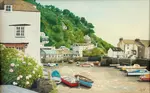
Watercolour pencil tutorial - Italian Street Scene
A step-by-step demonstration showing how to create an Italian street scene using watercolour pencils from Caran d'Ache


Copyright © 2009- pencil-topics.co.uk All rights reserved
Home | About Us | Contact Us | Privacy Policy