- Home
- Realistic Portrait of a Cat
Tutorial - Realistic Drawing of a Cat
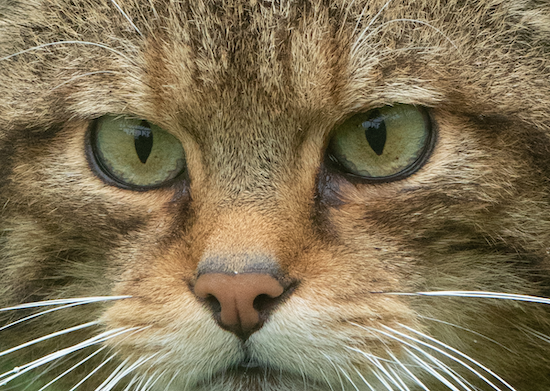
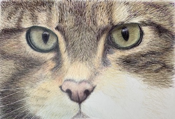
This stunning close-up of a Scottish wildcat was snapped during a lucky vacation encounter.
The photo may seem intricate, but we'll break it down into manageable steps for this drawing tutorial.
First, grab the high-res version by clicking on the image below, and follow along.
Think of the image as a composition of shapes, colours, and values.
Focus on the shapes first, then add the furry details later. It's a simple yet effective method that transforms a complex image into a doable drawing project.
Learn how to photograph your furry friends for the best drawing reference! Click here for an easy-to-follow guide.
Materials required
I used Fabriano 5 paper for this piece, but feel free to use any hot-pressed watercolour paper—it'll do the job just as well!
As for coloured pencils, I went with Prismacolor and Caran d'Ache Luminance. But you can use whatever brands you prefer; the key is to have a nice variety of colours.
Prismacolor (P)
- Dark green
- Dahlia purple
- Black
- Pale sage
- Yellowed orange
- Apple green
- Permanent red
- Ginger root
Luminance (L)
- Sepia
- Buff titanium
- Light cobalt blue
- Apricot
- Sepia 10%
- Raw Umber
- Manganese Violet
- Burnt Sienna 50%
- Burnt Ochre 10%
- Burnt Sienna 10%
- Olive Brown 10%
- Dark Indigo
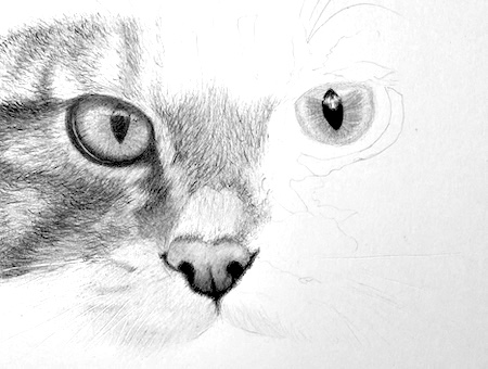
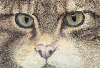
Transferring the outline to your paper
For this exercise on drawing a cat's fur and features with coloured pencils, feel free to use the provided outline instead of drawing it from scratch.
To transfer the outline to your paper, try one of the following methods:
- Place tracing paper over the printed outline and trace the lines.
- Use a lightpad: lay the outline on the pad, cover it with tracing paper, and trace the lines.
- Tape the outline to a window with bright daylight behind it, then place your drawing paper on top and trace.
If you use tracing paper, scribble over the back of the tracing with a soft graphite pencil (2B) where the lines show through.
Then, flip the tracing over, place it on your drawing paper, and re-trace the outline with a coloured pencil. This will help you catch any missed lines. Be gentle to avoid smudges.
If you used a lightpad or window, you can skip the tracing paper step.
Starting your realistic drawing of a cat
The whiskers
To create crisp, white whiskers, use a pencil or stylus to indent the lines, carefully positioning them just beside the graphite marks.
This technique prevents graphite from smudging the whiskers. When applying coloured pencil pigment, it will neatly skip over the indented areas, leaving the whiskers a clean white.
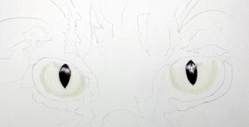
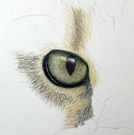
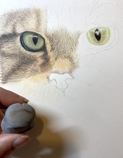
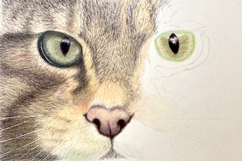
The pupils
Start by defining the pupils, carefully avoiding the light reflection area.
Using a Sepia Luminance (L) pencil, fill in the pupils with medium pressure and a scumbling stroke. Then layer Prismacolor Dahlia Purple, Dark Green, and finally Black. (P)
Apply a base layer of Titanium Buff (L) to the iris, leaving the reflection area clear.
Use gentle to moderate pressure to achieve a smooth, even coat.
Next, add a ring of Pale Sage (P) around the pupil's edge, applying moderate pressure. Finally, layer Light Cobalt Blue (L) over the green, creating a subtle depth of color.
Gently layer blue over the reflections that cross the pupil and iris. Although the colour may seem too dark at first, it will balance out as you continue drawing.
Begin by drawing radiating lines from the pupil, stopping short of the outer edge.
Use Yellowed Orange (P) and vary the length of your strokes, placing them randomly to create a natural, organic pattern. Be mindful of the reflection area and avoid it as you work.
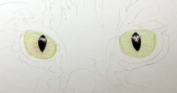
To add depth to the iris, start by layering a light wash of Apple Green (P) over the entire area, carefully avoiding the reflection. Next, build up the outer edges with a subtle layer of Yellowed Orange.
Using very light pressure, create radiating strokes from the pupil with Permanent Red (P). This will enhance the depth, but be cautious not to apply too much pressure, which can give the eye an unnatural red hue.
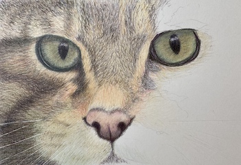
Taking the eye darker
From this point on, I'll focus on the left eye. When drawing a realistic cat, you can work on the eyes separately or simultaneously.
To shade the iris, apply Dark Green (P) with moderate pressure, as the upper lid casts a shadow. Extend this colour to the surrounding area, gradually building up to a darker tone. We'll add more layers later.
Using the same Dark Green (P) and a scribble stroke, add pigment to the iris's centre to deepen its colour.
Next, blend the entire iris area with the Ginger Root (P) pencil, applying heavy pressure (without burnishing) to merge the colors. Be careful to avoid the reflection.
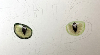
To create the eye surround, start by layering Dahlia Purple (P) and then Black (P) around the eye. Within the darker area, add a subtle touch of Titanium Buff (L) to the grey section below the eye to prevent overpowering the surrounding colour.
Next, use light pressure to draw black radiating lines in the iris, then burnish them with Pale Sage (P) using firm pressure. This will add depth and dimension to the eye.
Continue building up the eye surround with Black (P), blending it seamlessly over the lighter section. To shift the iris colour from green to blue-green, apply a light layer of Light Cobalt Blue (L) along the outer edge.
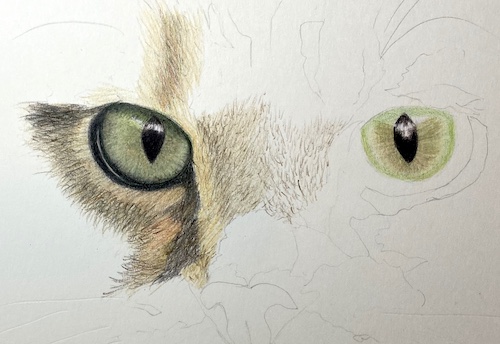
Studying the fur
Observe the fur directions in the photograph closely, as they adapt to the cat's head bone structure.
Don't strive for straight or parallel fur lines; instead, aim to capture the fur's organic appearance. Use random, haphazard strokes to work in the general direction of the fur, embracing its wild and uneven nature. Neatness is not a priority – focus on conveying the fur's natural texture.
To create rich, dark areas in your drawings, try the following techniques:
- Apply more pressure or build up layers
- Place strokes closer together
- Switch to a darker pencil
Take a closer look at the fur, and you'll discover a surprising array of colours. At first glance, beige, brown, and white dominate, but upon closer inspection, hints of green, lavender, pink, and purple emerge.
Developing your eye to detect subtle shades takes time and practice. However, incorporating these nuances into your drawings will yield astonishing results. Fur rendered with a single pencil or limited value range will never appear as vibrant and lifelike as fur drawn with a diverse range of colours.
Beginning the fur
Begin by applying a base layer of Ginger Root (P) to the light areas of fur around the eye and muzzle, using strokes that roughly follow the direction of the fur.
Don't worry about precision - a realistic cat drawing benefits from messy, random strokes that mimic the natural texture of fur. Feel free to cross strokes and create uneven layers, as this will add depth and authenticity to your drawing.
The accompanying photos may appear rough, but they are enlarged from the original drawing, which has a smoother finish.
Learn how to glaze with coloured pencils
Now, let's introduce a new technique called glazing. This involves leaving the pencil on the surface between strokes, creating a smooth layer of colour.
To glaze, hold the pencil at the end and gently lay colour over the existing strokes, using the suggested colours.
When glazing over a graphite boundary line, start by using a putty eraser to remove any excess graphite. This prevents the graphite and coloured pencil pigment from mixing, which can make your drawing look dirty.
To create a warm, light fur tone, layer Yellowed Orange (P) over the Ginger Root (P) with gentle pencil strokes. Be sure to extend the colour into the darker areas to prevent gaps between the patches.
For the darker fur patches, use a combination of Raw Umber (L) and Sepia (L) strokes. Apply gentle pressure to avoid creating "tadpole" marks, which can occur when starting a stroke with too much pressure. These marks can be hidden with additional layers, but it's best to avoid them from the start.
To add depth to the lighter fur, apply an additional glaze of Apricot (L) to the more orange areas.
Starting at the centre of the nose, create tiny strokes with Raw Umber (L), angling them inward on both sides before shifting to a vertical direction. To create shading, concentrate your strokes near the left eye, applying gentle pressure.
Using Ginger Root (P) with medium pressure, blend the nose to soften the fur texture. Then, layer additional fur on top with Sepia (L).
Extend the ginger root down the bridge of the nose. Use the same pencil to block in the lighter areas beside the nose and on the cheek, shifting to horizontal strokes as you work.
Begin by adding a warm, golden glow to the bridge of the nose with a glaze of Yellowed Orange.
Next, build up the depth and richness of the fur on the cheek, using the same colors as before to create a soft, layered effect.
To add subtlety and nuance to the darker fur patches, apply a 10% Sepia (L) layer, gently softening the strokes and filling in any white specks of paper.
Correcting errors
The turning point in my drawing arrived when I realized I'd made a critical mistake: the dark tear stain marking had extended too far.
Fortunately, my trusty kneaded putty eraser came to the rescue. With gentle dabbing, I lifted off the excess pigment and reworked the area.
By kneading and stretching the eraser, I absorbed the unwanted pigment, preventing it from re-depositing onto the drawing's surface.
This mistake could have been disastrous if I were working on a realistic cat portrait for a client. Instead, I saw an opportunity to demonstrate that mistakes happen, and some can be corrected.
Take a closer look at the left side of the head, and you'll notice the initial fur layers, which will evolve as I add more pigment. This mistake became a valuable lesson, and I'm glad I didn't abandon the project.
The cat's nose
To paint the nose, start by applying a smooth base coat of Burnt Ochre 10% (L) to the entire area. Use a circular stroke to add shadowed areas to the bottom and above the nostrils with Burnt Sienna 10% (L).
Deepen the shadows at the bottom with light layers of Manganese Violet (L) and Burnt Sienna 50% (L). Blend the colors together with medium pressure and White (P), then glaze with Burnt Ochre 10%.
Add a subtle touch of Dahlia Purple (P) to the lower section. Use Sepia (L) to define the crease and nostrils.
Build up layers of Black (P), Dark Green (P), and Dahlia Purple (P) to darken the nostrils, crease, and surrounding area.
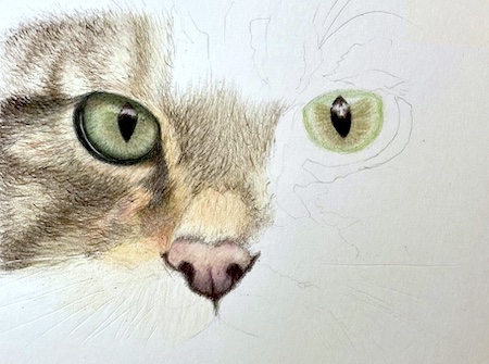
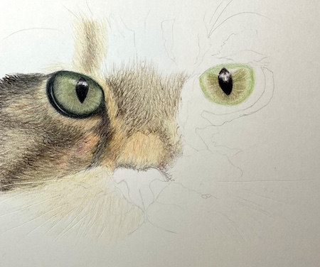
The cat's mouth
Layer Light Cobalt Blue (L) and Pale Sage (P) over the fur above the mouth line, following the direction as it angles downwards. Blend with 10% Olive Brown (L).
Continue the Olive Brown up to the orangey tones of the muzzle.
Use Raw Umber (L) for the dark whisker line, then blend with Ginger Root (P) and sweep it across the muzzle towards the nose, where the hue shifts to yellow. Glaze with Apricot (L).
To check your values, take a photo of the artwork and convert it to black and white by removing the saturation. This will reveal if your blacks are truly black.
We'll explore another simple tool to help with values shortly.
Lower cheek
Don't worry about achieving a perfectly smooth base at this stage. We'll build up layers to create the dark base later. Start by applying colour to the bottom left corner of the cheek with the side of the pencil, using gentle pressure.
Gradually build up the values by layering Dark Green (P), Dahlia Purple (P), Sepia (L), and additional Raw Umber (L). As you progress, the indented lines you created earlier will start to emerge.
Check your values
Create a "value viewer" by punching holes of varying sizes in two pieces of medium grey card. Position the holes over the same area of your drawing and reference photo to compare values and colours.
As shown, my initial stripe was too light and warm.
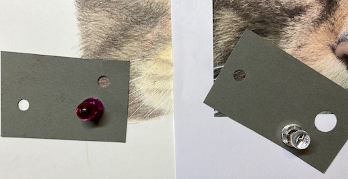
To add depth, I used Black (P) and Dark Indigo (L). The magnets holding the card in place are part of my setup, which includes a slanted board with a magnetic sheet behind the paper.
As I worked on the fur, I also built up layers on the forehead area using the same colours. However, this area still needs more depth and darkness.
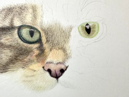
The second eye
Next, I turned my attention to the second eye, using the same palette of colours to complete it. This allowed me to assess the values in the fur and achieve a sense of balance.
Upon closer inspection, notice how the second eye reflects light differently, resulting in more vibrant colours. The nose also casts a subtle shadow on the inner area, adding depth to the feature.
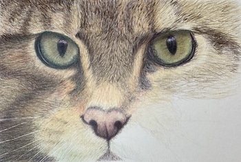
With swift, short pencil strokes, I crafted the fur between her eyes, layering on darker shades. The quintessential wildcat expression began to emerge, and I noticed my colour mixing growing more precise.
I refine the fur texture and values around the eye on the right, carefully following the direction of the fur to capture the cat's likeness.
I build on the initial layers, adding more fur to the muzzle and cheek, blending the textures seamlessly.
To add depth to the coloured pencil portrait, I darken the small visible portion of the chin and shade the lower edge of the muzzle with Light Cobalt Blue and Sage Green. This subtle curve where the muzzle meets the mouth gives the area a more defined shape.
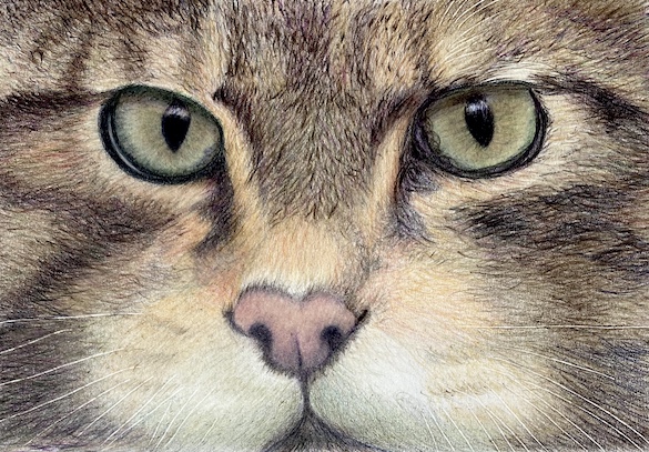
With these steps, you now have a foundation for drawing a realistic cat. Try creating your own feline portrait and see the techniques come to life.

I'm Carol Leather, a coloured pencil artist for over 15 years. Most of my teaching comes back to the same idea: realistic coloured pencil starts with structure, light and observation long before the colour goes down.
My work has featured in Ann Kullberg's Color Magazine, CP Magic and Color Pencil Treasures (vol 7). I'm a member of the UKCPS and was a prize winner in the Nature section of their Annual Open Exhibition in 2020.
You might like these
How to Combine Pastel Pencils and Coloured Pencils for Depth
Layer coloured pencils over pastel pencils for atmospheric depth. Learn the underpainting technique, the crucial fixative step, and how to add crisp details
Sanded Pastel Paper & Specialist Surfaces: Artist Reviews & Tests
Discover the best sanded pastel paper & other specialist surfaces! Carol Leather's hands-on reviews cover UART, Colourfix, coated & textured options
Clairefontaine Pastelmat Pastel Paper: My In-Depth Review
Considering Pastelmat Pastel Paper for your art? Carol Leather reviews this Clairefontaine offering, covering layering, blending, pros & cons. See tests!

Copyright © 2009- pencil-topics.co.uk All rights reserved
Home | About Us | Contact Us | Privacy Policy