- Home
- Mixed media
- Combining Colored Pencil and Pastels
Combining coloured pencil and pastels for atmospheric scenes
Hello! Have you ever wondered how to combine the soft, blendable nature of pastels with the sharp detail of coloured pencils?
It’s a fantastic mixed-media technique that allows you to create rich, atmospheric scenes with a wonderful sense of depth.
In this tutorial, we'll break down a beautiful mixed-media piece featuring the Abbey of Bellapais, originally created by the site's founder, Peter Weatherill.
We will use his work as a case study to learn a reliable method for using pastels to create a soft base layer, and then how to add crisp coloured pencil details on top.
More than just following steps, you'll learn how to creatively interpret a reference photograph—making deliberate choices to improve your composition and create a piece of art that is uniquely yours.
What You’ll Learn in This Tutorial
- A reliable, step-by-step process for combining pastel and coloured pencil.
- How to use pastel pencils to block in an effective underpainting.
- The role of spray fixative in preparing your surface for coloured pencils.
- How to layer detailed coloured pencil work over a fixed pastel base.
- Tips on how to simplify and interpret a reference photo for a stronger composition.
Supplies You’ll Need
- Paper: A paper with some tooth is essential. The original piece used the grey Winsor & Newton 'Tints' pastel paper (160gsm), which is an excellent choice. Any good quality pastel paper you have will work. (You can see my testing process for the Tints paper here.)
- Pastel Pencils: A small set of pastel pencils is needed for the base layer. The original used CarbOthello, but brands like Faber-Castell Pitt will also work. You'll need white, a few greys, and some earthy stone colours.
- Coloured Pencils: A good set of wax or oil-based coloured pencils for the detail work. The original used Caran d’Ache Luminance because their opaque white is very effective for highlights in this technique. Derwent Coloursoft or Faber-Castell Polychromos would also work well.
- Fixative: A can of workable spray fixative is necessary for this process.
The Sketch and Compositional Choices
 The reference photo we will work from
Begin by lightly sketching your main subject onto the pastel paper.
For this piece, the focus is the beautiful architecture of the abbey arches. When looking at the reference photo, you might notice several tourists. An important part of artistic interpretation is deciding what to leave out to strengthen your composition.
Keep your sketch light and accurate, focusing only on the main structural lines.
Artistic Interpretation Tip: The original artist chose to include only three figures, simplifying the scene to keep the main focus on the archway. Don't be afraid to edit your reference photo. Your goal is to create a pleasing drawing, not a perfect copy.

Blocking In the Pastel Underpainting
Now we will use pastel pencils to establish the main areas of light and colour. At this stage, think in broad shapes, not details.
- Establish Lights: Identify the lightest areas of your drawing, particularly where the sun hits the stonework on the left. Using a white pastel pencil, generously block in these areas. Also add white to the sky area seen through the arches. This white base will help keep the subsequent colours vibrant.
- Block in Colour: Using an earthy, ochre-coloured pastel pencil, add a gentle layer of colour over the main stone arches.
- Add Shadows: Use a grey pastel pencil to gently block in the main shadow on the floor.
Your drawing should look soft and impressionistic at this point. Don't worry about any fine details.

Fixing Your Pastel Layer (A Crucial Step)
This is the most important technical step in this process. Before you can add coloured pencils, you must "fix" the loose pastel pigment to the paper.
In a well-ventilated area, apply a light, even coat of workable spray fixative over the entire drawing. Hold the can about 30cm away and use a sweeping motion.
Why This Works: The fixative does two things.
First, it glues the pastel dust to the paper so it won't smudge.
Second, it creates a new, slightly gritty surface texture on your paper.
This new "tooth" is fantastic for gripping the pigment from your wax-based coloured pencils, allowing you to add sharp details on top.
Let the fixative dry completely (usually 15-20 minutes). You may notice the colours have darkened slightly—this is normal, and we will bring the vibrancy back with the coloured pencils.
Adding Coloured Pencil Details

Now that the pastel base is sealed, you can confidently work on top with your coloured pencils.
- Focus on a Key Area: Begin with a main feature, like the standing figures. Using your coloured pencils, start to add details and define their forms. You will notice how well the pencil layers over the fixed pastel.
- Refine Highlights: Using a sharp, opaque white coloured pencil (like the Luminance white), go back into the sunlit areas of the stonework. This is your chance to reclaim the bright highlights that may have been slightly dulled by the fixative.
- Add Architectural Details: Start to render the details on the building, the background hedge, and the tree. Use the sharpness of your coloured pencils to create crisp edges and textures that contrast with the soft pastel base.
- Work the Background: Gently add detail to the background hillside and the trees. Be careful not to make the background too detailed, as this can flatten the image. You want it to feel like it's sitting behind the main archway.

Final Touches and Review
Step back and look at your work. The combination of the soft pastel underpainting and the crisp coloured pencil details should create a wonderful sense of depth and atmosphere.
Use your pastel pencils for any final, soft adjustments. For instance, you might want to slightly darken the shadows on the floor or in the stone arches to increase the contrast and make the sunlit areas pop.
Resist the urge to overwork the piece. The beauty of this technique lies in the contrast between the soft and sharp areas. Once you are happy with the balance of detail and atmosphere, your work is complete.


I'm Carol Leather, a coloured pencil artist for over 15 years. Most of my teaching comes back to the same idea: realistic coloured pencil starts with structure, light and observation long before the colour goes down.
My work has featured in Ann Kullberg's Color Magazine, CP Magic and Color Pencil Treasures (vol 7). I'm a member of the UKCPS and was a prize winner in the Nature section of their Annual Open Exhibition in 2020.
You might like these
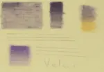
Velour Paper Review: Is Hahnemühle Good for Pastel Pencils?
Is velour paper right for your art? Carol Leather reviews Hahnemühle Velour, exploring its soft surface, layering, blending & best uses for pastel pencils.
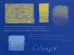
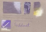
Sanded Pastel Paper & Specialist Surfaces: Artist Reviews & Tests
Discover the best sanded pastel paper & other specialist surfaces! Carol Leather's hands-on reviews cover UART, Colourfix, coated & textured options
Underpainting coloured pencil
How to use underpainting to achieve colour density in a coloured pencil painting. We cover various methods of creating an underpainting.

Copyright © 2009- pencil-topics.co.uk All rights reserved
Home | About Us | Contact Us | Privacy Policy