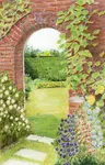
Landscape Drawing Step by Step Guide to a Charming English Countryside Scene
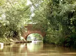
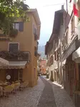
This initial page in our series guides you through a step-by-step process of a coloured pencil landscape drawing. It showcases the charming village of Allerford, nestled on the North Coast of Somerset.
It is focused on developing skills with watercolour and coloured pencils.
The photo was selected for the white building's placement but needed tweaks for better focus on the bridge and riverside buildings.
The composition's format was adjusted to a rectangle by widening the central cottage and adding a third window upstairs, shifting the lavender bush rightward for contrast against the bridge's dark arch, enhancing the landscape's balance.
The instructions guide you through the process and the artist’s reasoning to a finished drawing, culminating in a showcase of 6 student interpretations of the same subject on the final page.

What Paper Should I Use?
For this landscape drawing using watercolour pencils, opt for a smooth, heavy watercolour paper of at least 300gsm to avoid warping.
Stretching the paper is recommended for a flat surface.
Good options are Fabiano 5, Saunders Waterford HP, or Daler Rowney Langford HP (HP means hot pressed). If tracing, the image should be 10x7 inches with an extra margin for mounting and framing.
Tracing the Outline Drawing
Trace the pre-reversed outline once, flip it, and trace again to transfer the image to your paper.

Tracing offers several benefits to the artist:
- It ensures accurate positioning of elements on paper, minimizing the wear and tear caused by repetitive erasing.
- It streamlines the creative process, saving precious time otherwise spent on making constant adjustments.
- It provides the convenience of repeatable patterns, serving as a reliable fallback for making amendments without starting from scratch.
Tracing Tips
Switch to watercolour pencils rather than graphite, to avoid marks showing through your washes.
For transferring outlines to paper, use a firm tool like the back of a teaspoon or a bone folder. This method allows for flexibility without strictly adhering to the initial pencil lines.
Be cautious not to indent the paper, which can cause unwanted dark lines when you apply water and pigment.
Choosing The Palette of Watercolor Pencils
The artist, Peter Weatherill, will now walk you through his process.
After transferring and correcting my drawing, I begin layering foundation colours using watercolour pencils
It's best to avoid highly pigmented brands for subtler colouring.
I use Steadtler karat aquarelles for their ability to create thin washes—preferably multiple light layers over a single thick one.
I choose six basic colours, noting that precise colour matching isn't crucial as wax pencils will fine-tune the hues in subsequent layers.
I've selected these colors...
- an Earth Green (dark green) 55
- a simple mid green (5)
- a light olive green (56)
- a light reddish brown (49)
- a light grey (80)
- a purple grey (08)
While not all these colours may be necessary, they form a versatile palette. An ochre can replace olive green if unavailable.
A small, pointed No. 5 watercolour brush is sufficient for precise corner work, as high liquid retention isn't crucial.
As demonstrated in the plate photo, I recommend scraping shavings onto a damp surface to avoid dispersing them into the air.
I create a palette with primary and secondary colors that blend into various shades.

I then dilute a chosen color in a separate dish for a light wash.

I've blended a green and this photo shows its diluted wash effect on my paper.

Laying the Foundation for Background Trees
Inverting the reference and my paper, I carefully painted the treetops to align with the building edges.
Although I navigated around the chimneys, I overlooked a small section by the main chimney and inadvertently extended the greenery. This minor spread of the trees is inconsequential to the overall piece.

My painting extends past the drawing's edges to allow for potential resizing. I'm layering thin washes to darken the tree section, an ideal practice area due to its forgiving nature.

The images sequentially demonstrate the layering of colors, culminating in a lighter green at the picture's forefront through adding olive green to the mix.
A touch of dark grey has been blended into the final shadows of the trees.
Remember to leave patches of light green to represent the sunlight filtering through the treetops.

I've adjusted the image contrast for better clarity, although the original wash shades are more subtle.

I begin by lightly tinting the paper to mark the placement of the elements.
After this step, I gently erase the pencil marks from my initial sketch, revealing the base watercolor wash.
I can fix mistakes as I move onto the dry colored pencils.

Scribbling Techniques with Dry Colored Pencils
With the underpainting set, I'll focus on the central background trees using dry colored pencils.
I use various greens and a few shades of brown or dark grey from my Caran d’Ache Pablos.
After multiple 'scribble' layers, I blend the pigment with uniform shading at a 90-degree angle for an evenly colored surface.
Next, I add finer details per the reference, noting sunlit treetops to the left and shadows at the base of the trees to the right.


The first photo above illustrates the early phase of layering dry colored pencil marks.
In contrast, the second image highlights the distinction between blended (top left) and unblended sections. I apply the pencil in block patterns mirroring tree shapes to prevent discernible straight lines.


The close-up images offer an insight into the current phase of tree detailing.
While the color application might appear hasty and unrefined, the visible scribble marks are part of the process.
As additional layers are applied, these will blend seamlessly. The focus will naturally shift to the completed foreground, with the background trees forming a cohesive woodland scene.
The image below shows my progress so far.

Selecting and Layering Colors for The First House

Now that the trees are beginning to appear realistic, I’ll start on the large building on the left foreground. I may return to the trees later.
I need to ensure the perspective of the roof's dark tiles aligns with the vanishing point at the wall's top right edge; the tile lines should converge there, not run horizontally.
For the tile effect, I experiment with color layering. Starting with broad strokes of white or grey, followed by dark brown/ I consider adding a touch of dark brown or black.
The upcoming evaluation involves selecting shades for the left-hand shadowed wall, likely a blend of grey, white, and ochre. Although the wall seems light in the photograph, the ochre pigment contrasts sharply with the white paper.
Color perception varies significantly whether viewed on-screen or on a printed reference. This discrepancy is further influenced by individual differences in vision and variations in device displays. To illustrate, I've provided a photo of my test sheet, which I recommend replicating for comparison.

Applying a white base layer results in a lighter final color; layering order significantly affects the outcome, hence the importance of testing.
I tested several colors from the Pablo set. The right-hand sample, beginning with a Light Beige base, appears darker compared to the reference, but it's lighter against my printed version, leading me to consider it.
The color balance matches my trees well, despite the on-screen hue appearing pinker; keep in mind I'm using a printed reference.
For my final selection, I opted for more warm grey to accentuate the sunlit central building with the left-side structure. When using different pencil brands, consider my advice but test your palette to ensure effective colour harmony.
Starting to Paint the First House

The photo shows just a section of the left roof; however, my tracing on blank paper allows me to expand it to ensure I get the perspective correct.
Then I mark angled lines at the bottom of each row of tiles.
I use a light grey pencil to mark sloped rectangles between the lines for lighter areas, as shown in my example.The bottom lines aren't perfect, but it's okay; they can be fixed.
I apply bistre shading followed by black to intensify the roof edge, ensuring the underlying grey tiles remain visible. Remember, I find two thin layers are preferable to one thick one.
The current shading isn't as deep as desired, so I'm considering switching from my medium hardness oil-based black Pablo pencil to a softer option like Prismacolor, Luminance, or Coloursoft for more intense contrast later in the process.
The Ochre coloured wall

I have decided to incorporate a little more warmth into the mixture. The touch has been quite light, but in each overall colour layer there have been approximately 3 coverings of the paper. I started with light grey, then added apricot which, surprisingly, gave a quite accurate mix with the grey underneath. This was followed by green ochre and a further colour layer of apricot.
The final colour layer (so far) was light beige and that was followed by a burnishing layer of white. That is five colours and a burnish and approximately 3 coverings to each colour layer. The result is shown with the windows, the roadside weeds and the shadow on the road.
I am not sure about those windows! I think that upstairs window ledge should be more horizontal.
The windows don’t look very convincing at the moment and they are right in the foreground, so I think we may have to rely on the fact that once the rest of the picture is completed, they eye will be too busy looking elsewhere!
If not, I will have to look at them again in the final tidy up
That completes the left hand side so far.
Landscape drawing step by step Stage 4
Remember that all the work we are doing at the moment is the foundation of the painting.
Once the picture is all done, we can look at it overall and then sharpen up some areas, darken some and strengthen the colour in others so that we get the viewers to look where we want them to. At the moment the picture has a focal point by the arches of the bridge. We may need to tinker with the work we have done to point eyes that way.
We will next have a look at the right-hand side building, where the first decision is whether to leave it white or to ‘paint’ it cream to balance the picture better. At the moment, the eye goes first to that white wall and it then has to be diverted to look at the ford and the bridge. We need to do some cautious Town and Country Planning.

Here we are starting on the roof area of the right hand house. The first step was to apply English Red in a row of little circles along the roof peak and then fill in the top edge with the same colour. The green of the trees was then in-filled to bring the green right up to the red and get rid of any white paper.
Red and green are complementary colours (opposite on the colour wheel) so they spark off a vibration when they meet and attract the eye.
Below the top line of English Red I have added a line of Apricot - a paler light brick colour - to represent the paler line of tiles at the top.
Next was to tidy up that black and white timbered fascia with a dark
grey and Ivory black - with very sharp points - and a small ruler to
ensure the edges were correct and crisp.
Roof tiles

So let us now look at those roof tiles.
They are in the sunshine, so although they are generally grey in colour they are warm in tone and there is very little shadow - apart from those vents at the top edge.
This suggests that we will need white as a base (to keep the tones light that we put on top). We will most probably be working with grey, green and brown. We already have an underpainting of grey so the touch of the pencil point will need to be light, as we don’t want to get too dark to take away from the darkness of the shadowed woodwork which will be the main contrast.
When putting down your white base layer, don’t forget to keep the direction of shading in line with the way the roof
runs - i.e. horizontal, and vertical at a slight angle - reflecting the fall of the roof as we see it. You will see very little
difference in the colour of the surface and you may need to look at the paper against the light to be sure that you
have an even coat of white pigment.
I used Moss Green and Blue Jeans over the white base coat on the roof tiles and marked them out with a very sharp Cocoa coloured pencil.
There are 16 rows of tiles on that roof so the spacing can be done as described briefly below - half, half and half again (and then divided by two). I actually burnished with white to even out the general colour and get the tile edge lines to sit back.
I then used an eraser to lift out small areas
where tiles showed up lighter and applied
Mouse Grey to some areas to darken
edges

I am now looking again at the right hand side building.
We have completed the roof tiles and it remains to work down from the roof edge, completing the building and the end garden wall as we go. Watch out for those tree branches against the roof and end house wall and make sure you leave space to fill in the greens later.
I have started on the shadow under the window and under the roof gutter. These are light blue in colour, but I have started off with a light under layer of Steel Grey to ensure the blue doesn’t go down too bright in colour. Don’t forget that if you are dealing with very light colours, to shade even lighter and put down two coats of colour - the second at right angles to the first so that the finish is as even as possible. I have kept the initial shading as light as possible as I need to be able to compare the tones of the surrounding elements.

When a subject is in full sun, the colours will be warm and shadows cool. There can be a problem assessing how contrasts work within the sunlit surface (those shadows against the bright white wall).
To make life easier, I need to work any areas of sharper contrast around the sunlit section and that means completing both the trees that are seen to the left of the wall, and also the tree and wall to the right below the roof.
It will be necessary to bring all these areas ‘up to speed’
together once the initial layers are in place.
From the image above, you will see the small tree area at the left side of the house has been completed with scribble strokes in a selection of greens, being careful to outline the house wall with a straight edge using mid green, and you will also see that I have left a clear area for the bar which the sign is hung from. It is dark in the reference, but I think it will look better white. I have added a final burnish of a yellow green on top of those trees to keep them lighter than the bank of trees behind.
Moving on to the tree against the house wall, I have applied loose scribbles in three very pale greens - the palest I have.
I need to keep this area light even when I later add in
shadow greens so my first layers are the lightest colours.
I will remove any surplus layout pencil marks as soon as I
have the main body of green in place, as you will see I
have done with the upper window surround. Before I do
any more with the tree, I will put some of the base work
into the garden wall and identify the shadows under the
foliage.
Stone garden wall

Working next on the garden wall, I put in the shadows with a light warm grey (don’t get too hung up on exactly which grey, you will be using a variety of colours on this wall and you just need to look at colours as steps in a progression). Using a slightly darker grey, I added some scribble lines working in perspective across the wall in rows.
I added small areas of apricot and ochre very lightly to show up the different stone colours and built up more and more little shadow areas using the picture reference as a general guide. I then worked a series of random scribble lines into the tree using first of all a green just a shade darker than the underpainting, and then added cross scribbles with other light greens and yellow greens.
Then I added the tree shadows and intensified the wall shadows to match. Now I have to complete the window boxes and the foliage alongside the house wall base.
This detail photo is much enlarged but it will
give you a better idea of the build up of colour
and you can see how the other random colour
elements have been included as well as the tree
shadow.
It is a question of giving the IMPRESSION of wall
and foliage rather than the exact detail, leaf by
leaf and stone by stone.

I have now worked away at some of these fiddly details - see photo (right). You will note that I have completed the window boxes and the three pots outside The Packhorse - the right hand house. (I have also filled in the name on the sign board - the building is let as holiday apartments).
Shadows make everything
sing. The shadows give form to the pots, show
that the window boxes stick out from the wall
and give form to foliage. I have faintly brought
some detail into the thatched cottage in the
background. Not too much detail and tonal
strength as I don’t want it to come forward to far.
A little bit of road edge has been sketched in
and I think that will do for the moment.

Here on the left, I show the same area completed at this point by one of the group who was originally working along with this tutorial. You can see how her colours are quite different and she had some problems with the wall, which were resolved by looking again at the perspective of the stonework. It just goes to show how a different hand and a different brand of pencils with a slightly different colour selection can make a lot of difference - NOT WRONG, JUST DIFFERENT.
The next step for me is to look at that large
central building, and I will start from over on the
left and work across the roof space first. The
colour scheme for that building will need a range
of natural reds and I may have to dip into the
Polychromos box, but we will see how we go.
Landscape step by step Stage 5 - The central building
Your colour printing of the reference may not show the true colours of the red brick involved in the centre building of this scene. I suggest that you check your print with this image below and choose a selection of natural reds that will go with this brickwork.
In the Pablo colour range, I have some useful reds like Dark Carmine, Bordeaux Red, Mahogany, English Red
and Venetian Red. The darker ones will be needed for small areas of tiles. I will also need cool and warm
Greys, Sepia, Slate Grey and Cream. It may well be that other colours will be identified as we go.
In the Polychromos box we have several colours that may prove useful


You may find it useful at this point to have a PDF of the centre building to be able to check on detail.
The roof of central building
First of all some close attention to what we are about to tackle. The roof has 13 rows of tiles (and a top capping row) so I reckon we would need to draw in at least 10 rows if we were to actually draw them in. If you squint with your eyes as you look at the reference, you will see that the tiles appear to be in vertical rows - it is harder to see the horizontal lines. This is because the sun is from the left and the ridged tiles show more shadow that way.
Our emphasis therefore needs to be to draw the vertical lines when we mark out the tiles. BUT Like most
building artwork, we are not going to draw in every brick or tile, merely give the impression of the surface.
To get a feel for the size of those tiles, there are 10 vertical rows between each of the upper gable windows! No
way will you get 10 lines of tiles drawn in that space on your picture even with a very sharp pencil !
No, the approach is to put down a set of background layers of colour to get the feel of the roof, and then add
some fine grey or umber lines later. Don’t forget to leave those leaded areas either side of the gable tops (they
show light on the reference).
I have started off shading in with horizontal strokes on ‘patches’ of colour using the light ‘Venetian Red’ from Pablo and the darker ‘Dark Carmine’. I will steadily build up the pattern using three of four colours, remembering that later I will be adding the rows of shadow, and the colours I lay down will have to form straight edged blocks to fit with the tile rows. I have also put in the detail of the shadowed ‘edges’ around the windows and the top and bottom of the roof, so that I can see where I am going with the shading. I have used Umber for this.
I have left the big chimney stack for now until I get some practice in on the rest of the brickwork. This feature is
central to the picture and it needs to be ‘right’. Incidentally, there is another high chimney stack on the left
hand end of this roof which would have been just visible above the left hand ‘black’ roof if we had been working
to a correct reference for the three gable windows. You would have to know the view very well to spot it is
missing, though. don’t propose to add it now!

The next step has been to make sure the tops of the light coloured lead strips on the gables are all level, by running a ruler across the six light areas. I have then put in some slightly off-vertical shading in line with the lines of tiles as we see them.
Note that perspective applies here too, with the lines straight
in front of us vertical and the ones either side sloping. This will
give us the effect of the sloping tiles when we complete the
roof artwork. I have levelled up the bottom of the roof and
also re-aligned the shadows around the windows.
The shading looks a bit rough and ready at the moment but it
will all sort itself out as the further colour layers go down.

More layers of colour, and we can start to see a smoothing out of the overall tints but at the same time we are keeping that sloping effect of the roof. I am now able to square off some of the shading to fit in with the way the tiles look in the reference.
Using Bistre (a cool grey/brown) I am able to refine some of
the shadow edges. Those gable windows are not equally sized
from the underpainting and it is annoying me, but I really need
to finish the roof a bit more before I wander off into further
areas. I will just tidy up the shadows either side of the white
windows to ensure the window spaces all look the same, and
then finish the roof.

Having evened out the shapes of the windows, I have now added some more light colour shading, to the roof itself, and then added the tile shadow lines with a charcoal grey.
I have done them freehand, very lightly, and even then, they are too strong, but a further layer of colour on top will set them back. I have burnished the whole roof area with Bluish Pale Pablo coloured pencil - a very useful colour for blending back colour into the mid or background.

I will need to bring up the shadows a shade darker, but this can follow on once the walls and windows are completed. The next step will be the three gable windows.
These need to be completed carefully with a straight edge to
make sure that window panes are aligned. I usually use a
second pencil for this type of task, to act as a small ruler. The
pencil shape enables me to see exactly where the pencil point
is touching the paper.
There are 6 panes in each of the upstairs windows.
A tip here, is to carefully draw in the three left hand lines
(allowing for the curtain) as shown and then add the 6 top and
base lines. That gives us the best approach for getting the 4
corners of the 3 panes level with each other.

We can then add the rest of the lines and complete the darker areas. Note that some of the white curtains are in shadow and some in sun , and at least two of the windows are open. I am going to leave the left hand windows shut. I have used a Slate Grey coloured pencil for this but darkened the centre areas with a line of Ivory Black.
I have then used a battery eraser to carefully clean up the
white outside edges of each window (as seen in the detail
image above). In fact I can see a little more work may be
needed but I will look at that when I do the overall tidy up at
the end.
Central house wall

Let us now have a look at how we will show the wall stonework.
The sandstone of the wall to the left is much redder than the older stonework to the right.
I have chosen Bordeaux Red (Pablo) for this section of wall and I have scanned the artwork in mid flow of working it. (right). The selection of the first colour is a little bit arbitrary, as I am able to modify the colour later and warm up the cold red/brown with a warmer shade.
This later layer of English Red has partly blended in the gaps
so that the mortar is less obvious, and a final burnish over the
whole lot will further blend the layers together.

Don’t get too wound up over getting exactly the right colour for your start. I originally intended to chose two colours that will work together as first layer for each of the left and right hand ends of the building, and a further two colours that will work with them to build up the colour.
HOWEVER, second thoughts take me to another option which
was worth a try.
It demonstrates the power of an under layer to determine the
outcome.

INSTEAD of working with 4 or 6 colours for the two tones of the wall , we will use the same two/three colours for the whole wall, but lay down a light first layer of either white of Ivory for the right hand side. This results in a substantially lighter result for the right hand side.
In order for this to work well, we need to fill in the darker stones on the corner of the building on the right side first, and make sure that the under-layer of white/ivory is thinner where we want the chimney stones to be darker.
There is quite lot of pressure put into laying down the colours, above, and you can see the much lighter tone in sample 5 on the right from sample 2 on the left, showing the effect of the first white layer.
Keep an eye on the reference and make sure that little things like the house name plate at the front door are left clear, and also that the vertical stones over the door and windows are shown.
I will bring down the shadow areas from the roof overhang later when I do the burnishing of the wall itself. We will be doing the actual bridge later, but see how the colour of the house is very much redder than the very old stonework of the packhorse bridge - that will be mostly umbers and greys.
Note how effective the climbing roses are around the brickwork, they are merely scribbles with one very dark green on top of the original light green underpainting. The dark green in this case was Pablo Olive Black. I may put in one or two roses later.
We are about to move on another step. I have virtually completed the centre house - except for some tidying
up later. This image gives us the story so far. I will have a look at the bridge next.

Landscape drawing step by step Stage 6 - The bridge
The next step is to get the major focus point into the picture. The Bridge is where we want the viewer to look first - it will be the area that must attract the most attention. That means that there must be areas there of maximum contrast.
The lavender at the foot of the bridge path will be one focus point and the far archway of the bridge another where the deep shadow meets the bright sunlight on the stone.
I have laid down a light warm grey on the top of the bridge parapet and then applied a layer of scribble Sepia to the shadowed stonework on either side. It could possibly be darker but that can come in the final touches. I left the area white paper for the weeds along the inside path of the bridge and then applied a mixture of ochre and grass green with some shadow from a mid Olive Green to get the weedy effect. I was VERY careful to leave the area on the nearside of the bridge path for the blue lavender to go against the dark shadow of the inside arch.
That inside archway shadow is laid down with a thin layer of ochre (to establish the stone colour) and then a firm layer of Ivory black on top. That first layer of ochre keeps the black from being a ‘dead’ colour and still enables us to get the intense dark. The bushes down to the waterside have also been completed and the shadows punched in with a dark green and black.
The lavender was worked with a light Violet mixed with Sky Blue and the edges cut back in with the Black.

The result puts the bridge firmly in the spotlight and looking around the area, I can see that I will need to do something with that cottage in the background. Whilst the value (tone) of the colours is correct to the reference, it doesn’t look right, it is too light. I can see that I will have to work some more detail into it with subdued shades to sit it back behind the main house and into the background.
I will also need to do some tidying up around the pots on the right hand side where the top of the plants
looks artificial at the moment. In fact everywhere I look there are areas to be enhanced, shadows to be
deepened and edges to be corrected.
Never mind, that’s the interesting bit
Landscape drawing step by step - Final steps
Below you will see I have completed the railed off area on the left hand side of the bridge and made sure that I put the shadow lines in first before doing the foliage behind. Green line above - to lose itself in the bushes at the rear and a Sepia line below to show up the shadow.
I have added a couple of grey layers to the thatched roof of the cottage in the background and encouraged it to take a back seat. I have laid down two very light layers on the road - the first one a light cold Grey and the second with Sky Blue.
I have then used a white pencil to blend over the whole road surface. I have worked into those pot
plants on the right hand side patio. I added some weeds under the right hand wall and enhanced the
shadows on the wall and in the tree on the right against the house. I have tickled round with a grey and
a sepia to bring up one or two more shadows.

And here we have my finished version of this landscaper drawing step by step featuring Packhorse Bridge at Allerford, Somerset
I guess you may be wondering about the final results from some of my fellow artists in this original on-line exercise.
The pictures are all different, as you might expect. The pencil brands and papers were different and the coloured pencil skills also differed. I do think they were an excellent collection, though, and well worth another look in this gallery below.
I have included credits in this version of the tutorial,
but if any of the culprits would like their names removed from their artworks below, I will be happy to do
so, but I think you all did an excellent job!


Alan
Andrea


Carole
Judith


Pauline
Ray
Well done to all of you who sent me your results and also well done to the folk who worked along with us but were too shy to submit their final pictures.
If any of the readers of the Pencil Topics web site
who read this tutorial and work through the picture, wish to submit a scan of their finished work, I will be very happy to include it here.

I'm Carol Leather, a coloured pencil artist for over 15 years. Most of my teaching comes back to the same idea: realistic coloured pencil starts with structure, light and observation long before the colour goes down.
My work has featured in Ann Kullberg's Color Magazine, CP Magic and Color Pencil Treasures (vol 7). I'm a member of the UKCPS and was a prize winner in the Nature section of their Annual Open Exhibition in 2020.
You might like these
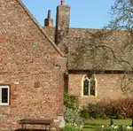
How to Draw Buildings: Brick and Stone Walls in Colored Pencil
You don't need to draw every brick. Learn techniques for realistic brick and stone walls in coloured pencil, from mortar lines and texture to light and shadow.
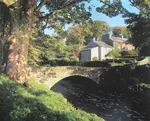
Watercolour Pencil Landscape Tutorial – Brokken Bridge
A complete step-by-step watercolour pencil tutorial. Paint an English packhorse bridge using washes, scribbles, and layering techniques. Includes free outline.
Coloured Pencil Drawings: Composing a Beautiful Canal Scene
Coloured Pencil Drawings: how to alter and adapt your reference photos to improve the composition of your artwork. A step by step walkthrough

Copyright © 2009- pencil-topics.co.uk All rights reserved
Home | About Us | Contact Us | Privacy Policy