- Home
- Landscape drawing
- Drawing buildings
How to draw buildings in a coloured pencil landscape
In short
A building belongs in a landscape when you get its big shape and weight right, not when you draw every brick and window. Start with the silhouette and how it sits on the ground, let the distance decide how much detail you add, and keep the light consistent. Handle the surface with a light touch and the building will settle into the scene instead of sitting on top of it.
Buildings are one of the things we most often leave out of a landscape.
A tree or a hill forgives a loose hand, but a wall wants straight lines, a roof wants angles, and the whole thing seems to demand a kind of precision that feels like a different hobby altogether. So we edit the cottage out and draw the hill behind it instead.
That is a shame, because a building is often the very thing that makes a landscape feel real. It gives the eye somewhere to rest and a sense of scale, and it brings a quiet solidity that a field alone cannot.
This guide is about getting that solidity without the fear, by drawing the building the same way we draw everything else: as shapes, light and suggestion, not as an engineering diagram.
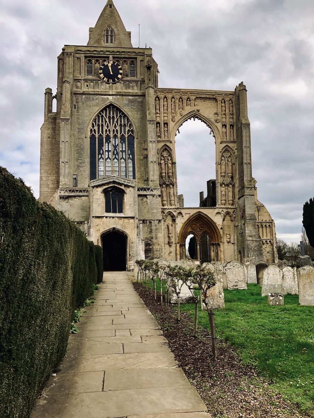
Crowland Abbey. Part ruin, centuries old, and still the most solid thing for miles. A building like this anchors everything around it.
A building anchors the scene
Solidity is what a building brings to a landscape. Weight, permanence, the sense of something set down and staying put.
That feeling does not come from counting the bricks or ruling in every window. It comes from the big mass, from how the walls catch the light, and from the way the whole thing plants itself on the ground.
The proof is a ruin. Look at the abbey above, or a lighthouse standing alone against the weather. Half fallen, weathered raw, and yet nothing reads as more solid or more permanent.
If a crumbling wall can feel that immovable, then you do not need crisp detail to convey solidity. You need the weight. Once I understood that, buildings stopped frightening me, because I realised I was drawing their presence, not their brickwork.
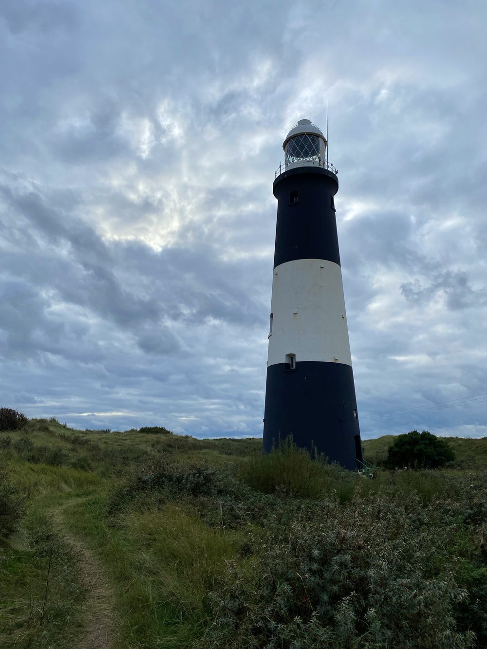
A single structure can command a whole landscape. The banded lighthouse does it with nothing but a bold shape and the sky behind.
See the big shape first
The shape comes before everything.
Before windows, before doors, before a single course of brick, block in the overall silhouette and the main planes of the building: which wall faces the light, which sits in shadow, where the roof cuts against the sky.
If those big shapes are right, the building will already read as a building. If they are wrong, no amount of careful detail will rescue it.
I find it helps to half close my eyes at the reference until the detail drops away and only the masses are left. That squint is the most useful tool you have for a building.
If you want to test those masses before committing to the paper, a thumbnail sketch takes two minutes and will tell you straight away whether the shape is working. It is also worth building a reference collection of buildings in different light, because the one thing you cannot invent convincingly is how the sun falls on a wall.
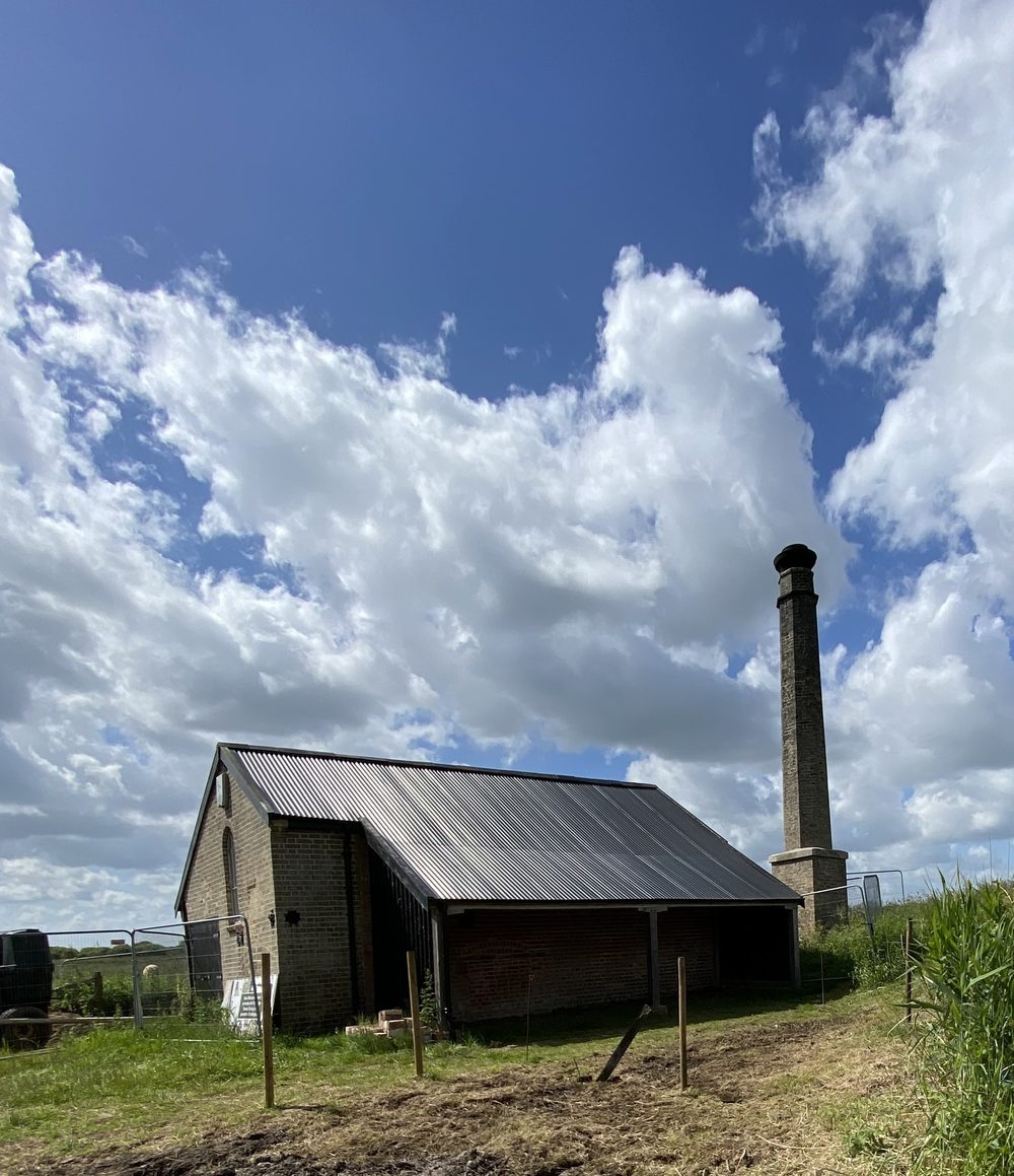
Reduced to its big shapes, this old pumphouse is a box, a sloping roof and a tall chimney. Get those three right and the rest is decoration.
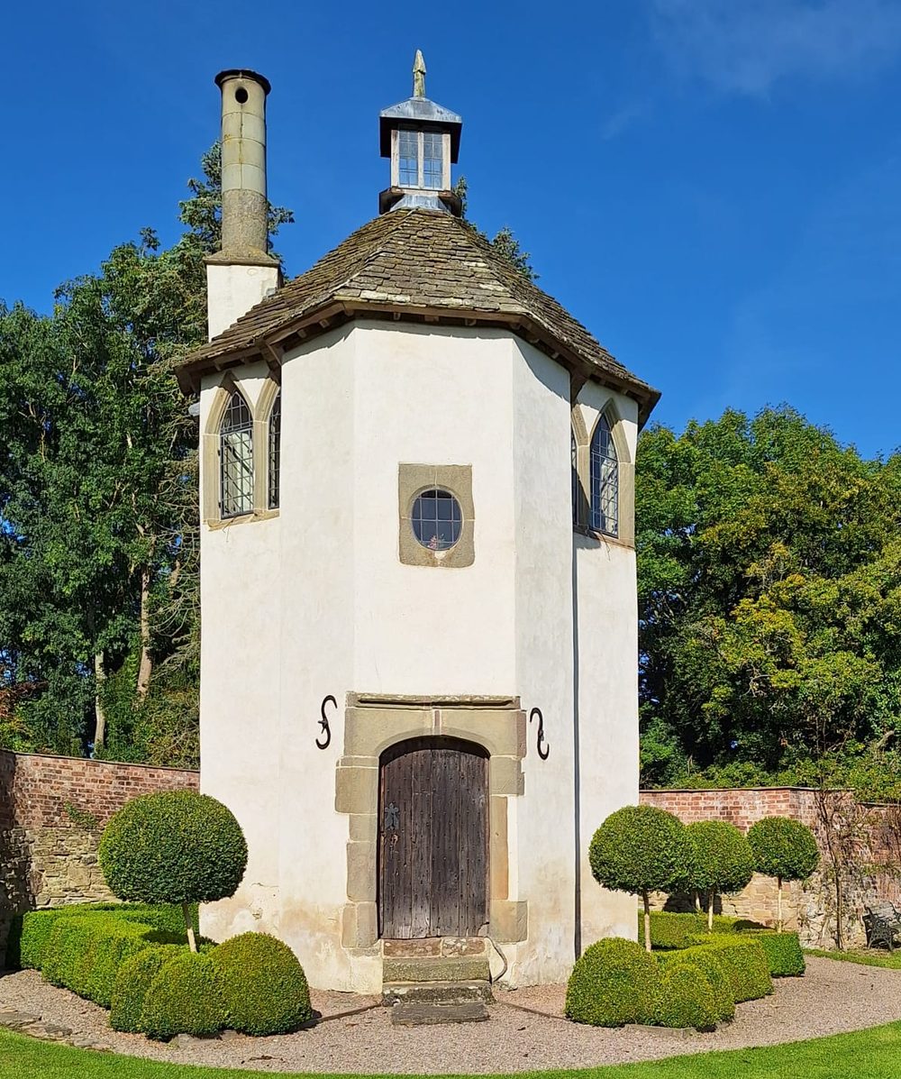
Even an ornate garden house is, at heart, a simple solid with a cap of roof. Find the plain shape underneath the decoration.
Let the distance set the detail
How much detail a building needs depends entirely on how far away it sits in your scene. This is the thing that saves you the most work and the most worry.
A building in the far distance is only a silhouette and a few values. A pale shape, a darker roof, a hint of shadow, and the eye fills in the rest. Try to draw every window on a distant cottage and it will look wrong, too busy for its place in the scene.
A building close to the viewer is a different job. Now you need the structure, the way the planes turn, the set of the windows, and a suggestion of the surface. Even then it is suggestion, not inventory.
This is not a rule about buildings, it is a rule about distance. Distant trees work in exactly the same way, and once you see it in one part of the scene you will start applying it everywhere.
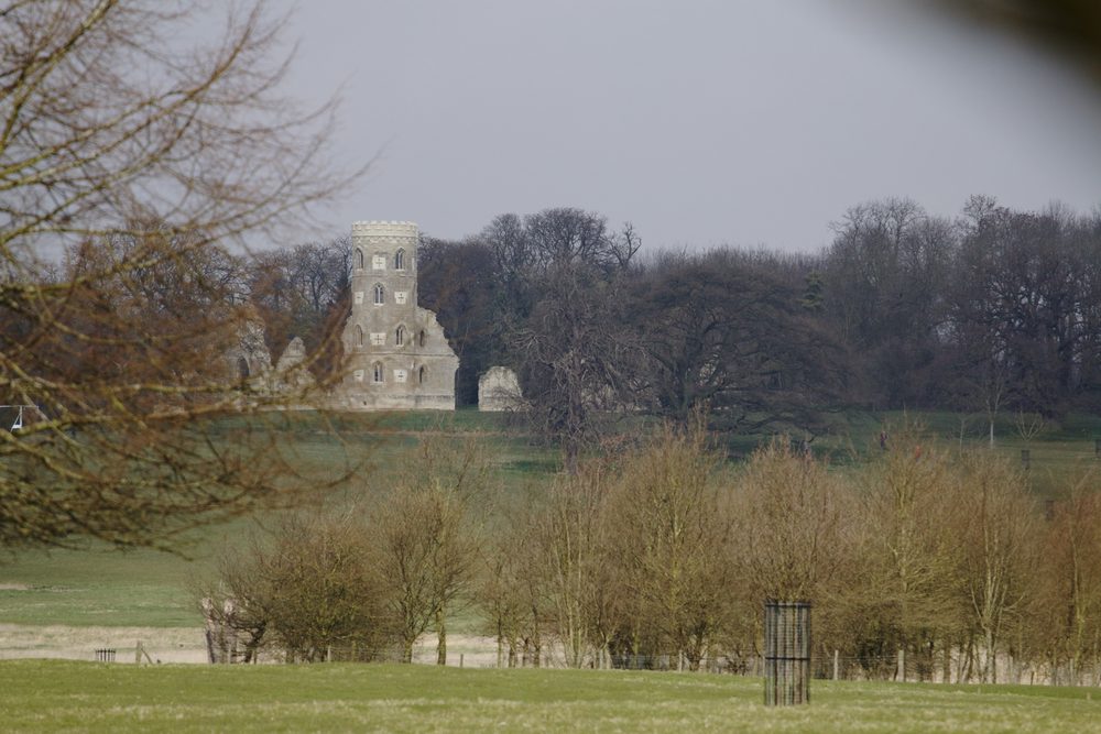
Far off through the trees, this folly is barely more than a pale tower and its shadow. At this distance, that is all it needs to be.
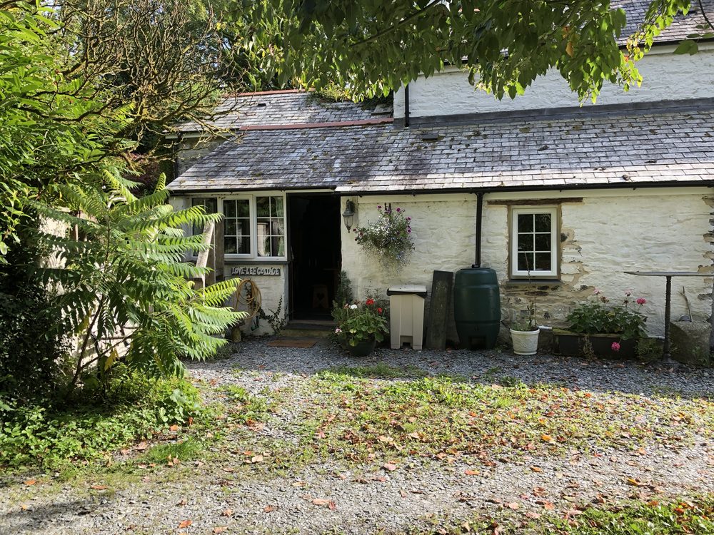
Up close, the same rules but more of them: the turn of the walls, the set of the windows, the rendered surface. Still suggested, never counted.
Surface and roof: a light touch
The surface is where most people over-work a building, and it is the easiest part to hand off.
Once your shape and light are right, the brick, stone or render only needs suggesting, exactly as it does on a wall. Vary the colour, hint at a few courses, let the indented mortar trick do the work, and stop.
Go further: Because the surface is a whole skill of its own, it has its own guides. For brick, stone and dry stone walls, see how to draw brick and stone walls. For tiles, slate and thatch, see how to draw a roof. For natural rock rather than built walls, see drawing realistic stone and rock textures. And if your building has an archway in it, the garden archway tutorial works through a curved brick structure step by step. Draw the building here, then borrow the surface technique from there.
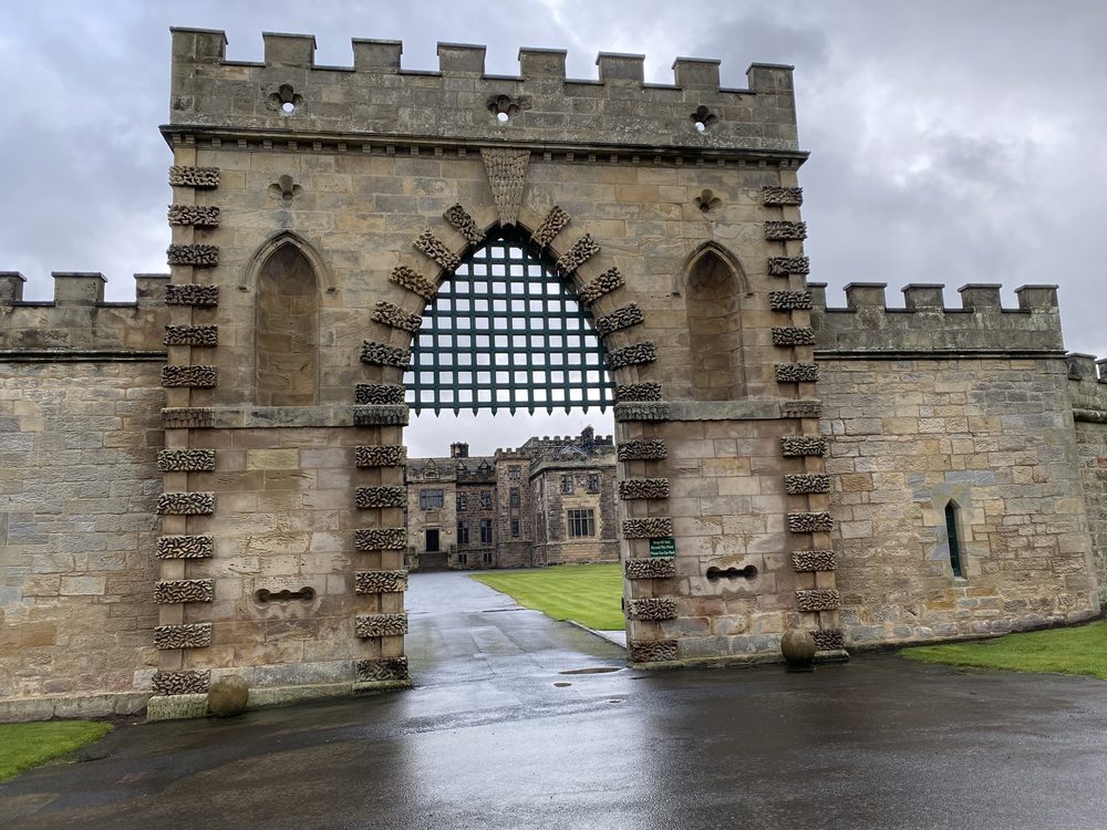
Handsome stonework, but you would suggest it, not carve every block. The surface technique lives on the walls page.
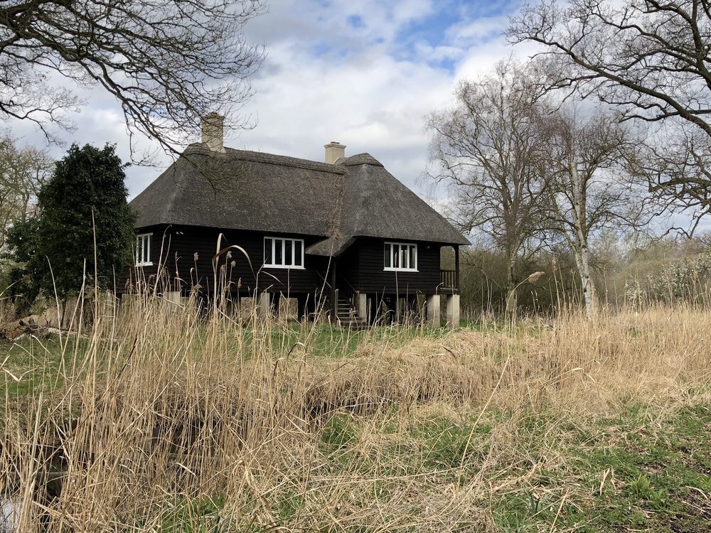
A deep thatched roof like this is all about soft mass and shadow. The roof page covers thatch, tile and slate.
Light and mood
Light is what turns a drawn building into a place.
The same cottage feels entirely different in flat midday light, in low golden sun, or against a stormy sky, and choosing the light is half the picture.
Low, raking light gives you long shadows and a lit edge that models the whole form. A moody sky behind a pale building makes it glow, which is reason enough to spend some time on the clouds behind it.
When you come to the shadow side, resist reaching for black. Darker versions of the wall's own colour, or its complementary, will keep the building alive. What colour is a shadow works through why, and light and shadow in drawing covers the whole business of modelling form with light.
And a building beside still water gives you a second one for free, upside down. Drawing reflections in water shows how to handle that when the surface is calm enough to give you one.
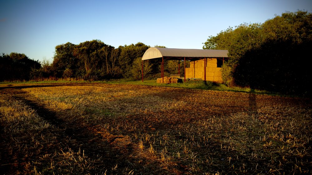
Late golden light does most of the modelling for you, warm on the lit side, long shadow across the stubble.
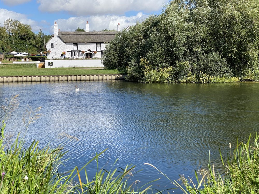
The pub sits back beyond the lawn, small in the frame, and still holds the whole scene together. Water in front, mown grass between, trees behind: the building does not have to be big to be the anchor.
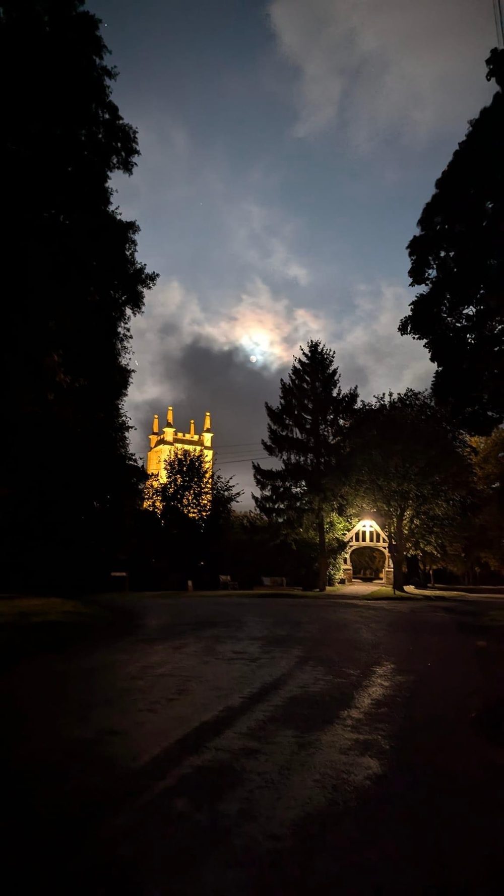
Not every reference is a daytime one. A floodlit tower against a moonlit sky is pure mood, worth keeping for atmosphere.
A word on perspective
The moment a building sits at an angle to you, its lines start to converge, and that is what trips most people. The near corner is tallest, and the lines of the roof, the windows and the wall base all run back toward a vanishing point.
You do not need to measure it. A few light guide lines, sketched before you commit to any detail, will keep the whole building sitting true.
Get them down early, because unpicking perspective after you have built up colour is a miserable job.
If you would rather watch it done than read about it, my Venice buildings project works a whole street of them up from the first guide lines to the finished colour.
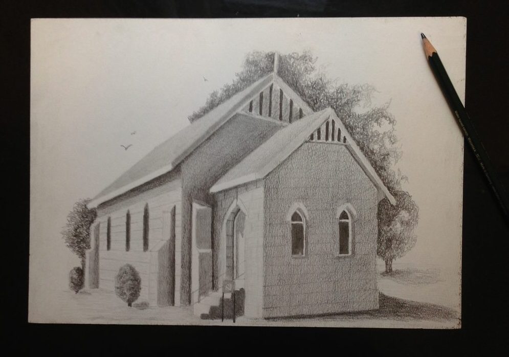
One of my own early drawings, worked out in two-point perspective. The guide lines came first, the stonework came last.
New to perspective? I have laid it out simply in perspective drawing for beginners, with companion pages on one-point perspective and two-point perspective, which is the one that covers buildings seen from an angle.
Where to go next
Brick, stone and dry stone. The surface itself, suggested rather than counted.
Tiles, slate and thatch. The surface above the walls, handled the same suggestive way.
Vanishing points without the maths, so a building at an angle sits true.
Coloured pencil landscape guide
How walls, buildings, trees, skies and water fit together in one complete scene.
The same distance rule, applied to the trees standing behind your building.
Modelling form with light, which is what makes a drawn building feel solid.
A building beside still water gives you a second one, upside down.
A whole street of buildings worked up from guide lines to finished colour.
Copyright © 2009- pencil-topics.co.uk All rights reserved
Home | About Us | Contact Us | Privacy Policy