- Home
- Landscape drawing
- Drawing Reflections
Drawing Water Reflections With Coloured Pencils
Water reflections are one of those things that look wrong and you can't quite work out why. You've drawn the boat, the buildings, the trees along the bank. You add the reflection underneath and it doesn't convince. Something's off, but what?
I spent a long time thinking the problem was my technique. Softer strokes, more blending, different colours. None of it fixed the fundamental issue, which turned out to be much simpler than I expected: I wasn't thinking about where I was standing.
That's what this page is about. Once you understand how your viewpoint shapes what the water shows you, reflections start making sense.
1. Start With Viewpoint, Not Detail
A reflection is never an exact copy of what's above it. Your height above the water and the angle of the object both change what you actually see reflected.
If an object leans, the reflection shifts and bends. It's subtle, but it's real. Stand higher and some things disappear from the reflection entirely. Crouch down and they reappear.
Try this with your reference photo: look at what's visible in the water and compare it to the real object above. You'll almost certainly spot differences. Things that are hidden, shortened, or angled differently. Those differences are the key to a convincing reflection.
Sketch the big silhouette shape in the water first. Details can wait. What matters at this stage is getting the overall shape right for your particular viewpoint.
The thing to remember: the water reports your viewpoint, not your assumptions.
2. Get the proportions right before you pick up your colours
It's tempting to start laying down colour straight away, but locking the basic geometry first saves a lot of frustration later.
Mark the waterline where the object meets the surface. Block in the reflection's height and width relative to the object. They'll be similar, but not identical. Some elements you can see directly will vanish or shrink in the reflection.
Compare edges: which corners are closer to you? Those usually drop lower in the reflection. Light guide marks or a simple grid will help you place things where they actually belong rather than where your brain assumes they should go.
Proportion first. Polish later.
3. Let the water do its job
This is where I used to go wrong. I'd try to make the reflection as sharp and detailed as the real object, and it always looked pasted on.
Water softens, darkens and simplifies everything it reflects. Even in bright sunshine, reflected values drop a notch. That's just how it works. Once I gave myself permission to make reflections less detailed than the objects above them, everything started looking more realistic.
Keep your edges in the reflection softer than the object. Save your crispest pencil work for the real thing and let the water blur the rest.
Fewer hard lines means more believable water.
4. Getting colour and value right
In water, lighter objects tend to reflect darker, and darker objects can reflect slightly lighter. It's a compression towards the middle values.
A light blue hull might reflect as a deeper, more muted blue. Even sunlight that picks out every plank on a boat will sit a notch darker in the reflection. Use your colour wheel to find those muted counterparts rather than guessing.
Build your values gradually so you don't overcommit too soon. Mid-values first, deepen the darks slowly, and save highlights for last.
A few coloured pencil specifics that help here:
- Vertical, broken strokes suggest gentle ripples
- Thin horizontal glazes calm the surface
- Blend selectively. Over-burnishing kills the watery feel
Muted, layered colour beats bold, first-pass colour every time.
5. When it looks wrong but you can't see why
Your brain loves shortcuts when it comes to reflections, and those shortcuts are often wrong.
Here's a common one: you can see inside a boat when you look at it directly, but its reflection shows more of the exterior, almost like a view from underneath. Your brain says "that can't be right" but the water disagrees.
That "doesn't look right" feeling is usually your expectation talking, not the water.
The quickest fix I know: flip your reference (or your drawing) upside down. Errors jump out immediately because your brain stops naming objects and starts seeing shapes and values instead.
Watch for bounce light, too. Sunlight can toss a golden glow onto a bird's underside via the water's surface. It looks unlikely but it's real. Draw what you see, not what you think should be there.
6. Slow down and check
After your first pass, take a step back and scan the reflection specifically.
Track the true shape, size and colour in the water, not the object's. Make small adjustments to edges and values. Most of the refinement at this stage is subtle.
Three things to check:
- Is the reflection slightly softer and darker than the object?
- Are small features simplified rather than copied in full detail?
- Do any ripples gently break the straight lines?
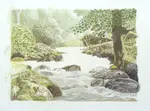
Real-world examples: seeing the method in action
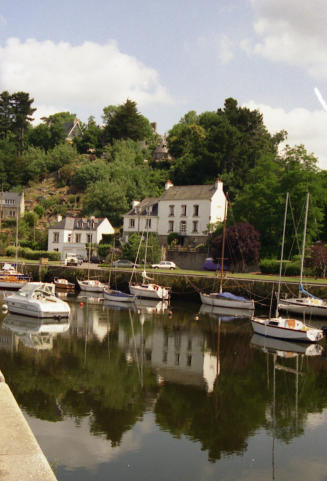
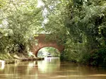
The Loire Region
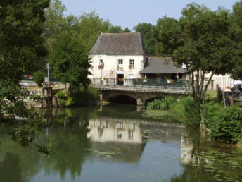
Look at the right-hand building. It's partly hidden by a tree, and only the left side shows in the water. That partial visibility is normal, not a mistake.
The mill cottage shows only its top floor in the water. The front door stays hidden. The low mill shed sits back from the road bridge. Only a hint of its rooftop appears in the reflection.
Distant trees disappear from the water entirely, because far objects drop out of reflections first.
If the trees along the bank are causing more trouble than their reflections, this how to draw trees guide will help you build believable structure and foliage first.
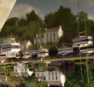
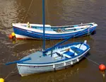
Honfleur Harbour
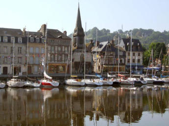
The waterfront buildings shrink and seem set back from the harbour wall in the water. The distant hill disappears entirely. Boat masts look angled and bent in the reflection rather than standing rigid.
Every one of these "oddities" is the viewpoint method in action. Once you know to look for them, you'll spot them in your own reference photos too.
If you want those waterfront structures to feel solid before you tackle their reflections, this guide on drawing buildings will help with brick, stone and wall textures.
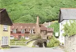
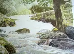
The flip test: your fastest reality check
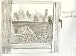
 The old port at Pont Aven in Southern Brittany. Is this real or the reflection?
Here's the old port at Pont Aven in Southern Brittany. Is this the real scene or the reflection?
Turn it upside down and your brain stops naming things. "Boat" becomes a shape. "Building" becomes a block of colour. The reflection can feel like a view from beneath the surface, with boats hovering above, because it shows different facets than your direct view.
This works just as well on your own drawings. If something feels off, flip it before you start changing things. The problem usually reveals itself straight away.
Quick checklist
Before you call a reflection finished:
- Viewpoint first. Where are you standing, and what does the water actually show from there?
- Big shapes first. Block the reflection's proportions. Similar to the object, not a mirror copy.
- Softer and darker. Fewer details, softer edges, values dropped a notch.
- Muted colour. Use your colour wheel to find deeper, quieter versions of reflected hues.
- Check your assumptions. Flip the reference. Verify what's really there.
- Finish gently. Light ripples, glazed values, keep it soft.
Where to go next
If you want to see these reflection ideas applied in a full project, start with how to draw realistic water.
For the next stage, realistic water part 2 shows how those broken shapes and water patterns start to come together.
To see the finishing stage, realistic water part 3 follows the final refinements that make water feel convincing.
If you’d like to apply the same ideas to a fuller landscape, try how to draw a river, which combines rocks, water and reflections in one scene.
For a full canal project, begin with canal scene part 1, where the planning and composition decisions set up the reflections later on.
Then canal scene part 2 shows how the underpainting begins to build the water and its reflective surface.
Finally, canal scene part 3 develops the finished water, reflections and boats in far more detail.
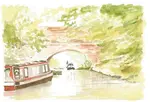
For another practical example, the watercolour pencil painting of Coventry Canal explores reflected light and water in a different canal setting.
If your scene includes a boat, our page on drawing a boat that actually looks like it floats puts these reflection principles to work alongside hull shapes and waterlines.
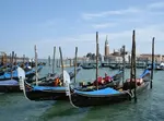
If you enjoy boat subjects with reflective water, this gondola painting offers a Venice scene where water plays a major part in the composition.
And if you're building a full scene with sky, trees, grass and stone as well as water, our coloured pencil landscape guide shows how all these elements come together.

I'm Carol Leather, a coloured pencil artist for over 15 years. Most of my teaching comes back to the same idea: realistic coloured pencil starts with structure, light and observation long before the colour goes down.
My work has featured in Ann Kullberg's Color Magazine, CP Magic and Color Pencil Treasures (vol 7). I'm a member of the UKCPS and was a prize winner in the Nature section of their Annual Open Exhibition in 2020.
You might like these
Colored Pencil Landscape Drawing: A Beginner's Guide
Break any landscape into simple sections and draw each one with colored pencils. Covers trees, skies, water, grass and stone using just your starter set.
How to Draw Clouds with Coloured Pencils: 3 Methods That Work
Pencils make lines, clouds don't. Learn 3 methods that actually work: felt transfer, watercolour pencils, and soft pastel. Step-by-step for each technique.
Landscape Composition Painting & Prep (Pt 1): Coloured Pencil Guide
Start your coloured pencil landscape! Part 1: Learn to analyse photo references, improve composition with artistic license & choose your art supplies.

Copyright © 2009- pencil-topics.co.uk All rights reserved
Home | About Us | Contact Us | Privacy Policy