- Home
- The Golden Section
Composing Your Art with the Golden Section (Made Easy!)
Have you stood before a painting and felt your eye swept along a path landing exactly on the subject? That invisible route is often shaped by the Golden Section. No math required: it’s a simple overlay you can sketch and use to make your compositions feel natural and alive.
Think of it as a map for the eye. Use it to nudge your focal point or horizon off centre so the picture feels balanced, not forced.
This article will give you a practical, artist-focused look at the Golden Section:
- What it looks like visually.
- How it relates to the simpler 'Rule of Thirds'.
- How you can use it as a guide in your own compositions (with examples!).
- A quick peek at its origins in nature (optional fascinating bit!).
Think of it as another tool in your composition toolkit – not a rigid rule, but a helpful guide to explore!
The Golden Section is one of the wider fundamentals of drawing, helping you place focal points and create more balanced compositions.
Draw a quick Golden section grid
The Golden Spiral (Fibonacci Spiral)
This guide looks like a spiral curling inwards, often fitting neatly within Golden Ratio proportions.


How to Use It
The idea is that the spiral draws the viewer's eye naturally through the composition towards the tightest part of the curve.
Placing your main point of interest or focal point within this tight curve can create a very compelling and organic flow. You can rotate or flip the spiral overlay to best fit your subject.
Here’s an example using one of my flower photos. You can see how placing the centre of the rose near the tightest curve of the overlaid Golden Spiral helps draw your eye into the subject.

In this photo of a butterfly, the spiral is rotated. Aligning the butterfly's body along the curve helps guide the viewer's focus.

Relationship to the Rule of Thirds
If the Golden Section grid sounds familiar, you might be thinking of the Rule of Thirds.
The Rule of Thirds (dividing your frame into nine equal parts with two horizontal and two vertical lines) is indeed a simplified, easier-to-visualise approximation of the Golden Section.
For many artists, especially when starting out, using the Rule of Thirds is perfectly sufficient for creating well-balanced compositions off-centre.
The Golden Section offers a slightly more nuanced placement, but the underlying principle of avoiding dead-centre and using these lines and intersections as points of interest is very similar.
Think of the Golden Section as the slightly more sophisticated cousin of the Rule of Thirds!
If you want to strengthen the wider planning behind your layouts, this guide to composition basics covers focal points, balance, leading lines, and other core principles.
Where Does it Come From? (A Brief Aside)
You might wonder why this specific proportion (roughly 1:1.618) is considered special.
Fascinatingly, this ratio appears frequently in nature – in the arrangement of sunflower seeds, the chambers of a nautilus shell, the branching of trees.
 Sunflower seed head
 Pine cone
 Nautilus shell
It's also related to a mathematical sequence called the Fibonacci sequence (where each number is the sum of the two preceding ones: 0, 1, 1, 2, 3, 5, 8...).
While the deep mathematics isn't essential for using it visually in your art, it's interesting to know this pleasing proportion is found all around us!
How Can Using the Golden Section Help Your Art?
Thinking about the Golden Section (or even the simpler Rule of Thirds) as you plan your drawings can help in several ways:
- Create Stronger Focal Points: Placing your main subject near one of the key intersections naturally draws the viewer's eye.
- Improve Balance and Harmony: Compositions often feel more balanced and less static when key elements align with these guiding lines rather than being placed randomly or dead centre.
- Guide the Viewer's Eye: Using the flow of the Golden Spiral can help you arrange elements in a way that leads the viewer naturally through your picture.
A Guideline, Not a Rule!
It's really important to remember that the Golden Section, like the Rule of Thirds, is just a guideline, not an unbreakable rule!
Don't get bogged down trying to make every composition fit perfectly. Sometimes placing your subject dead centre creates exactly the impact you want. Sometimes your subject matter dictates the composition.
Use these guides as tools to help you think about placement and balance, especially when you feel a composition isn't quite working.
Observe art you admire, look at photos, and experiment in your own sketches (thumbnail sketches are great for this!) Trust your eye – if a composition feels right, it often is, regardless of whether it precisely matches a mathematical ratio!

I'm Carol Leather, a coloured pencil artist for over 15 years. Most of my teaching comes back to the same idea: realistic coloured pencil starts with structure, light and observation long before the colour goes down.
My work has featured in Ann Kullberg's Color Magazine, CP Magic and Color Pencil Treasures (vol 7). I'm a member of the UKCPS and was a prize winner in the Nature section of their Annual Open Exhibition in 2020.
You might like these
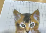
How to use the pencil drawing grid method to plot out your artwork
Struggling with accurate outlines? Learn the pencil drawing grid method step-by-step. Simple technique for beginners to transfer or scale photos perfectly.
Copyright © 2009- pencil-topics.co.uk All rights reserved
Home | About Us | Contact Us | Privacy Policy