- Home
- Fundamentals of Drawing
- Perspective
Basic Perspective Drawing for Beginners
Perspective Doesn't Have to Be Scary!
Heard the word perspective in art tutorials and felt a little worried or confused? You’re not alone.
Perspective can sound complicated, but here’s the good news: you don’t need to become a perspective expert to make a huge difference in your drawings. For the kind of beautiful, realistic pencil art you’re aiming for, you only need to get comfortable with a few simple core ideas.
Basic perspective is your secret weapon for avoiding common frustrations—like buildings that look wonky, roads that sit flat on the page instead of disappearing into the distance, or tables that feel strangely tilted in a still life sketch.
Get the structure right early, and your finished piece will look far more convincing.
Perspective is one part of the wider fundamentals of drawing, alongside value, composition, and other core skills that help your artwork feel solid and believable.
What is Perspective?
Perspective is simply how artists show three-dimensional objects and scenes on a flat, two-dimensional surface (like your paper) so they look like they have real depth and distance—like you could step into the drawing.
On this page, we’re focusing on linear perspective: using lines (real or imaginary guides) to work out the correct angles and sizes of objects as they appear to get further away.
The Two Most Important Ideas
If you understand these two concepts, you’re already well on your way.
1) Your Eye Level Line (Horizon Line)
 Just like looking out at sea, the visible horizon line is a perfect real-world example of your eye level line – the crucial 'anchor point' for basic perspective drawing.
Imagine standing on a beach looking out at the sea. That perfectly straight line where the sea meets the sky? That’s your eye level line—an imaginary horizontal line that sits exactly level with your eyes as you view the scene.
But what if you’re indoors, or drawing a landscape where you can’t see a horizon? No problem—the eye level line is still there. It’s simply the “height of your viewpoint” running across the scene.
Why it matters:
- Objects below your eye level: you see their tops.
- Objects above your eye level: you see their undersides.
- Vanishing points always sit on the eye level line.
2) The Vanishing Point (VP)
 located on the Eye Level / Horizon Line.") Just like looking down a straight road or railway tracks, parallel lines appear to converge at a single Vanishing Point (VP), which always sits on your Eye Level / Horizon Line.
Just like looking down a straight road or railway tracks, parallel lines appear to converge at a single Vanishing Point (VP), which always sits on your Eye Level / Horizon Line.Think of standing in the middle of a long, straight road. The sides are parallel in real life, but as they go into the distance, they appear to get closer and closer until they seem to meet at a tiny point.
That “meeting point” is the vanishing point—the spot on your eye level line where parallel lines moving away from you appear to converge. You use it as a target to draw receding lines accurately and create the illusion of depth.
Now let’s see how these two ideas work in the two perspective types you’ll use most often.
Key rule:
- Only the lines showing depth angle towards the VP.
- Lines showing height stay vertical.
- Lines showing width stay horizontal.
One-point perspective is perfect for:
- Roads, paths, or railway tracks disappearing into the distance
- Room interiors viewed from a doorway
- Corridors and hallways
- Simple buildings viewed straight-on
 Example of one-point perspective: Notice how positioning the box above, below, or crossing the Eye Level Line changes whether you see its top or bottom surfaces.
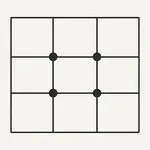
Two-Point Perspective: Looking at a Corner
Two-point perspective is what you use when you’re looking at the corner of something rather than a flat face. This is the type you’ll use a lot, because corner views are so common.
Think of standing on a street corner looking at a building. You can see two walls receding away—one to the left, one to the right. Each direction has its own vanishing point.
How it works:
- Place two vanishing points on your eye level line: VP1 (left) and VP2 (right).
- Lines on the left-facing surface angle toward VP1.
- Lines on the right-facing surface angle toward VP2.
- Vertical lines stay vertical.
Important tip: place your two VPs far apart (often beyond the edges of your paper). If they’re too close together, your objects can look distorted.
.") Notice how the vertical edges stay parallel, while the top and bottom edges angle towards the two Vanishing Points (VPs) on the Eye Level Line. This is the core idea of two-point perspective.
Notice how the vertical edges stay parallel, while the top and bottom edges angle towards the two Vanishing Points (VPs) on the Eye Level Line. This is the core idea of two-point perspective.Two-point perspective is essential for:
- Buildings viewed from a corner angle
- Furniture like tables, chairs, and cabinets
- Books, boxes, and packages
- Vehicles
- Any rectangular object that isn’t facing you square-on
Key Takeaways
- Perspective helps you create a believable feeling of 3D depth on flat paper.
- The eye level line is your anchor point—an imaginary horizontal line at your eye height.
- Vanishing points sit on the eye level line and show where parallel lines appear to converge.
- One-point perspective is for straight-on views (one VP).
- Two-point perspective is for corner views (two VPs).
 Keep practicing! Try drawing boxes from different viewpoints, like these examples viewed from above and more front-on, to see how perspective changes things.
Ready to Practise?
Understanding the concepts is step one. Now it’s time to pick up a pencil and try them.
I’ve created detailed, step-by-step tutorials with multiple exercises for each type:
- One-Point Perspective Made Simple (With 3 Easy Exercises!) - Draw roads, rooms, and corridors that disappear convincingly into the distance.
- Two-Point Perspective: Draw Buildings and Objects That Look Real - Master boxes, buildings, and furniture with step-by-step exercises.
If you’re completely new to basic perspective drawing, start with one-point perspective—it’s the gentler introduction. If you’re itching to draw buildings, jump straight to two-point.
The goal isn’t perfection—it’s understanding. Every slightly wonky box you draw is training your eye and hand to work together.
If you want to strengthen the observation and shape-reading skills that make perspective easier, this guide to basic drawing for beginners is a good place to build that foundation.

I'm Carol Leather, a coloured pencil artist for over 15 years. Most of my teaching comes back to the same idea: realistic coloured pencil starts with structure, light and observation long before the colour goes down.
My work has featured in Ann Kullberg's Color Magazine, CP Magic and Color Pencil Treasures (vol 7). I'm a member of the UKCPS and was a prize winner in the Nature section of their Annual Open Exhibition in 2020.
You might like these
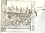
How to Use Thumbnail Sketches to Plan Better Drawings
Most drawings fail at the planning stage. Thumbnail sketches catch composition mistakes before you commit to a full piece. Here's how to use them.
Using Photo References for Drawing: Beginner Tips | Pencil Topics
Using photo references for drawing? Get beginner tips on choosing good photos, interpreting them artistically, simple adjustments & essential copyright rules

Copyright © 2009- pencil-topics.co.uk All rights reserved
Home | About Us | Contact Us | Privacy Policy