- Home
- Fundamentals of Drawing
- Value in Drawing
Understanding Value in Drawing
Introduction: What is Value, and Why is it So Important?
Welcome! In the previous section, basic drawing for beginners, we focused on getting the fundamental shapes and proportions right in your initial sketches.
Now, we're moving on to what I believe is arguably the single most important element in making your work leap off the page and look truly realistic and three-dimensional: understanding value in drawings.
So, what is value? It’s a question many beginners ask, and the answer is actually quite simple.
Value refers to the lightness or darkness of a tone or colour. Think about a black and white photograph – it contains no actual colour (hue), only values ranging from the brightest whites, through many different shades of grey, to the deepest, richest blacks.
Every colour has an inherent value too – think about how light lemon yellow is compared to a dark navy blue.
Why is focusing on value in drawing so incredibly important, especially for us as coloured pencil artists aiming for realism?
- Value Creates Form: It's the range of light and dark values across a surface that tricks our eyes into seeing a flat circle as a rounded sphere, or a collection of flat lines as a solid-looking box. Without a good range of values – from light to dark – drawings tend to look flat and lifeless, no matter how accurate the initial outline is.
- Value Adds Depth and Realism: Correct values help show how objects sit in space, how light is falling across them, and even what their surface texture might be like. Getting value right is a key ingredient for achieving that believable, "reach out and touch it" quality in your art.
- Value is Often More Important Than Colour Choice: Now here's a statement that might surprise you, but I truly stand by it based on years of experience: If you get your values right, your drawing will look convincingly real and solid, even if your colours are slightly unconventional (like that green fox mentioned on the old page!). But if your values are wrong (for example, if everything is hovering around a similar mid-tone), even the most perfectly matched colours won't save the drawing from looking flat and lacking impact.
- It Helps Overcome the Fear of Darks: Many beginners, and I see this often, are quite hesitant to add really dark areas to their drawings. This can result in work that feels a bit weak or washed out. Understanding value helps build the confidence to use those essential dark shadows effectively to create drama and form.
Think of value in drawing as the underlying architecture that gives your coloured pencil work its strength, solidity, and sense of reality.
Learning to see value accurately and then control it with your pencils helps you make much better decisions about which specific colours to choose, how much pressure to apply, and how many layers you might need to build up truly convincing forms.
Getting your values right is like giving your drawing superpowers – it breathes life into it!
Ready to explore how we see and use value more effectively? Let's start by looking at a fundamental tool... the Value Scale!
Seeing in Black and White: The Value Scale
One of the very best ways I know to start training your eyes to see different levels of light and dark more accurately is by using – and even creating for yourself – a simple Value Scale.
What is it?
Think of it like a visual ruler just for measuring lightness and darkness.
It's basically a strip showing distinct steps of tone, progressing smoothly from pure white all the way down to solid black, with several shades of grey neatly arranged in between.
While professional artists sometimes use scales with many, many steps (perhaps 9 or 10), a much simpler 5-step or 7-step scale is absolutely perfect for getting started and understanding the concept.
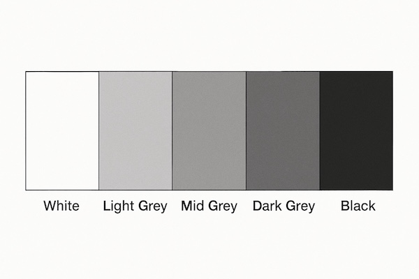 A simple white to black value scale for artists
Why is a Value Scale such a useful tool for us?
- It trains your observation skills: Just looking at a clear scale helps you start to consciously identify different value levels when you look at your subject matter (whether it's a real object or a photo). You can start asking yourself, "Looking at that shadow on the apple, is it closer to the dark grey or the mid grey on my scale?"
- It provides a handy reference: When you're drawing or colouring, you can glance at your value scale and compare the values you are creating on your paper to check if you're achieving the level of lightness or darkness you intended.
- It encourages a full range of values: It's a great visual reminder to use not just comfortable mid-tones, but also those really important lightest lights and darkest darks in your artwork. Using that full range is key for creating contrast, impact, and that believable 3D look.
Try Creating Your Own! (It's a Great Exercise!)
Making your own value scale is a fantastic way to practice controlling your pencil pressure and seeing values.
You can do it easily with a graphite pencil (a softer B or 2B might be easiest for getting darks) or even just a black or dark grey coloured pencil:
- Lightly draw a long rectangle on some scrap paper and divide it into 5 (or 7, if you prefer) equal boxes side-by-side.
- Leave the first box on one end completely white (just the plain paper).
- Now go to the box on the other end. Using your pencil, fill this box in as dark and solid as you can possibly make it – this is your black.
- Next, find the box right in the middle. Try your best to shade this box in with a grey tone that looks visually halfway between your white and your black – a true mid-grey.
- Finally, fill in the remaining boxes, aiming to create evenly stepped shades of grey between white, mid-grey, and black. (So, for a 5-step scale, you'd need to create a light grey between the white and mid-grey boxes, and a dark grey between the mid-grey and black boxes).
Don't worry at all about making it perfectly smooth or getting the steps exactly even on your first attempt!
The real benefit comes from the act of trying to create those distinct steps and actively comparing the values you're making. It's brilliant practice for both your eyes and your pencil control.
You could even try making separate value scales using different individual coloured pencils (like a blue, a green, or a brown) just to see the range of light-to-dark values you can achieve with a single colour!
Having a little value scale like this (either one you've made or one printed out) tucked nearby when you're working can be a really helpful reference guide.
How Light Creates Form
Now that we understand what value is (lightness and darkness) and have a way to think about its different levels (the Value Scale), let's look at the magic of how these different values work together on an object to make it look solid and wonderfully three-dimensional.
Once you understand how light behaves on a simple shape like a sphere, you can apply that same 'light logic' to drawing any complex form; whether it's an apple, a cheekbone, a tree trunk, or a fold of fabric!
The 'Anatomy' of Light and Shadow
This simple shaded sphere is perfect for showing us all the key 'zones' of light and shadow that artists learn to look for.
Let's put some names to these areas:
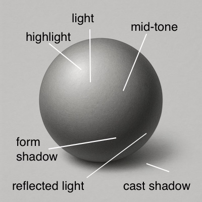
- Highlight: This is the very brightest spot (or spots) on the object, where the light source hits the surface most directly and reflects strongly. Sometimes, on a matte object, it's just the lightest value, but on a shiny object, it might be close to pure white.
- Light (or Full Light): This is the broader area that is directly lit by the main light source. It's light in value but not as bright as the highlight.
- Mid-tone(s) (or Halftones): This is the transition zone where the surface of the object starts to curve away from the light source. It's darker than the Light area but lighter than the main shadow. Often, you'll see a graduation through several mid-tones as the form turns.
- Core Shadow (or Form Shadow / Shadow Core): This is typically the darkest part of the shadow that's on the object itself. It occurs on the part of the surface turned furthest away from the direct light source.
- Reflected Light: Now, this is a subtle but super important detail for realism! Look closely within the dark Core Shadow area, often near the bottom edge of the object (if it's sitting on a surface). You'll often see a slightly lighter band of value there. This isn't direct light; it's light bouncing off the surface the object is sitting on and reflecting back up onto the underside of the object. Adding reflected light stops your shadows looking like dead, black holes and makes the object feel much more naturally integrated into its environment.
- Cast Shadow: This is the shadow that the object itself blocks the light from reaching, casting it onto the surface below or behind it. The cast shadow is usually darkest right underneath or directly next to the object and often gets slightly lighter and its edges slightly softer as it stretches further away. It's crucial for anchoring the object and reinforcing the light direction.
Learning to identify these different zones on any subject is fundamental to creating convincing 3D form with your pencils.
Seeing Value in a Real Drawing
That sphere is great for understanding the theory, but let's see how this 'anatomy of light' applies to a more complex, real-world drawing.

Here is a graphite still life drawing that includes various shells and a starfish. Since we are only working with black, white, and grey tones, it’s a perfect example of value in action.
- The Shiny shell on the left: This shell is light with dark splotches. As it curves away from the light source, the top section falls into shadow, and the dark splotches become even darker. The background also darkens to emphasize the shell's form.
- The Whelk Shell (2nd from left): The whelk shell is facing away from us, showing its smooth interior. Note that the shadow within the shell is not just a uniform dark area; instead, it contains lighter and darker areas, conveying the shell's shape and texture.
- The Ammonite Fossil: The ammonite fossil is curved, with its outer ring catching the light and appearing white. As the surface turns away from the light, it gradually darkens, and the grooves become shadowed, adding a sense of dimension. The left area forms a shadow against the fossil itself making part of the centre darker.
- The (articial) Starfish: The starfish is white with a rough, pitted texture. The texture is hardly visible where the light catches it but becomes apparent in the shadowed areas. The pits are rendered as darker shadows within the surrounding shadow, creating a sense of a bumpy surface.
Tips for Seeing and Using Value in Your Drawings
Understanding the 'anatomy' of light and shadow on that sphere and seeing it applied to the shells is fantastic theory, but how do you get better at actually seeing the different values in your own subjects (whether real life or photos) and applying them confidently in your coloured pencil drawings?
Like any art skill, it definitely takes practice, but here are a few practical tips that I find really help my students (and me):
Keep Squinting!
Yes, that simple trick we mentioned on the basic drawing principles page is brilliant for seeing values too!
Seriously, try it often.
Squinting your eyes blurs out distracting details and colours, and somehow makes the underlying shapes of light and dark – the values – much easier to see and compare.
Make it a regular habit while you're observing and while you're drawing.
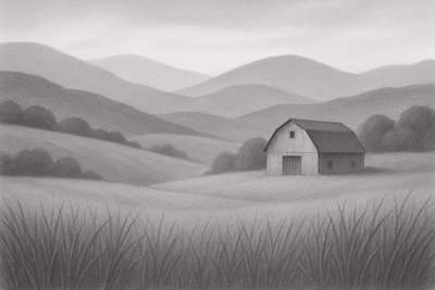 Here’s a landscape drawing showing the full range of details and subtle values you might see when looking normally. Now, let's see what happens when you squint...
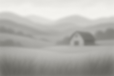 By squinting, the details blur away, making it much easier to identify the major underlying masses of light, mid-tone, and dark values without getting lost. Try it yourself!
Compare, compare, compare
Train yourself to constantly compare values within your subject or reference photo.
Don't just guess if an area is 'dark' – ask yourself specific questions like:
- "Okay, looking at this petal, is the shadow near the centre darker or lighter than the cast shadow underneath the whole flower?"
- or "Is this highlight on the forehead really the brightest white, or is that highlight in the eye even brighter?"
Constantly comparing one area to another helps you place values accurately relative to each other.
Find Your Extremes First (A Great Trick!)
Before you get too deep into shading, try to identify the absolute darkest dark and the absolute lightest light you can see in your subject or reference.
Mark these on your drawing early on (even if just with a light indication).
Getting these 'extreme' values established gives you clear benchmarks at both ends of your value scale.
You can then judge all the other mid-tones much more accurately by comparing them: "Okay, how dark does this area need to be compared to my darkest dark? How light compared to my lightest light?"
Be Brave with Your Darks! (Please!)
This is probably the single biggest hurdle I see beginners struggle with – being hesitant to make shadows and dark areas dark enough.
We often perceive darks in real life as being lighter than they actually are when translated to paper.
Remember from our sphere example, it's the strong contrast between the lights and the darks that really creates that powerful sense of 3D form and stops drawings looking flat or washed out.
Don't be afraid to layer that dark coloured pencil or use firm pressure where needed to really push those core shadows and cast shadows nice and dark!
It makes a world of difference. (You can always start a bit lighter and gradually build up the darkness if you're nervous).
Consider a Value Finder (Optional Tool)
Some artists find a simple physical 'value finder' tool quite helpful.
These are often just small cards with different shades of grey printed on them (like a portable value scale) usually with little holes punched in them.
You can hold them up, look through the holes at your subject, and match the area to one of the grey shades on the card to help judge its value more objectively
Applying Value with Coloured Pencils (A Quick Preview)
Just very briefly, how do we actually create these different values when using our coloured pencils?
It mainly comes down to two things (which we explore in much more detail in the Core Techniques Hub.
- Pencil Pressure: Applying light pressure with your pencil creates lighter values of that colour; applying heavier pressure creates darker values. Learning to control your pressure is key as we learned in our first pencil pressure exercise.
- Layering: Building up multiple light layers of coloured pencil gradually darkens the value and can create much richer, deeper tones than just pressing hard with one layer. You can layer the same colour multiple times, or layer different colours together to achieve the exact value you need.
By actively practicing seeing values more accurately using the tips above, and learning to control those values using your pencil pressure and layering skills, you truly unlock the secret to convincingly realistic and three-dimensional drawings!
Quick Practice: Let's Draw a Sphere!
Reading about the 'Anatomy of Light' and looking at diagrams is helpful, but the absolute best way to start getting a feel for creating form is to put your pencil to paper! Let's put the theory into practice with a very quick and simple exercise.
Please don't worry at all about making this look beautiful or perfectly blended – that's not the goal here! The aim is simply to practice placing the different value zones we just learned about.
Here’s what to try:
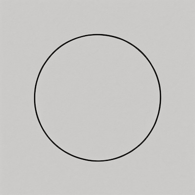
1. Draw a Circle: On a piece of scrap paper, lightly draw a simple circle outline. (Don't worry if it's not perfectly round!).
2. Choose Your Light Source: Before you start shading, decide where your imaginary light is coming from. Is it shining from the top left? The top right? Directly from above? Make a conscious decision. It can even help to draw a little arrow outside your circle pointing from the light source direction – I often do this myself!
3. Map the Zones (Very Lightly!): Thinking about your light source direction and the 'Anatomy of Light & Shadow' we looked at earlier in this page, can you very lightly sketch in where you expect the main value zones to fall on your circle?
- Where will the Highlight likely be? (You might just leave this area as the white paper)
- Roughly where will the main Core Shadow area sit (the part turned furthest away from your light)?
- Where will the Cast Shadow fall on the 'ground' beneath it (stretching away from the light source)?
- Again, don't stress about getting this mapping perfect, it's just a rough guide for your shading.
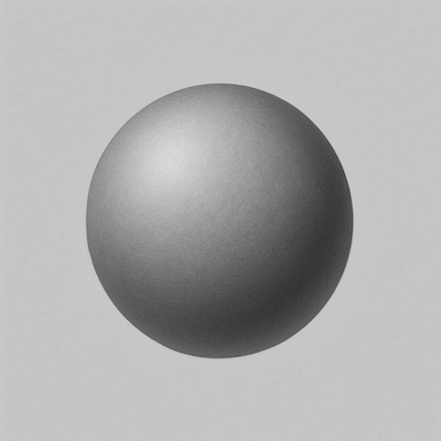
4. Start Shading (Build Gradually): Now, using a graphite pencil (a softer B or 2B might be easiest for getting a range of tones) or even just a single dark coloured pencil (like a grey, dark blue, or brown), begin building up the shading on your circle to turn it into a sphere.
- Keep the highlight area very light (or completely white).
- Gradually make the tones darker as the 'surface' of the sphere curves away from your light source.
- Aim for your darkest value within the Core Shadow area.
- See if you can create that slightly lighter area of Reflected Light near the bottom edge within the core shadow – remember light bouncing off the surface below!
- Don't forget to add the Cast Shadow underneath, usually making it darkest right next to where the sphere 'touches' the ground.
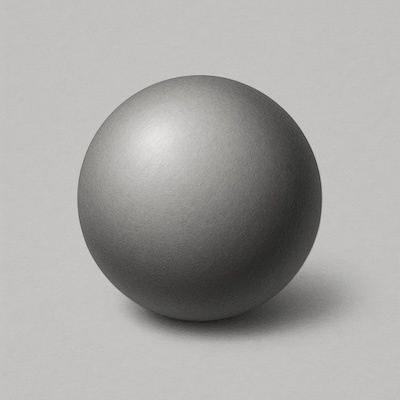
5. Focus on Value Range, Not Smoothness: Remember, the main goal here isn't perfect, silky smooth blending (we cover blending techniques later!). It's simply about deliberately using different levels of light and dark (value) to make your flat circle begin to look like a round, solid sphere.
Give it a try!
Can you make your circle look convincingly 3D using just these changes in value?
Practicing this simple exercise regularly – just drawing and shading spheres or even cubes – even if only for five or ten minutes, is truly fantastic training for both your eyes and your hand control.
Value is Your Key to Realism!
So there we have it – a first look into the incredibly important world of Value in drawing! We've covered quite a bit, so let's quickly recap the main takeaways from this page:
- Value is simply the fundamental lightness or darkness of any tone or colour.
- Using (and making!) a Value Scale is a brilliant tool for helping us see and compare different value levels more accurately.
- Understanding the 'Anatomy of Light & Shadow' on a simple shape (like our sphere example – with its Highlight, Core Shadow, Reflected Light, Cast Shadow etc.) shows us exactly how value creates the powerful illusion of 3D form.
- Actively practicing observing and comparing values in your subjects, and being brave with using strong darks, are key skills to develop for achieving realistic results.
I really believe that getting comfortable with seeing and using a full range of values is one of the most fundamental steps you can take towards creating the realistic, compelling coloured pencil art you're aiming for.
It might take practice to train your eye and hand, for sure, but focusing on getting your values right truly is a key that unlocks believable form, depth, and impact in your work.
Keep practicing that sphere shading exercise whenever you have a moment, perhaps try creating your own value scales with different pencils, and most importantly, start consciously looking for the different values in the world around you!
Ready for the next exciting layer?
Now that you have a solid understanding of how light and dark values create the structure and form of your drawings, we can start to explore the wonderful world of Colour and how it works specifically with coloured pencils!
Let's move on to the next essential page in our Foundation Skills Hub: