- Home
- Fundamentals of Drawing
- Composition
Composition Basics for Coloured Pencil Artists
Why Composition is Your Secret Ingredient
Have you ever spent ages working on a coloured pencil drawing, carefully layering your colours, perhaps getting a texture just right, but when you stand back to look at the finished piece, you feel... well, just a little disappointed?
Maybe it looks technically okay, but it doesn't quite have the impact or 'sparkle' you hoped for? Like something important is still missing, but you can't quite put your finger on what it is?
Nine times out of ten, I find that missing 'secret ingredient' is Composition!
So, what exactly is composition when we talk about art?
Don't worry, it's not nearly as complicated or mysterious as it might sometimes sound!
Put simply, composition is the art of arranging all the different parts of your picture – your main subject (like a flower or a face), the background elements, the empty spaces, the different shapes, colours, and values – within the edges of your drawing paper.
I like to think of it like arranging flowers in a vase.
You could just toss a random bunch in, and it might look alright. But a thoughtful, deliberate arrangement – where you consider the heights of the stems, the balance of colours, the shapes of the blooms, and the spaces between them – looks infinitely more beautiful, balanced, and captivating, doesn't it?
The very same principle applies to arranging the elements in your drawing.
Why does taking a little time to think about composition matter so much, especially when you're starting out with coloured pencils?
- It Creates Impact: Good composition is what elevates a simple drawing of an object into an eye-catching, engaging picture. It gives your artwork structure and helps it communicate clearly and powerfully.
- It Guides Your Viewer: Composition is how you gently control where your viewer looks first (your main area of interest, or 'focal point') and the visual path their eye naturally follows as they explore the rest of your artwork.
- It Avoids Common Problems: Thinking about composition helps you avoid drawings that accidentally end up looking cluttered, confusingly busy, unbalanced ('lopsided'), static, or simply not very interesting to look at.
To see how these challenges can unfold in practice, and the valuable insights an artist gains when a composition doesn't go quite as planned, explore our detailed process study: Lessons in Landscape: A WCP Background & Composition Study
Now, I know that words like 'Composition' and related ideas like the 'Rule of Thirds' can sometimes sound intimidating, like complex rules only found in dusty art school textbooks.
But please don't let that put you off!
Composition isn't about following rigid, scary formulas that stifle creativity.
Think of it much more like having a helpful set of tools and guidelines in your artistic toolkit – simple concepts that anyone can learn to use to make their drawings significantly stronger and more visually appealing.
On this page, we're going to explore some of the most useful and basic composition tools together.
We'll keep things simple and practical, focusing on ideas you can start applying to your coloured pencil drawings right away.
We'll look at things like:
- Identifying the 'star' of your drawing (your Focal Point).
- Deciding where best to place it (using the Rule of Thirds).
- Creating a pleasing sense of visual Balance.
- Guiding the viewer's eye using Lines and Space.
Ready to discover how thinking a little about arrangement can add that 'wow' factor to your coloured pencil art? Let's start by thinking about the main subject of your picture: the Focal Point...
What's Your Main Subject? (Understanding the Focal Point)
Just like a good story usually revolves around a main character, or a theatre stage often uses a spotlight to draw attention to the lead actor, a strong drawing typically benefits from having a clear Focal Point.
So, what do we actually mean by 'focal point' in the world of art and composition?
It's quite simple, really! The focal point is the main area of interest in your picture – it's the specific part that you intend the viewer's eye to be drawn to first.
Think of it as the 'hero' element, the undeniable star of your visual show!
Why is having a focal point generally so important in a drawing?
- It Gives Your Drawing Focus & Clarity: A clear focal point prevents your picture from feeling like a confusing jumble of equal elements. It immediately signals to the viewer, "Look here! This is what this artwork is primarily about." This gives your drawing purpose.
- It Grabs Attention: Often, it's the distinct focal point that initially captures someone's interest and invites them to engage more deeply with your artwork, rather than just giving it a passing glance.
- It Helps Tell Your Story (or Show Your Subject): The focal point usually represents the main subject you want to portray or helps communicate the central theme or feeling of your piece more effectively.
Identifying Your Focal Point (Decide Before You Draw!)
One of the most helpful habits you can get into when planning a drawing is to consciously decide what your focal point will be before you even start sketching seriously.
Ask yourself these simple questions:
- "What is the single most important thing in this scene or setup that I want my drawing to feature?"
- "When someone looks at my finished coloured pencil piece, what do I want them to notice first and foremost?"
Your focal point could be:
- The largest or most detailed flower in a bouquet.
- The eyes in a portrait of a person or pet (eyes are often a natural focal point because we're drawn to them).
- A specific, interesting building nestled within a wider landscape.
- The single figure walking along a beach.
- Even an area of particularly strong light, dramatic shadow, or vibrant colour
Knowing what your focal point is early on helps guide all your other compositional decisions.
Making Your Subject 'Focal' (How Artists Make it Stand Out - A Quick Preview)
Okay, so you know what you want people to look at first.
How do artists actually guide the viewer's eye and make that area stand out?
We'll touch on specific techniques as we go, but here are the main ideas artists use:
- Using Contrast: Often, the area with the strongest contrast between light and dark values naturally commands attention. Placing your lightest lights very close to your darkest darks can create a powerful focal point. Strong colour contrast can work too!
- Using Detail and Sharpness: We tend to look more closely at areas that are sharper and more detailed compared to areas that are softer, simpler, or slightly out of focus.
- Using Placement: As we're just about to explore, simply where you position your focal point within the frame of your paper makes a huge difference to how effective it is.
Right then, you've hopefully thought about what the main subject or focal point of your drawing will be.
The next vital compositional question is: where exactly should you place it on your paper for the most visually pleasing and impactful result?
Let's look at a really helpful guideline for this called the Rule of Thirds...
Where Should it Go? (The Rule of Thirds & Placement)
Okay, so you've identified the 'star' of your drawing – your focal point. The very next question is, where on your paper should you actually place it for the most impact?
It's a really common instinct, especially when we first start drawing, to put the main subject right in the very centre of the page – like hitting the bullseye on a dartboard!
And while that can sometimes work perfectly well, particularly for formal portraits or very symmetrical subjects, compositions often feel much more dynamic, natural, and visually engaging if the main point of interest is positioned slightly off-centre.
"But where exactly off-centre?" That's where a very simple and incredibly helpful guideline comes in, used by artists and photographers for generations: the Rule of Thirds.
What is the Rule of Thirds? (It's Just a Simple Grid!)
Don't let the word 'Rule' put you off – think of it purely as a helpful suggestion!
It works like this:
- Imagine dividing your drawing paper (or the area you plan to draw within) into nine equal rectangles. You do this by visualizing two horizontal lines dividing the space into thirds vertically, and two vertical lines dividing the space into thirds horizontally – just like drawing a noughts-and-crosses grid.
- Now, pay attention to the four points where these imaginary lines intersect inside your rectangle. Let's call these the 'power points' or 'sweet spots'.
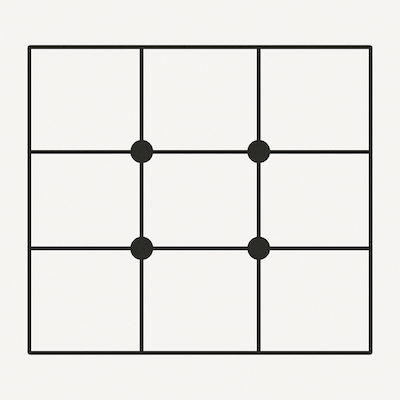 The Rule of Thirds grid. The guideline suggests placing your focal point or key elements on or near one of the four marked intersection points (sometimes called 'power points') for a more balanced and dynamic composition.
The Rule of Thirds guideline simply suggests:
Try placing your focal point, or other key elements of your composition (like an important horizon line, a main tree, or a figure), on or very close to one of these four intersection points, rather than placing it dead centre or too close to the edge.
Why Does Placing Things Off-Centre Often Work So Well?
Using the Rule of Thirds as a starting point generally helps because:
- It Creates More Visual Interest: Placing the subject off-centre usually feels less static and more dynamic than a perfectly centered composition. It invites the eye to explore.
- It Encourages Better Balance: It often leads to a more pleasing sense of asymmetrical balance (we'll talk more about balance next!), using the surrounding space effectively.
- It Guides the Eye Naturally: Our eyes are often naturally drawn to these 'third lines' and intersection points, making it a comfortable way to view an image.
How to Use It When Planning Your Drawing:
When you're starting your initial sketch, you can very lightly draw this 3x3 grid onto your paper (you can easily erase the lines later), or just try to visualize it in your mind's eye.
Then, make a conscious decision to position the most important part of your focal point near one of those four 'power points'.
- Quick Tip for Landscapes: The Rule of Thirds is also very commonly used for placing horizon lines.
- Instead of putting the horizon exactly halfway up the paper (which can sometimes feel like it cuts the picture in two), try placing it along the top horizontal grid line (if you want to emphasize the land or sea) or along the bottom horizontal grid line (if you want to emphasize a dramatic sky).
- This often creates a more interesting division of space.
Remember: It's a Guideline, Not an Unbreakable Law!
I really want to emphasize this: the Rule of Thirds is a fantastic tool to have in your composition toolkit, and it's incredibly helpful, especially when you're unsure where to place your main subject.
But it is not a rigid rule that must be followed slavishly every single time!
Sometimes, a centered composition might be perfect for your subject and intent.
Sometimes your artistic intuition will lead you to place things differently.
That's absolutely okay!
Think of the Rule of Thirds as a strong suggestion, a great starting point, but always feel free to adapt or break it if your artistic vision demands it.
Okay, so using the Rule of Thirds helps you place your main subject effectively to create interest. Now let's think about how to arrange the other elements in your drawing to create a pleasing sense of visual Balance...
Creating Balance (Making Your Drawing Feel 'Right')
Alright, so you've thought carefully about what your main subject is (your focal point) and perhaps used the Rule of Thirds to decide where to place it for good visual interest.
The next step in building a strong composition is to think about how all the other elements in your drawing – the secondary subjects, the background, even the empty spaces – work together with your focal point to create a satisfying sense of Balance
What do we mean by 'Visual Balance'?
Can you remember those old-fashioned weighing scales with two pans? Or maybe a seesaw in a playground?
For them to be stable and level, the 'weight' needs to be distributed correctly on both sides.
It's very similar in art!
Visual balance is all about arranging the elements within your drawing so that the whole picture feels stable, settled, harmonious, and comfortable to look at.
A well-balanced drawing feels complete and 'right'. An unbalanced drawing, on the other hand, can feel awkward, visually lopsided, or make the viewer feel slightly uneasy, even if they don't know why.
There are two main ways artists typically achieve this feeling of balance:
1. Symmetrical Balance (Like Looking in a Mirror)
This is the most straightforward type of balance to understand.
It happens when one half of your drawing is essentially a mirror image of the other half.
If you imagined drawing a line right down the middle (either vertically or horizontally), the elements on one side would closely match the elements on the other in terms of size, shape, and placement.
- Think of: A butterfly with its wings held open symmetrically, a portrait where the person is looking directly forward, a formal building design viewed straight on, or perhaps a perfect reflection in absolutely still water.
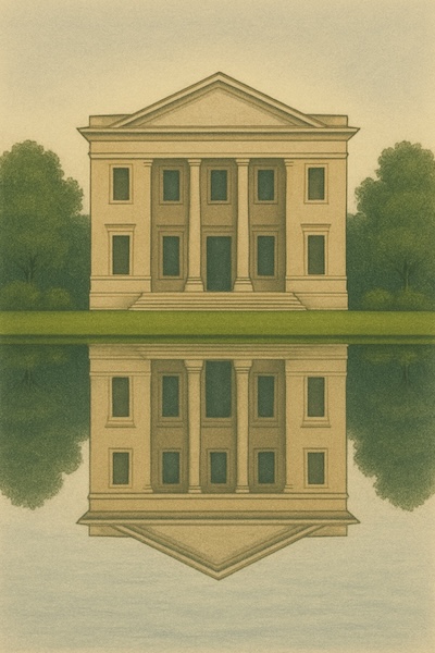 A clear example of symmetrical balance. See how the reflection in the water creates an almost perfect mirror image of the building and trees above? This kind of balance often feels very formal, stable, and calm.
2. Asymmetrical Balance (Balancing Different Things Cleverly)
This type of balance is often more common in art, especially when depicting natural scenes, and it usually looks more dynamic and informal.
Asymmetrical balance is achieved by arranging elements that are different in size, shape, colour, or position in such a way that they still feel balanced overall.
How does that work if the sides aren't the same?
Well, different elements in a picture naturally attract our eye with different levels of strength – think of this as 'visual weight'.
For example:
- A large shape generally feels 'heavier' than a small one.
- A bright, intense colour often feels 'heavier' than a pale, muted one.
- An area with lots of intricate detail or strong light/dark contrast tends to feel 'heavier' than a simple, plain area.
Asymmetrical balance is like successfully balancing that seesaw with two children of different sizes – the heavier child needs to sit closer to the middle, or maybe you need two smaller children on the other side!
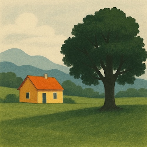 An example of asymmetrical balance. Notice how the sides are different? The large tree's 'visual weight' on the right is balanced by the smaller house and the open space on the left, making the whole composition feel stable but also natural and dynamic.
In drawing, you achieve this balance by arranging these 'unequally weighted' elements so they counterbalance each other visually across the composition.
For instance:
- You might balance a single large, dark tree dominating the right side of your landscape with a smaller, brightly coloured cottage placed further towards the left edge.
- A detailed focal point placed according to the Rule of Thirds on one side might be balanced by a larger area of interesting empty sky (negative space) on the other side.
The goal is for the entire picture to feel stable and visually resolved, even though the left and right (or top and bottom) sides contain different things.
- The Feeling It Creates: Asymmetrical balance often creates a sense of energy, movement, visual interest, and naturalness. It usually feels less rigid and more spontaneous than perfect symmetry.
Finding the Right Balance for Your Drawing
So, which type of balance should you aim for?
- Consider Your Subject and Mood: Think about what suits your specific subject and the feeling you want your drawing to evoke. Does the subject have inherent symmetry (like a patterned tile)? Do you want a feeling of calm and order (symmetry might work)? Or does the scene feel more naturally dynamic and flowing (asymmetry is likely better)?
- Trust Your Eye! This is really important. Once you have the main elements sketched in, step back from your drawing and just look at it as a whole. Does it feel balanced? Does one side seem too 'heavy', making your eye stick there? Does another area feel too 'empty' or unimportant? Sometimes simply adjusting the size or placement of a background element, or adding a small counterpoint (like a bird in the sky), can make a huge difference to the overall feeling of balance.
- Link to Rule of Thirds: Remember that if you've placed your focal point off-centre using the Rule of Thirds, you'll almost certainly need to use asymmetrical balance to arrange the remaining elements effectively!
Thinking consciously about balance helps you arrange all the parts of your picture so they work together harmoniously and create a pleasing experience for the viewer.
Now that we've thought about placing our subject and balancing the elements, let's consider how we guide the viewer's eye smoothly through the drawing...
Guiding the Eye (Leading Lines & Using Space Wisely)
So far, we've thought about what to draw (your focal point), where to place it (Rule of Thirds), and how to make the overall arrangement feel balanced.
Now, let's consider how you actually guide your viewer's eye on a pleasant journey through your artwork, leading them towards the most important parts and preventing the picture from feeling cluttered or confusing.
Two really useful tools help us achieve this: Leading Lines and understanding Negative Space.
1. Leading Lines: Showing the Viewer the Way
Just as the name suggests, leading lines are lines within your drawing – either real or implied – that our eyes naturally tend to follow.
Think of them as visual signposts or pathways that gently guide the viewer's gaze deeper into the picture, ideally leading them towards your focal point!
Obvious Examples You'll See Everywhere: These are often found in landscapes and scenes with perspective.
- Paths winding through a field towards a cottage.
- Roads or railway tracks disappearing into the distance.
- Rivers or streams meandering through a valley.
- Fences or walls stretching away from the viewer.
- Even the strong converging lines on the side of a building can act as powerful leading lines
How to Use Them
When you're looking at your reference photo or planning your scene, actively look for any existing lines that could act as leading lines.
Ask yourself: "Where does this path naturally lead the eye?"
Try to arrange your composition so these lines point towards your focal point or main area of interest, rather than confusingly leading the eye straight out of the picture frame or into an unimportant corner.
Sometimes you might even subtly emphasize a leading line in your drawing to strengthen its effect.
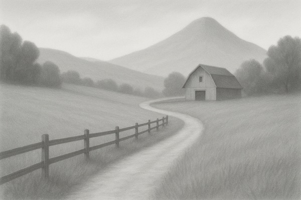 Notice how the winding path and the line of the fence in this drawing naturally lead your eye deeper into the picture, towards the barn? Using elements like these as 'leading lines' is a powerful way to guide your viewer towards your focal point.
2. Negative Space: The (Surprisingly) Powerful Emptiness!
This concept might sound a bit strange at first, but it's one of my absolute favourite composition secrets, and understanding it can make a huge difference!
Negative space simply refers to the empty areas around and between the main subjects (the 'positive shapes') in your artwork.
It's the shape of the plain background behind a portrait, the patches of sky seen between the leaves and branches of a tree, the space around a vase of flowers sitting on a table.
Why is paying attention to this 'empty' space so important?
- It Defines Your Subject: Often, the shape of the negative space around an object helps our brain understand and 'read' the shape of the object itself much more clearly. Here's a great trick: If you're struggling to draw the outline of a complex object accurately, try focusing instead on drawing the shapes of the empty spaces around it – you might be surprised how much easier it is!
- It Creates Balance and Breathing Room: As we touched on when discussing balance, areas of negative space are essential for visually counterbalancing the 'busier' parts of your drawing. Leaving some 'breathing room' around your subjects prevents the composition from feeling overly cramped, dense, or cluttered.
- It Makes Your Focal Point Stand Out: Deliberately leaving a good amount of clear, uncomplicated negative space around your main subject is a fantastic way to make it really 'pop' and draw the viewer's attention straight to it. Too much competing detail nearby can lessen its impact.
- It Improves Clarity & Simplicity: Thinking consciously about negative space often encourages you not to feel you have to fill every single centimetre of the paper with detail or 'stuff'. Sometimes leaving areas simpler, emptier, or less defined makes the elements you have included much stronger and the overall composition clearer. Remember, less can definitely be more!
 See the black background area around and between the leaves and pot? That's the 'negative space'. Try focusing on seeing (and even drawing!) the shapes of these black 'empty' areas – it's a great trick to help you accurately capture the outline of the plant itself (the 'positive space')
Using Lines and Space Together for Flow
Leading lines and negative space often work best when considered together.
A leading line that travels through a nice clear area of negative space will guide the eye much more effectively than one that has to fight its way through lots of background clutter.
Thinking about how you arrange both the 'things' and the 'spaces' in your drawing helps create compositions that feel intentional, clear, and easy for the viewer to navigate visually.
So, we've considered how to arrange things within the space of your drawing... but what about the basic shape of that space itself?
Let's briefly look at paper orientation...
Paper Orientation - Setting the Stage
Before you even begin sketching out your composition, there's a very simple but fundamental choice you make that sets the stage for your entire drawing: which way round will you orient your paper?
It seems basic, but consciously choosing your paper orientation can help enhance the subject you plan to draw.
There are two main formats we typically use:
Portrait Orientation (Vertical Format):
This is when your paper is positioned so it's taller than it is wide – think of a standard letter or A4 page held the usual way up.
As the name suggests, this orientation often feels like a natural fit when your main subject is a portrait of a person or animal.
Because it emphasizes height over width, it's also generally well-suited for subjects that are inherently tall and relatively narrow, such as a single standing figure, a tall tree, a flower vase, or looking up at a tall building.
Landscape Orientation (Horizontal Format):
This is when you turn your paper so it's wider than it is tall.
Again, the name gives us a big clue!
This horizontal format naturally emphasizes width and is often perfect for drawing expansive scenes like landscapes, seascapes, panoramic views, or wide-open skies.
It also works well for subjects arranged horizontally, like a group of objects in a still life or animals lying down.
Square format
You might also sometimes choose to work on a Square format paper, where the width and height are equal. This isn't as common for traditional subjects but can create a strong sense of balance and focus.
How to Choose Which Orientation to Use?
Often, the subject itself will suggest the best orientation. Ask yourself:
- Does my main subject feel naturally tall or vertical? Portrait might be best.
- Does my scene or subject feel naturally wide or horizontal? Landscape might suit it better.
- Which orientation will best emphasize the qualities I want to capture?
Remember Your Artistic License!
If you're working from a reference photo, you absolutely do not have to stick to the orientation of the original photo!
Feel completely free to crop the image differently or change the format for your drawing if you feel a different orientation will create a stronger or more pleasing composition.
It's your choice as the artist!
This simple decision about orientation is just one example of the many artistic choices you get to make when composing your drawing, which brings us perfectly to our final thoughts on the matter...
You're the Artist, You Decide!
And there we have it – a tour through some of the most useful basic concepts of composition! We've explored several helpful 'tools' that artists keep in their toolkit to make their drawings more structured, engaging, and visually appealing:
- Thinking about your Focal Point – the main star of your picture.
- Using the Rule of Thirds as a simple guide for effective placement.
- Creating a sense of visual Balance, whether symmetrical or asymmetrical.
- Guiding the viewer's eye with Leading Lines.
- Understanding and using Negative Space wisely to define subjects and avoid clutter.
- Making a conscious choice about Paper Orientation.
Please remember, all of these are guidelines and tools, not strict, unbreakable rules!
They are fantastic starting points, especially when you're learning or feeling unsure how best to arrange the elements in your drawing, but they are not meant to restrict your creativity.
Because the most important principle of all, overriding any guideline, is Your Artistic License!
I really want you to embrace this idea: When you are creating your artwork, YOU are the artist, and YOU are in charge.
- If you're working from a reference photo, you have the complete freedom (and often, should take it!) to rearrange elements for a better composition. Move that tree! Leave out that distracting car! Add an extra cloud!
- Don't like the lighting or the colours in the photo? Change them in your drawing to create the mood or effect you want!
- Feel the need to simplify a busy area or crop the scene differently for more impact? Go right ahead!
Composition isn't about finding the single 'correct' layout according to a formula.
It's about making thoughtful, conscious, creative choices to best express your vision, tell your story, or simply create a drawing that feels balanced, harmonious, and impactful to you.
Think of it as enjoyable problem-solving: "How can I arrange these elements to make this subject look its best?"
So, my best advice is to experiment!
Play around with these ideas. Try sketching the same subject using a couple of different compositional arrangements – maybe one centered, one using the Rule of Thirds.
See which one feels better to you and try to understand why.
Developing your own intuitive sense of good composition comes from this kind of practice, combined with observing artworks you admire (how did that artist arrange things?).
Use these guidelines we've discussed as helpful starting points, absolutely. But always trust your artistic instincts too, learn from what you try, and most importantly, have fun arranging the elements in your drawings to make them uniquely yours!
One fantastic way to quickly test out different compositional ideas before you commit hours to a full coloured pencil piece is by using quick, small planning sketches called thumbnails.
Let's find out exactly why they are so useful:
