- Home
- Mixed media
- Country Lane tutorial
Underpainting Colored Pencil Art: Enhance Your Drawings
Today, we're going to explore a valuable technique often demonstrated by artist Peter Weatherill: underpainting with watercolour pencils to enhance coloured pencil artwork.
This method is particularly effective for tackling common issues like those distracting white specks of paper that can break the illusion of realism.
Peter's approach not only helps create a smoother surface for your dry pencils but also adds wonderful depth and vibrancy from the outset.
I remember when Peter first shared his insights on using watercolour pencils as an underpainting base – it was a real eye-opener for many artists, including myself, show how these mediums can work together beautifully.
When I took over the Pencil Topics website from Peter in 2020, he had built up a fantastic library of tutorials, and this country lane project is a great example of his practical teaching style.
In this article, we'll walk through his process, and I'll add my own notes and thoughts along the way to help you get the most out of this technique.
Think of this as a 'process study' – a chance to learn by observing and understanding an experienced artist's workflow. This technique is best suited for artists who have some familiarity with watercolour pencils and are looking to explore mixed media.
For a broader look at layering methods, materials, and tutorials, see my complete guide to watercolour pencils.
Why Consider Underpainting with Watercolour Pencils?
Before we look at Peter's demonstration, you might be asking, 'How does underpainting with watercolour pencils actually help?' It’s a great question! This initial wash serves several key purposes:
- It fills in those tiny paper crevices, significantly reducing those distracting white specks.
- It can create a smoother surface for your dry coloured pencils to glide over.
- It provides a unified base tone, which can lead to more subtle and harmonious colour variations in your final piece.
- It can speed up your drawing process by establishing base colours and values quickly. The result is often a drawing with a new depth and richness.
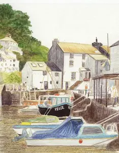
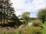
 Peter Weatherill's charming 'Country Lane' achieved with coloured pencils over a watercolour pencil underpainting. This tutorial explores his process for creating depth and vibrancy using this mixed-media technique. Follow along as we delve into his method for building up this beautiful scene.
Materials You'll Need
Watercolour pencils
Peter often used a variety of brands.
When choosing watercolour pencils for underpainting, consider how easily they dissolve. Some create smoother washes than others.
It's always a good idea to test your pencils first. While Peter had his favourites, brands like Caran d'Ache Supracolor or Museum Aquarelle are excellent for their high pigmentation and solubility.
For a good budget-friendly option that still performs well for underpainting, Staedtler Karat Aquarell pencils create smooth, even washes, though be mindful they can sometimes stain the paper.
Faber-Castell Albrecht Dürer pencils are wonderful artist-quality watercolour pencils, but be aware that some of their colours can granulate. While granulation is desirable in some pure watercolour techniques, for underpainting with dry coloured pencil layers on top, a smooth, even dissolution of pigment is usually preferred.
Watercolour paper
Peter used a quality watercolour paper. It's crucial to use paper designed for wet media to prevent excessive buckling.
For best results, especially with multiple washes, consider stretching your watercolour paper first.
Using good watercolour paper, such as Arches or similar, often means that applying water can soften the internal sizing, which can actually restore some of the paper's tooth – a benefit when you later apply dry coloured pencils.
Soft brushes
Palette (for mixing washes)
Craft knife (for scraping pigment)
Water container
Dry coloured pencils (for layering on top - my go tos are Polychromos)
The Country Lane Demonstration - With Peter's Images
Let's look at how Peter approached his country lane scene using this underpainting technique. The following steps are based on his original demonstration.
Step 1: Preparing the Watercolour Washes
Peter's method for creating washes involved carefully scraping a little pigment from the watercolour pencil onto a palette and then adding a small amount of water to create a thin, paint-like consistency.
He advised against drawing directly on the paper and then wetting, for this particular underpainting purpose, to maintain a light, controlled tint.
Peter's Tip: Avoid pencils that have white in their composition, as they won't provide a strong enough wash. Remember, less is more here - we want a light tint, not a thick layer of paint.
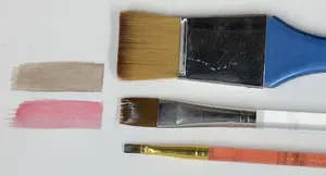
 Fig. 1: Preparing the watercolour pencil. A long, exposed pigment core, carefully sharpened with a craft knife, makes it easier to scrape off fine shavings for creating washes.
 Fig. 2: Dry watercolour pencil pigments ready for activation. Tiny amounts of pigment have been shaved from three different blue pencils into separate wells of the palette
This method of creating a puddle of colour on a palette gives you excellent control over the intensity of your wash.
Always test your colours on a scrap piece of the same paper before applying them to your main artwork.
As Peter demonstrated, colours can look very different in wash form compared to their dry state. For example, a Sky Blue with a lot of white might be barely visible, while a pure Blue can be quite intense.
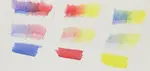
 sitting behind a piece of paper with the relevant swatch below each well. The three pencils are also laying on the paper.") Fig. 3: Testing the blue watercolour pencil washes. Water has been added to the dry pigments in the palette. Below each well, a test swatch on watercolour paper shows the resulting colour intensity. From left to right, the washes are Powder Blue, Sky Blue, and Pure Blue. Notice how the Sky Blue, which contains more white, creates a much lighter wash than the more intense Pure Blue.
Fig. 3: Testing the blue watercolour pencil washes. Water has been added to the dry pigments in the palette. Below each well, a test swatch on watercolour paper shows the resulting colour intensity. From left to right, the washes are Powder Blue, Sky Blue, and Pure Blue. Notice how the Sky Blue, which contains more white, creates a much lighter wash than the more intense Pure Blue.Remember, less is more here - we want a light tint, not a thick layer of paint.
Step 2: Initial Planning & First Washes
Peter often developed his compositions intuitively.
For this demonstration, which he drew from imagination, he started by placing the initial underpainting with plenty of space around it, allowing for later enhancements to the scene and composition.
He mixed a limited range of soft, pale greens, yellows, and oranges for the first thin washes.
Keeping the direction of light in mind was important for establishing shadows and depth, even at this early stage. His advice was to keep shading very light to maintain control.
 Fig. 4: Peter Weatherill's initial light washes for the country lane scene. Using a limited palette of soft greens, yellows, and oranges, the first thin washes are applied to block in the main elements – trees, the distant cottage, and the path. Notice how light these initial layers are, establishing basic tones while preserving the paper's brightness for later development.
Peter's approach to 'composing on the fly' is interesting.
While some artists prefer detailed preliminary drawings, developing a scene more organically can be a rewarding process, especially with a forgiving medium like watercolour pencil washes.
Using thin layers, as Peter advised, is key. It's always better to build up colour intensity gradually with two thin layers rather than one thick one.
If you'd like to see another example where an underpainting is established before adding dry pencil, the step-by-step of the Coventry Canal scene shows this.
Step 3: Developing with Second Washes
With the second layers of wash, Peter concentrated on areas where greater depth of colour was needed, further defining the forms and shadows in the landscape.
 Fig. 5: Building depth with further watercolour pencil washes. Peter has now applied a second layer, concentrating on areas where greater depth of colour and shadow are needed, such as beneath the trees and along the edges of the path. Notice how these carefully placed darker washes begin to sculpt the form of the landscape
Step 4: Transitioning to Dry Coloured Pencil
Once the watercolour underpainting was completely dry, Peter began to build up layers of dry coloured pencil on top.
He started by adding darker shades to create more definition and added an additional tree on the left to balance the composition.
 Fig. 6: Introducing dry coloured pencils. With the watercolour washes completely dry, Peter begins to build up form and detail using dry coloured pencils. Here, you can see the central tree and its trunk starting to take on more solidity and texture as layers of dry pencil are carefully applied over the initial underpainting.
Once the washes are dry you can begin to build up the dry pencil on top of the underpainting.
Step 5: Final Details and Adjustments
Peter then added the sky at the top and minimal work to the cottage to give an indication of windows and shadows, ensuring it blended seamlessly into the landscape.
He built up the right-hand greenery with more dry pencil.
In his final version, he mentioned making a subtle change by removing some underpainted foliage to the right of the copper beech tree to reveal more sky, noting an attempt to insert a cloud wasn't entirely successful but was barely noticeable in the original.
 Fig. 7: Building form with values. Peter continues to layer dry coloured pencils to build up the tonal values (lights and darks) in the trees, giving them a more three-dimensional appearance. He is now also extending this layering technique to the grass verges and hedges, establishing their form and texture over the initial watercolour pencil underpainting.
It's insightful how Peter continued to assess and adjust the composition throughout the process, even making changes to the underpainted areas.
This highlights that an artwork is often an evolution.
 Fig. 8: Peter Weatherill's finished 'Country Lane' – the culmination of watercolour pencil underpainting and dry coloured pencil layering. In the final stages, details such as the blue sky peeking through the foliage, clear windows in the distant cottage, and the interplay of light and shadow on the road have been added, bringing the scene to life. The initial underpainting provided a rich foundation, allowing the subsequent dry pencil work to build texture, depth, and vibrant colour.
His decision to keep the cottage details minimal is a great example of how to ensure background elements recede and don't compete for attention.
Looking at Peter's completed image above, we can really see the benefits of his watercolour pencil underpainting technique.
The colours have a wonderful luminosity, there's a beautiful sense of depth, and the initial washes have provided a harmonious base that unifies the entire scene
Your Turn to Experiment!
Peter's demonstration offers a fantastic insight into the watercolour pencil underpainting technique.
I encourage you to try something similar. Perhaps start with a simple subject as he suggested, like an apple or a leaf, or a small section of a landscape.
Experiment with different colours for your underpainting and observe how they influence your final dry pencil layers.
Remember, practice is key. Each attempt will teach you more about how the colours interact and how to achieve the effects you desire.
Don't be discouraged if your first go doesn't turn out exactly as hoped – see it as a learning experience. This technique can transform your artwork, adding a new level of depth and richness.
We'd Love to Hear From You
Have you tried underpainting with watercolour pencils?
What are your favourite tips or colour combinations? Please share your experiences or any questions you might have by dropping me an email from the Contact page.

I'm Carol Leather, a coloured pencil artist for over 15 years. Most of my teaching comes back to the same idea: realistic coloured pencil starts with structure, light and observation long before the colour goes down.
My work has featured in Ann Kullberg's Color Magazine, CP Magic and Color Pencil Treasures (vol 7). I'm a member of the UKCPS and was a prize winner in the Nature section of their Annual Open Exhibition in 2020.
You might like these
Stretching Watercolour Paper When Using Watercolour Pencils
Why stretching watercolour paper before using watercolour pencils is important for the best results. Also learn what NOT to do!
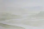
Watercolour Pencil Background Study & Lessons | Pencil Topics
Learn to paint atmospheric watercolour pencil backgrounds. A unique process study covering technique, composition, and learning from artistic challenges.
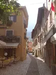
Watercolour pencil tutorial - Italian Street Scene
A step-by-step demonstration showing how to create an Italian street scene using watercolour pencils from Caran d'Ache
Copyright © 2009- pencil-topics.co.uk All rights reserved
Home | About Us | Contact Us | Privacy Policy