- Home
- Still life tutorial
Easy Coloured Pencil Still Life: Draw a Fruit Arrangement Step by Step
This friendly tutorial shows you exactly how to layer colour and choose pencil strokes so your fruit looks convincing, without needing special skills or lots of supplies.
In about 45–60 minutes, you’ll finish a realistic three-fruit still life using 8 pencils, even if you’ve never layered before.
Why choose this tutorial..
- Purpose-built for beginners: gentle pace, clear steps, no guesswork.
- Results you can see: layering for richness and depth; strokes that match each texture.
- Flexible with your supplies: works with most artist-quality coloured pencils and widely available papers.
- Optional head starts: printable outline and full notes if you want to skip freehand setup.

What you’ll learn
Layering: the core technique that gives coloured pencil its depth and glow.
Stroke choices for texture: scumbling for an orange’s dimpled skin; curved strokes for smooth apple and banana forms.
Colour control: using complements (green with red) to deepen shadows cleanly.
Finishing: light blending and confident burnishing for a polished look.
What you will need
To get the best results and enjoy the process, here’s what I recommend:
Pencils
You can use any brand of artist-quality coloured pencils.
Softer leads like Caran d'Ache Pablos, or slightly firmer Faber-Castell Polychromos. Polychromos layer beautifully thanks to their oil-based, slightly translucent quality.
Helpful colours for this project:
- Cream or very Pale Yellow
- Mid-toned Yellow (Cadmium Yellow or Lemon Yellow)
- Bright, warm Orange
- Light, cool Red (Rose Pink, leaning more towards purple than orange)
- Deeper Red (Cadmium Red Dark or Permanent Red)
- Lght to medium Green
- Sepia or dark warm Brown (Burnt Sienna or Dark Umber)
- Light Grey and a Blue of your choice (optional background)
Paper
Choose a surface with enough tooth to accept multiple layers.
Great options include: Stonehenge, Derwent Lightfast, or Strathmore 400 Series Bristol Vellum. A slight texture is most forgiving for this tutorial.
How this tutorial works
Set up quickly
We’ll work from the photo reference below. Before drawing, pause and look: identify big shapes, bright highlights, and shadow areas.
 The photo reference we will work from
1. Prefer a head start? Use one of these:
2. Create Your Outline:
With an H or HB graphite, lightly sketch the placement of the fruit. Keep pressure soft so early lines erase cleanly and don’t trap graphite under your coloured layers.
If you have them in your stash already, you might like to use ColErase pencils which, as the name suggests, are erasable, however, if you pick a similar colour to the item you are sketching in the outline is unlikely to be visible at the end of the project.
Don't press hard, as you could leave indents in your paper which cannot be removed.
3. Build colour in light layers
The key to believable colour is patience: stack thin layers and protect your highlights.
4) Finish with confident blending
Use your lightest pencil to blend softly where needed; burnish only after you’re happy with your layers.
Step-by-step walkthrough
1. The Orange: Capturing Zesty Texture
We'll start with the orange. Oranges have a lovely, slightly dimpled skin, and we can suggest this with our pencil strokes.
Warm Base: With Cream or Pale Yellow, softly shade the whole orange, leaving highlights as bare paper.

Introduce Texture: Use small, light circular strokes (scumbling) to suggest the dimpled skin. Keep your wrist loose.
Build Colour: Layer mid Yellow over the base with the same circular motion. Add a light pass of Orange in the shadow areas (sides and bottom). Add a touch of light Green at the stalk.

First Blend: Take your Cream pencil again. Using light pressure and circular strokes, go back over the fruit (avoiding the highlight and stalk).
This will gently blend the underlying colours, but because you're shading lightly, you'll retain some of the paper's texture, which adds to that lovely orange-skin effect.
Intensifying Colour: Repeat the Yellow, then Orange. Increase pressure slightly with Orange in deeper shadows to enrich the colour.
2. The Apple: Smooth Skin and Luscious Curves
Changing Strokes: This is important. Instead of circles, we'll use strokes that follow the curve of the apple's shape. Think gentle, curved lines that wrap around its form. This simple change is what will convince the viewer's eye that the apple is round and smooth.

Light Side First: Begin with the lighter part of the apple. Apply a soft, even base layer of your Cream or Pale Yellow pencil where the light hits it most directly. For any rosy patches on this lighter side, lightly introduce your cool-toned Red.
Colour Tip: If you're unsure about "cool" versus "warm" colours, it's all about where they sit on the colour wheel. Cool reds lean more towards purple, while warm reds lean towards orange. You can learn more in my guide to colour theory basics.

Sculpting with Colour: Introduce light Orange where the form turns from the light. Go easy, subtlety keeps the surface looking smooth.

Deeper reds, cleaner shadows: To create richer, deeper shadows in the red areas, we can use a touch of its complementary colour: green.

Blend and Intensify: Layer reds back over the green, transition into lighter areas, then blend gently with Cream for sheen. Reinforce key colours with slightly firmer pressure. Use Sepia or dark brown for the stem.
3. The Banana: Gentle Curves and Soft Hues
Follow the form: Use long, curved strokes that echo the banana’s shape.

Build Colour: Start with a light, even Cream layer, then add mid Yellow. Touch in light Orange for riper spots and a hint of light Brown for cast shadows from the other fruit. Use Sepia/dark Brown on the ends.
Optional realism: A few delicate brown specks can add believability.
Finishing with Burnishing: When happy with your layers, burnish with Cream—firm, even pressure to press pigment into the paper’s tooth for a smooth, waxy finish.
If burnishing is new to you, see: The Ultimate Guide to Burnishing Coloured Pencils
4. The Background: Setting the Scene
Fruit Bowl is copyright Peter Weatherill 2005-2020Keep it Simple: The fruit is the star. Suggest the plate and cloth with Light Grey and a Blue of your choice. Use a lighter touch and looser strokes than the fruit.
Crucial Shadows: Add cast shadows where fruit meets plate and plate meets cloth. This grounds the objects so they don’t float.
You’re done - here’s what to notice in your result
Depth from layering: those first light passes created glow; later layers added believable shadow and form.
Texture by stroke choice: circular scumbling for the orange; curve-following strokes for apple and banana; burnishing for a polished finish.
Control through complements: that whisper of green under red for clean, deep shadows.
Try the same process with other simple objects at home. Each small study builds your confidence and control.
Or repeat this coloured pencil still life after a while to see how your skills improve with practice.
You might like these
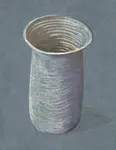
Pastel Pencil Tutorial for Beginners: How to Draw a Simple Vase
Try this pastel pencil tutorial with our beginner-friendly vase drawing tutorial. Learn layering, blending, and shading to create a simple still life drawing.
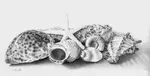
Still Life Objects for Coloured Pencil Storytelling
Learn how to choose meaningful still life objects, from toys and books to keepsakes. Use colour, light and texture to turn them into emotive pencil art.
You might like these
Pastel Pencil Tutorial for Beginners: How to Draw a Simple Vase
Try this pastel pencil tutorial with our beginner-friendly vase drawing tutorial. Learn layering, blending, and shading to create a simple still life drawing.
Still Life Objects for Coloured Pencil Storytelling
Learn how to choose meaningful still life objects, from toys and books to keepsakes. Use colour, light and texture to turn them into emotive pencil art.
Copyright © 2009- pencil-topics.co.uk All rights reserved
Home | About Us | Contact Us | Privacy Policy