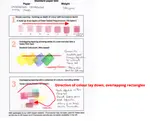
- Home
- Paper choices
- Coloured Pencil Paper
Testing Coloured Pencil Paper Suitability: An Artist's Review
Understanding how different papers perform is important when choosing the right surface for your coloured pencil art.
This artist's review details a series of suitability tests where the same subject was drawn on 8 different paper surfaces using a consistent selection of pencils.
Explore Peter's findings and observations to see how each paper handled the demands of detailed artwork.
Peter's Chosen Pencils
The same pencil selection was used throughout the tests, and Peter drew the same subject. Just the paper changed.
He selected a range of colours from the Faber Castell Polychromos pencils along with a Caran d'Ache black and white. Here is the list of pencils:
- Sanguine - 188
- Light Yellow Ochre - 183
- Warm Grey 2 - 271
- Cold grey 6 - 235
- Caran d'Ache Pablo black - 009
- Caran d'Ache Pablo white - 001
The Subject He Chose to Draw
 Peter's chosen subject for testing the papers: a 3.5-inch pottery figurine of a Welsh Slate Miner, a souvenir from Snowdonia.
The subject chosen was a small pottery figure of a Welsh Slate Miner. The figure is 3.5 inches (9 cm) tall and was a souvenir from a trip to the old slate mines in Snowdonia (North Wales) several years ago.
The procedure adopted was to transfer the outline of the image to each paper by a trace and then apply white pencil to those areas where the white or light shades were to appear. This gave a white foundation so that the later colours applied came out paler than otherwise.
Where dark tones were required, the greys were added after the main colour was laid down. In one or two cases, solvents or burnishing were used, and in these we show the "before and after" images.
Paper Test 1: Simple White Card

This was our first example. Peter spent nearly 3 hours on this particular test. He writes...
"I thought the paper was an Italian print making paper called Canaletto Liscio, but later checks showed it was much smoother and was in fact a real problem to use with coloured pencil.
The final attempts to get the colour to produce a smooth effect just led to the top coats slipping around. I now believe the surface was a simple white card of about 250gsm.
I gave up the work in the end and moved on to the examples of work on papers I could be sure of. It proved that if you use the right paper the finished result will be better and also take less time and trouble."
Conclusion: Based on this test, basic white card proved unsuitable for achieving the desired smooth layers and depth with coloured pencils.
Paper Test 2: UART 800 grit paper

This time Peter selected some UART 800 grit paper. The number relates to the grit surface - the higher the number the finer the grit.
The link above is an affiliate link, this means if you use it to purchase from Amazon I will earn a little commission which helps to keep the site online, without costing you a penny extra! Thank you.
Many people consider a sanded paper of this type to be the best paper for coloured pencils - so let's read about Peter's experience and thoughts...
"The figure here took an hour to complete. The grit takes a good layer of pencil down, but it is not as easy to get fine detail. The image is only 3 inches high, I dare say I could have worked longer and put down more colour to give better shaping to the arm and base."
Conclusion: While challenging for fine detail at this small scale, the UART 800 grit's ability to take pigment suggests it could be a suitable choice for larger scale coloured pencil pieces where texture is also a feature.
Paper Test 3: Fabriano Classico 5 Watercolour Paper
A much more satisfactory result for test three.
"I decided to try an underpainting using watercolour pencils and this was tested on Fabriano Classico 5 watercolour paper (300gsm).
In the first image you can see the mid way point with the original dry pencil on the right and on the left I went over that with a damp brush.
The traditional coloured pencil were then applied to give the final result shown in the second image. This took a fraction over the hour and I was much happier with the result."
 Mid-stage of Test 3 on Fabriano Classico 5 paper, demonstrating the watercolour pencil underpainting technique being activated.
 The finished slate miner from Test 3, demonstrating the effect of layering traditional coloured pencils over a watercolour pencil underpainting on Fabriano Classico 5 paper.
Conclusion: Using a watercolour paper, along with watercolour pencils as a base, worked well.
Paper Test 4: Hermes 400 Grit Paper

Moving back to a sanded paper for this test, it was worked on Hermes 400 grit paper.
"As you can see the finish is much rougher on the rougher grit paper. Very quick to do (about 30 minutes) but not a lot of opportunity to improve on detail.
Note how bright the white areas are. This is down to the amount of pigment the grit holds."
Conclusion: The rougher texture of the Hermes 400 grit paper made achieving fine detail on this small subject difficult, indicating it is less suitable for precise, small-scale coloured pencil drawings.
Paper Test 5: Stonehenge Light Grey Paper
 Coloured pencil on Stonehenge light grey paper (Test 5). A well-regarded paper that is very absorbent and allows for extensive layering.
This time Peter used Stonehenge light grey paper. A very good paper for coloured pencil and loved across the pond in the USA by many. Peter writes...
"Not too happy with my blending of the final layers, but I wanted to produce a comparable result for the same time as the other tests. This took an hour."
Conclusion: This paper is definitely suitable for using with coloured pencil. Personally, I find it can soak up the pencil as it is very absorbent, and may need further layers the next time I come back to the project. It will, however, take many, many layers so that is not a problem as far as I am concerned. It is one of my "go to" papers.
Paper Test 6: Strathmore Bristol Smooth paper

Peter used Strathmore Bristol Smooth paper for this test. It is very smooth and allows lots of fine detail, although the number of layers possible can be somewhat limited. Peter commented...
""This was a 45 minute exercise. Nice paper and a satisfactory result"."
Conclusion: If you like a smooth paper, with little tooth, this may be the one for you. Perhaps ideal for botanical artists?
Paper Test 7: Somerset Black Velvet paper

Somerset Black Velvet was used for the next test. This is much smoother than the grit papers and is also very good for pastels.
"Well under the hour for this one, but you have to be particularly careful not to rub the light colours onto the black background with the heel of your hand as you work.
Very effective and quick, but probably not a perfect example. I like working on black papers and the Somerset Velvet is a very good one. As well as being lightfast (non-fading) it has a good surface."
Conclusion: Ideal if you like working on black paper.
Paper Test 8: Canson 300gsm Watercolour Paper (with heat application)
For this final test, Peter decided to try an experiment, as he had some trouble with final layers in earlier examples.
"On a sheet of Canson 300gsm watercolour paper, I worked a similar coloured pencil base as in the other examples, but this time took a photo of the basic colour as applied. You will see it has many similarities to the other tests above in that they layers are not as even as I would like.
I then took a hand held craft heat gun and warmed up the surface on the pad until the wax pigment was soft. I then applied a "bone folder" tool to burnish and smooth the warm wax which resulted in a very much superior image. Any variations from the images above which possibly make it look like a different image are down to my photography!
I hadn't tried heating the wax image before, and it has much the same result as water on aquarelles in making the colours more intense. I think that you do need to have the image on a pad or a heat retaining surface to keep the warmth in the area you are targeting. Worthy of more investigation, perhaps!"
 Test 8 on Canson 300gsm watercolour paper: The slate miner drawing on the left shows the base coloured pencil layers. The image on the right shows the significantly smoother and more intense result after applying heat to soften the wax pigment and burnishing.
To Sum Up
This review of eight different paper surfaces showcases the diverse results achievable with the same coloured pencils simply by changing the paper. These tests aimed to illustrate how various papers handle detailed work and their suitability for such tasks.
While these examples provide practical insights, the ideal paper for your coloured pencil art is a personal discovery. We encourage you to experiment!
To learn more about what to consider when selecting papers, visit our main Guide to Coloured Pencil Paper.

I'm Carol Leather, a coloured pencil artist for over 15 years. Most of my teaching comes back to the same idea: realistic coloured pencil starts with structure, light and observation long before the colour goes down.
My work has featured in Ann Kullberg's Color Magazine, CP Magic and Color Pencil Treasures (vol 7). I'm a member of the UKCPS and was a prize winner in the Nature section of their Annual Open Exhibition in 2020.
You might like these
Paper & Pencil Tests: 3 Brands on 15 Surfaces Reviewed
Make informed choices! Our coloured pencil & paper tests show how brands like Faber-Castell & Derwent behave on various art surfaces. See the results.
Coloured Pencil on Black Paper: Best Papers, Techniques & Demo
Which black paper works best for coloured pencils? Compare Stonehenge, Somerset Velvet and more. Step-by-step sweet jar demo plus tips on paper fading
Stretching Watercolour Paper When Using Watercolour Pencils
Why stretching watercolour paper before using watercolour pencils is important for the best results. Also learn what NOT to do!
Copyright © 2009- pencil-topics.co.uk All rights reserved
Home | About Us | Contact Us | Privacy Policy