- Home
- Paper choices
- Black paper
How to Use Coloured Pencil on Black Paper
In short
Sketch your outline in white pencil, then apply colour straight onto the black with no white base underneath. Work from your darkest shade back toward the light, and save the true highlights until last so nothing muddies them.
Black paper gives you the shadows before you start. On white paper you build every dark yourself; on black, the dark is already there and the only thing left to make is the light. That is why a drawing on black can look lit from the inside.
It also asks you to work backwards from everything you are used to, which is why a lot of first attempts come out muddy. This page is the method that fixes that, followed by a full demonstration you can sit down and copy.
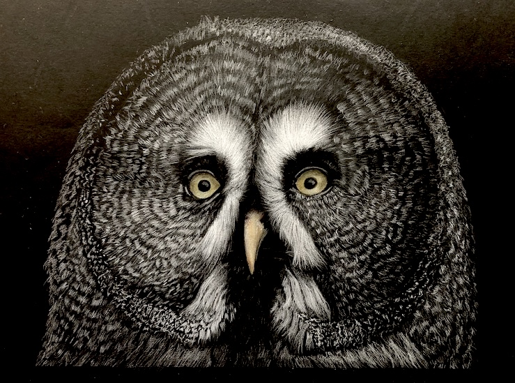
Mostly white pencil, with colour kept back for the eyes and bill
Choosing your paper first? Four black papers are compared side by side, with the same pencil on each, in black paper for coloured pencils, four papers tested. Come back here for the technique.
What colours show up on black paper?
Quick answer
Opaque, light-valued colours read. Transparent ones sink in and disappear. Opacity matters more than hue, and you can test it in two minutes.
The usual advice is to use light colours, which is true and not very useful, because plenty of pale colours vanish on black while some mid-tones sing.
What is really deciding it is opacity. A transparent pigment lets the black beneath show through, so it reads as a slightly tinted shadow. An opaque one sits on top and reads as itself.
The two-minute opacity test
Draw a thick black line on white paper with a permanent marker, then lay a block of each colour across it. The ones that hide the line are your opaque colours and they will work on black. The ones that let the line show through are glazes, and on black paper they will disappear.
It takes one sheet and it tells you more about your own set than any chart of somebody else's.
Do the test once, mark the opaque ones, and you will stop guessing.
Choosing the right image for a black background
Black paper brings certain images to life and flattens others. Look for these:
- High contrast, with genuine bright highlights. If the reference is mostly mid-tones, black paper has nothing to push against.
- Something lit from behind or from one side. Rim light is what black paper does better than white ever will.
- A subject you can isolate. Backgrounds are already done for you, which is half the appeal.
Two rules of thumb once you start: apply colour directly, with no white base underneath, and begin with harder pencils before layering softer ones over the top for the detail.
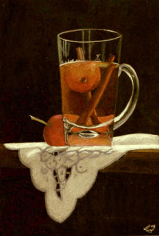
Crabapple Tea, one of Peter's early experiments on black Stonehenge in Polychromos and Luminance, from a photo by Gemma Gylling CPSA
If some of your colours are looking stronger than you expected and others weaker, that is worth understanding rather than fighting. These colour basics for coloured pencil artists explain why a dark surface changes what each colour does.
Let's look at the process
Sketch your outlines with white pencil before applying any colour. The photos below are Peter Weatherill's, showing one drawing from reference photo to finished piece.
The subject is the wooden storefront of a French wine merchant, sitting in a row of half-timbered buildings. On white paper this scene is a slog: the window grill, the posters and the lettering all have to be drawn around. On black, the white pencil goes straight to the light and the dark takes care of itself.
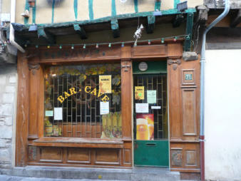
The reference photo
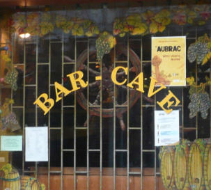
The window, close up
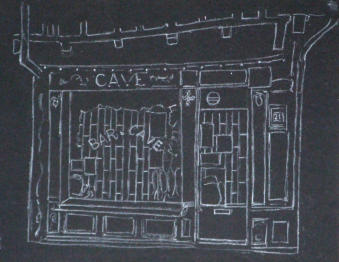
The outline in white pencil
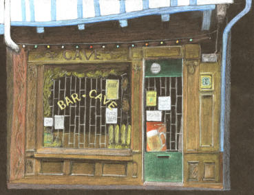
Finished
That was one afternoon's work, and Peter calls the result "a fairly respectable" shop front. The white pencil carries the detail and the timber framing on the upper storey, and none of it needed a single dark laid down.
It is not perfect and it is not meant to be. The point is that starting from black is a different route to the same place, and often a shorter one.
Step by step demonstration
Now a full demonstration, worked through properly. This one is Peter Weatherill's, from his own course notes, and the reference photo is below to download so you can draw along with him.
The subject is a glass jar of sweets, or candies for my American readers, sitting on black mount board. The family had eaten a few before the photo was taken, so some inventing was needed along the way.
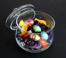
The reference photo
Draw along: Download the high-quality reference photo (PDF). Print it at the size you want to draw and work from the print rather than a screen. Judging a value against a backlit screen will mislead you every time, and on black paper value is the whole game.
Drawing the glass jar
There are five curves that have to be right: three on the lid, the top edge of the jar, and the bowl. Trace those from the reference rather than drawing them freehand. Glass is unforgiving and a wobble in a curve reads as a dent.
Everything else can go in freehand. Tracing the structure and drawing the rest is not a shortcut, it is putting your effort where the skill lives.
Which pencils to use
Narrow your focus to one brand for the whole drawing rather than mixing four. On black you are learning how much pressure a given pencil needs before it reads, and that lesson does not transfer cleanly from one brand to another.
Peter worked this demonstration mainly in Caran d'Ache Pablo, borrowing a few Polychromos for their better reds. Eight brands charted side by side on black, with what separated them, is on the paper page.
Because contrast is doing so much of the work here, it helps to be clear about what value means in drawing before you choose your colours.
The technique
Start with two or three sweets from the reference and place them where you want them in the jar. You are composing, not copying.
Work with four versions of each colour: the lightest tint, two intermediates, the darkest shade, plus white for the highlights.
For the foil-wrapped sweets, begin with the highlights. Let the white run slightly past where the highlight really ends, then fade it out. Then work backwards from the darkest shade in each sweet. When you reach the lightly applied white, keep going over it, and you get a smooth gradient from dark to light with the highlight preserved inside it.
For the translucent wrappers, find where the colour transitions happen and test them on a spare corner first.
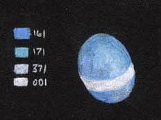
Blue
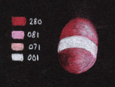
Red
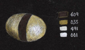
Cream
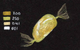
Gold foil
With the method for one sweet settled, the rest of the drawing is repetition. To build brighter, cleaner colour rather than pressing harder too early, these layering techniques for coloured pencils are the ones to use.
The sequence below is the drawing coming together.
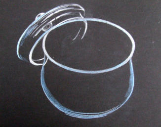
The outline
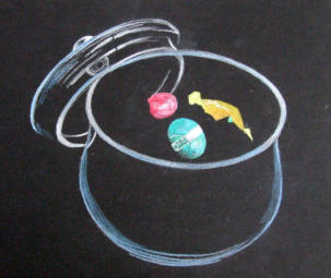
First sweets in
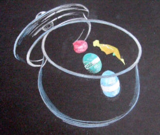
Building up
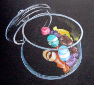
Filling the jar

Finished. Compare it with the reference and you will spot the sweets that were invented to fill the gaps
Adding the finishing touches
The last stage is tidying: edges sharpened, missing parts of the egg wrappers completed, the twisted ends of the transparent wrappers refined. Richer colour and the final highlights go in with a very fine point.
After a lot of layers of Pablo the paper reaches its limit and stops taking pigment. That is the moment to switch to something softer, and Luminance will still lay down over the top when Pablo will not.
A pale blue reflected backlight in the glass lifts the luminosity without shouting. Then clean the surface with a ball of Blu Tack to lift the loose pigment dust, and sharpen a few selected edges back with a clean plastic eraser.
White coloured pencil on black paper
Quick answer
White will not cover in one pass on black paper. Build it in layers, and let it run slightly beyond the edge of the highlight before fading out.
This is the single most common frustration with black paper, and it is almost never your pressure.
A white pencil on an absorbent black surface lays down grey on the first pass. Pressing harder does not fix it; it just burnishes the tooth flat so that the second layer has nothing to grip. Build it instead, in light passes, and let it come up gradually.
Two things make a real difference. First, whites vary far more between brands than colours do, and a hard waxy white will stay grey however patient you are. Second, laying white down first and working colour over the top gives you a paler, cooler version of that colour than the same pencil on bare black. It is a way of controlling strength without changing pencils.
Which white? Ten white pencils swatched side by side on the same black sheet, from Derwent Drawing and Chromaflow through to Luminance, are in which white pencil shows up best on black paper. The gap between the best and the worst is not subtle.
A second example: the same scene, two different blacks
This one started as a challenge. A student of Peter's decided to tackle a Venice reference on black paper, which Peter had not tried at that point.
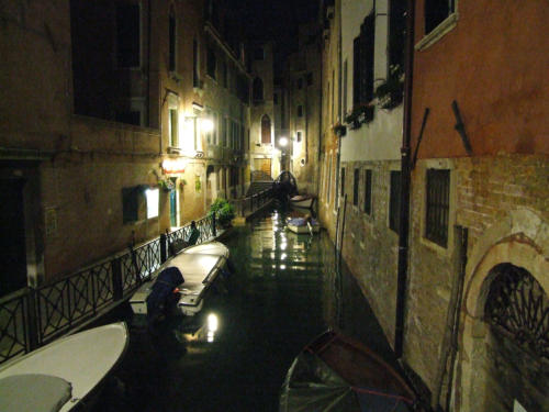
The reference: streetlamps, reflections, and a lot of very fine light against very dark
The student worked on black Stonehenge, a smooth and absorbent surface, in Polychromos. An in-progress scan came back to Peter part way through.
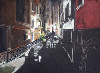
In progress
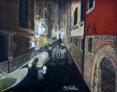
Finished
Peter was not remotely surprised to see the brickwork given star billing in the finished piece. The student was an engineer.
Months later he tried the same photograph himself, on a rougher black paper, and ran straight into the thing that smooth paper had spared the student.
The grain broke up every light area. The streetlamps and the reflections on the water came out flecked with black, and the railings, which needed fine light lines against an already light footpath, were close to impossible.
Same image, same medium, same artist's method. The paper decided the outcome. What surface texture does to your whites goes into why, with four papers side by side.
How he got round it
He stopped trying to make the pencil do it. White soft pastel went down first over the footpath, the top of the foreground boat, the lights and the canal wall, blended down into the grain so the low points filled.
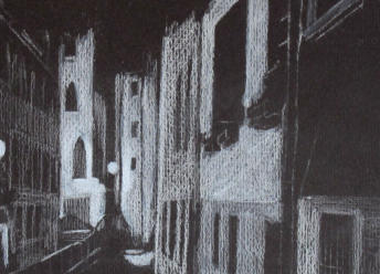
The problem: grain flecking the lights
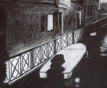
The fix: white pastel blended into the grain
Over that went a layer of white Supracolor, washed in to bulk the pigment up with the pastel, and once dry another dry layer of white on top. That gave a base solid enough to draw the railings back into with a fine black point, which is far easier than trying to leave them as untouched paper.
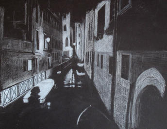
Still in the to-do file
The picture has never been finished. That is a more honest ending than most tutorials get, and the lesson survives it: when the paper is fighting you, change what you are putting down rather than how hard you press.
Using pastel with coloured pencil on black paper
What Peter did to rescue the Venice scene is worth knowing as a method in its own right, not just as a repair. Pastel first, pencil second, is a good way to work on any black paper with a pronounced tooth.
A whole drawing built that way from the start, a Lake District cottage doorway in pastel and coloured pencil, works through it stage by stage.
Common questions about coloured pencil on black paper
Do you need a white base under coloured pencil on black paper?
No. Apply colour directly to the black. A white base flattens the depth you came to black paper for. Laying white first is a deliberate technique for keeping a colour pale, not a default first step.
Can you use ordinary coloured pencils on black paper?
Yes. No special pencil is needed. Softer, more opaque ranges cover in fewer layers, which suits black, but you can start with what you already own.
How do you sketch an outline on black paper?
Draw it in white pencil, lightly. For anything with precise curves, tracing from the reference is more reliable than freehand, and it lets you spend your effort on the rendering.
Why does my white pencil look grey on black paper?
White needs building in layers on black, and a single pass always reads grey. Pressing harder flattens the tooth and makes it worse. The brand matters here too, more than it does with colours.
How many layers does coloured pencil need on black paper?
More than on white. The paper absorbs pigment and most surfaces reach a limit after several layers, at which point a softer pencil will still take when a harder one has stopped.
Does black paper fade?
Cheap black paper does, and it takes your drawing's contrast with it. Archival black holds. There is a simple window test on the black paper page.
Which black paper is best for coloured pencils?
Fabriano Black Black is the darkest of the four I have tested. The full comparison is here.
How do you clean up a black paper drawing?
Lift loose pigment dust with a ball of Blu Tack rather than brushing it, which just spreads it, and sharpen edges back with a clean plastic eraser.
Where to go next
Which black paper, and which pencils on it
Four black papers tested with the same white pencil, eight pencil brands charted, ten whites compared, and a simple test for whether a black will fade.
Pastel first, coloured pencil second
A cottage doorway on black paper, blocked in with pastel then finished in pencil, for when the paper grain is breaking up your lights.
How to build colour in passes so it stays clean, which matters more on black than on any other surface.
Why the lightness of a colour decides whether it reads on black, and how to judge it before you commit a pencil to the paper.
Copyright © 2009- pencil-topics.co.uk All rights reserved
Home | About Us | Contact Us | Privacy Policy