- Home
- Watercolour pencils
- Watercolour background
Lessons in Landscape: A Watercolour Pencil Background and Composition Study
Welcome! Many of us who love to draw and paint are drawn to the beauty of landscapes, aren't we?
Capturing that sense of atmosphere, the soft recession of hills into the distance, or the gentle play of light can be incredibly rewarding.
Watercolour pencils offer a wonderfully versatile way to achieve these effects, particularly for creating lovely, layered background washes.
In this article, we're going to take a slightly different approach to a tutorial.
Instead of a step-by-step guide to replicate an exact scene, we'll be diving into a process study.
In simple terms, this means we're focusing on the how and why behind an artist's work during its creation, from the initial techniques to the decisions made along the way, rather than just aiming to reproduce a final image.
We're fortunate to have a documented session from Peter Weatherill, the original founder of Pencil Topics from whom I took over the site upon his retirement, as he worked on a "Scottish Hillside" piece.
Our focus will be on exploring his method for creating atmospheric backgrounds using watercolour pencil washes lifted from a dry pigment palette – a fascinating and effective technique.
But just as importantly, we'll be observing how an artist makes decisions as a painting unfolds. We'll see Peter's compositional choices, his adjustments along the way, and his candid reflections on the process.
As you'll discover, not every artistic endeavour results in a 'masterpiece' ready for framing. Sometimes, the greatest value lies in the lessons learned from the journey itself – and Peter was always generous in sharing those.
While this particular piece presented some compositional challenges for him in its final stages, the techniques he employed for the background washes, and the insights into an artist's evolving vision, are incredibly valuable for any of us looking to develop our skills with watercolour pencils and our understanding of landscape art.
So, let’s explore Peter’s Scottish Hillside journey together and see what practical wisdom we can gather.
Setting the Scene: Peter's Approach and Materials
This particular exploration of creating a Scottish hillside scene began when Peter Weatherill demonstrated his technique for painting a background using watercolour pencils.
This took place during a workshop at Knuston Hall, and thankfully, he documented the process with photos, allowing us to learn from his session.
What I find particularly interesting is that Peter often painted such scenes from memory, composing the picture as he went along rather than working from a specific photo reference.
This approach really allows for spontaneity and for the painting to evolve organically, as we'll see.
Before we study Peter’s own words describing the initial steps, let’s take a look at the materials he chose for this demonstration:
- Paper: A fresh piece of stretched Fabriano Classico 5 Hot Pressed paper. (If you'd like to know more about watercolour papers, you might find my guide on choosing paper helpful).
- Water and Palette: A row of small bowls containing clean water, and a small sheet of rough paper – Peter used this to scribble the pigment from the pencils onto, creating a dry palette to then lift washes from.
- Brushes: A nylon no. 6 brush and a watercolour wash brush. (For tips on selecting brushes, see my guide to watercolour pencil brushes).
- Pencils: A set of Caran d'Ache Supracolor watercolor pencils. Peter favoured these for their quality.
It’s worth noting that links to specific products like the Caran d'Ache Supracolor pencils may be affiliate links. This means if you choose to purchase through them, I might earn a small commission at no extra cost to you, which helps support the running of Pencil Topics. I only recommend products I genuinely believe are of good quality and suitable for the techniques discussed.
Now that we've set the scene and looked at the tools, let's follow Peter's process.
The Core Technique: Creating Your Watercolour Pencil Wash Palette
One of the key methods Peter Weatherill used in this "Scottish Hillside" study, and a wonderfully versatile technique for creating soft, controlled watercolour washes from your pencils, is to prepare a temporary "palette" of dry pigment.
This allows you to lift colour with your brush and mix your washes to the desired consistency before applying them to your main artwork.
Here’s how he described setting it up:
Begin by scribbling your chosen pencils onto rough watercolor paper. Then moisten those patches, allowing them to be lifted with a brush and mixed with water to create thin, pale washes. It's best to prepare more pigment than needed, as you'll use very little and it's easier to make excess than to recreate a colour later.
 Peter's setup for the Scottish Hillside study. On the rough paper, you can see the dry watercolour pencil swatches ready to be activated. Above it, a plastic palette holds the activated liquid washes, mixed and ready for painting.
My thoughts/Tips for This Technique
This method of creating a 'palette' from your watercolour pencils is incredibly useful, especially when you want very delicate, controlled washes for something like a landscape background.
- Why use rough paper for the scribbled palette? The texture of rough paper helps to 'grab' more pigment from your pencils as you scribble, giving you a richer source of colour to lift from.
- Controlling Wash Intensity: By scribbling a dense patch, you can create a stronger wash. For paler washes, scribble more lightly or dilute the lifted pigment with more water in your plastic palette.
- Mixing Colours: You can easily mix colours by lifting pigment from two different dry swatches with your brush and blending them in a well of your plastic palette before applying to your main painting.
- A Little Goes a Long Way: As Peter noted, you often need very little dry pigment to create a surprising amount of liquid wash, especially for pale background layers. However, it’s always better to have a bit too much prepared than to run out and have to stop and try to match a colour mid-wash
This technique really highlights how watercolour pencils can be used in a way that’s very similar to traditional pan watercolours, giving you great flexibility.
Applying the Initial Washes: Building Atmosphere Layer by Layer
With his palette of liquid watercolour pencil washes prepared, Peter then began to build up the background for his Scottish Hillside scene. He described his approach for these initial layers:
I apply thin layers of colour wash to dampened, stretched paper, allowing the colour to flow smoothly over the surface. Since the actual colour is very thin, multiple layers are often needed to build a soft background effect.
Keep in mind that watercolour appears darker when wet than it will when dry.
I began painting the hills without a plan, leaving the unpainted white areas to potentially become a road or stream as the picture evolves. For the sky, I started with two layers of pale blue, derived from a darker, purplish ultramarine.
Although the photo quality isn't ideal, you can still see how each thin layer of colour builds on the previous one, allowing for total control over the graded colour.
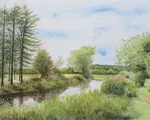
 Peter's initial pale washes for the Scottish Hillside. Notice the soft, layered application of colour for the sky and emerging landmasses, with areas of white paper left untouched for potential features like a road or stream
To give you a clearer view, here's a scaled-up portion of the washes with adjusted colours.


My Commentary/Thoughts on This Stage
This stage of Peter's process really highlights a couple of key things for anyone learning to create landscape backgrounds with watercolour pencils:
The Beauty of Layered Washes: Applying multiple, very thin layers of colour, as Peter did, is a fantastic way to achieve subtle gradations and a real sense of atmospheric depth. Each transparent layer interacts with the one beneath it, creating luminous and complex colours that are hard to achieve with a single, heavy application. It gives you incredible control.
Working on Dampened Paper: Peter mentions applying the wash to "dampened, stretched paper." Working on pre-dampened paper (where the whole sheet is lightly and evenly moistened with clean water and allowed to lose its initial shine) helps the washes flow very smoothly and encourages soft edges, which is often desirable for skies and distant landscape elements.
Of course, your paper must be properly stretched to handle this without excessive buckling!
Composing 'On the Fly' - Pros and Cons: Peter's admission that he "began painting the hills without a plan" is a very honest insight into one way artists sometimes work.
- The Pro: It can be a very intuitive and freeing way to explore, allowing the painting to evolve organically. Sometimes wonderful, unexpected compositions can emerge from this less structured approach.
- The Potential Con (especially for beginners): Without at least a basic compositional idea or a reference, it can be easy to lose direction, as Peter himself later found.
While leaving some white areas for 'potential' features is a good tactic, having a general sense of where you want your main masses, light source, and focal points to be can prevent the painting from becoming disjointed later on.
Observation about Wet vs. Dry Colour: Peter's reminder that "watercolour appears darker when wet than it will when dry" is a vital one. Always allow your washes to dry fully to accurately judge their value and intensity before deciding to add more layers."
Developing the Landscape: Compositional Choices and Emerging Forms
After establishing the initial soft, atmospheric layers, Peter then began to give more definition to the landscape and make more concrete compositional choices. He described this stage as follows:
I've developed the colour washes, defining the left-hand hills as mountains and adding a darker line of hills on the right.
As I progress, I make decisions on background details on the fly.
The next step was to add shadows along the road and stream edge. Although the overall subject is still unclear, the hillsides are taking on a Scottish feel, with warmer, golden colours emerging in the foreground.
 The Scottish hillside scene taking shape. Peter has further developed the watercolour pencil washes, defining distant mountains and hills, and introducing warmer foreground colours. The path of the stream (or potential road) is becoming clearer, and shadows are starting to add form.
My Commentary/Thoughts on This Stage
Watching Peter develop these washes and start to define the forms in his landscape is fascinating, and there are some really key takeaways here for anyone learning to paint with watercolour pencils, especially for landscape work:
- The Power of Layering: Peter mentions developing the colour washes and adding darker lines for hills. This is a beautiful demonstration of the technique of layering watercolour pencil washes.
By applying thin, transparent layers one over another (allowing each to dry or working into damp areas for softer blends), you can build up incredible depth, richness, and subtle colour variations that are hard to achieve in a single, thicker application. It gives you so much control over the final values and hues. - Atmospheric Perspective Through Colour Temperature: Notice how he mentions "warmer, golden colours emerging in the foreground," while the distant hills and mountains retain cooler blues and greens. This is a classic use of colour temperature to create atmospheric perspective.
Warmer colours tend to advance or come forward in a picture, while cooler colours recede.
By thoughtfully placing warmer tones in your foreground and cooler tones in your distant elements, you can create a much greater sense of depth and space in your landscapes. - Watercolour's "Mind of Its Own" and Adapting Your Plan: I always say that watercolour, even when it comes from a pencil, can sometimes have a "mind of its own"!
You'll find that washes can blend and flow in ways you don't entirely predict, and colours can interact to create unexpected (but often beautiful) results.
Peter's comment about making "decisions on background details on the fly" really speaks to this. It highlights an important skill for artists: the ability to be flexible and rethink your approach as the painting develops.
Even if you start with a clear plan or composition in mind (which, as Peter later notes, is generally advisable!), you often need to adapt and respond to what's happening on the paper. This adaptability is a key part of the creative process. - Establishing Light Direction with Early Shadows: Peter mentions adding "shadows along the road and stream edge" at this stage.
Getting these foundational shadows in relatively early, even if they are soft and subtle to begin with, is very important. They immediately start to define the form of the land and, crucially, help to establish the direction of your light source.
Once you know where your light is coming from, all your subsequent decisions about highlights and shadows throughout the painting will be much clearer and more consistent, leading to a more believable and three-dimensional scene.
This stage of Peter's painting really showcases how an artist interacts with the medium, making decisions and adjustments as the landscape begins to emerge from those initial washes. It's a blend of technique and intuitive response.
Peter continued to build upon the initial washes, making significant adjustments as the scene evolved. He notes:
I added more ochre washes to the green, then stepped back to reassess the picture.
I've since introduced Highland cattle on the right and trees in the middle distance.
To create contrast, I applied darker shading to the left-hand side of the high ground in the distance. I've also decided to replace the road in the foreground with a stream, which will add more interest to the scene.
 Peter introduces key elements like the Highland cattle and a foreground stream, while also adjusting tonal values to build contrast.
My Commentary/Thoughts on This Stage
This stage really highlights the dynamic nature of working with watercolour and composing as you go. Peter isn't afraid to make quite substantial changes, like replacing the road with a stream. This is a great example of how a painting can tell you what it needs if you're open to listening.
The introduction of the Highland cattle is a classic focal point for a Scottish scene, and it's interesting to see how he's beginning to place them.
Notice how the darker shading on the distant hill starts to push it back, enhancing that sense of depth we talked about earlier – a subtle but effective use of atmospheric perspective and value contrast.
Adding the ochre to the green would likely warm up those areas, perhaps suggesting sunlight on the hills, and it's a good reminder that greens in a landscape are rarely just one 'green'. Layering different tones, even subtly, creates a much more believable and interesting effect.
The decision to change the road to a stream is a significant compositional choice.
Streams can act as wonderful leading lines, guiding the viewer's eye into the picture. It also introduces a different texture and reflective quality to the foreground, which can add a lot of visual interest. It shows courage to alter a key element like this mid-process, but sometimes those bold decisions are exactly what a piece needs to come alive.
Further Refinements & The "Oops!" Moment: Learning About Balance
Peter writes:
I applied a damp brush to the dry pencil areas, to intensify the colors in the background.
Next, I added more green shading to the grazing areas and distant lower ground, but I'm not convinced it's an improvement. I'll correct this once I decide on my next step.
 The background colours are intensified, and more green has been added to the foreground, though Peter expresses doubt about this latest addition.
My Commentary/Thoughts on This Stage
It's quite common with watercolour techniques to re-wet areas to intensify colours, as Peter has done here with a damp brush on the background. This can really make those earlier layers sing and can also help to further meld the washes together beautifully.
His next step, adding more green shading, and his immediate uncertainty about it, is something I think every artist can relate to!
That moment of "Have I taken this too far?" or "Was that the right decision?" is all part of the creative journey.
It’s especially common when you’re trying to balance different elements in a landscape – in this case, the vibrancy of the foreground grazing area against the softer, more distant hills.
What’s particularly valuable here is Peter’s honesty. He acknowledges his doubt and makes a mental note to correct it.
This is a crucial part of the artistic process: stepping back, assessing critically (but not harshly!), and being willing to adjust.
It’s not about getting everything perfect on the first go; it’s about responding to what you see unfolding on the paper and making informed decisions for the next steps.
This uncertainty also flags up an important aspect of watercolour pencils (and traditional watercolours): once a colour is down, especially if it's a staining pigment or has dried thoroughly, it can be challenging to lift or alter completely.
So, there's always a balance between confident application and cautious development, especially if you're not entirely sure about a colour choice or its placement.
It also foreshadows the challenges that can arise when trying to balance different areas of a painting.
Sometimes, strengthening one area can inadvertently weaken another or throw off the overall harmony. This is where considering the composition as a whole, rather than just isolated sections, becomes so important.
The exploration continued, but Peter found that his next compositional choices led him to a point of no return:
I experimented with adding trees on either side, but it was a mistake.
The additions overpowered the subtle hills on the right, disrupting the picture's balance. Despite my best efforts to correct it, I ultimately abandoned the piece.
 The final stage of the painting before Peter decided to abandon it due to compositional imbalance caused by the added trees.
Peter concludes with a pragmatic reflection:
However, it still serves its original purpose: demonstrating the use of underpainting to create a watercolor background.
The composition issues were entirely my own doing.
My Commentary/Thoughts on This Stage and Peter's Decision
This is such an honest and valuable conclusion from Peter.
Many artists, especially those starting out, can feel that abandoning a piece is a sign of failure.
But as Peter demonstrates, it’s often a sign of acute artistic awareness and a sensible decision when a piece has gone in a direction that no longer works.
The issue he identifies – the trees overpowering the subtle hills and disrupting the balance – is a common challenge in landscape painting.
It’s easy for elements added later, especially if they are darker or more prominent, to steal attention from areas you intended to be more delicate or distant.
This highlights the importance of stepping back frequently and assessing the overall impact of each addition, not just its isolated execution.
His point about the composition issues being "entirely my own doing" is also key.
It’s not a failing of the materials or the techniques themselves; the watercolour pencil background washes, as he notes, served their purpose beautifully in creating that initial soft atmosphere.
The struggle came with how the subsequent elements were integrated (or not) into a harmonious whole.
This is a critical distinction: technique can be perfect, but if the composition is flawed, the painting may not succeed.
What can we, as aspiring artists, take away from this?
- Know when to stop, or even step away: Sometimes, trying to 'correct' a piece can overwork it further. Recognising that a painting has reached a natural, albeit perhaps unintended, conclusion is a skill in itself.
- Every piece is a learning experience: Peter didn't throw this away and declare it a waste of time. He saw its value as a demonstration of a technique and, just as importantly, as a lesson in composition.
We learn as much, if not more, from the pieces that don't quite make it to the 'masterpiece' wall. - Composition is king: This process study underscores how vital strong compositional planning is. While emergent, 'on-the-fly' composing can be exciting (as we saw in the early stages), it also carries risks if not continually evaluated against the overall vision.
- Separate technique from composition: It's useful to analyse what worked and what didn't.
Here, the wash technique was successful. The compositional choices around the trees were less so. This allows for targeted learning
Ultimately, Peter’s decision to abandon the piece, and his clear-eyed assessment of why, offers a more profound lesson than if he had simply produced a perfect painting.
It normalises the trial-and-error nature of art and reinforces the idea that critical self-assessment is a vital tool for growth.
Peter’s Final Reflection on the Process
Peter sums up his own learning from this particular painting experience:
The moral of the story is clear: starting with a reasonable composition is better than working without a guide. You can always make changes, but working blind can lead to disappointing results.
This exercise, however, demonstrates how to build a background by layering watercolor pencil washes.
Starting with a reasonable composition makes the process smoother, especially when creating subtle, scenic backgrounds.
What We Can Learn from This Process Study
Looking back at Peter Weatherill's journey with his "Scottish Hillside," it’s clear that while the painting itself didn't reach a traditional 'finished' state, the process offers us a wealth of insights.
This was never about creating a perfect, step-by-step replica, but rather about peeking behind the curtain to understand an artist's decision-making, technical application, and even those moments of critical reassessment.
One of the most significant takeaways, as Peter himself highlighted, is the profound impact of compositional awareness.
While the initial watercolour pencil washes beautifully established an atmospheric background, the later introduction of stronger elements, like the trees, demonstrated how easily a composition can become unbalanced if not carefully considered.
It underscores the value of preliminary planning, perhaps through quick thumbnail sketches, to explore different arrangements before committing to more permanent layers.
Even if you enjoy a more intuitive approach, regularly stepping back to assess the overall harmony, as Peter did, is vital.
This study beautifully illustrates the importance of embracing "mistakes" and the entire learning journey.
Peter's candidness about the trees being a "mistake" and his ultimate decision to abandon the piece isn't a tale of failure; it's a testament to an experienced artist's discerning eye and knowing when further effort might not yield the desired outcome.
For anyone learning coloured pencils, or indeed any art medium, it’s crucial to remember that not every piece will be a masterpiece.
Some pieces are explorations, some are technical practice, and some, like this one, become invaluable lessons in what not to do next time, or how to approach a similar challenge differently.
There's immense value in that.
Finally, Peter's process here gives us a glimpse into an artist's intuition and decision-making in action.
From the initial energetic washes to adding the cattle, then attempting to adjust with the trees, we see a series of choices, responses, and evaluations.
Art making is rarely a purely linear path from A to B.
It involves listening to the artwork, trusting your instincts (even when they tell you something isn't working), and having the courage to change direction or, as in this case, to decide that the exploration itself has served its purpose.
So, while this particular Scottish hillside scene might not hang in a gallery, the techniques explored and the compositional lessons learned are incredibly useful for any aspiring artist looking to develop their skills and their artistic judgment.
Share Your Own Artistic Discoveries
Peter Weatherill’s journey with this Scottish Hillside piece reminds us that every artwork, whether it ends up framed on a wall or tucked away in a sketchbook, carries valuable lessons.
The path of an artist is filled with moments of experimentation, unexpected turns, and insightful discoveries.
Have you had a similar experience where a painting or drawing didn't quite go as planned but ended up teaching you something crucial about your technique, your materials, or your creative process?
Perhaps you discovered a new way to blend colours, a compositional approach that didn't quite work, or simply the wisdom of when to pause and reassess.
These "lessons learned" are an essential part of growing as an artist. If you have a story of your own artistic discoveries or an "oops!" moment that turned into a valuable insight, I'd genuinely love to hear about it. You can share your experiences via my Contact Page.
You might like these
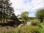
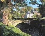
Watercolor Pencil Painting Of Coventry Canal - Step By Step
Watercolor pencil painting techniques used to depict an English canal scene. Step by step tutorial for water soluble pencils
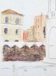
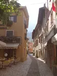
Venice drawing - part 3
Part 3 of our Venice drawing in watercolour pencils. Here we start the buildings and learn about mixing colours for the scene
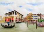
Painting the sky above our Venice scene
Painting the sky - the second page in our watercolour pencil tutorial featuring the Venice Rialto Fish Market scene


Improve Your Pencil Art: Get Free Tips & Techniques
Sign up for our newsletter – just occasional emails packed with practical advice and inspiration for pencil artists like yourself
Copyright © 2009- pencil-topics.co.uk All rights reserved
Home | About Us | Contact Us | Privacy Policy