- Home
- Fundamentals of Drawing
- Colour basics
Understanding Colour Basics for Coloured Pencil Artists
Feeling a bit lost when it comes to choosing or mixing colours for your drawings?
You're definitely not alone! The term 'Colour Theory' can sound quite formal and intimidating, but understanding just a few simple basics makes a massive difference in coloured pencil art.
It's the key that helps you:
- Avoid those frustrating 'muddy' colour mixes.
- Create colours that look vibrant and realistic.
- Achieve a convincing sense of depth and form.
- Make your drawings truly shine!
This guide covers the essentials you really need to know, focusing specifically on how colour works with our wonderful coloured pencils. Don't worry, we'll keep it practical and straightforward. Let's unravel the magic of colour together!
The Colour Wheel: Your Colour Map

At the heart of understanding colour is the Colour Wheel. Think of it as a handy visual map showing how colours relate to each other. It's built from three types of colours:
Primary Colours: These are the three 'parent' colours: Red, Yellow, and Blue. They're unique because you can't create them by mixing other colours together. All other colours are derived from these three.
Secondary Colours: When you mix two primary colours, you get a secondary colour:
- Yellow + Blue = Green
- Red + Yellow = Orange
- Blue + Red = Violet (or Purple)
Tertiary Colours: These are the 'in-between' colours made by mixing a primary colour with a neighbouring secondary colour (like Red-Orange, Yellow-Green, Blue-Violet etc.). They fill out the rest of the wheel, creating a full spectrum
Getting Specific: Hue, Value, and Saturation
To really talk about colour like an artist, it helps to know these three key terms:
Hue: This is simply the pure colour name we traditionally use – Red, Blue, Green, Yellow, etc. It’s the colour's basic identity.
Value: This refers to how light or dark a colour is. Think of a pale lemon yellow versus a deep navy blue. Understanding value is crucial for making objects look solid and three-dimensional (we explore this fully on the Understanding Value page). Even with a single coloured pencil, you can create many different values just by changing your pencil pressure or by layering.
(Quick Terms: Adding white or a lighter colour creates a Tint; adding black, a darker colour, or a complementary colour creates a Shade).
Saturation: This describes the intensity or brightness of a colour. Is it a really vibrant, intense fire-engine red, or a dull, muted brick red? High saturation means vivid colour; low saturation means the colour is more greyed-out or muted.

How Coloured Pencils "Mix": It's All in the Layers!
This is super important! Unlike paint, we can't usually mix coloured pencil pigments before putting them on the paper. Instead, we create new colours and subtle blends through Optical Mixing.
Layering is Key: We apply light layers of different colours one over the other. Because the pencil layers have some transparency, your eye visually blends the colours together where they overlap! (Head over to our Layering Guide for the full technique).
Tinting Strength: Be aware that some colours are 'stronger' than others when layered. Blues and some reds, for example, often have high tinting strength and can easily overpower lighter colours like yellows if you're not careful. This often means it's better to apply your lighter colour first when layering to create a mix.
Crucial Tip: Test Your Layers! Because different pencil brands behave differently and colours interact in sometimes surprising ways, always test your colour layer combinations on a scrap piece of your drawing paper before applying them to your actual artwork. This simple step saves so much potential frustration!
Complementary Colours: Your Secret Weapon for Realism
Look directly across the colour wheel from any colour, and you'll find its Complementary Colour. These pairs are special! The main ones are:
- Red ↔ Green
- Blue ↔ Orange
- Yellow ↔ Violet (Purple)
Understanding complementaries is incredibly useful for coloured pencil artists:
Mixing Rich Darks & Neutrals (This is GOLD!)
What happens when you layer complementary colours?
They neutralise each other, cancelling out brightness and creating muted browns, greys, or rich, deep shadow colours.
This is the secret to avoiding flat, dead shadows!
Instead of just reaching for a black or grey pencil to shade, try lightly layering the complementary colour into your main colour. It creates much more natural and vibrant results.
- Examples: To shade a yellow object, gently layer in some violet. To shade green foliage, layer in some red or red-violet. For orange or brown areas (like skin tones or fur), try layering in blue for the shadows.
Underpainting for Depth (Advanced Tip)
Applying a very light layer of the complementary colour underneath your main local colour can make the top colours appear richer and add subtle depth. (You can learn more about Underpainting Techniques here when you're ready).
Creating Contrast:
Placing complementary colours next to each other makes both appear more vibrant and creates visual excitement (though use this effect carefully – too much can be jarring!).
Warm vs. Cool Colours: Creating Mood and Depth
Colours also have a 'temperature' – they can feel warm or cool, and this affects both the mood and the sense of space in your drawing.
- Warm Colours: Think Reds, Oranges, Yellows – associated with sun, fire, energy. Warm colours tend to feel like they advance or come forward towards the viewer.
- Cool Colours: Think Blues, Greens, Violets – associated with water, sky, shade. Cool colours often feel calmer and tend to recede or move back visually.
Using this for Depth:
This is incredibly useful!
To make something look further away (like hills in a landscape), use slightly cooler, less intense colours.
To make something jump forward, use warmer, brighter colours. This is called 'atmospheric perspective'.
Mixing Matters Too
Even within a single colour like Red, you can have warmer (more orangey) and cooler (more purplish) versions.
Mixing these different temperature primaries will give you different secondary colours – something to experiment with!
Seeing Colour Realistically: Local and Reflected Colour
When you're aiming for realism, it's important to draw what you see, not just what you think you know about colour.
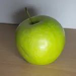
Local Colour: This is the object's basic colour in neutral light – an apple is red, a leaf is green.
Affected Colour: But the colour you actually see is rarely just the pure local colour. It's influenced by:
- Light: Bright light might make it look lighter and warmer; shadows make it look darker and often cooler.
- Reflected Colour: Objects pick up subtle reflections from things nearby! A green apple sitting on a blue cloth might have faint bluish tints in its shadow. Look closely at your references for these subtle colour shifts – capturing them adds a huge boost to realism.
Quick Tip for Harmony: Analogous Colours
Want a simple way to create a pleasing, harmonious colour scheme?
Try using Analogous Colours – these are colours that sit right next to each other on the colour wheel (like yellow, yellow-green, and green).
They naturally feel calm and cohesive together.
(We explore colour schemes more in our Articles & Tips section).
Putting it into Practice
Colour theory comes alive when you use it!
Remember to always test your layered colour mixes on scrap paper first.
Try This: Grab a warm red, a cool red, a warm blue, a cool blue, a warm yellow, and a cool yellow from your pencil set.
Create little swatches showing what happens when you layer combinations like: Warm Red + Warm Yellow vs Cool Red + Warm Yellow.
You'll quickly see how temperature affects your mixed oranges, greens, and violets!
Putting Your Colour Knowledge into Practice
Understanding the basics of colour is a wonderful step forward in creating artwork you can be really proud of.
When you begin to see how colours work together, how they can create mood, and how they contribute to making your drawings look more realistic, you'll find a new level of control and enjoyment in your art.
Ready to see how these colour principles apply in practical ways? Here are a few places to explore next:
- Learn to Build Richness with Layers: Check out The Essential Guide to Layering Coloured Pencils. This is where you'll see how to apply your understanding of colour to build up depth and vibrancy, one layer at a time.
- Discover How to Combine Your Hues: Explore Blending Methods for Coloured Pencils. Understanding how colours interact is key when you start to blend them for smooth transitions and new shades.
- See How Light and Shadow Affect Colour: Visit Understanding Value in Drawing. Colour and value are inseparable partners in creating form and realism. This will help you see your colours in terms of their lightness and darkness.
- Consider Your Colours in the Bigger Picture: Take a look at Composition Basics for Artists. Learning how to arrange elements, including your colour choices, will make your artwork more compelling.
- Or, if you're ready for a broader look at applying colour and other fundamental techniques, head over to the Core Techniques Hub to continue building your skills.
The most important thing is to start experimenting with the colours in your pencil box.
Try out some of the ideas you've learned here on a practice sheet. See what happens when you put different colours side-by-side or layer them. The more you play and observe, the more intuitive your colour choices will become!
You might like these
Using Photo References for Drawing: Beginner Tips | Pencil Topics
Using photo references for drawing? Get beginner tips on choosing good photos, interpreting them artistically, simple adjustments & essential copyright rules
Composition Basics for Coloured Pencil Artists
New to composition basics for coloured pencil art? Discover ways to plan focal points, balance your page and use leading lines to guide the viewer's eye.

Improve Your Pencil Art: Get Free Tips & Techniques
Sign up for our newsletter – just occasional emails packed with practical advice and inspiration for pencil artists like yourself
Copyright © 2009- pencil-topics.co.uk All rights reserved
Home | About Us | Contact Us | Privacy Policy