- Home
- Landscape Pencil Underpainting
From Reference to Reality (Page 2): The Watercolour Pencil Underpainting
Welcome back to our 'From Reference to Reality' series, where we're following the creation of a beautiful canal scene step by step!
Or, if you're just joining us here and want to see how we got to this point, you might like to pop over to Page 1: Composition, Planning & Preparation first.
In Part 1, we covered how Peter critically analysed his reference photos, made key decisions to improve the composition, and carefully selected his palette and tools for the project.
Now that all that essential groundwork is in place, we're ready for what I always think is one of the most exciting stages – bringing the scene to life with the very first layers of colour!
In this Page 2: The Watercolour Pencil Underpainting, we'll be following Peter closely as he:
- Prepares his drawing on the watercolour paper
- Mixes and applies those crucial first washes with his watercolour pencils.
- Uses the pencils both wet and then dry to establish initial textures in the foliage and water.
- And finally, lays in the initial base colours for those important narrowboats, all while carefully preserving the white of the paper for highlights.
This underpainting stage is where the magic really begins to unfold.
It’s all about creating a foundation that will beautifully support the detailed dry coloured pencil work we'll be adding later. So, let’s dive in and see exactly how Peter approaches these foundational layers!
Stage 3: Laying the Foundation: The Watercolour Pencil Underpainting
Your first task is to draw out the image and transfer it to your paper.
My notes
Peter’s absolutely right that getting your main outline onto the paper is the first essential step before you even think about your paints or pencils.
For a landscape scene like this one, with its organic shapes and the lovely, slightly impressionistic feel we might be aiming for, I personally wouldn’t bother with a highly detailed tracing.
The key thing, as I see it, is to create a basic outline that simply lays out where the different elements – like the diagonal lines of the river bank, the lovely arched bridge, and the main shapes of the boats – are placed within your overall composition. You really don't need to draw every leaf or blade of grass at this stage!
I would, however, take a little more care with the details of the foreground boat, as that will naturally be a more prominent feature in the finished piece.
A really useful tip here, and one I often use myself, is to draw your initial outline using a lightly applied watercolour pencil in a relevant colour. A very pale grey, a light earthy tone that will blend in with your underpainting, or even a light blue for sky areas can work beautifully.
This is often much better than using a traditional graphite pencil, as graphite lines can sometimes look a bit stark or can muddy your delicate watercolour washes if they're too heavy.
A watercolour pencil outline, on the other hand, will usually just dissolve and blend beautifully into your painting as you add water.
Of course, if you're not yet comfortable drawing your scene directly onto your watercolour paper freehand from your reference, you can certainly use other methods to help you get the placement right.
You can find more information on these in my guide to How to Use Tracing Paper and my guide to The Pencil Drawing Grid Method.
The main goal at this point is simply to get a confident, light outline in place to guide your first washes.
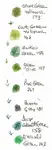
Gently scrape the pigments from the pencil tips and collect them in separate wells. Add water to each well, to create delicate washes. The plan here is to use two thin washes of colour rather than one thicker one. Apply the washes with a flat watercolour brush leaving the sky and white areas on the boats and water as bare paper.

My notes
Starting with an underpainting of watercolour pencils is such a smart approach, just as Peter outlines.
It really helps you focus on the bigger picture of your artwork and can stop that common tendency to get too fussy with details right at the very beginning.
Plus, those initial washes cover the bare paper, filling in the little ‘valleys’ in the paper’s tooth which can sometimes be a nuisance later on if they show through as tiny white flecks.
It’s also a brilliant way to establish the main base colours in each area and, as Peter points out, it serves as a visual reminder of where those important white spaces should remain bare paper at this crucial stage.
I must admit, I share Peter's enthusiasm for preparing pigments by gently scraping them from the pencil tips!
There’s something strangely satisfying about watching that pigment blossom into a coloured puddle when you add a little water.
And from a practical standpoint, I know I’m not wasting any of that precious pencil core, nor am I risking getting water inside the wooden casing of the pencil itself, which can happen with some other methods of lifting colour.
You can explore this and other ways to lift pigment and prepare your washes in my guide to Watercolour Pencil Techniques.
Just as with traditional watercolour painting, I love that Peter emphasizes the benefit of applying multiple thin layers of colour rather than trying to achieve a deep enough value all in one go. This approach gives you so much more control over the intensity, helps prevent streaking, and builds up a lovely, luminous depth to your underpainting.
Using a flat brush, as Peter does, for these initial washes is also a good tip, especially for larger areas.
It can make the process of applying pigment to the paper quicker and certainly lessens the chance of one brushstroke drying out before you’ve reloaded your brush for the next, helping you achieve smoother, more even coverage.

Once the painting is dry, use the watercolour pencils dry to add texture and depth to the foliage, by scribbling with the pencil. Use smooth horizontal strokes for the water.
My notes
Don’t put your watercolour pencils away yet!
Peter’s next step is to use them in pencil form on top of the dry washes. Do be patient and wait until your paper is bone dry as any remaining dampness will draw the pigment out of the pencil and create a heavy line that you do not want!
This way of using the watercolour pencils shows how versatile they are. The dry textures (such as scribbles for the foliage and horizontal strokes for the water) will guide you when you come to do the final detailing with your choice of coloured pencils.
Add the base colours to the narrowboats, leaving the white areas free of pigment
My notes
Peter’s next instruction is to focus on the narrowboats themselves, and this is where we see a common and very effective artistic approach unfold.
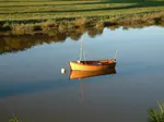
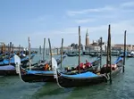
You might recall that Peter's initial four-colour palette for the overall 'canal scene' (Grass Green, Yellow Ochre, Burnt Sienna, and Paynes Grey) didn't include a red.
And yet, as we can see in the image of the first washes, the boat clearly has its distinctive red colour established! This isn't a contradiction, but rather a smart way of working.
While that lovely limited palette is perfect for creating the harmonious greens, earth tones, and general atmosphere of the water and surrounding foliage, when it comes to a key feature like a brightly coloured narrowboat, an artist will often use the actual main local colour of that object for its own initial underpainting wash.
So, for the red parts of the boat, Peter has introduced a suitable red watercolour pencil and applied that as a light, even wash, just as he did with the other colours for the landscape elements.
This ensures the boat has a really vibrant and true foundation, ready for the more detailed dry coloured pencil work that will come later. It’s all about giving each part of the painting the best possible start.
The key, as Peter rightly emphasizes, is to continue leaving those white areas free of pigment on the boats. These will be your brightest highlights, perhaps where the sun is glinting off the paintwork or the cabin roof, and preserving the white of the paper here is crucial.
So, to sum up this stage: the limited palette helps to set the overall mood and foundation for the broader landscape, and then specific, important objects within that scene (like our narrowboats) often get their own true base colours established with watercolour pencil washes.
It’s a logical process of working from the general to the specific, ensuring each element is perfectly prepped for the detailed layers to come.
And that brings us to the end of our exploration of the watercolour pencil underpainting for this beautiful canal scene!
We’ve journeyed with Peter from transferring the initial drawing right through to preparing and applying those lovely foundational washes, and even seen how watercolour pencils can be used dry to establish early textures and base colours on key elements like the narrowboats.
You can hopefully now see how this underpainting stage has infused the artwork with a wonderful sense of light, established the initial depth, and laid down a harmonious canvas of colour.
It’s this carefully prepared base that will allow the subsequent layers of dry coloured pencil to really sing and achieve their full richness.
This technique is a fantastic way to give your coloured pencil pieces a professional start.
Feeling eager to see how this luminous underpainting is transformed by the magic of dry coloured pencils? I hope so!
In our next instalment, Part 3: Dry Pencil Layering & Detailing, we’ll move into the phase where Peter begins to build up all those wonderful textures, intricate details, and the final layers of realism that will bring the foliage, water, bridge, and boats to their full glory.
This is where the scene will fully blossom!
Ready to see the coloured pencils take centre stage?
Continue to Page 3: Dry Pencil Layering & Detailing

I'm Carol Leather, a coloured pencil artist for over 15 years. Most of my teaching comes back to the same idea: realistic coloured pencil starts with structure, light and observation long before the colour goes down.
My work has featured in Ann Kullberg's Color Magazine, CP Magic and Color Pencil Treasures (vol 7). I'm a member of the UKCPS and was a prize winner in the Nature section of their Annual Open Exhibition in 2020.
You might like these
Drawing reflections in water with coloured pencils
Learn all about drawing reflections in water using coloured pencils | Your guide to discovering how they are affected by your viewpoint.
How to Draw Realistic Water Pt 2: Expert Swirl Techniques
Learn to draw realistic water! Part 2 of Daryl's coloured pencil journey reveals Peter Weatherill's expert techniques for tackling 'swirls' & how to apply them
Canal Scene Pt 3: Finish with Coloured Pencil Depth & Detail
Bring your landscape to life! Part 3 of our guide reveals final techniques for a stunning canal scene. Master composition & create art you'll be proud of.
Copyright © 2009- pencil-topics.co.uk All rights reserved
Home | About Us | Contact Us | Privacy Policy