- Home
- Landscape Composition
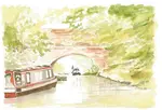
Canal Scene Page 3: Building Richness & Finish with Dry Coloured Pencils
Hello again, and welcome back to our in-depth journey with Peter Weatherill's beautiful "Canal Scene"!
In Page 1: Landscape Composition & Preparation, we explored the crucial initial steps of analysing the reference photo, making thoughtful compositional choices, and gathering the right tools and palette for the task ahead.
Then, in Page 2: The Watercolour Pencil Underpainting, we explored how Peter laid a vibrant and expressive foundation using watercolour pencils, creating initial washes, textures, and base colours for the entire scene, including those iconic narrowboats.
Now, in this exciting Part 3, we get to see the magic really happen as Peter picks up his dry coloured pencils. Over the next sections, we'll be following along as he meticulously builds up depth, detail, and richness, transforming that wonderful underpainting into a finished piece of art.
We'll be covering:
- Stage 4: Building Depth & Detail with Dry Coloured Pencils: Focusing on the lush foliage and structural elements like the bridge.
- Stage 5: Developing the Water and Reflections:
- Stage 6: Bringing the Boats to Life: Adding colour, form, and context to the narrowboats, making them key focal points.
- Stage 7: The Final Piece & Key Takeaways: Witnessing the completed artwork and reflecting on the valuable lessons learned throughout this entire process
It's in these stages that the patient layering and skilled application of dry coloured pencils really come to the fore. So, grab your cup of tea, get comfortable, and let’s join Peter as he brings this charming canal scene to its beautiful conclusion!
Stage 4: Building Depth & Detail with Dry Coloured Pencils

The photo shows the range of greens from the Polychromos range, arranged in the order they were used for the painting in this demonstration.
Deepen the shadows beneath the overhanging branches on the right, using the darker tones at your disposal. Then tackle the water's surface, using horizontal strokes.
Next it’s time to add depth and dimension to the bridge brickwork. With the combination of Walnut brown and Sanguine, carefully draw the shadowy areas along the undersides of each brick leaving the sunlight top edges the white of the paper.
Check out the garden arch tutorial for more practice at drawing bricks.
My notes on choosing your greens
If you only have a basic 12-colour set of dry coloured pencils, you might be limited as to greens. The smaller sets tend to have only two – a dark and a light.
Of course, you can layer blues and yellows, even Paynes Grey and yellow, to create more variety, but having a larger selection ready to hand is certainly convenient for landscape work.
You don't necessarily need to buy bigger tins with colours you may not ever use in them. A more economical approach is to pick out similar colours to those Peter mentions here (or those you find yourself needing regularly) and buy them as open stock pencils.
Many good art supply shops, offer this option.
A range of dark, medium, and light greens is useful, but even more important is to have pencils with lower chroma – this means they are dulled down and not at their brightest, most artificial-looking intensity.
Aim for a mix of warm (more yellowish) and cool (more bluish) greens too. Used together, these variations are much more likely to help you create a realistic and harmonious piece of artwork.
My notes on deepening shadows & tackling the water surface
When it comes to darkening areas of shadow, Peter leaves it to you to pick out colours from "the darker tones at your disposal."
My first piece of advice here is to resist the urge to immediately reach for a black pencil!
While black has its place, using it to deepen shadows, especially under green foliage, can often lead to flat or lifeless results.
Instead, consider the power of complementary colours. For green areas, a dark red will work wonders to create rich, natural-looking shadows. Red is directly across the colour wheel from green, and when layered carefully, these complements can create beautiful depth. (If you'd like a refresher, you can visit our guide on Colour Basics for Coloured Pencils).
Because we’re aiming for a naturalistic scene here, we don’t necessarily need to keep the greens pure and bright in the shadowed areas. This means we can also get away with using dark blues, dark browns, or even purples to deepen the shadows under the foliage.
Layered with your existing greens, these colours will create much more interesting and believable shadow tones.
However, a word of caution: be wary of adding too many different hues on top of each other in a small area. You don’t want to overwork the paper or end up with everything resembling the same muddy, darkish shade. Choose one or two darkening colours for a specific area and layer them thoughtfully.

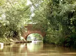
Now, let's turn our attention to the water. If you study the reference photograph again, you'll notice that the water itself isn't predominantly blue, apart from perhaps a reflection under the foreground boat.
This is a common observation in calm, inland waters – the surface primarily picks up the colours of its surroundings, in this case, the greens and brownish tones from the trees and possibly the bottom of the canal.
To make this area resemble water and give the impression of a reflective surface, we need to employ a visual trick.
Peter’s advice to use horizontal lines when laying down your pencil strokes is key here. Even if the colours are similar to the surrounding land, the consistent horizontal application of your coloured pencils will help the viewer's eye interpret that area as water.
My notes on rendering the bridge brickwork
Peter’s choice of Walnut Brown is excellent here; it’s a good, cool brown that has a very natural look suitable for aged brickwork.
Contrasting this with the pinker tone of Sanguine gives you the potential to create a variety of brick hues, suggesting the natural variations you’d find in an old structure. Sanguine might not be included in smaller pencil sets, but at a pinch, you could achieve a similar effect by using very light layers of an orangey-red.
It’s easy to think of brickwork as being flat and almost one-dimensional when viewed from the front. However, it possesses texture and some limited depth, especially on an old bridge like this one that has likely weathered many years.
Peter’s instruction to include the shadows on the undersides of each individual brick, while leaving the sunlit top edges as the white of the paper, is a key technique to give them that essential three-dimensional quality and sense of solidity.
This careful attention to light and shadow is what will make the bridge look realistic.
Peter’s suggestion to check out the garden arch tutorial for more practice on drawing bricks is a good one. Repetitive elements like bricks can be tricky, and dedicated practice on rendering them will certainly pay dividends in your landscape work.
For more guidance on tackling architectural elements, you might also find my page on Drawing Buildings helpful.
Adding depth to the foliage
Take a look at the image below, which reveals the original layers of watercolor pencil strokes on the trees in the upper right-hand side. This snapshot showcases the scribbles that bring the scene to life.

My notes on the foliage
When working on distant foliage, it’s important to keep the effect quite random and natural.
But, as you will discover, that’s often easier said than done! When we consciously try to be random, we can inadvertently end up creating repeating patterns or predictable marks.
The technique I like to use to combat this and achieve a more natural look is to hold the pencil quite loosely, right at the end opposite the point. Then, I let the pencil almost ‘dance’ where it will across the area I’m working on.
I find it helps to slow down and focus on a small section for a short while, then skip to another area, always leaving some of the underpainting or previous layers showing through.
When you come back to add the next colour or layer, some of your new strokes will naturally cover parts of the original ones, while others will sit in the gaps you’ve left.
It’s quite difficult to apply much pressure on the pencil when holding it this far back, which is actually a benefit here as it helps build up delicate layers.
After you have a few of these light, dancing layers established, you can then more purposely place some heavier or more defined strokes, or even small circular motions, where you feel the foliage needs a bit more density or specific darker accents.
This combination of loose, light layers and more deliberate marks helps to build that lovely sense of depth and intricacy that we see in trees and bushes.
The blend of colours in this overlapping image gives a glimpse into the beauty of the final painting.
Add vitality to your foliage by exploring a rich palette of colors beyond just greens. Embrace the earthy tones of ochres, the warm hues of browns, and the depth of dark shades like sepia. By incorporating these colors, you can create a more authentic and realistic portrayal of nature's lush greenery.
My notes
Peter’s advice to look beyond just greens when tackling foliage is so important, and it’s something I always try to emphasize in my own work. It’s a common trap for beginners to reach for just one or two green pencils, but nature’s palette is far richer and more complex!
Here’s a breakdown of why expanding your colour choices here makes such a significant difference to the realism and vibrancy of your trees:
- Trees are more than just green: A tree isn't a single mass of green. Think about the underlying structure. There are branches – some clearly visible, others subtly peeking through – and these will have their own woody colours, such as various browns, greys, and sometimes even soft purplish tones.
- The variety in leaves: Leaves themselves are rarely a uniform green. New growth might present as a brighter, more yellow-toned green. Older leaves, or those catching the light differently, might show hints of brown, ochre, or other subtle variations. And, of course, some leaves will be in full light while others are cast in shadow.
- Creating depth, visual interest, and realism: Achieving these qualities in your foliage really hinges on your understanding of how colour and value work together.
Leaves nestled deeper within the canopy or in shadow won't simply be a darker shade of your main green; they'll often appear less saturated (duller), cooler (perhaps more blueish or greyish-green), and generally darker.
Using these cooler, duller, and darker tones for such recessed areas, while reserving warmer, brighter, and lighter colours for leaves catching the light, is key to achieving a convincing three-dimensional effect.
This variation across a wide range of hues – incorporating not just greens, but also yellows, ochres, browns, sepias, and even blues or greys within the shadows – alongside varied values and chroma (brightness versus dullness), is what improves your drawing.
It moves beyond a simple representation, making your foliage look full, layered, dynamic, and ultimately, more lifelike.
When you start to consciously observe trees, you'll begin to notice this incredible variety of colours. Don't hesitate to experiment with layering these seemingly "non-green" colours into your foliage. For instance, a touch of a complementary red or a deep indigo within the darkest shadow areas can make your greens appear even more vibrant and natural.
As Peter continues to develop the foliage in this piece, keep an eye on how he applies these principles. It’s a fantastic way to learn. If you’d like to explore these concepts further, you might find it helpful to revisit the Colour Basics for Coloured Pencils guide on the site.
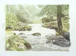
Stage 5: Developing the Water and Reflections
Depicting water can reveal hidden treasures beneath the surface of an image. Its rippling waves and the presence of boats disrupt the pristine reflections, yet maintain a connection with the surroundings. Don’t forget the sunlight highlighting lighter patches on the water's surface.
Take a moment to observe the colours captured in the reference photo. The lush greens, rich browns, and warm ochres beautifully mirror the natural hues found in the flourishing plants and majestic trees lining the canal bank.
Be sure not to overlook the intricate vertical lines that, although not immediately apparent, contribute to the overall sense of realism.

My notes
Water is such a wonderfully dynamic subject, but it can be a bit daunting to draw!
When you look at Peter's artwork developing alongside the reference photo, you can really start to see how an artist translates those complex, ever-changing qualities.
Let's look at the images. On the right, we have the reference photo, and on the left, Peter’s interpretation in coloured pencil at this stage.
- Echoing the Environment: Notice how the colours from the canal bank – those lush greens, rich browns, and warm ochres visible in the reference – begin to appear mirrored in Peter's rendition of the water. This is your first step: really see and then translate those reflected hues to connect the water with its surroundings.
- Embracing Imperfection in Reflections: Water rarely gives you that perfect mirror finish, does it? Movement from ripples, or objects like the boat, will always break up reflected shapes. You can see this clearly in the reference photo. Peter’s approach in his artwork – using more blended, elongated strokes of colour for the reflections – is a great way to suggest this effect in coloured pencil. Trying to copy every single ripple from a photo can often make a drawing look too busy or overworked; suggesting the texture is often more effective.
- The Sparkle of Sunlight: Those lighter patches of sunlight on the water's surface are vital for adding that touch of sparkle and life. Look for them closely in your reference. They might be brilliant white, or simply paler versions of the reflected colours. Making sure to preserve these areas as you work, or carefully lifting them out later, will really enhance the realism. You can see Peter beginning to incorporate these highlights in his rendering.
- Subtle Verticals for Depth: Those subtle vertical lines, which can be easy to miss, often make a big difference to the sense of realism in water. They might suggest the gentle downward 'drag' of reflections in stiller areas, or even slight surface textures created by the current or breeze. The key is subtlety – think light, broken vertical strokes or a soft downward blurring of reflected edges, rather than hard, obvious stripes.
- The Art of Simplification: Water can indeed feel overwhelming with all its intricate details! A crucial skill for any artist, which you can see Peter applying here, is learning to simplify. Focus on capturing the overall atmosphere, the dominant colours, and the general shapes of the reflections rather than getting lost in every minute detail. This often results in a stronger, more impactful drawing.
Drawing water effectively really is a journey of patient observation and thoughtful interpretation. It’s about understanding how light and colour behave on and within the water, and then finding ways to translate those complex interactions using your pencils.
If you're keen to explore drawing water in even more depth, you might find the How to Draw Realistic Water series in the Articles & Tips section helpful. It documents another artist's process of tackling this very subject.
For now, let's see how Peter continues to build upon this foundation for the canal water.
Stage 6: Bringing the Boats to Life
Adding the narrowboats
Build up the depth of colour on the painted areas of the boats.
Allow for the glowing reflection on the side of the closer vessel by using grey and not black for that area. A slight shadow along the bottom edge and a ripple between that and the hull separates it from the dark reflection.
The complementary colours of red on the boat and green foliage behind really catch the eye, drawing it away from those darker shadows on the right of the picture.
My notes on making the narrowboats stand out:
Narrowboats often form the heart of a canal scene, and giving them a sense of solidity and vibrancy is key.
To achieve that rich, deep colour you see developing on the painted sections in Peter's image, think about building your colours in patient layers. Starting with a lighter touch and gradually increasing your pencil pressure will help you achieve a lovely depth and smooth coverage.
That "glowing reflection" on the side of a painted boat, like the one on the closer vessel here, is a beautiful detail to capture.
A really useful tip for this is to use a soft grey for the main body of that reflected light, especially for any shadowed parts within the reflection itself, rather than immediately reaching for black.
Black can sometimes make such reflections look a bit stark or heavy, whereas a well-chosen grey (or even a darker, muted version of the boat's colour) helps to maintain a more natural sense of luminosity and form.
Creating a clear distinction between the boat’s hull and its reflection in the water also makes a big difference. A small contact shadow carefully placed along the boat's bottom edge, perhaps with the suggestion of a ripple in the water just beneath it, provides just the right separation. This stops the boat from looking like it's merging with its reflection and gives it a more defined presence.
And the use of colour here is so effective! The vibrant red of the boat set against the lush greens of the foliage is a classic example of how complementary colours can create a powerful focal point.
This visual 'pop' really helps to draw your eye towards the boats, making them stand out beautifully from the more muted tones or shadowed areas elsewhere in the picture.
For a deeper dive into how these colour relationships work, our Colour Basics for Coloured Pencils guide is always there as a handy reference.
Paying attention to these aspects – how you build your colour, handle reflections on different surfaces, define edges, and use colour relationships – will really help your key subjects to shine in any piece.
Stage 7: Peter’s Reflections & Key Takeaways
My notes
And so, we reach the end of this wonderfully detailed journey through Peter Weatherill's "Canal Scene." Seeing a piece develop from initial concept to final touches is always such an insightful experience, and I hope following along has been as inspiring for you as it has been for me to revisit.
For me, there are a few standout lessons from Peter’s process that I think are particularly valuable for any of us looking to grow as artists:
You are the Artist – Your Reference is a Starting Point, Not a Rulebook: One of the most important things I feel this demonstration highlights is that you don't need to be a slave to your reference photo! A photograph is a fantastic tool, a source of information, but you have the artistic license to change it. If something in the photo doesn't quite work for your vision of the final picture – perhaps the composition feels a little off, or an element is distracting – you have the power to add, take away, or move things to create a stronger, more pleasing image. Peter did this by considering the placement and inclusion of the boats to enhance the scene.
Integrating Elements Thoughtfully: Following on from that, if you do decide to bring in elements from different references, or alter existing ones, it's crucial to do it with care. As you might be considering when looking at your own work, simply "sticking" something on from another photo rarely looks convincing. You need to become a bit of a detective and ensure the new element matches the main scene in terms of its angle, perceived size and scale, the direction and quality of light, and its overall perspective. If the reference for your added element has different lighting, for example, you’ll need to use your artistic skills to adjust it so it sits harmoniously within your drawing. This might take a bit more effort, but it's what makes the final piece believable and unified.
The Unifying Power of a Limited Underpainting Palette: I also particularly appreciated Peter's approach to the watercolour pencil underpainting. By keeping his palette for those initial layers relatively limited, he ensured that a sense of harmony was established right from the start. This limited range of colours in the underpainting can subtly unify all subsequent layers of dry coloured pencil, helping all the different elements of the scene – the foliage, the water, the sky, the boats – feel like they belong together. It’s a wonderful strategy for creating a cohesive and professional-looking finish.
Every artwork we create is a learning experience, and by sharing his process so openly, Peter has given us a fantastic opportunity to learn alongside him. I hope observing his choices, his techniques, and his reflections will give you fresh inspiration and practical ideas to take into your own coloured pencil adventures!
And So, Our Canal Journey Concludes... Over to You!
Well, that brings us to the end of our in-depth look at how Peter Weatherill created his "Canal Scene." We've journeyed together through three parts, from the initial spark of an idea and compositional planning, through the vibrant watercolour pencil underpainting, and finally into the detailed layering of dry coloured pencils to bring the piece to life.
My hope is that following along with Peter's complete process, and seeing his thoughts and techniques unfold, has provided you with plenty of inspiration and practical insights that you can carry into your own artistic endeavours. Perhaps you're now thinking about how you might approach your next landscape, tackle reflections in water, or even be a bit bolder with your compositional choices!
The real magic, of course, happens when you pick up your own pencils. I encourage you to experiment with some of the ideas and techniques we’ve explored in this series.
- What was your biggest takeaway from observing Peter’s process?
- Is there a specific technique you’re now keen to try in your own work?
- Do you have any questions about applying these concepts to your subjects?
I’d love to hear your thoughts, experiences, or any questions you might have. Please do share them in the comments section below – it’s always wonderful to hear from you.
If you’re feeling inspired and wondering where to explore next here on Pencil Topics, why not:
- Dive deeper into other projects and tutorials in our Beyond Bascis section. There you can explore areas like working with Watercolour Pencils (as Peter used for the underpainting in this series), or discover other Mixed Media Techniques. (The "Canal Scene" series itself is a great example of an advanced project, and this is where you'll find more like it as the Hub grows!)
- Revisit the fundamentals in our Core Techniques Hub to solidify your dry coloured pencil application skills?
- Browse our Articles & Tips Section for more in-depth advice on a wide range of coloured pencil topics?
- Or, if you're newer to coloured pencils, head back to the Getting Started Hub or the Foundation Skills Hub to build a strong base.
Thank you for joining us on this "Canal Scene" adventure. Keep learning, keep experimenting, and most importantly, keep enjoying your creative journey!
Happy Drawing!

I'm Carol Leather, a coloured pencil artist for over 15 years. Most of my teaching comes back to the same idea: realistic coloured pencil starts with structure, light and observation long before the colour goes down.
My work has featured in Ann Kullberg's Color Magazine, CP Magic and Color Pencil Treasures (vol 7). I'm a member of the UKCPS and was a prize winner in the Nature section of their Annual Open Exhibition in 2020.
You might like these
Landscape Composition Painting & Prep (Pt 1): Coloured Pencil Guide
Start your coloured pencil landscape! Part 1: Learn to analyse photo references, improve composition with artistic license & choose your art supplies.
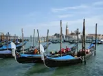
Creating a Venice Gondola Scene: An Artist's WIP & Tips
Follow artist Daryl Cogavin's process creating a Venice gondola scene in mixed media (ink, watercolour, coloured pencil). Insights & tips from a real project.
Drawing reflections in water with coloured pencils
Learn all about drawing reflections in water using coloured pencils | Your guide to discovering how they are affected by your viewpoint.
Copyright © 2009- pencil-topics.co.uk All rights reserved
Home | About Us | Contact Us | Privacy Policy