- Home
- Landscape drawing
- Drawing Reflections
- How to draw water
How to Draw Realistic Water (Part 1): An Artist's Journey with Coloured Pencils
Welcome! Painting water, with its movement, reflections, and myriad colours, can be one of the most rewarding yet challenging subjects for any artist, especially with coloured pencils.
Many of us look at a beautifully rendered waterscape and wonder, "How did they even begin to capture that?"
Today, we're going to explore that very question by diving into a wonderful archived discussion from the old Pencil Topics community forums.
This isn't a typical step-by-step tutorial for you to replicate, but rather an insightful artist's journey, following fellow coloured pencil enthusiast Daryl Cogavin as she bravely tackled a complex water scene.
We're fortunate that Daryl shared her work-in-progress openly, along with her thought processes, her questions, and the invaluable feedback she received from other members, including some expert tips from Peter Weatherill himself.
This allows us a unique window into the real-world process of artistic creation – the initial attempts, the moments of uncertainty, the breakthroughs that come from good advice, and the satisfaction of iterative improvement.
Throughout this documented journey, I’ll be adding my own commentary and highlighting key learning points.
Following Daryl's journey offers practical water-painting insights, underscores the value of community feedback, and highlights the rewards of persistence.
So, let’s join Daryl on her creative adventure and discover together the process of learning to paint water with coloured pencils!
Daryl's Materials and Initial Thoughts on This Challenge
Our artistic journeys often begin with a spark of inspiration, a chosen subject, and the selection of our trusted tools.
In this case, Daryl generously shared her starting point when she began this water painting project at a workshop, posting it for fellow members to see.
It's always so valuable when artists are willing to post a 'work in progress' (WIP) and open themselves up to the insights of others – that's where so much learning happens!
Let's hear directly from Daryl about her initial intentions for the piece, the reference photo she was working from, and the specific materials she selected for the task.
I thought I would post the picture that I started with Peter Weatherill at Knuston Hall last weekend as a WIP for others to see and comment on. I am very happy to hear both positive and negative comments - its always useful to see things through other people's eyes.
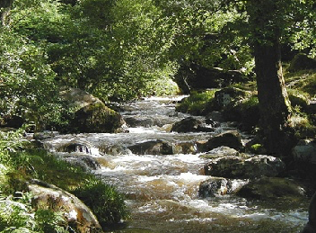
Reference photo: This is a photo that I took many years ago, somewhere in Wales (I think) but I really can't remember where it was.
Paper: Cotman Cold Pressed watercolour paper, 190gsm.
Pencils: Caran d'Ache water-soluble pencils for the initial wash, Prismacolors for adding depth, and Polychromos for detail work.
My Notes
It’s wonderful to see Daryl’s enthusiasm and her open approach to sharing her WIP right from the start.
That willingness to put your art out there for feedback, whether positive or constructive, is such a key part of growing as an artist. This community discussion itself is a wonderful example of artists growing and learning together.
Her choice of reference photo – one taken many years ago, with the exact location a charming mystery – also adds a relatable human touch. Sometimes these slightly less defined references can free us up to be more interpretive with our art, which can be quite exciting.
Now, let's consider the materials Daryl selected:
Paper Choice: Cotman Cold Pressed Watercolour Paper, 190gsm
"Cold Pressed" means the paper has a noticeable texture, or "tooth," which can be lovely for watercolour washes as it helps the pigment settle in the little valleys of the paper.
For coloured pencil work that follows, this texture can add character, but it can also be a little challenging if you're aiming for very smooth, photo-realistic detail, as you'll need to work to overcome the texture.
At 190gsm (grams per square metre), this is a lighter-weight watercolour paper.
While suitable for light washes, this 190gsm paper can buckle or warp more easily with water than heavier papers (300gsm and up). To prevent this with more demanding watercolour work, artists usually stretch lighter papers or choose a heavier one from the outset.
Cotman is also Winsor & Newton's student-grade range, so while it’s accessible, it might not offer the same robustness or archival quality as an artist-grade paper for very intensive techniques.
Pencil Choices: A Classic Mixed-Media Approach
Daryl’s selection of pencils is a classic and very effective strategy for combining the best of different pencil types:
- Caran d'Ache Supracolor for the initial wash: These are excellent quality water-soluble pencils, known for their vibrant colour and good lightfastness. Using them for an initial wash is a fantastic way to quickly block in base colours and establish general tones, creating an underpainting that subsequent dry pencil layers can build upon.
- Prismacolor Pencils: These are wax-based and are well-loved for their soft, creamy texture, rich pigmentation, and how beautifully they blend and layer to build up depth. They can achieve very smooth coverage.
- Polychromos Pencils: Faber-Castell Polychromos are oil-based pencils. They generally have a slightly firmer core than Prismacolors, which means they can hold a sharper point for longer, making them ideal for adding crisp details, textures, and refining edges. They are also less prone to wax bloom, which can sometimes occur with heavy applications of wax-based pencils.
Combining water-soluble pencils for a base, then wax-based pencils for building colour and depth, and finally oil-based pencils for fine details is a very smart approach that many coloured pencil artists adopt. It allows you to leverage the unique strengths of each type.
Preparing the Base
With her materials chosen and reference in mind, Daryl began the process of bringing the water scene to life on her paper. Here’s how she described her first step:
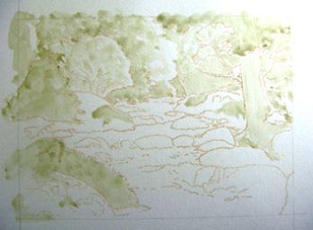
I used Peter's trace down method to transfer it onto my paper. Then I used Caran d’Ache pencils to lightly map out the tree areas, mixing a wash with water to block in initial tones.
My Notes
Daryl's approach here highlights a couple of very practical techniques that are particularly useful when starting a coloured pencil piece, especially one that will involve watercolour pencils for an underpainting:
Transferring the Outline:
Daryl mentions using "Peter's trace down method." For artists who might not feel confident about freehand drawing a complex scene, or for those who want to ensure accuracy from the outset, using a tracing method to transfer your main outline onto watercolour or coloured pencil paper is perfectly acceptable. It allows you to focus your energies on the painting and colouring process itself. If you're interested in different ways to do this, my guide on how to use tracing paper might be helpful.
Lightly Mapping with Water-Soluble Pencils:
Her choice to then "lightly map out the tree areas" before applying washes is key. "Lightly" is the operative word here.
Because these pencils are water-soluble, any initial sketch lines will dissolve and blend into the subsequent washes, preventing harsh outlines from showing through in the finished piece. This makes them ideal for an under-drawing that you plan to activate.
Blocking In Initial Tones with a Wash:
By 'blocking in initial tones' with a wash, Daryl is efficiently establishing the foundational colours and values of her painting.
As we noted when looking at her pencil choices, using her Caran d'Ache water-soluble pencils for this underpainting is a key first step. It immediately softens the stark white of the paper, which will help her judge subsequent colours and values more accurately.
For this water scene in particular, these initial washes are perfect for suggesting the overall fluidity and essential hues of the water and landscape, creating that vital cohesive base for the dry pencil work to come.
Adding the Darkest Areas
After establishing her initial washes in Step 1, Daryl made a deliberate switch in materials and approach for this next crucial stage:
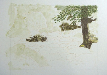
Next I changed over to Prismacolors to start putting in some of the darkest areas.
I find this works well for me, to get the darkest areas in first, as I tend to be a bit cautious with colour otherwise and end up having to go over everything again because it lacks depth and contrast.
By putting in the very dark areas first I can then see where I can have my mid tones and my lightest areas.
This is a really insightful part of Daryl’s process, and her reasoning highlights a common challenge and a very effective strategy:
Choosing Pencils for Rich Darks:
Daryl’s switch to Prismacolor pencils is smart for her darkest areas. Their soft, wax-based cores lay down rich, opaque colour, ideal for establishing deep shadow values and crucial depth from this early stage.
The "Darks First" Strategy:
Her approach of "getting the darkest areas in first" is a technique favoured by many artists, particularly those who, like Daryl, feel they might otherwise be too cautious with their values. There are several benefits to this:
- Establishing Your Value Range: By putting in your darkest darks early, you immediately define the bottom end of your picture's value scale (the range from lightest light to darkest dark). This makes it much easier to accurately judge all subsequent mid-tones and ensure your lightest areas truly pop.
- Building Contrast and Depth: Strong darks are essential for creating contrast, which in turn creates a sense of three-dimensionality and visual impact. Tackling them early can prevent a drawing from looking flat or washed out.
- Guiding Subsequent Layers: As Daryl herself notes, having those darks in place provides a clear visual guide for where the mid-tones and lighter areas should be, helping to map out the rest of the drawing.
Overcoming Timidity: For artists who tend to be a bit tentative with applying colour and value, committing to those darks early can be quite liberating. It helps to avoid that common pitfall of producing an image that lacks the necessary "punch" and then requires extensive reworking to deepen the values later on.
Some artists prefer to build values gradually from light to dark, especially when aiming for subtle transitions with many translucent layers. However, Daryl’s strategy of establishing her darks early with a pencil like Prismacolor is sound and effective, particularly for ensuring good contrast and depth.
It’s all about finding the approach that best supports your artistic vision and personal working style.
Developing the Background
It's very common when facing a complex piece to feel drawn to tackling the most challenging or perhaps the most exciting part straight away. Daryl experienced this as she moved into developing her painting further. Here’s what she decided to do:
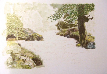
At this point I was keen to start working on the area that I felt least confident about - the water itself.
However, under Peter's guidance, I focused on completing the background rocks and foliage before tackling the water.
My Notes on Developing the Background
Daryl’s honest admission here – wanting to dive into the water, the very part she felt least confident about – is something I’m sure many of us can relate to! It’s a natural impulse. Sometimes we’re eager to conquer the main challenge, or perhaps it’s the element that truly inspired the piece.
However, her decision to instead focus on the background rocks and foliage first, particularly noting that this was "under Peter's guidance," is a key learning moment in this artistic journey. It highlights several important aspects:
The Value of Experienced Guidance
When you're working on a piece and feeling uncertain about the best way to proceed, advice from a trusted mentor or a more experienced artist can be incredibly helpful. Peter's guidance here likely helped Daryl take a more strategic approach to building her painting.
A Common Artistic Strategy
Background to Foreground: Many artists, particularly in landscape work, choose to develop their background elements before moving to the middle ground and then the main areas of focus in the foreground. This approach offers several advantages:
- It helps to establish the overall atmosphere and context of the scene early on.
- It allows you to judge subsequent colours and values more accurately once the surrounding environment is in place.
When layering coloured pencils to achieve an opaque effect, it’s often easier to bring foreground elements forward over background layers rather than trying to "carve out" background details around an already completed foreground. - Working on less critical background areas can sometimes serve as a good warm-up, allowing you to get comfortable with your materials and the subject before tackling the more demanding focal points.
Building Confidence Incrementally:
By completing the surrounding rocks and foliage before tackling the complexities of the water, Daryl was likely building a solid foundation for the painting. Successfully rendering these areas could also have boosted her confidence before she approached the part she felt less sure about.
While there isn't one single "right" order to paint every picture (some artists do prefer to establish their main subject first), tackling the background before a complex element like moving water is a very sound and widely practiced approach. It allows for a methodical development of the scene and can make the more challenging parts feel more manageable when you finally get to them.
Daryl Asks for Feedback
It takes courage to share your artwork midway through, especially when you're about to tackle a particularly challenging element. But this is often when feedback can be most valuable.
Daryl bravely posted her progress, inviting comments and advice as she prepared to render the flowing water.
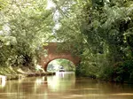
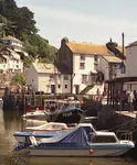
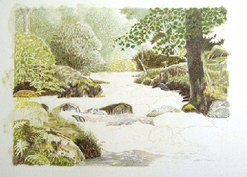 Daryl's coloured pencil landscape at the stage she sought feedback, with the central water areas still to be developed
Initial Reactions and Daryl's Apprehensions
The initial response was encouraging, with fellow member MT Lisa commenting:
Daryl it's beautiful! Looks like you have made an excellent start on it, and I will be interested to see how you tackle the water.
Daryl replied, voicing her thoughts on the task ahead:
I'm going to be interested in how to paint water too! But luckily Peter will be here hopefully to help me along. When I look carefully at the reference all I can see is a mind boggling swirl of colours and my brain has not yet worked out how to translate that into marks on paper.
I know that I need to keep it random and not try to replicate ever precise little shape, but I'm finding it very hard at the moment.
My Notes on The Courage to Share and Common Artist Challenges
Daryl’s comments here highlight some very common and relatable experiences for artists, especially those pushing their boundaries:
- The Value of Sharing: Putting your work 'out there' for discussion, even when you're feeling uncertain, is a significant step in the learning process. It opens the door to fresh perspectives and solutions you might not have considered.
- Feeling Overwhelmed by Complexity: It's completely normal to look at a reference photo, particularly for intricate subjects like moving water, and feel what Daryl describes as a 'mind boggling swirl of colours.' Nature rarely presents itself in neat, easy-to-draw blocks! The challenge is to simplify without losing the essence.
- The Mental Hurdle: That gap between seeing the complexity and knowing how to translate it into marks on paper is a hurdle every artist faces. Daryl's honesty about her brain 'not yet working out how to translate that' is something you may connect with.
- Knowing vs. Doing: Often, we can intellectually understand a principle – like Daryl knowing she needs to 'keep it random' and not get bogged down in tiny details – but actually implementing that can feel incredibly difficult. This is where guidance and practical exercises become so important.
- The Role of a Mentor/Community: Daryl’s hope for Peter’s guidance underscores the importance of having access to more experienced artists or a supportive community. Sometimes just knowing help is available can provide the confidence boost needed to tackle a tricky passage.
It's at this precise point, where the artist has identified the challenge and is open to advice, that targeted feedback can really make a difference.
So, Daryl has successfully navigated the initial stages of her coloured pencil landscape, from selecting her materials and preparing her base to developing the background elements. She now stands before the core challenge: translating the 'mind-boggling swirl' of the water onto her paper and has voiced her hope for some expert input.
What techniques and advice will Peter Weatherill offer to help her master this complex element? And how will Daryl begin to apply them? Find out in the next installment of this exciting journey!
Continue to How to Draw Realistic Water (Part 2): Applying Expert Advice to the Swirls

I'm Carol Leather, a coloured pencil artist for over 15 years. Most of my teaching comes back to the same idea: realistic coloured pencil starts with structure, light and observation long before the colour goes down.
My work has featured in Ann Kullberg's Color Magazine, CP Magic and Color Pencil Treasures (vol 7). I'm a member of the UKCPS and was a prize winner in the Nature section of their Annual Open Exhibition in 2020.
You might like these
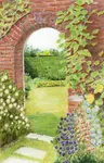
Draw a Garden Archway: Coloured Pencil Tutorial (Advanced)
Develop your coloured pencil skills with our garden arch tutorial. Learn to render brick, foliage & flowers with depth & light. Outline & photos included!
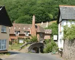
Landscape Drawing Step by Step - English Village demonstration
Landscape drawing step by step guide to drawing a charming english village scene using colored pencils and watercolour pencils
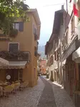
Watercolour pencil tutorial - Italian Street Scene
A step-by-step demonstration showing how to create an Italian street scene using watercolour pencils from Caran d'Ache
Copyright © 2009- pencil-topics.co.uk All rights reserved
Home | About Us | Contact Us | Privacy Policy