- Home
- Tutorials
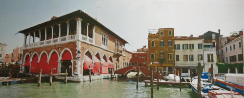
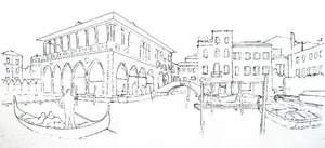
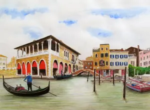
- Venice Grand Canal
- The Sky
Page 4: Painting the Venice Sky
Credit: This tutorial series is based on original work by Peter Weatherill, restructured and expanded for Pencil Topics.
Venice Grand Canal Project Menu:
Overview & Materials : Preparing Your Drawing : Colour Mixing : The Sky : The Buildings : Water, Trees & Gondola : Finishing & Comparison
Painting the Sky
The sky is only a small part of the Venice scene, but it sets the mood for everything below it. Get it right and the whole picture benefits. Overwork it and it fights for attention with the buildings and water.
If you haven't already read Part 3: Colour Mixing(colour-mixing-watercolour-pencils.html), I'd strongly recommend doing so first. Understanding how your blue behaves when wet will make this section much less nerve-wracking.
A Quick Reminder About Real Skies
Next time you're outside on a clear day, look up and notice something: the sky isn't the same blue all over.
Directly overhead, the blue is stronger and deeper. Toward the horizon, it fades to a much paler version. The difference is quite dramatic once you start looking for it.
Northern climates have a different quality of blue to tropical skies, too. None of this needs to worry you for our Venice scene, where we'll only be showing small patches of blue between clouds. But it's worth knowing, because it stops you painting a flat, uniform blue and wondering why it looks artificial.
Choosing Your Blue
I usually reach for Ultramarine Blue.
It's a strong blue, so a little goes a long way, and it sits on the purple/red side of the colour wheel. That cool quality suits a sky seen between cloud edges.
If you're using Derwent pencils, Oriental Blue is another option. It leans toward the green side, which gives a warmer, softer feel. It's also strongly pigmented, so treat it with the same caution.
Avoid pale blues. They tend to contain more filler and less pigment, which makes them harder to control for this technique. You want a colour that gives you intensity with very little pigment on the paper.
And remember, as we covered in Part 3: different brands call their blues different things, and even when they share a name like "Ultramarine," the actual colour can vary quite a bit. Trust your test sheet, not the label on the pencil.
What Kind of Sky Are We Painting?
The reference photo shows a cloudy white-grey sky.
If we painted that faithfully, we'd leave the paper white and move on. Job done.
But that would mean missing the chance to learn some genuinely useful techniques, and it would leave the sky area looking rather flat.
So we're going for something more interesting: a sky with some patches of blue showing through the clouds.
This gives us an excuse to introduce stronger shadows in the scene below, as if gaps in the cloud cover are letting sunlight through. It makes for a more dramatic picture.
The sky needs to stay quiet, though. It's a supporting player, not the star. We want enough blue to add atmosphere without drawing the eye away from the buildings and water.
Your Options
Watercolour pencils on textured cold-pressed paper present a specific challenge for skies. Pencils are designed to produce lines, not smooth, even washes. And our grained paper surface makes smooth coverage even trickier. But there are several approaches that work well.
Option 1: A traditional watercolour wash. If you stretched your paper, this opens up the full range of watercolour techniques. You can wet the paper evenly and let pigment flow and spread smoothly. This gives the most painterly results but requires confidence with wet-on-wet techniques.
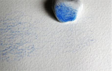
Option 2: The dry felt method. Scribble your blue pencil onto a spare piece of rough watercolour paper to create a "palette" of dry pigment.
Pick the colour up with a piece of thick white felt and rub it gently into your drawing surface. This works best on smoother paper and gives a soft, grainy effect. You can erase the edges to create cloud shapes.
If you use this dry method, do not add any water afterwards. It will intensify the blue dramatically and create hard edges that spoil the soft, atmospheric effect.
For more on this dry technique, I cover it in detail on my drawing clouds page where wax coloured pencils were used in the same way.
Option 3: Controlled wet patches. This is the approach I'll demonstrate below. It uses watercolour pencil techniques (dry pigment, then damp brush) to create small areas of sky between clouds. It's the most controlled method and works well on our cold-pressed paper.
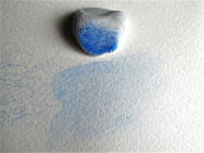
Technique 1: Small Patches of Strong Blue
This method creates convincing patches of blue sky glimpsed between white clouds. Have everything to hand before you start, because you'll need to work quickly while the paper is damp.
Step 1: Wet a small area of paper where you want a patch of blue sky. The paper should be glistening damp, not flooded.
Step 2: While the paper is still damp, transfer a very small amount of blue pigment lifted from a paper palette (watercolour pencil scribbled onto scrap paper). The colour can be quite strong at this stage. We're going to manage it.


Step 3: Work the colour gently, spreading and softening it. Then use a pad of kitchen paper to fade out the edges where the blue sky meets the cloud. This creates that soft, natural transition.


This will look different every time you do it. That's not a problem. Real skies don't repeat themselves either.

Technique 2: Very Pale Blue Through Thin Cloud
Sometimes you want an area of sky that's just barely blue. A thin wash of colour seen through a veil of cloud. This is trickier because we need a very even, very faint application of colour.
The problem is that strongly pigmented colours (which are what we're using) want to go on strong. And our grained paper surface doesn't help, because the grain catches pigment in the valleys and leaves the peaks white.
Here's a method that solves both problems:
Step 1: Apply a very light shading of Ultramarine across the area you want to colour. Keep it gentle.
Step 2: Take a blob of white Blu-Tack, a white kneadable eraser, or a piece of Scotch Magic tape and dab it over the shaded area. This lifts most of the pigment off the surface while pressing a tiny amount into the paper grain. After dabbing, the paper will look almost white again.
Step 3: Take a slightly damp brush and gently wash over the remaining traces of pigment. The tiny amount left in the grain will dissolve into a beautifully pale, even blue.
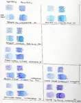
To show you how effective this lifting process is: here's the same paper with the untouched (unlifted) colour on the left, dampened down. See how much stronger it is compared to the lifted area on the right? That's why the lifting step matters.
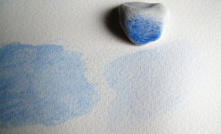
When working areas of your sky with this method, keep a pad of kitchen paper handy. Blot out all your edges of blue to avoid hard lines. Hard edges scream "painted" rather than "sky".
A Warning About Paper Buckling
Even with 300gsm paper, applying water to a large area can cause slight buckling if the paper isn't stretched or secured.
If you're using loose sheets or a spiral-bound pad, tape the edges of your paper to a board before painting the sky. You probably won't need much water, but it's easier to take a precaution than to worry about creating a problem later.
If you're using paper supplied in block form (where the sheets are glued on all four edges), you should be fine.
An Honest Note About Sky Painting
Even after plenty of practice, I still only get about one attempt out of two that I'm happy with.
Skies are unpredictable, and that's part of their character.
If your first attempt doesn't quite work, try another piece of scrap paper before working on the actual painting.
Here are two of my sky attempts.
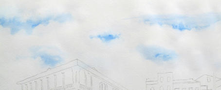
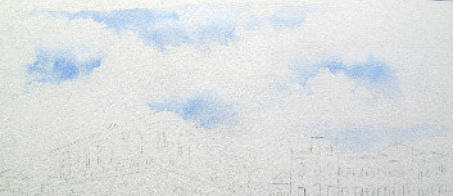
Each one is unique. Your sky will be unique too, and that's exactly how it should be.
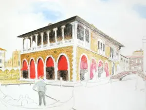
On to the Buildings
With the sky complete (or at least complete enough to work with), it's time to move down the paper and start on the Venetian buildings.
[Continue to Part 5: The Buildings →](venice-project-buildings.html)
Venice Grand Canal Project Menu:
Overview & Materials : Preparing Your Drawing : Colour Mixing : The Sky : The Buildings : Water, Trees & Gondola : Finishing & Comparison
You might like these
Colour Mixing with Watercolour Pencils: A Practical Guide
Learn how watercolour pencil colours mix, why wet and dry look so different, and how just six pencils can produce every colour you need.
Preparing Your Venice Drawing: Reference and Outline
How to assemble your reference photo, correct perspective distortion, and transfer the outline onto watercolour paper for the Venice project.
Venice Buildings: Colour Foundations and Grisaille
Two approaches to painting Venetian architecture with watercolour pencils. Colour foundations for sunlit walls, grisaille underpainting for shadow
Copyright © 2009- pencil-topics.co.uk All rights reserved
Home | About Us | Contact Us | Privacy Policy