- Home
- Watercolour pencils
- Pear tutorial
Easy Watercolour Pencil Art: A Beginner's Pear Tutorial
Let's Paint Some Pears!
Welcome to a lovely beginner-friendly exercise using watercolour pencils!
This simple study of two pears is a wonderful way to practice the basics of applying, blending, and layering your pencils without needing any complicated drawing skills.
It's a classic lesson that Peter Weatherill taught at his workshops for many years, and I'm delighted to share an updated version with you here.
It’s the perfect next step after you’ve familiarised yourself with the essentials in our Beginner’s Guide to Watercolor Pencils primer page.
You can also find the full learning pathway (guides and tutorials) in the watercolour pencils hub.
 Our reference photo for this pear study. Notice the soft highlights and the way the colours blend on the fruit.
What You'll Need for This Pear Study
To create your pears, you'll want to gather a few key supplies. Don't worry if you don't have the exact brands mentioned; good quality alternatives in similar types and colours will work beautifully.
Watercolour Paper:
- A sheet of Hot Pressed (HP) watercolour paper, around 140lb (or 300gsm) is ideal. The smooth surface of HP paper is lovely for this kind of subject, allowing for nice blending. Make sure it's proper watercolour paper so it can handle the water without buckling too much (though you can always try Stretching Watercolour Paper if you prefer).
- If you'd like more information on choosing papers, see our guide: Best Paper for Coloured Pencils page.
Watercolour Pencils:
A small selection of good quality watercolour pencils. Peter's original demonstration used Staedtler Karat pencils, but any reputable brand will do. You'll need the following colours (or similar shades from your own set):
- Light Yellow (e.g., Staedtler Karat 001 Yellow)
- Dark Red / Carmine (e.g., Staedtler Karat 029 Carmine)
- Dark Brown / Van Dyke Brown (e.g., Staedtler Karat 076 Van Dyke Brown) – for stalks and deep accents.
- Olive Green / Brownish Green (e.g., Staedtler Karat 057 Olive Green) – for subtle green tones on the pears.
- Violet / Purple (e.g., Staedtler Karat 006 Violet) – for adding depth to shadows.
- Mid Grey – for the initial sketch and possibly very light shadow work.
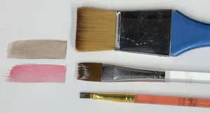
Watercolour Brush:
- A medium-sized synthetic round brush (perhaps a size 6 or 8) will be perfect for activating and blending the colours on your pears. Look for one with a good point.
- (For more advice on brushes, see our Choosing Watercolour Brushes for Watercolour Pencils page)
Other Essentials:
- A pot of clean water.
- Some kitchen paper or a soft cloth (for dabbing your brush).
- A pencil sharpener.
- An eraser (a kneaded eraser is good for lifting light initial sketch lines).
Let's Get Started: Step-by-Step to Your Painted Pears
Now that you have your supplies ready, we can begin creating our pear study. We'll take it one step at a time.
Step 1: Lightly Sketching the Pears
First, take your piece of watercolour paper. We're going to lightly draw the basic shapes of the two pears.
Choosing Your Sketching Pencil
You can use a standard graphite pencil (like an HB) for this initial sketch, but make sure to keep your lines very light, as heavy graphite lines can sometimes look a bit muddy when watercolour is applied over them.
Alternatively, and often a better choice when working with watercolour pencils, is to use a light grey watercolour pencil for your initial sketch. If you use a grey watercolour pencil, its lines will often dissolve and blend in more naturally when you add water later.
Drawing the Pear Shapes
Lightly sketch out the forms of the two pears, looking at the reference photo for their placement and how they overlap.
- A Tip for Drawing Pears: If you find drawing freehand a bit tricky (and many of us do!), a simple way to get the basic shape of a pear is to lightly draw two overlapping circles – a larger one for the body of the pear and a smaller one above it for the top section. Then, you can smoothly join up the sides of these circles to create the pear outline and erase any internal construction lines you no longer need.
Keep it Light!
The key at this stage is to keep all your sketch lines very light and clean. Once you're happy with your basic pear shapes and have erased any unnecessary guidelines, you're ready to start adding colour!


On the left, using simple circles to construct the basic pear shapes. On the right, the cleaned-up light outline drawing, ready for the first layers of colour.
Step 2: Applying Your First Dry Colour Layers
Now that you have your light sketch of the pears, it’s time to start bringing them to life with some colour! We'll begin by applying a couple of light layers of dry watercolour pencil.
1. First Gentle Layer (Yellow and Red)
- Take your Light Yellow pencil and lightly shade one of the pears. Try to keep your pencil strokes following the curved shape of the fruit.
- Next, very lightly layer some of your Dark Red / Carmine pencil over parts of the yellow, again following the pear's form. Think about where the pear might have a blush of red, looking at the reference photo.
 The pears after their initial light layers of dry watercolour pencil (yellow and red). Notice how the highlights are kept free of colour and the stalks have been filled in. The strokes follow the curve of the fruit.
- Crucially, remember to leave any areas that will be bright highlights completely white – don't colour over them at this stage. It's much easier to preserve highlights now than to try and lift them later.
- Repeat this for the second pear.
- A key tip when using watercolour pencils (both dry and for wetting later) is that two or three light layers of colour are nearly always better than one single heavy application. Light layers give you more control, richer colour mixes, and make it easier for the water to dissolve the pigment smoothly.
2. Adding the Stalks:
- Once you've got that first light covering of yellow and red on the pears, take your Dark Brown / Van Dyke Brown pencil and carefully colour in the stalks.
3. Building with a Second Dry Layer
- Now, go back to your pears and add a further light layer of the Light Yellow and then the Dark Red / Carmine. This time, you can use small, light, circular strokes (sometimes called "scumbling" when done lightly) or continue with strokes that follow the form. Continue to ensure your shading respects the overall shape of the pears.
- Begin to apply slightly more pressure with your Dark Red in the areas that will eventually be the darkest shadows on the pears. Take a good look at the reference photo – you might notice that the darkest part of the shadow on a pear is often as dark, or nearly as dark, as its stalk. That’s the kind of depth we are gradually aiming for, but we'll build up to it slowly. Don't rush to go too dark too soon!

Step 3: Your First Wet Application – Bringing the Colours to Life!
Now for the magical part! We're going to take a damp watercolour brush and gently merge those dry colours you've applied. Remember to keep your brush damp, not soaking wet, to maintain control.
1. Activating the Colours:
- Dip your clean watercolour brush into your water pot, then gently wipe off any excess water on a piece of kitchen paper or the side of your pot.
- Carefully begin to brush over the dry pencil marks on one of your pears. It’s generally best to work from the lighter areas towards the darker areas to avoid pulling dark pigment into your highlights.
- Keep clear of those areas of shine you preserved earlier – let the white of the paper be your brightest highlight.
- Use gentle strokes, allowing your brush to follow the curves and form of the pear, just as you did with your pencil strokes. This will help to enhance the three-dimensional shape.
- You might find a gentle dabbing or stippling motion with the brush helps to activate the pigment without creating harsh lines. Keep wiping your brush on a scrap of kitchen roll frequently, especially if you pick up a lot of colour, to keep your washes clean and avoid them becoming muddy.
 The pears after their first wet application. See how the dry pencil marks have dissolved, the colours have intensified, and the highlights remain bright. This forms a beautiful base for further work
2. Observe the Transformation
As you add water, you'll notice the colour becomes much more intense and vibrant. The pencil lines should soften and blend, forming a smooth, painterly base. This initial wet layer forms a lovely foundation for adding more layers of dry pencil later on to build up depth and detail.
Don’t get your paper too wet; we're aiming for damp activation, not puddles!
3. Dry Thoroughly (and an Optional Repeat)
Once you've activated the colours on both pears, you must allow your artwork to dry completely before moving on to the next stage. This could take an hour or two, depending on how damp the paper is and the humidity. Be patient – working on damp paper can cause damage.
Step 4. Building Depth with More Dry Layers and Final Details
Once your first wet application (from Step 3) is completely bone dry, you'll have a beautifully tinted surface to work on. The aim now is to build up further layers of dry watercolour pencil to create richer colour, deeper shadows, and more three-dimensional form.
1. Adding More Dry Colour (Reds and Yellows)
Just as you did in Step 2, begin by lightly layering more of your Light Yellow and Dark Red / Carmine over the pears. Continue to use strokes that follow the curve and shape of the fruit.
You can gradually increase the pressure in areas where you want the colour to be more intense, but always build up slowly.
2. Introducing Violet and Olive Green for Nuance
Now, let's add some subtle complexity to the colours. Take your Violet pencil and lightly shade it into the areas that are in deeper shadow on the pears (refer to your reference photo). This will help to cool those shadows and give them more depth
With your Olive Green pencil, you can add touches to some of the lighter parts of the fruit, perhaps where the light catches a greener undertone, or to help transition between the yellow and red areas if needed.
Continue to apply successive light layers of your Dark Red / Carmine where needed, especially in the mid-tones and shadows, until the colour depth reaches the richness and intensity you're happy with.
 After the initial washes have dried, further dry layers of watercolour pencil (yellows, reds, with touches of violet for shadows and olive green for complexity) are applied to build up richer colour and more defined form.
3. A Note on Pencil Choice (Optional)
At this stage, because we are not planning to add any more water to the pears themselves, you could technically switch to using traditional wax-based coloured pencils if you wanted to. However, for this particular exercise, we're going to stick with using the watercolour pencils (Peter used the Staedtler Karat pencils throughout his original demonstration) to see how much depth we can achieve with them used dry over a wetted base.
4. Adding Final Details and Cast Shadows
Take your Dark Brown / Van Dyke Brown pencil. Carefully add any small marks or blemishes you see on the fruit surface in the reference photo. These little details can add a lot of realism.
Now, let's ground the pears by adding the cast shadow underneath and between them. Look closely at your reference photo to see the shape and intensity of these shadows. Apply the Dark Brown, perhaps layering it a little to get a good, solid shadow.
Observe and Refine: Go back to your reference photo one last time. Notice how dark the shadow area is between the two pears – Peter often pointed out that it’s nearly as dark as the pear stalks themselves. Making this shadow sufficiently dark will help the lighter edge of the pear in front really stand out and create a good sense of separation and depth between the two fruits.
5. Knowing When You're Done (for this exercise!)
You can, of course, continue working on your pears, adding more layers to get the colour even deeper and stronger if you wish. However, for this exercise, once you've established the main colours, built up some depth, and added the cast shadows and a few details, you've reached a very satisfactory point to call it finished!
 The completed pair of pears! Notice the rich colours, the smooth blends achieved by activating the initial layers with water, and the added depth from the subsequent dry pencil work. The cast shadows help to ground the fruit and define their form
Well Done! Your Beautiful Pear Study is Complete!
Congratulations on completing this pear study! You’ve now had hands-on practice with some of the most fundamental aspects of using watercolour pencils:
- Lightly sketching your subject.
- Building up initial colours with dry pencil layers.
- Activating that pigment with a damp brush to create smooth, blended washes.
- Adding further dry layers over a wetted base to build richness, depth, and detail.
- Observing your reference to create form and shadows.
This exercise shows how effectively you can combine the control of drawing with the lovely fluid effects of watercolour. I hope you enjoyed the process and that this introduction to painting with watercolour pencils has given you a great foundation and the confidence to try more!
If you’d like to build on this project, see how to use watercolour pencils for the wider techniques behind blending, layering, and activating colour.
Ready for Your Next Watercolour Pencil Adventure?
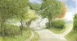
If you enjoyed this pear tutorial and are keen to try another project, our "Scottish Hillside" tutorial is a great next step. It will allow you to practice creating simple landscape elements, focusing more on washes and textures.
Happy painting!

I'm Carol Leather, a coloured pencil artist for over 15 years. Most of my teaching comes back to the same idea: realistic coloured pencil starts with structure, light and observation long before the colour goes down.
My work has featured in Ann Kullberg's Color Magazine, CP Magic and Color Pencil Treasures (vol 7). I'm a member of the UKCPS and was a prize winner in the Nature section of their Annual Open Exhibition in 2020.
You might like these
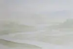
Watercolour Pencil Background Study & Lessons | Pencil Topics
Learn to paint atmospheric watercolour pencil backgrounds. A unique process study covering technique, composition, and learning from artistic challenges.
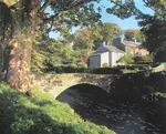
Watercolour Pencil Landscape Tutorial – Brokken Bridge
A complete step-by-step watercolour pencil tutorial. Paint an English packhorse bridge using washes, scribbles, and layering techniques. Includes free outline.
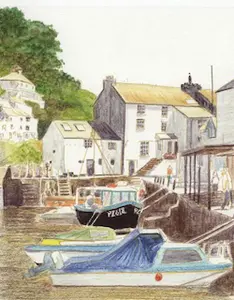
Watercolour Pencil Techniques | Beginner Guides & Tutorials
New to watercolour pencils? Start here with beginner guides, tutorials, and practical tips to build confidence and explore this versatile medium.
Copyright © 2009- pencil-topics.co.uk All rights reserved
Home | About Us | Contact Us | Privacy Policy