Derwent Watercolour Pencils
Venice Rialto Fish Market Tutorial
A set of 72 Derwent Watercolour Pencils were used for this tutorial. It was first undertaken by several members of the Topics Talk Group on Facebook and was completed in early 2017. The scene is of the Rialto Fish Market in Venice.
Three examples of this picture were worked in different brands of watercolour pencils on cold pressed watercolour paper.
The exercise notes include one or two examples of the student's work, but mainly feature Peter Weatherill's piece, done in the Derwent pencils.
This was a monumental exercise, so to make the study of this process more compact and manageable we have chosen just the one version to show this tutorial in detail.
The tutorial will run over multiple pages - and the sequence will be linked on the right hand side of each of the pages in the series.
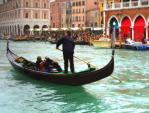
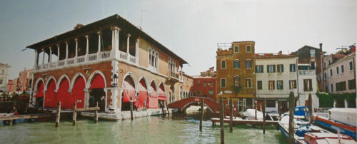
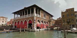
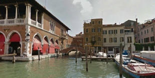
ABOVE: Firstly, here is the main reference photo which is a construct from more than one source. There were three photos used for the background row of buildings and the fish market, along with a separate photo of a gondolier.
Putting the photos together involved some manipulation, as they were taken from different places in the middle fo the Grand Canal. I don't have a source for the gondolier photo which came, I believe, from the Internet some time ago. If anyone knows the source I would be happy to credit it.
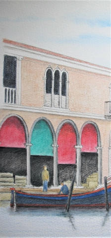
BELOW are the three finished pictures completed in the online tutorial, details are given below each image. We are going to look closely at the Derwent Watercolour pencils version, but there are one or two comments with the other pictures about the end result.
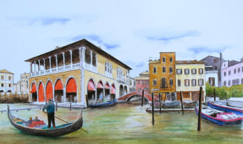
Venice Rialto Fish Market worked in Staedtler Karat Aquarelles on Clairfontaine Etival 300gsm cold pressed watercolour paper.
This picture was completed with just 36 pencils from a Steadteler Karat watercolour pencil set costing less than £35. These are a good student quality aquarelle pencil which respond well to water. The colours blend well and it was therefore quite easy to fill in the gaps for colours only available in the larger set. The colours came up vibrant and quite true to the reference. I was very happy with the performance of these modestly priced pencils.
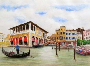
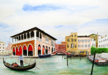
This version of the picture was completed with colours selected as required from the 72 set of the Derwent pencils on the same paper as above. I was very happy with the result on what is quite a grainy surface which made fine detail difficult. This is the version discussed in detail below.
This is the Faber-Castell Albrecht Durer aquarelle version of the Rialto reference.
Here we had a choice from 120 colours in the full set. The same paper as in the two examples above but a fairly similar result. The Faber-Castell pencils have a drier feel to them when compared to the other two brands discussed in this exercise.
Whilst not a scientific test, I felt that I preferred the handling of the Derwent pencils, and also the end result from Derwent. The Staedtler were excellent value and the result creditable.
Note: The exercises were completed over several months and the actual approach to each picture will
have been different with the passage of time. Some errors were made and this will also have had some
impact on the appearance of the final pictures seen above. All three pictures are worthy of a frame.
Derwent Watercolour pencils
The range of pencils used were the most up to date formula from Derwent.
These are the ones with the dark blue barrels. They are softer than the previous Turquise barrelled pencils and some colours have different formulas.
Either will work for this project, but I suggest you do not use the old grey barrelled
Derwent watercolour pencils as these are quite hard and do not dissolve so well.
About the photographs used
As mentioned above, two main photographs were used to create the scene. Because the viewpoint produces different perspectives into the camera for each of the images, we need to solve the problem of the distortion before we start. This is easy enough to do, but we must be aware of the need and sort it out first. We may add more traditional boats to the scene.
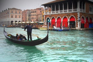
I do like the colour of that green/blue water with the red of the blinds in the archways in the gondolier photo.
The sketch was for an earlier pastel of the same area. I included more boats and figures which added interest. You don't have to put in everything that the camera shows and you are free to add extra elements.
This is the amalgamation of the two main reference photos above in the larger reference below.
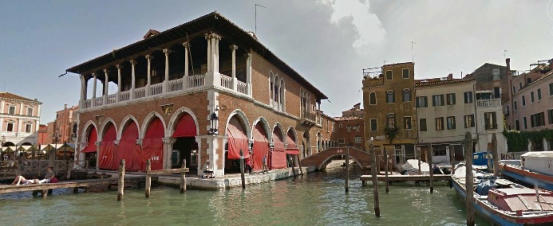
This reference picture has been reduced in height by cropping the lower edge.
We will probably include more of the nearest part of the right hand boat and an additional reference will be available for that.
What pencils do I need?
If you do not have the Derwent Watercolour pencils, you can use any well known brand in their place. The top quality brands will be easier to work with as they release good quality pigment onto the paper. Among the top brands you will find..
- Caran d'Ache Supracolour
- Caran d'Ache Museum Aquarelles
- Faber Castel Albrecht Durer Aquarelles
However, you could also get away with the Staedtler Karat pencils and if so I would go for the 60 set rather than the 36 I used so that you have a good selection to call on..
I do not advise Derwent Inktense as they are very strongly pigmented and also permanent when they have reacted with water and then dried.
I also do not advise 'own brand' watercolour pencils or low cost imports. You are going to spend quite some time on the project so it is worth investing in good pencils.
Along with your pencils you will need a good sharpener (a spiral cutter preferably but if not, then one with a new blade in it). Read more about the types of sharpeners available here.
You will also need two or three low priced watercolour brushes. You don't need sable or fancy expensive ones - just make sure they come to a good point and have a good 'spring' to the bristles. I generally use the nylon type costing just a few pounds. They only have to carry a small amount of water across to the paper and then work the colour on the paper.
A supply of kitchen paper is useful and we will discuss a wonderful collection of other bits and pieces of mainly household stuff as we go along (you will be surprised what we can use to work the colour on the paper!)
if you haven't had a chance to check out the watercolour pencils section of this site, I recommend you do so before tackling this project.
I have met many people who have a box of unused watercolour pencils tucked away in a cupboard.
They either bought a set, or were given it, and after a short experimental tryout decided that they were going to be
too complicated to use. YES, they are different to the traditional wax type of coloured pencils and they need
understanding. They are not really difficult and they do have a lot of advantages once you understand them.
What paper do I need?
The last time we did one of these exercises, virtually everyone was in the UK, so we were able to specify a paper which was readily available. This time the prospective members of the group were spread worldwide therefore different papers were selected by the participants depending on what was available where they lived.
You need a 300gsm (140lb) paper with some surface grain, but not too much. My early thought was to use Bockingford but this has more surface pattern than we need.
Pick a paper that is both internally and externally sized if possible. (You can read more about sizing and watercolour paper in general on this page).
As a guide, Canson, Daler Rowney, Strathmore, Fabriano and Clairefontaine are all names to look out for. I chose Clairefontaine Etival cold pressed 300gsm which has a different surface on each side. I shall use the smoother side.
The image shows an indication of the grain on the Etival paper compared with the Bockingford cold pressed.
Cold pressed watercolour paper
Hot pressed paper has a smooth surface - ideal for detail and photographic effect.
Cold pressed paper has a grain on the surface which gives high points to engage with the pencil or brush point, and valleys which can leave white flecks typical of a watercolour style. If we work dry pencil pigment along the paper surface we can leave a pattern of colour and white paper which differs according to the paper manufacturer's design.
Paers made in a cold pressed style will have two sides that differ - one smoother than the other. The rougher the surface the more difficult it will be to get detail - but then we don't always want fine detail - sometimes we are looking for an artistic effect.
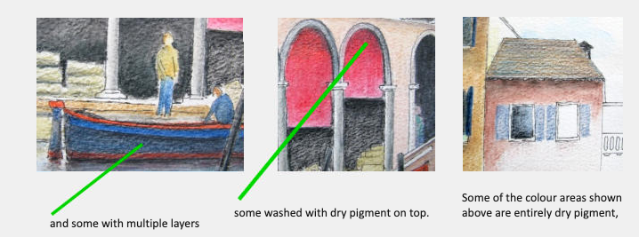
Watercolour pencils enable us to lay down the pigment on the paper and then manage it with a damp brush. We will see the several different techniques for this as we progress though the tutorial.
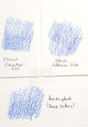
Suffice it to say that if we lay down dry colour on a cold pressed paper and then lightly wash in the colour to obtain an evenly coloured surface, we can go back once the paper is thoroughly dry and apply more colour in a light layer over colour number one. This produces a wonderful effect that you can't obtain any other way. I show below some thumbnails of a pen and watercolour pencil trial done on cold pressed paper in preparation for this tutorial.
So having looked at why we might choose to use a cold pressed paper we should now consider the weight we are going to use. Paper comes described in either grammes per square meteer (gsm) or as pounds per 500 sheets (sized 25 x 38 inches).
Don't get hung up over this - a sheet of art paper described as 300gsm compares almost directly with a sheet described as 140lb, and this is they you will see it listed. The heavier the paper, the more stable it will be when wet (and the more expensive).
What we are looking for is a paper that will accept colour well (ideally made with gelatine size to stabilise the wet pigment), be heavy enough to accept alterations without damage, and be strong enough not to buckle when it expands with the addition of water.
Because we are using very little water compared with someone painting in traditional watercolours, we don't have to worry too much about preparing the paper before we start. Whenever I commence a watercolour pencil work which I expect to frame and hopefully sell, I always stretch the paper on a special board before I start. This leaves me with all the options still open as to how I proceed.
For this exercise I have suggested that you use a heavyweight (300gsm/140 lb) paper, don't stretch it and avoid using too much water. If you are familiar with the process of stretching watercolour paper then by all means go ahead and do so before you start.
Why might you want to stretch your paper?
The sky area will benefit from a thin layer of even blue colour to indicate a spring day and enable us to play with shadows. This is relatively simple with watercolour washes on stretched paper. Fluffy clouds against a blue sky can also be very successful with watercolour techniques. This is the straightforward approach and is the one most frequently used.
HOWEVER, Because this tutorial is designed to look at techniques, I think it would be good to look at alternative ways of doing a sky which can be done on an unstretched heavyweight paper (even when it is cold pressed).
You will be the judge over how successful we will be.
How big a picture?
You can work from a pad (sealed around the edges) which will be convenient to buy and to use. This will give you more than one sheet (in case of disasters!) but limit you to using what the manufacturers regard as the ‘top’ surface of the paper. Many papers have different patterns on the two sides, so using an individual sheet of paper gives you twice the options.
The picture I first started to work on, in preparation for this exercise, was about 18 inches x 12 inches, so that needed to be on a sheet of paper fixed to a board.
That size enabled me to photograph detail well for the notes.
he most practical size for you to work will be slightly smaller and on a standard sized sheet or pad around 16 inches x 12 inches. I will give you a reference photo sized to this paper.
You will also be able to buy tracing paper to the same size.
The base (smaller) reference is on a pdf file and is sized to A4 sheet. In order to give you a larger reference to be printed out the larger size will be on two pdf files.
Pen and wash?
There is one more thing you might like to think about. When I drafted my first trial of this tutorial I drew the sketch image out entirely freehand and with a ruler in fineliner black ink.
The result was quite appealing. You can see something of it to the right here.
We will discuss this option before we get underway, as it will be quite possible to develop the new picture as a pen and wash exercise rather than using purely Derwent watercolour pencils.
In that case the ink lines will be applied after the pencil sketch has been finished and then all the graphite lines removed before we launch into colour.
I favour going forward in the 'traditional' way, having no ink involved, but that doesn't mean you can't take the pen and wash route if you wish. It will make no difference to the techniques, just to the final effect.
The image does not show a finished example, by the way!
Transferring the image onto your paper
Now you have chosen your pencils, prepared your paper and downloaded and printed the photograph and outline drawing you need to get that image onto your paper.
To avoid making this page overly long I will give instructions for doing this on another page. Be sure to read this through before choosing your method of transfer.
Perspective issues
Before you move on with starting the drawing I would like to talk about perspective.
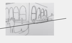
When we are dealing with a picture like this, with a letterbox shape, we need to take care with our perspectives - especially those that are from the horizontal such as the roof lines and the arch tops. As you can see there can also be vertical distortions seen by the camera.
For our picture, I believe we should ensure that all verticals are truly vertical otherwise our picture will 'look' wrong. We may need to correct some of those camera lines before we go too far.
The perspectives in the drawn references have all been adjusted, but you may wish to see what I am talking about...
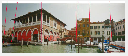
Look at the photo image above. Look at the red guidelines that I have drawn over it on screen and see how the width of view and combination of photos has given us some major distortions of lines that should be vertical.
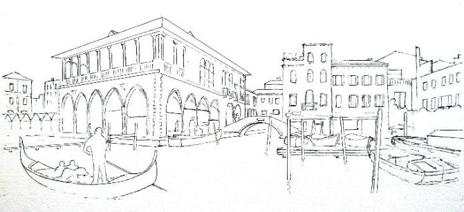
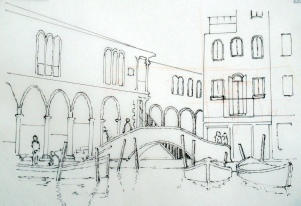
The image above shows what I suggest will be our picture.
I wanted to test our my idea of including the gondolier on the left foreground and also to include some older style boats at the rear centre. Working on the sketch in this way we can refine the composition by including items and possibly even excluding items seen in the original photo.
For the purpose of explaining the process, I have cropped this image. I think we need more water and more sky in our picture and the eventual drawing will fit more readily into a standard frame size.
When laying out your drawing you will have several options to include any exclude items on your reference.
One factor that needs consideration is the boat I have moored up against the side fo the main Fish Market building. This does not appear in the reference photos and the way you include it is very much up to you.
One of my original drawings had the boat placed in wrong perspective with the front (nearest) part too low down and the stern too high. If you are going to include it, you should make sure that your drawing has the boat with the waterline in line with the quay.
In the PDF files you will see an option for the centre area which has the new boat in a different position. I chose to go with the boat moored against the quay but you might feel the alternative in the 'centre pdf' is better.
It's now time to start thinking about colour
The logical place to start work on the picture is the SKY area as this requires a very small amount of colour being the lightest part of the drawing. The coloured pencil is not at its best when covering large areas of even colour, but using the Derwent Watercolour pencils we do have the option of avoiding lines in the sky by applying light colour from a brush. For this we need to know how to do a watercolour wash.
I will go over this in detail on the next page.
You might like these
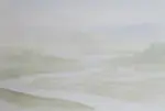
Watercolour Pencil Background Study & Lessons | Pencil Topics
Learn to paint atmospheric watercolour pencil backgrounds. A unique process study covering technique, composition, and learning from artistic challenges.
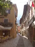
Watercolour pencil tutorial - Italian Street Scene
A step-by-step demonstration showing how to create an Italian street scene using watercolour pencils from Caran d'Ache
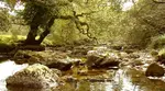
How to Draw a River with Realistic Rocks in colored pencils
Learn how to draw a river with Peter Weatherill's step-by-step guide, using Faber Castell Polychromos coloured pencils and create a realistic landscape
Copyright © 2009- pencil-topics.co.uk All rights reserved
Home | About Us | Contact Us | Privacy Policy