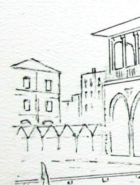
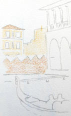
Venice Drawing - buildings on left
Author Peter Weatherill
This is part 3 of our Venice drawing in watercolour pencils. In the right column, under the photos, you will find a list of all the parts so you can follow along in order.
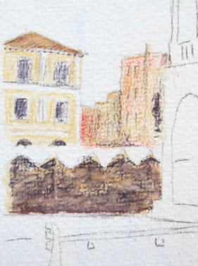
I have selected this area to start because it is out of the way, it is relatively unimportant to the picture and it gives us a chance to consider one or two of the basic techniques and not risk making a total mess of the exercise. It is a sort of "warm up" step!
First of all, our outline drawing does not include all the fine detail. That would have been pointless as we can easily draw in the details we need with reference to the reference photo. Yes, the pen version does make some shapes unchangeable, but most of you will have drawn out the picture using either graphite or watercolour pencil, allowing you to erase anything that is incorrect. Our outline simply ensures that most of the picture is in the right proportion and the right place.
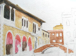
This area is a minor player in the overall scene, and as such should not have strong colours or hard contrasts.
Look at the main building, it has mainly light terracotta walls and creamy white pillar decoration to the walls and around the windows. The roof is a darker terracotta and the eaves with the block decoration are in shadow. There is a diagonal shadow across the wall to the left hand archway, and the darkest areas are the lower window openings and the archways themselves. The market stall covers are as light as we are going to see, so we can leave these the white of the paper.
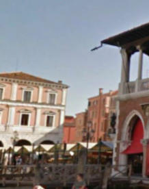
Moving to the right, I include another photo of the far left corner of the main building which might clarify what you are seeing. This reference is a photo taken from much further to the left so it doesn't actually fit with your scene. You might wish to include the boat though, if you are looking for an extra one.
Pencil colours for the Venice drawing
What colours do you have available in your pencil set? The changes are you don't have the "correct" colour. THIS IS NOT A PROBLEM.
We need to have an understanding that this picture can be worked in many ways, and no single way is correct.
To demonstrate this, for my original tutorial I used the full set of Albrecht Durer from Faber Castell on the Arches paper. My second painting used the set of 72 Derwent Watercolour pencils on the Clairfontaine paper. Then my third, pen and wash picture, used half of the box 36 pencils) of the Staedtler pencils.
You should be somewhere in that mix, but frankly it doesn't matter if you are working with just 6 colours, provided that the colours you have give you a wide range of mixtures and you understand something about the way a colour wheel works.
In case you don't have that information I will quickly explain a little about the colour wheel and mixing colours.
When Caran d'Ache launched their Museum Aquarelle pencils back in 2013 they sold an introductory pack comprising just 6 pencils. The colours included are shown below and the competition for artwork using just those 6 colours resulted in some superb work.
The colours in this set were:

- 350 Purplish Red (on the blue side of red)
- 560 Light Cadmium Red (on the orange side of red)
- 530 Gold Cadmium Yellow (an orange yellow)
- 240 Lemon Yellow (carrying plenty of green in it)
- 670 Permanent Blue (also carrying green in it)
- 640 Ultramarine Blue (with some purple in it)
Effectively, two reds, two blues and two yellows. This enables you to find good greens, oranges and purples by mixing the most related hues. It also enables the mixing of dark greens oranges and purples by mixing the opposites of the twins.
You can do this with any similar 6 colours from any brand - see the small trio of samples to the right of the mixing wheel? They show some examples of dark mixes.
When we do our main work with Aquarelle pencils we aim to supply the dry colour to the paper, and then mix and blend colours on the paper with a damp brush (just enough water to soften and mix).
If we use two colours on the paper which have an affinity - for example the lemon yellow and the greenish blue, we have two colours containing green. We would therefore expect to be able to get a good bright green from the mixture.
If we were to take the orange yellow, which has very little green content, and mix it with the blue green, we still get a green but not a bright one. The amount of green content is low.
If we mix the orange yellow with the purplish blue we have very little green at all. So our mixture will be quite dull and earthy.
By taking colours which are not neighbours on the colour wheel, we can get a wide combination of hues which give us many of the colours we will be looking for in this picture. Though getting the 'right' bright red for those blinds to the market arches is going to involve some entertainment, I think!!
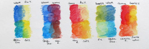
The six colours selected from the Derwent set produce a wide range of mixes. They were...
A: Ultramarine (a reddish blue)
B: Spectrum Blue ( a greenish blue)
C: Primrose Yellow (some green content but low pigment strength)
D: Cadmium Yellow Deep (orange yellow)
E: Deep Vermillion Red (with orange content)
F: Madder Carmine (a purple red)
As you can see from the mixtures shown, we get a very good purple in the second box and some interesting darker greens when we mix the orange with the Ultramarine in the fourth box.
So what does all this mean for our Venice drawing?
You need to understand the colours you are using. Having 120 colours is all very well but you need to know how the colour you have selected is going to mix with the second - or third - colour in your blend. How strong is it, is it easily overpowered by other colours? A test sheet of similar paper to your working surface is essential, because your dry colour mixture may look good, but adding water may produce the wrong effect.
Always use less dry colour than you think you need! It is easier to add than take away.
There is no problem applying four layers of pale colour to build what you want. It is a problem taking away colour that is too strong to try and get the exact shade.
When I completed the trio of pictures, some of the stages concentrated on the techniques for a particular area using another of the three brands. This makes explaining the Derwent version more difficult as there are some gaps in the explanation when another brand was discussed. However, the images below may give you some guide and there is a method detailed based on the Staedtler pencils.
The images below relate to the Staedtler Karat pencil version.
I have gone into my 36 colour box of Staedtler pencils for this demonstration. This restricted set should give me the colours I need and those of you working with larger sets should find similar - or even better - colours in your collection.
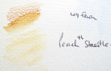
I need two basic colours here. A light pink for the walls and a darker brown for the roof tiles. The buildings to the right are more red and orange, but I still used the same pink as a foundation and will add a further layer in a moment or two.
I have done a small test to check the wet strength of the pencils I have chosen. The pink (Peach 43) is fine as it is a low strength colour. The brown (Fawn 49) is much stronger.
I have also used the Fawn as a foundation for the much darker area where the market stalls are. This warm brown will disappear under a further layer of dry colour shortly.
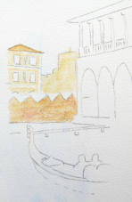
With a pad of clean tissue available to remove excess colour, I am now ready to add a little water from a damp brush to the pigment. I am using a number 4 brush, but you could equally use a number 2. We need to keep some areas in the 'pink' building white where there are white pillars on the fascia. If you are working over a graphite drawing don't worry about the grey/black lines. We will aim to remove those shortly after the first layer of colour is throughly dry.
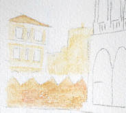
Make sure that you even out the wet paint on the paper surface - that is unless you want areas of darker and lighter tone. I have used hardly any water at all here.
Finally, most of the graphite has now been erased - the rough paper means that some will be left behind, but mostly that will be absorbed into the scene. The eraser will also lift a little of the colour, bu as we are adding more that doesn't matter
I am now going to sharpen up my pencils, add a grey and a dark brown, and do some dry work to that left hand corner. This additional colour can be touched in with a damp brush as required, though I suspect it won't need a lot.
So we have tried out our basic skills on this small area of the picture. Some of the colour is dry on top of the underlayer, some has been drawn in with the damp brush (the shadowed area of the market).
We can come back later and refine this when we see how it fits into the overall scene. There are a number of possibilities for refinement - one of which is to bring a fineliner pen into play. We will see.
You will note I have included that dark coloured statue on the corner of the main building. Once again we don't need detail, just a suggestion.
The most important thing to bear in mind is the fact that we are currently working a foundation for the picture. We will come back and apply more layers of colour later and also - with a fine point on the pencil - define detail much better.
The next section of our Venice drawing
For the next section, the notes relate entirely to the Derwent exercise.
I am using the Derwent Watercolour pencils on the Clairfontaine Etival 300gsm cold pressed paper, and you may recall the working of the sky on this paper.
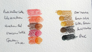
For this step I have put out some of the colours used last time and also some similar but paler colours, as some of the new step is in stronger sunlight.
We do have the benefit of a colour called Venetian Red in the Derwent se, so I have put that out to use. I think it will do well as it is a good base for the bridge and shadowed buildings behind the bridge.
I may add one or two more colours to those shown in the photo, as I go along. Note how the yellow/brown/orange colours make a leap in strength when wet, but the pink madder lake, which I want to use for the sunlit blinds, stays very much a pale colour. This may prove a problem. When working colours paler I is always the best to test out the strength on similar paper to the one being worked on.
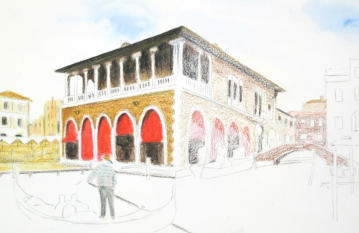
Some of those selected colours have been applied here in dry state.
I am keeping the amount of dry colour in a thin
layer for the moment - until I pluck up courage to apply
a brush. It will be wise to have a clean pad of kitchen
paper handy when I do this, to remove any over excited
colour as quickly as possible before it dries and sets
into the paper.
One or two important points here.
As you can see, I have first applied a relatively dry brush to the most sunlit part of the brickwork and the lightest part of the sunlit blinds (the shadows will darken the blind tops quite a bit). By using a barely damp brush, I leave a lot of white paper showing and this will enable me to leave that as brickwork without having to add further dry colour.
It is always best to work from light to dark with the brush, otherwise you tend to get too much colour pushed ahead of the brush and the picture gets too dark where it should stay light. I call this a 'snowplough effect' - it has its uses but not here where we need tones to stay light.

And here I have worked from the roof edge which the light is catching and working down into the darker shadow under the roof eaves.
The colour in the area at the top of the wall which is in light shadow is possibly too strong now water has brought up the tone. I will see if I can reduce the strength of this colour with a brush of clean water and a dry pad of kitchen paper. If that doesn’t work, I will have to rely on the dry colour layer to calm it down.
When applying water to the bridge, GO CAREFUL and
leave the line of white stone along the top of the bridge
and where the bridge name plate is situated.
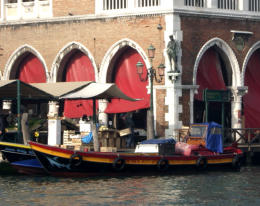
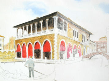
The colour on the bridge evened out nicely with the clean water and the pad of kitchen paper to lift of excess colour. The next step here is to add some dry colour to bring that brickwork shadow into line and put in the shadows over the blinds. I can then concentrate on putting in the boat and the two men. I want them in position before I do any finishing off of that side of the building.
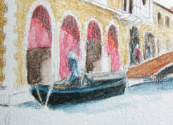
Not terribly happy with the shape of that boat.
The front should be a little higher from the water. I might take a scalpel blade to the rear line of the boat against the quay to remove some dark colour and balance it better, once the paper is fully dry. I have used the Derwent Blue Grey for the shadow on the brickwork, the far distant windows and the shadow on the water under the bridge. (I couldn't resist adding a bit of blue).
Carefully using the flat edge of a sharp blade removes a layer of colour from the paper (the 300gsm paper will take quite a bit of this treatment) and then a layer of white pencil over the top of the damaged area will seal down the paper surface again. This looks a lot better and the outline of the back of the boat can be redrawn. A final group of dry pencil ‘tidying up’ actions and we are nearly there.
The picture below is where I am stopping for now. It isn’t looking too bad when you stand back and see it as a complete picture.

Contrast in your Venice drawing
You may find it useful to read a note on CONTRAST which I wrote when I did the original tutorial with the students who were working along with me.
Working on 300gsm cold pressed watercolour paper, we can correct many things that go wrong but we may find that it is not necessary.
If we are aiming for photo realism, then we would be working on hot pressed paper and taking a lot of time and a lot of care to get every bit of the picture 'just right'. We are not, though.
We are working a tutorial picture with the aim of exploring ways of doing things. The paper is a very tolerant 300gsm cold pressed paper, and most papers of this type and weight will take a lot of ill treatment with knives, sandpaper etc etc. We don’t need to do any correcting until the later stages of the picture.
The focal point of any picture is where the lightest light meets the darkest dark. This is where the eye goes when you first look at a picture.
The composition of a well designed picture will position that focal point at one of the golden section points, approximately one third across (either way) and one third up (or down). That is not cast in stone, but a general guide to good practice. There is a top on the site about composition so I will not go into it more here, save that to say contrast can be tonal (dark against light) or colour contrast (think red flowers against green leaves).
So the highest point of contrast attracts the eye. When we are working on a picture, there are going to be areas that have high contrast, but possibly only for a short time.
Consider the matter of the small boat moored against the quay that we have been looking at in the notes above. The position of the boat is not a critical matter. When we look at it in isolation, with the black of the boat hull contrasted against the white of the paper, the position may look totally wrong. When we complete the water around the boat and include some shadow in the water and against the quay wall, the boat hull will suddenly be a minor contrasting factor within the picture and the eye will look elsewhere for something more important to worry about.
Yes, we can correct the position of the boat by removing some colour from the paper using a scalpel and then seal down the scratched surface with white pencil. This may not be necessary though.
Our aim in working this tutorial is to cover a wide range of techniques for watercolour pencils and to discuss and support your learning.
So what if things go wrong?
It doesn't matter!
Treat the mistakes as a tool to learn and explore how to put it right. You may well find that it doesn't need correcting. What you felt was a major disaster at the time slides away into obscurity with all the other activity going on in your picture. Just make sure that as you come to the final stages of working your picture, you bear in mind the need for contrast as a feature of your composition and make sure that the area of highest contrast is correct and is the feature of the picture that you want to be the most important.
You might like these
Beginner's Line and Wash Tutorial (Watercolour Pencils)
Transform your pencil drawings with water! Our beginner's line and wash tutorial guides you step-by-step from dry pencils to a lively, colourful scene.
Watercolour Pencil Landscape Tutorial – Brokken Bridge
A complete step-by-step watercolour pencil tutorial. Paint an English packhorse bridge using washes, scribbles, and layering techniques. Includes free outline.
Coloured pencil drawing step by step
Coloured pencil drawing step by step demonstrations by Peter Weatherill - watch how he tackles different drawings
You might like these
Watercolour Pencil Background Study & Lessons | Pencil Topics
Learn to paint atmospheric watercolour pencil backgrounds. A unique process study covering technique, composition, and learning from artistic challenges.
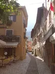
Watercolour pencil tutorial - Italian Street Scene
A step-by-step demonstration showing how to create an Italian street scene using watercolour pencils from Caran d'Ache
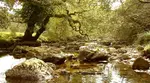
How to Draw a River with Realistic Rocks in colored pencils
Learn how to draw a river with Peter Weatherill's step-by-step guide, using Faber Castell Polychromos coloured pencils and create a realistic landscape
Copyright © 2009- pencil-topics.co.uk All rights reserved
Home | About Us | Contact Us | Privacy Policy