Painting Venice in
watercolour pencils
using a grisaille underpainting
Before we continue painting Venice in watercolour pencils, here is a quick reminder. This is page four in this extended tutorial, and you can find a list of the preceding pages below.
Let’s consider our process so far and explore alternative approaches that could enrich our work.
By slowly applying dry watercolor pencil pigment onto the paper, followed by careful amounts of water, we have built up a foundation of color. This unique process not only creates a beautiful base, but also saves time compared to using only wax pencils.
As we continue, it's important to bear in mind that most pencil pigments are transparent, and we must rely on layering to achieve the depth and exactness of color we desire. Using opaque pigments, while tempting, would hinder our layering technique and limit our ability to adjust color..
So far, we've used a foundation color that is similar to the end color we're aiming for, which works well for brighter, lighter tones. However, there are other ways to approach this.
Grisaille underpainting
When it comes to creating a nuanced and deep effect in our artwork, we need to consider the relationship between our base layer and the layers that will come after. If we want a subdued and moody tone, it's important not to waste time building up a bright and vibrant base that will eventually be covered up.
Instead, we can use a technique called Grisaille, which involves building up a subtle grey foundation that can be layered upon for greater depth and complexity. Alternatively, we can employ complementary colours (from the other side of the colour wheel).
By layering our colours over this foundation, we can create a rich and captivating work of art that will leave viewers spellbound.
With complementary colors is all about balance and understanding the color wheel. To achieve the desired effect, layering green over red works wonders. But, layering red over green, tends to overpower the weaker green. It's like trying to mix two paint colors of to get a specific shade - it can take a lot of trial and error to get it just right.
As we delve into the picture I will be creating, I must acknowledge that the specific colors and techniques I use may not be applicable to everyone. Each of us has our own unique set of materials and methods of application. It's important to understand the underlying principles and experiment with different approaches to find what works best for you. Let's explore together and embrace the beauty of individuality in our creative processes.
Working with darks
I must apologize for any confusion that may arise from the lack of photo reference in this section.
While away from home, I completed this part of the tutorial without the benefit of step-by-step photos or a detailed description of the method used.
However, I do have a complete description of the method using Staedtler Karat pencils, which I will share with you to provide as much information as possible.
Please note that the Karat tin I was using only included 36 colors, not the 72 in the Derwent box. The full Staedtler range extends to 60 colors, which I did not have hand.
Thank you for your understanding.
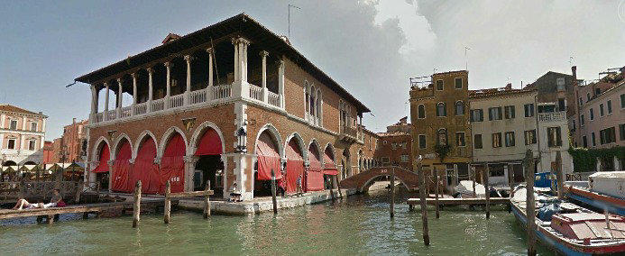
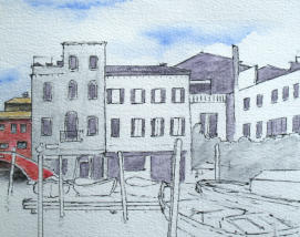
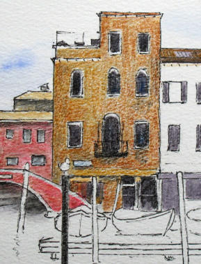
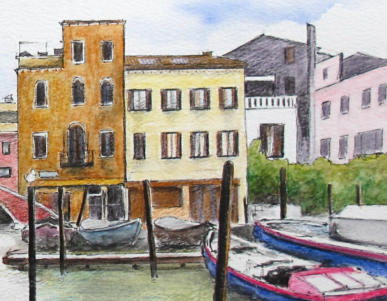
The shadowed buildings on the right hand side
After deciding to use the Grisaille method I picked out the grey pencils from my box. There were only two. One is a deep, cool grey with a hint of purple, while the other is a warmer, lighter grey with a touch of brown. I've labeled them as grey 8 and grey 80, respectively.
If you have a wider range of pencils, don't hesitate to experiment, but keep in mind that the darker, cooler shades should be reserved for the darkest areas. The image on the left shows my progress at this stage.
As I start adding the first shades of grey with my dry pencil, I am reminded of the unique nature of this colour.
Grey pencils are not just a single hue, but commonly a blend of blue and brown. This blend allows for the creation of both cool and warm greys, each with itheir own distinct character. It's fascinating how a simple colour can hold such complexity within it.
As I applied the first coat of color to the textured paper, I immersed myself in the process. It's important to keep your brush moist, but be careful not to overdo it.
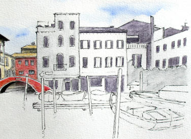
The second building still has a dry pencil texture, and I've left its light-colored walls untouched by any gray tones.
This photo was taken in different lighting conditions, resulting in an image closer to the actual colours of the painting.
Using a grey watercolour pencil foundation, I have created a blend of warm and cold greys that evoke a sense of depth and dimension. The colder greys contain more blue, while the warmer ones have hints of brown. This technique has allowed me to capture subtle nuances that are difficult to portray though photos.
As the darker tones are added on the right side, the balance of the picture shifts. This effect will intensify as the walls darken. While it may be tempting to start with even darker greys, it's better to err on the side of caution. It's easier to add more color later than to remove it.
As I add a second layer of dark grey to this image, I can see the subtle changes it brings. The area that will be green on the far right and the first building, remain untouched, allowing the dark purplish grey to take center stage. I
'm hesitant to add more layers, as I want to preserve the texture of the paper and the foundation underneath. However, I do need to correct the uneven windows on the light-colored building with dry pencils later on.
As for the green area, I'm excited to explore the possibilities of foliage with watercolor pencils. There is very little foliage in this picture, and I look forward to sharing my process with you. Sometimes, it's the small details that make all the difference in a piece of art.
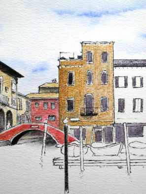
As we delve into the world of color, we will witness a transformation.
The first layer, a subtle mid-brown, (49 Fawn by Staedtler) adds depth and dimension to the right side of the building.
The second layer, (16 Golden Ochre), intensifies the warmth and radiance emanating from the center.
Finally, the burnt sienna (73) on the left edge of the building adds a touch of earthiness and grounding.
I cannot resist adding a hint of dark grey under the balcony along with black to the post in the water, to balance the composition. It is a delicate dance between light and shadow, color and contrast, which creates a work of art that speaks to the soul.
As I work on the mooring post, I leave a small white space on its right side. The paper's texture absorbs the pencil pigment in a way that made the valleys appear much lighter than the raised portions, creating too much contrast.
Let me complete the building front and you will see what I mean.
I add new hues, layering and building until the final result emerges. And then, with a delicate touch, I introduce water, allowing the colors to blend and dance together in a beautiful, fluid display.
Vertical brushstrokes blend the colours without smoothing them out completely. See the difference between the DRY and WET photos below.
 DRY
DRY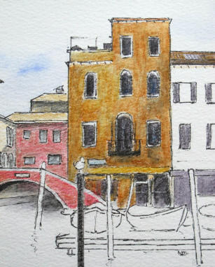 WET
WET
As we step back and take a closer look, we must ensure that the tones and contrasts are in harmony with each other. I feel that the newly constructed building is overpowering, and the red building to its left may require a darker shade. However, I will hold off on making any changes until I see how adding more color affects the rest of the buildings in that line.
It is worth noting how beautifully the burnt sienna pigment blends with the dark grey on the adjacent roof.
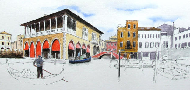
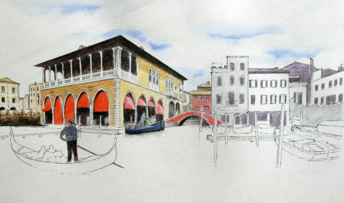
Interruptions have hindered my ability to capture the work in progress through photos, but the image above depicts the Staedtler pen and wash from the end of February 2017. Let me go through the various changes and explain what has been going on.
Beginning the water
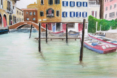
The completion of the buildings in the background is a straightforward process. See below for a close up of that area.
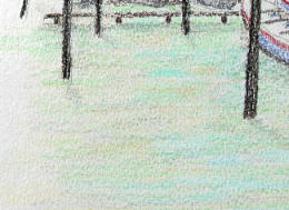
Although I have already added the dark posts, it may have been wiser to work on the water first before adding them. This approach would prevent the brown and black from spreading sideways when water is added.
Currently, I have laid down a foundation of grey/green on the water, except for the area of light reflection in the center.
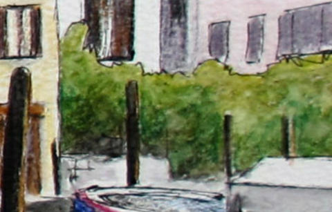
The foliage on the right has been worked with a combination of greens and browns. Using a small brush, I applied circular motions to create darker and lighter areas in a random manner. For a closer look, again please refer to the detailed photo below.
As for the water, I will tackle it later. The challenge here is that my Steadtler set of 36 colours does not offer many options for pale greens and greys. Therefore, I prefer to experiment with larger sets of colours in other versions of painting Venice, before taking on this significant task.
A more detailed look at the buildings.
Despite the leaning structures and crooked windows that define Venice's charm, I aim to present a more vertical view in my work.
As I darken the area under the pier, I notice how the shadows play a vital role in bringing the scene to life. The moored boats in the distance cast deeper shadows, creating an eerie yet captivating atmosphere. A seagull perched on a post catches my attention, and I make a mental note to highlight it later.
The nearby tree's foliage is a work of art in itself, so I will provide more details below.
The trees
Creating a realistic tree requires a careful selection of colors. Start with a mix of greens and add in a darker shade like grey or brown for the shadows. Apply these colors in overlapping squiggles or circles, then use a small brush to blend them together with a dabbing or circular motion.
This will create a range of tones and textures, with lighter areas at the top and darker areas underneath.
By working from top to bottom, you can create a natural flow that brings your tree to life. Remember, a few well-chosen colours, perhaps four or five, can become many with the right technique.
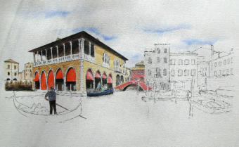
Back to painting Venice with the Derwent pencils
Let's revisit the Derwent rendition, which didn't quite hit the mark in my opinion. Without the aid of a photo reference, some of the colors may differ from the Staedtler version.
Additionally, the Derwent pencils have a softer texture, resulting in a larger working point unless frequently sharpened. This can make achieving fine detail more challenging. However, we can address these issues in the final dry layers. Moving forward, my notes shift to the water area and the Gondola.
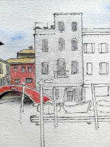
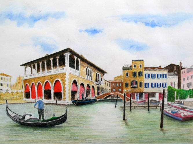
The Gondola
The colours I've chosen for the gondola are a mix of Gunmetal Grey and black, with a pop of bright green to connect it to the surrounding bushes.
The right-hand boat is a darker red, paired with a soft Delft Blue to keep the overall color palette harmonious. They may need darkening later.
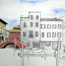
The Water
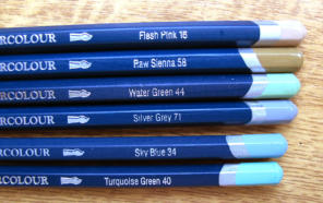
As I begin to paint the water, I carefully choose pastel colours from my Derwent set. I don't have a concrete plan yet, but I avoid the area of reflected highlight in the centre of the picture.
Above is a close-up of the water with the first layer of dry colour applied. And here's the overall view of the picture with the foundation of the Gondola in place. It's a work in progress, but I'm excited to see where it takes me.
The water is the trickiest part of this Venice drawing, and there's a good chance it won't turn out as planned - adding water to pencil is always a gamble. I tackled the background buildings first, using a small brush to even out the dry pencil. I left the mooring posts and two boats on the right for last.
I started by layering the six pastel coloured pencils shown above, blending in some white to create a range of delicate hues. As we move on to the next step, you'll see how the brush brings out the subtle tones.
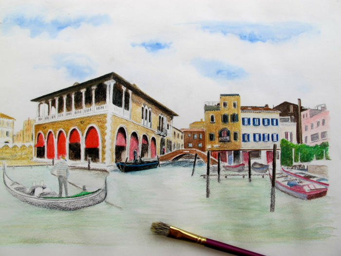
As I work on this painting, I'm being mindful of the order in which I add colours. I've left the bottom of the posts and the gondola untouched for now, to avoid smudging the lighter hues with darker ones. The pigment I'm using is thick, but once I add water with my brush, it blends in smoothly. I have some kitchen roll handy, in case I need to lift out any areas where the colour is too intense. And to apply the pigment, I'm using a bristle brush, as seen in the photo.
With a light touch, I've used smooth horizontal strokes, allowing the dry colours to dissolve and blend together. To add depth and texture, I've selectively lifted some areas with a paper pad, creating a dynamic interplay between light and dark. As the paper dries, I'll carefully layer on more of the six colors, each stroke imbued with intention and precision.
I aim to keep the water closest to the viewer in a darker shade, to complement the vibrant hues of the buildings. It's wise to establish a foundation of shadow or darker tones at the base of the artwork to provide a stable and solid foundation for the scene to rest upon.
Once the paper dries, I eagerly anticipate the next step. With my pastel colours in hand, I carefully add horizontal lines to capture the essence of the swirling water and the shadows of the gentle waves. It's a delicate dance between technique and creativity, but the end result is always worth it.
Adding the finishing touches
With a delicate brush and horizontal strokes, I bring life to the gentle waves.
I deepen the shadows beneath the boats on the right and add depth to the mooring posts, letting their reflections dance in the water. Every stroke is a chance to create a world beauty and depth.
As I add a touch of Smalt blue and Cedar green to mycolours, the colors gain a newfound depth. I'll repeat this technique on the left side, but I'm not sure how much darker I want to go just yet. What I love about using watercolour pencils is the freedom to choose from a wide range of shades and blend them together on the paper, creating unique and beautiful tones.
As I apply dry colour to the water and gondola, I mix in black and add vibrant hues to the gondolier. To prevent the colours from blending too much, I carefully add water in short, horizontal strokes.
I am struck by the contrast between the dark brown quay and the shimmering water below. With a gentle stroke, I pull the colour down, creating a reflection that seems to dance on the surface of the canal.
Adding a touch of Cedar Green, I deepen the shadow, giving the scene a sense of depth and mystery
But there is still work to be done - details to be added, nuances to be explored. As I continue to paint, I am reminded that art is not just about capturing what we see, but about revealing what lies beneath the surface. And so, I brush on, fiddling and refining, until the picture is complete.
With a clean, wet brush, I carefully soften the colors in certain areas, then quickly lift them out with a piece of kitchen roll. As I step back and examine the painting, I'm pleased to see the light points in the water, reflecting the sky's image in the gentle ripples.
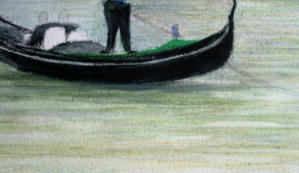
I grab some pencils and add the final touches, focusing on detailing the Gondola and Gondolier, as well as the boats on the right-hand side.
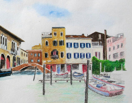
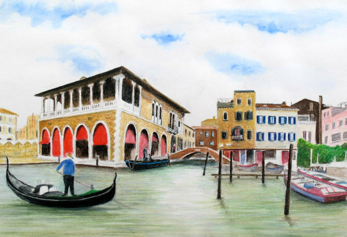
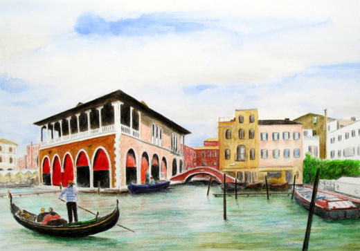
Derwent Version
72 colours available
Cold Pressed paper - Clairfontaine Etival 300 gms
Finished size 16 x 10 inches
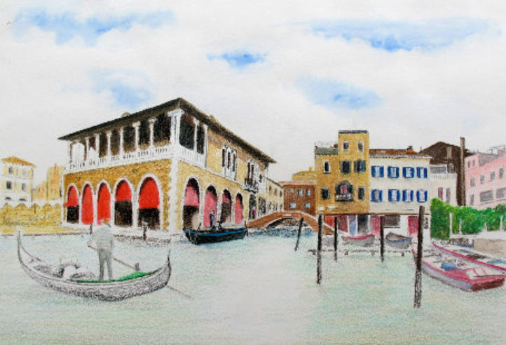
I present to you what I believe to be the final iteration of the Derwent picture. Additional details have been added in dry pencil, such as the Gondola, red blinds on the Fish Market, facing buildings, foliage on the right (with added shadow), and right-hand boats.
However, there comes a point where one must accept the limitations of working on a rough-surfaced paper and the accuracy that can be achieved.
My goal was to experiment with how watercolour pencils could be used on an unstretched, cold-pressed paper to create a reasonable image. Comparing the three versions I completed with different papers and pencil brands, it is surprising how well the 36 Steadtler box's limited range of colours holds up against the full range of Derwent and Faber Castell. This demonstrates that colours "in between" can be effortlessly mixed on the paper with watercolour pencils.
If you're interested, I've included the finished versions of the other two pictures below. Thank you for following along with my creative exercise.
Faber Castell Version
120 colours available
Cold pressed paper - Clairfontaine Etival 300 gsm
Finished size 16 x 10 inches
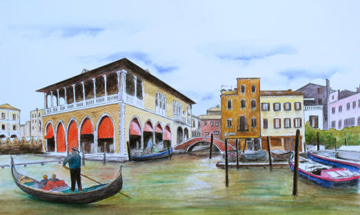
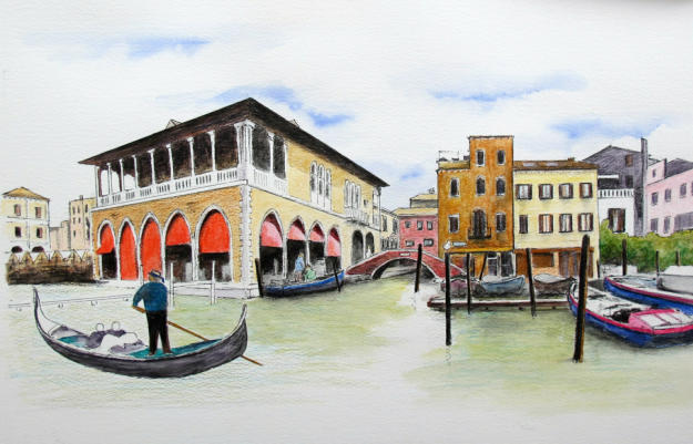
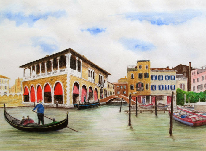
Staedtler version
36 colours available
Cold pressed paper - Clairfontaine Etival 300 gsm
Finished size 20 x 11 inches
You might like these
Beginner's Line and Wash Tutorial (Watercolour Pencils)
Transform your pencil drawings with water! Our beginner's line and wash tutorial guides you step-by-step from dry pencils to a lively, colourful scene.
Watercolour Pencil Landscape Tutorial – Brokken Bridge
A complete step-by-step watercolour pencil tutorial. Paint an English packhorse bridge using washes, scribbles, and layering techniques. Includes free outline.
Coloured pencil drawing step by step
Coloured pencil drawing step by step demonstrations by Peter Weatherill - watch how he tackles different drawings
You might like these
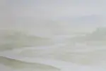
Watercolour Pencil Background Study & Lessons | Pencil Topics
Learn to paint atmospheric watercolour pencil backgrounds. A unique process study covering technique, composition, and learning from artistic challenges.
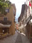
Watercolour pencil tutorial - Italian Street Scene
A step-by-step demonstration showing how to create an Italian street scene using watercolour pencils from Caran d'Ache
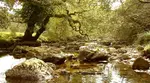
How to Draw a River with Realistic Rocks in colored pencils
Learn how to draw a river with Peter Weatherill's step-by-step guide, using Faber Castell Polychromos coloured pencils and create a realistic landscape
Copyright © 2009- pencil-topics.co.uk All rights reserved
Home | About Us | Contact Us | Privacy Policy