- Home
- Pastel Pencils
- Pastel Pencil Drawing
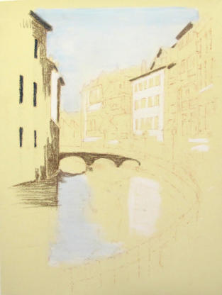
Pastel pencil drawing - Annecy Reflections step-by-step
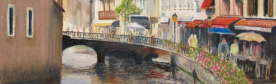
Caran d'Ache, a leading manufacturer of drawing, writing and art materials based in Geneva, commissioned this pastel pencil drawing. The request was that the picture should be used in their publicity for a new line of pastel pencils and a matching range of pastel cubes, both of which were launched in early 2012.
Please note the copyright conditions attached to this pastel pencil drawing at the end of the tutorial.
I selected the colours from the range supplied to me by the company. I was not aware of the colours' names, so I cannot give them to you. However, each artist working from the same reference will produce a different result, because there are many other factors influencing the result, so the specific choice of colours is not vital.
They turned out to be very good pencils with an excellent colour range.
I wrote the notes below as I completed the steps. This page is not a work of planned literature!
Pastel pencil drawing - Step-by-step with notes
To bring the painting to life, I used a sheet of Colourfix pastel board in ‘sand’ (a pale yellow), which is mounted onto a firm drawing board. The sheet was 30 x 40cm.
Accurate drawing is necessary
All vertical structures in a picture should be drawn accurately, otherwise reflections will not 'ring true' and the picture will not look as if the buildings are standing on firm ground.
If a well-known location is to be painted, be sure that it is shown correctly.
For this reason I will carefully measure out the positions of most of the main parts of the buildings and put in lines for correct perspective of windows. This will give me the framework on which the eventual picture can be hung.
I will first measure out where the doors and windows will be and places marks along these lines to indicate correct perspective. This will give me a framework onto which the final picture can be hung.
Pastel pencils work best when left undetailed, allowing for the blending of tones, and the creation of a feeling of a place instead of an exact copy of it.
For this reason I will concentrate my detail around the centre of interest – near to the cafés on the waterside and the promenade. We don't want the viewer to have to do all the work – we want them to see and enjoy the beauty of the work, not wonder how it was done.
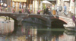
Looking at the reference photograph, I have applied some changes to the immediate foreground to frame the bridge and the reflections in the water more appropriately. The pedestrian way does not curve as much as is shown in my drawing, but if I bring the railings and flower boxes further left it will benefit the composition.
I have found my 'Golden section' or intersection of thirds under the left-hand arch of the bridge, making it the main area of interest. I will increase the contrast of light and dark here to focus the eye of the viewer.
The four stages of a pastel pencil drawing
Working a pastel picture of a landscape (and most other subjects) involves at least four stages.
- The line drawing to place the elements of the picture
- The blocking in of tonal values and main colours to establish the shape and composition is best done using pastel blocks or sticks, but can be done with Pan pastel as well.
- The establishing of some detail, using pastel pencils, following which the picture can be 'fixed' using a spray to hold the main pastel media in position. Colourfix board has a fine grit surface and doesn't need much fixing
- Finally, extra detail can be added where required and highlights and contrasting darks confirmed.
If the original line drawing is correct, the pastel pencil drawing can be completed in a relatively loose way and still be recognisable by those who know the place.
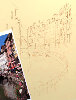
The outline drawing
I have drawn the outline of my landscape in a brick red pastel pencil. I will remove the surplus powder using White Tac. This will provide the final outline.
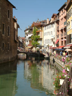
My photo measures 20 x 27 cm. The pastel pencil drawing is roughly 26 x 35cm with the foreground added.
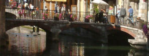
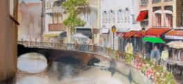
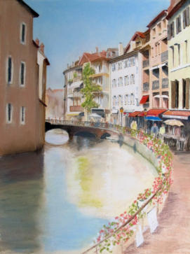
The number of arches to the bridge is not immediately obvious from looking at the photograph.
Therefore I have lightened up a small portion of the photograph so that you can see what the whole scene includes. It's important to understand the reference before we go on and resolve any areas that may be in doubt.
If you have an idea of what you are painting, then the viewer may understand, and your work is more likely to be successful.
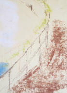
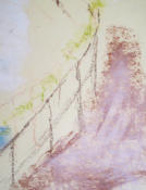
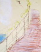
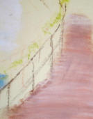
My first thought was to swing the nearby railing round as a curve right across the immediate foreground as shown here. This did not work as well as I expected, so I reduced the curve and brought the railing in at the centre line.
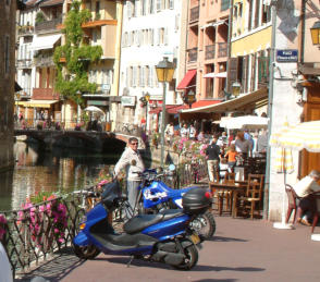
Because I altered the line of the steel railing, I referred to a second photo, which I took at the same time, to provide a guide to the colour of the pavement along with the railing design and positioning of the resturant's tables and chairs.
I applied a dark brown to the shadowed areas on the left and other areas of shadow, like the bridge - although lighter tones of colour can be more be applied on the top, we can easily get back to our dark tone if we need to.
White, as a base coat of pastel, always allows us to get back to a light tone at a later point. The first layer of dry colour on the working surface locks itself down to the paper and performs the task of a foundation.
I laid white pastel in the sky and the water areas and also white where there are major areas of white or light in the buildings.
This next image shows my correction to the line of railings.
If you look at the blue of the water you will see the nearer water is darker. Starting with the blue produced a darker result than had the white been applied first.
With the previous base coat of pastel down on the sky and water, I can now work in a selection of the pastel cubes in white and pale blue to increase the colour in the top section of sky and the lower section of the water. I am able to blend the dry pastel into the prior coating and easily achieve an even coat right over the edge of the building line.
I can still see my drawn line and working back to the buildings gives a crisp edge. I am enhancing the darks where possible as I want to keep the sunlit feel which needs dark shadows.
If you refer back to the photograph, you will note that I have not included any detail in the far buildings behind the bridge as I want to prevent these from fighting for attention.
Where I have needed to work with my hand over existing pastel, I have used a section of clear perspex to protect the picture surface and this also protects light coloured areas from dry pastel dust falling on them from above.
Note the shading in the sky goes to darker blue overhead. I have not tried to match the exact blue for the moment – that can await a later check towards the end.
The pavement
Now I want to look at how the pastel cube colour is laid down on the base surface and then blended in. I have shown a series of images below and we will look at the working process.
 1.
1. 2.
2. 3.
3. 4.
4.1. The first image above shows a base coat of pastel applied to the footpath. This is loosely applied as you can see. This first layer establishes the colour as brick red.
2. A second layer of white pastel on the top will lighten the base colour, but no blending takes place yet.
3. Thirdly, horizontal lines of a light violet are applied, after which....
4. ...the pastel is blended with the finger in horizontal strokes. This gives the flat feeling of the footpath with some grading of colour. The blocked-in colour here, now balances the colours elsewhere and we can start to get a feel for the overall image.
Using the same process, I darkened the shadowed wall of the left-hand building, and blended colour into the shadowed water on the left.
When working with pastel, fine points are required, so I constantly sharpen them with a craft knife and turn the pencil regularly to keep the point sharp as long as possible.
The bridge and buildings beyond
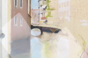
When drawing detail, a see-through plastic guard laid over part of the picture is useful. The plastic is held in place by two blobs of White Tac outside the picture area and allows for the side of the hand to rest on the working surface without damaging the already worked pastel.
I can now complete the central building behind the bridge and also some associated areas. I have blocked in some colour to the two buildings on the right and identified the lightest areas (around windows and a couple of sunshades etc) where I will need to keep the white pristine.
Next, I darkened the water and added a shadow to the bridge to give more form to the overall pastel pencil drawing.
Being right-handed, I normally start painting a picture from the top left corner and work across the picture from left to right.
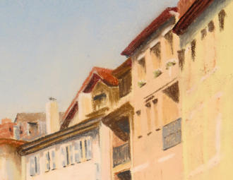
The next stage is to work the windows and shutters on the white building right of centre.
This is slightly away from the main focus of interest so the detail will be less pronounced and the contrast in tones lower.
Here we can see the roofline completed. I took this photograph in direct sunlight so the pastel pencil drawing looks warmer.
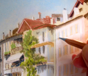
I have included a detail of the windows and shadows on those upper levels so that you can see that the pastel is effective even though the line is not as sharp as you would get with a wax coloured pencil.
This doesn't matter, as this part of the picture is away from the main focus and we just need to give a valid impression of the architecture.
Perspective issues
The changes I have made to the railings have caused an issue with the eye level in my pastel pencil drawing. We are now looking down on them from a height of around 3 metres instead of the normal 1.75 metres.
It was therefore necessary to change the perspective of the nearest building on the right, so that our eyes are now looking from a point nearly level with the ground floor of the building.
This will give me a better opportunity to compose the detail of tables etc. outside the cafés but will necessitate changes to the top of the window blinds.
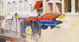
Colour choices can redirect attention
My first colour choice for the sunshade to the right of the bridge was green, expecting it to provide a sharp contrast with the red blind above. However, this brought the focus of the picture away from the bridge. Therefore, I lifted off the green with White Tac and replaced it with blue.
The effect is still too pronounced and I will likely darken it before I finish. The pictures below will illustrate the problem. Note, the lower edge of the blue sunshade is not finished, as I may want to make further changes later.
I have been working around the pathway area in front of the buildings and included a couple of people walking away from the camera. Minimizing the detail in this area prevents it from drawing too much attention.
Blocking in the shapes of the flowers on the railing begins to give me a feel for the way the final picture composition will work.
Things are starting to come together
The area in front of the railings in the bottom right hand corner is a little bare, but I don’t want to include any more people - that would divert attention from the main picture focus. The final picture may well be cropped off on the right, so there may not be too much open space to worry about.
Next, I will work on the tables and the restaurant details along with the flowers on the curved railing. Later I will make a further decision on the bottom right corner.
Artists often hang pictures on the railings in this area. I want to keep them in my picture but subdue them so they don't divert the viewer's eye. They will enable me to introduce some shadows across the pathway to confirm the flatness of the path and the strength of the sunshine.
It is important to regularly compare your drawing to your photo reference to ensure the reflections line up correctly. They should drop vertically from the item above the water above that is causing them.
More work will be needed on the flowers and railings, as well as on the water surface. Visible features in the water are darker than what is seen from higher vantage points.
This latest stage of the work may not appear to show much difference, but the areas worked on have been as follows:
- The lower part of the wall alongside the river has been darkened
- Shadows have been added to the flowers
- The railing has been defined and a shadow applied to the footpath on the lower right
- The paintings hanging from the railings have been completed
- The blues in the sky and water were darkened
- The rendering of the building and river walls is almost complete.
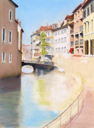
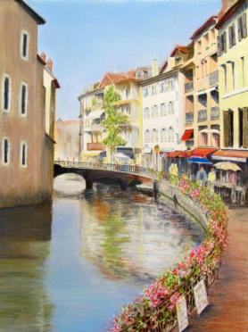
Reviewing the work
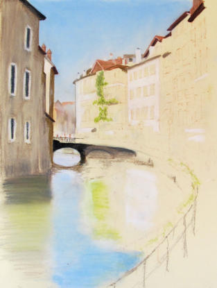
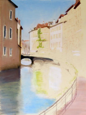
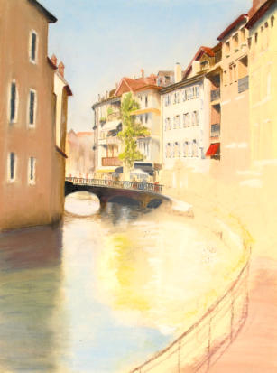
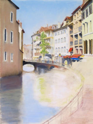
A comparison of the photograh and pastel pencil drawing shows that the new dark footpath surface now provides a better base for the composition. The reds help balance out the blues of the sky and water. It is now more inviting to take a walk down that path!
I am still undecided about the light area under the bridge arch. It does what I intended in providing a focus, but is it the best option?
A solution may be to work up an alternative of the light area under the main bridge arch on a piece of card, cut it out and lay it on the artwork surface under the bridge to see what the effect would be.
Fixing the pastel pencil drawing
Time to apply a fixative. This is a light varnish spray which is designed to hold down the loose pastel powder.
Fixative can darken the pastel colours but in this instance there is very little difference before and after the application.
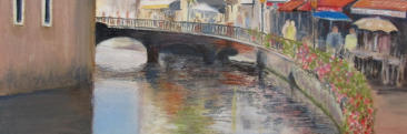
Final steps after fixing
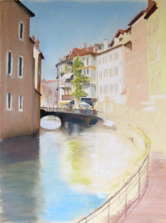
The image below shows a few adjustments that I made after fixing.
The left hand side windows have been re-worked, more detail has been applied to the water and the reflections in the water, and further shadows have been added to highlight the effect of the sunshine.
A stronger blue has been added to the immediate foreground water to highlight the contrast between the reflected sky blue and the shadowed flowers and greenery along the railing.
We now have a triangle of focal points between the arch of the bridge, the reds and blues of the blinds on the cafes and the foreground flowers/water.
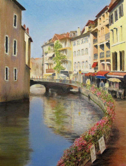
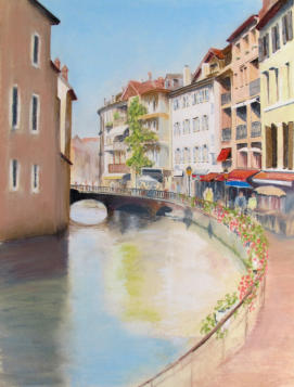
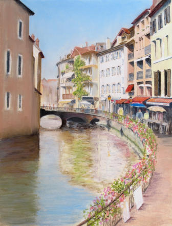
Annecy Reflections - Pastel and pastel pencil drawing 2012
From original photo by Peter Weatherill 2012
The finished work copyright is owned by the commissioner, Caran d’Ache
COPYRIGHT CONDITIONS
NOTE: the picture itself was commissioned by Caran d’Ache and the original is owned by them. The Company gave their express permission for this completed picture to be used by the artist in a tutorial exercise online, and therefore you are permitted to follow the notes and complete your own version of the picture using the original photo (which is copyright : Peter Weatherill 2012).
The picture, and the exercise, are not to be used for any commercial purpose without express permission from the copyright holders
You might like these
Pastel Pencil Tutorial for Beginners: How to Draw a Simple Vase
Try this pastel pencil tutorial with our beginner-friendly vase drawing tutorial. Learn layering, blending, and shading to create a simple still life drawing.
Choosing Pastel Pencil Brands: A UK Guide for Beginners
Overwhelmed by pastel pencil choices? Our complete guide helps UK beginners understand types, compare brands & make confident decisions for realistic art.
Are Pastel Pencils Good for Realistic Drawing? Complete Artist Guide
Discover if pastel pencils suit your realistic art goals. Complete UK guide covering techniques, supplies, common mistakes, and getting started tips.


I'm Carol Leather, a coloured pencil artist for over 15 years. Most of my teaching comes back to the same idea: realistic coloured pencil starts with structure, light and observation long before the colour goes down.
My work has featured in Ann Kullberg's Color Magazine, CP Magic and Color Pencil Treasures (vol 7). I'm a member of the UKCPS and was a prize winner in the Nature section of their Annual Open Exhibition in 2020.
You might like these
Are Pastel Pencils Good for Realistic Drawing? Complete Artist Guide
Discover if pastel pencils suit your realistic art goals. Complete UK guide covering techniques, supplies, common mistakes, and getting started tips.
Pastel Pencil Tutorial for Beginners: How to Draw a Simple Vase
Try this pastel pencil tutorial with our beginner-friendly vase drawing tutorial. Learn layering, blending, and shading to create a simple still life drawing.
Copyright © 2009- pencil-topics.co.uk All rights reserved
Home | About Us | Contact Us | Privacy Policy