Pastel pencil tutorial for beginners
Let's start with a simple ceramic vase
We'll practice three core skills: sketching the vase's oval opening and curved sides, laying down base colours, and blending the pastels. I picked this soft-toned vase because its non-glossy surface makes it easier to draw - you won't have to capture any tricky light reflections.
Materials Needed
Before we start, here’s what you’ll need. (If you don’t have these exact items, feel free to use similar alternatives.)
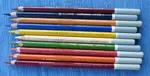
Pastel Pencils:
White, Raw Umber (mid-brown), Sepia, Peach, French Grey, Purple, Magenta, and Dark Blue.
Learn about the different pastel pencil brands here.
Paper:
160gsm Ingres paper
Additional Supplies:
- Drawing board
- Thin protective sheet (white paper, Glassine, or tracing paper)
- Masking tape (optional)
- Cardboard underlay for extra cushioning
 The original photo reference of our vase
Tip: Using a soft underlay, like cardboard beneath your paper, helps prevent board imperfections from affecting your work.
Step 1: Setting Up Your Workspace
For this tutorial, I used the smooth side of blue Ingres paper, as it works well with pastel pencils.
Learn more about pastel papers here.
Tape the top and sides of the paper lightly to the board to keep it steady, leaving the bottom edge loose for flexibility. Place a protective sheet along the top to fold down over your drawing when you need to store it or take it on the go.
The protective sheet helps prevent smudging and can be made from any thin paper, like tracing paper or even brown paper if you don't have glassine.
 This photo shows a selection of pastel papers
 The paper set up ready for use
Step 2: Outline and Initial Layers
We’ll start by drawing the basic outline of the vase.
To keep the shape natural, rotate your paper and the reference photo as needed. This allows your wrist to move naturally, making it easier to create smooth curves.
It's far better to move the paper than force an awkward drawing angle.

Colours for the First Layers
For the inside of the vase:
- White, Raw Umber, and Sepia create the subdued colours
- Sepia outlines the dark edge
- Peach for lighter areas
For the outside of the vase:
- White: for the lighter side
- Purple and Magenta: for the darker side
- Sepia: for the deepest shadows
- Peach: for the highlights
Cast shadow on surface:
- Dark blue

Getting the foundation layers right
This pastel pencil tutorial teaches specific layering techniques which you can apply to landscapes, portraits, or still life drawings.
You'll learn how to build up fewer layers of pastel than would normally be used when drawing with wax or oil based coloured pencils.
Your first 2-3 pastel layers establish your light and dark values. These base layers create a workable surface where you can add texture or fine details, like individual hairs or leaf veins, in the final steps.
Tips for tonal areas
- Dark areas need a dark base
- Light areas need a white base
- Mid-tones are more flexible
- Adding white lightens colours
- Adding darker colours deepens shades

Step 3: Building Up Layers
Unlike coloured pencils, pastel pencils allow you to physically mix pigment on the paper, adding depth and texture.
Use the peach pencil to:
- Brighten lighter areas
- Add heavier vertical lines on the outside (left)
- Build up lighter areas inside the vase (right)

Step 4: Shading and Blending Techniques
Now we come to the big difference between coloured pencil and pastel pencil.
As you work, you might notice that the pastel dust starts to accumulate on your paper.
Don't worry – this is normal and can actually be beneficial.
You can gently blend some areas if you'd like a smoother finish. Just be careful not to smudge areas you want to keep crisp.

Blending tools
Finger: Great for broad, smooth blending. Dry skin works best—avoid blending if your skin is oily, as this can smudge or stain the pastel.
Torchon (Paper Stump): Ideal for small areas where your fingers might be too large.
Step 5: Adding Highlights and Shadows
To create a realistic form, add highlights and shadows to shape the vase:
Highlights: Use the Peach pencil on lighter areas to brighten them.
Shadows: Deepen shadows by adding Sepia and a touch of Dark Blue for a cooler tone.
Avoid creating a harsh line down the centre of the vase, instead aim for a soft even gradient.

Step 6: Refining and Final Touches
Finish your drawing by adding details and refining edges:
Sharpen Edges: Use a sharpened pencil to refine the edges of the vase.
For soft "lost" edges: Try using a silicone shaper, paper stump or a pastel matching the background paper colour.

Step 7: Finishing the Cast Shadows
For the cast shadow: Use Sepia close to the vase’s base, and layer Dark Blue over it. Blend with your finger to create a soft fade.
Shadows on coloured surfaces take on that surface's colour, just darker and bluer. For example, a shadow on a red apple appears burgundy, not grey or black.
In direct sunlight, this shadow colour shifts toward blue.
Caring for Your Pastel Pencil Points
Pastel pencils wear down quickly, so proper care will help them last longer.
Rotate the Pencil: Keep turning the pencil to use a fresh edge.
Use a Chiseled Edge: This is ideal for crisp lines.
Try Sandpaper: Sandpaper can help you shape the tip for detailed work.
Tip: Avoid working with a dull pencil. If the pastel is barely visible beyond the wood, it’s time to sharpen.
Final Thoughts
This beginner’s pastel pencil tutorial is designed to help you master basic techniques like layering, blending, and shading. By focusing on these fundamentals, you’ll be well-prepared to apply pastel pencil techniques to a range of subjects.
Remember, this is just the beginning—practice makes perfect!
We hope you enjoyed this tutorial and found it helpful. Feel free to share your results and explore more pastel techniques with us!

I'm Carol Leather, a coloured pencil artist for over 15 years. Most of my teaching comes back to the same idea: realistic coloured pencil starts with structure, light and observation long before the colour goes down.
My work has featured in Ann Kullberg's Color Magazine, CP Magic and Color Pencil Treasures (vol 7). I'm a member of the UKCPS and was a prize winner in the Nature section of their Annual Open Exhibition in 2020.
You might like these
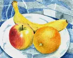
Coloured Pencil Still Life Tutorial: Step‑by‑Step Fruit for Beginners
Easy coloured pencil still life: clear steps, reference photo, and tips on layering, stroke direction and burnishing—download the outline and start today.
Copyright © 2009- pencil-topics.co.uk All rights reserved
Home | About Us | Contact Us | Privacy Policy