- Home
- Pencil Backgrounds
How to Create Coloured Pencil Backgrounds (Without Ruining Your Drawings)
You've spent hours perfecting your subject - every detail carefully rendered, every highlight placed just right. Now you're staring at that intimidating white space around your beautiful drawing, knowing it needs a background but terrified that attempting one will somehow destroy all your hard work.
I get it. I've been there.
The fear is real: What if the background colors bleed into my subject?
What if I can't get the edges clean?
What if it ends up looking amateur and ruins the entire piece?
So you either skip backgrounds entirely (leaving your work looking unfinished) or you attempt one and watch in horror as it goes wrong—muddy colours, harsh edges, or worse, accidental marks across your carefully rendered subject.
Here's what I learned after years of background disasters: the problem isn't your artistic ability - it's your approach.
Most artists try to add backgrounds as an afterthought, when they should be part of the planning from the very beginning.
Professional-looking backgrounds aren't about complex techniques or expensive tools.
They're about understanding when to add them, how to protect your work while you're creating them, and which methods actually work for realistic drawing (versus the techniques that look good in theory but fail in practice).
In this guide, I'll show you the systematic approach I teach all my students: how to plan backgrounds that enhance rather than compete, foolproof methods for protecting your subject while you work, and the simple techniques that create professional results without the stress.
No more skipping backgrounds. No more ruined drawings. Just confident, controlled methods that work every time.
What is the purpose of a background?
A good background should quietly enhance your artwork without stealing the show.
It creates a sense of distance, known as aerial perspective, which adds depth and makes your subject stand out. By using softer colours or less detail in the background, you can give the illusion of three dimensions, helping to push the main subject into focus.
The goal is to let the background support your composition, not compete with it, so that all eyes are drawn where they should be—right to the heart of your piece.
Do You Really Need a Background for Your Drawing?
Let's be honest about when backgrounds actually help versus when they're just extra work that adds little value.
Your Drawing Definitely Needs a Background When
- The subject looks "floating" or cutout-like against the white paper
- You're creating a complete scene (landscapes, still life arrangements, environmental portraits)
- The composition feels unbalanced with too much empty space
- You want to suggest depth and atmosphere in your work
- The white paper competes with your lightest lights making them appear dull
- You're working toward gallery presentation where professional polish matters
Skip the Background When
- Your subject is complete and balanced as-is (many botanical studies work beautifully this way)
- You're doing studies or practice work where speed and learning matter more than finish
- The white paper actively contributes to your design as negative space
- You're working in a sketchbook where backgrounds might feel forced
- Time constraints make it impractical (backgrounds do add significant time)
The Reality About Background Fears
If you're avoiding backgrounds because you're worried about ruining your work, you're not alone. This is the most common concern I hear from realistic artists.
The good news?
With proper planning and protection methods, background disasters are entirely preventable.
Planning and Adapting Your Background
You may have a clear plan for the background before you start, or it could be that you allow it to develop as you go along, adjusting the colours and details based on the needs of the foreground subjects and the overall mood you want to achieve.
This approach allows for flexibility and ensures that the background complements the main subject effectively.
For example, if you're working on a landscape, the background might need to be adjusted to reflect the changing light conditions or to create a sense of depth and distance.
When should we work the background?
It's usually best to start with the background, laying down a soft, subtle layer of colour first. This way, you can easily build your foreground subjects on top, ensuring clean, crisp edges and avoiding any awkward gaps.
Plus, with the background in place, it's much easier to add delicate details like flyaway hairs or fur, blending them into the scene rather than trying to work around an already detailed foreground.
Adding these overlapping details helps reduce the impression that the subject matter might be a cutout stuck onto the background, creating a more cohesive and natural look.
How Do UK Artists Plan Backgrounds That Actually Work?
Let's talk about the practical realities of creating backgrounds in UK conditions—from paper choice to workspace setup.
What Planning Questions Should UK Artists Ask?
Workspace Considerations
- Lighting: Will you be working by window light or artificial light? Plan background colours accordingly
- Space: Do you have room to protect surrounding areas from pigment dust? (Essential for powder techniques)
- Ventilation: Important if using fixatives or solvents for blending
- Time availability: Can you work on background in one session, or do you need techniques that work across multiple sessions?
UK-Specific Material Planning
- Humidity: Our changeable weather affects paper behavior—test techniques on scraps first
- Available supplies: Plan techniques around materials you can easily source locally
- Budget realities: Choose methods that don't require expensive specialized tools
What Affordable Background Supplies Work Well for UK Artists?
Essential Masking Materials (Available Locally)
- Masking tape: £2-5 from hardware stores—test on paper scraps first
- Card for templates: Old postcards or cereal box card work perfectly
- White felt pieces: £3-8 from craft shops—buy white only for color control
- Tracing paper: £5-10—doubles as masking and transfer paper
Background-Specific Pencils (Budget Approach)
- Derwent Coloursoft: Excellent for soft backgrounds, available at Hobbycraft
- Faber-Castell Polychromos: Good for controlled blending, widely available
- Caran d'Ache Luminance: Investment purchase for serious background work
- Strategy: Start with a basic set, buy individual background colours as needed
Paper That Actually Handles Backgrounds Well
- Stonehenge: £15-25/pad, smooth enough for detailed edges
- Fabriano Artistico: £20-35/pad, holds multiple background layers
- Budget option: Daler Rowney heavyweight cartridge for practice
Which Paper Actually Works for Realistic Backgrounds?
Let me share what I've learned through years of background successes and failures on different surfaces.
For Detailed, Controlled Backgrounds
Smooth papers like hot-pressed watercolour paper or Stonehenge
Why they work: Allow precise edges and even colour application
My experience: Essential when your subject has complex edges (hair, fur, delicate stems)
Best techniques: Layering, powder application with felt, careful masking
Limitations: Can't hold as many heavy layers as textured paper
For Atmospheric, Painterly Backgrounds
Textured papers like Colorfix, Pastelmat, or cold-pressed watercolour
Why they work: Texture grabs pigment for rich, organic-looking backgrounds
My experience: Perfect for landscape backgrounds, abstract colour areas
Best techniques: Heavy layering, cross-hatching, powder techniques
Limitations: More challenging to achieve clean, precise edges
The type of paper you use plays a significant role in how your coloured pencil background turns out. Surfaces respond differently, so selecting the right paper can really influence your results.
My Paper Testing Results
I tested both rough white card and Stonehenge paper for background work. Here's what happened:
Rough white card: The grain made smooth finishes nearly impossible, no matter how carefully I applied the pencil. Every stroke showed texture, which can work for some styles but limits your options.
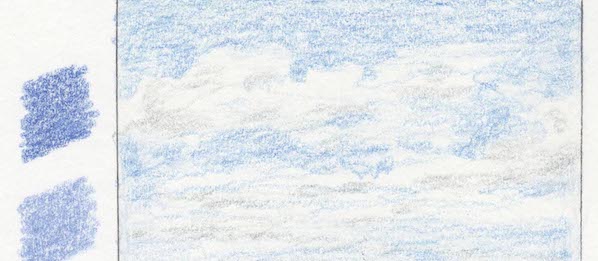
Stonehenge paper: Much better colour acceptance and blending capability. That initial white pencil layer I applied made a significant difference—it created a base that helped subsequent colours blend more smoothly.
Bottom line: Paper choice dramatically affects your background options. Match your paper to your intended background style, not just your subject requirements.
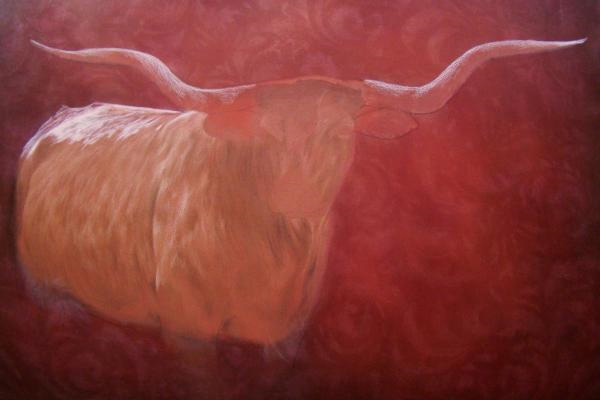
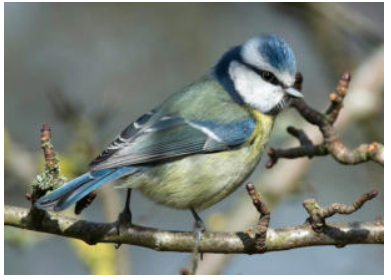
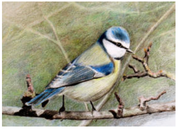
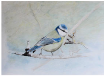
A pencil background example
In the following example, Brandy demonstrates her technique for creating a richly textured background.
You'll see how she starts with a bold paisley background pattern in the photograph below.
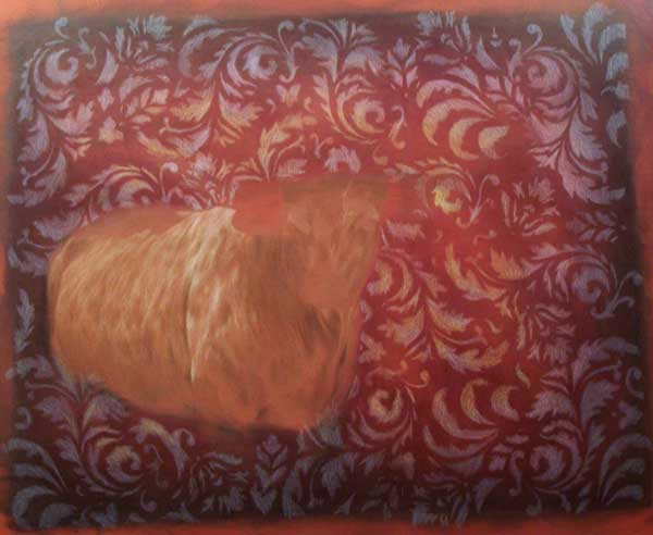
In the second step, Brandy applies a blending layer over the top, softening the bold pattern into a gentle, out-of-focus area of colour.
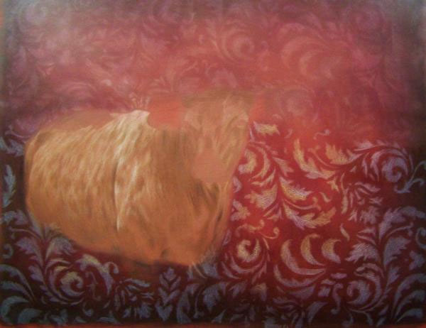
This technique gradually darkens the edges of the picture, helping to frame the subject without drawing attention away from it.
Above, she applies the light colours to provide a base for the detail on the animal.
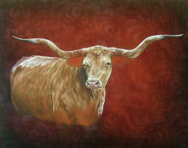
In the final image, you can really appreciate the intricate detail Brandy achieves. She applies multiple layers of pencil to bring richness and depth to her work.
How Do You Protect Your Subject While Creating Backgrounds?
This is where most background disasters happen—inadequate protection of the completed subject. Here's my systematic approach:
Planning Protection Before You Start
The cardinal rule: Never attempt a background without a clear protection plan.
- Trace your subject outline onto tracing paper while the graphite lines are still visible
- Create paper templates from card stock for complex edge shapes
- Test your masking materials on paper scraps—some tapes damage certain papers
- Plan your background in sections if the subject has very intricate edges
Simple Masking for Clean Edges
Card Shield Method (My Go-To for Most Work)
- Cut shapes from old postcards or cereal box card
- Hold firmly while working background colour up to the edge
- Always work AWAY from the subject, never toward it
- Perfect for areas where tape might damage the paper
Low-Tack Tape Method
- Test tape adhesion on paper scraps first
- Press down edges firmly to prevent colour bleeding
- Remove while background pigment is still fresh (not after it's been sitting
- Good for straight edges and geometric shapes
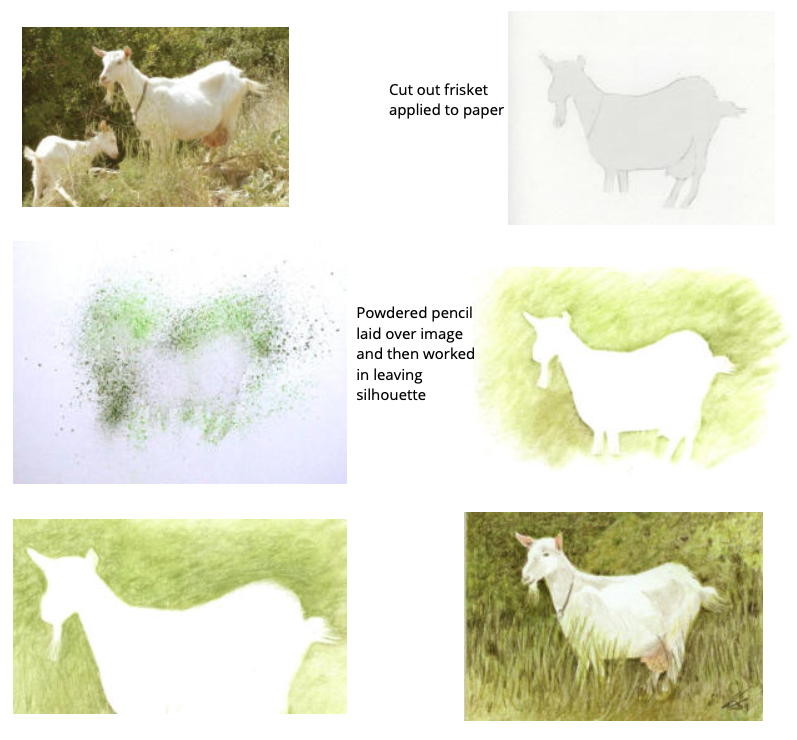
Frisket Film Method (For Complex Protection)
- Available from Amazon UK or professional art suppliers
- Low-tack, cuts easily, excellent for complex shapes
- Always work OUTWARD from the film to prevent lifting
- Worth the investment for detailed realistic work
My Subject Protection Workflow
- Complete subject fully before starting background work
- Clean drawing surface with soft brush to remove graphite dust
- Apply protection method carefully, testing edges
- Work background in systematic sections rather than randomly
- Remove protection while background is fresh for cleanest edges
- Touch up edges if needed with sharp pencil or battery eraser
What to Do When Protection Fails
Sometimes backgrounds go wrong despite protection. Here's damage control:
- Minor colour bleeding: Battery eraser can often remove unwanted marks
- Harsh background edges: Soften with light pencil work or blending stump
- Background too strong: Lighten with kneaded eraser before fixing
- Lost subject details: Re-establish with sharp pencil over the background
Which Background Techniques Actually Work for Realistic Drawing?
Let me walk you through the methods I use most often and when each works best.
Felt and Powder Method (My Most-Used Technique)
Why I love this method: Gives you smooth, even coverage that's nearly impossible to achieve with direct pencil application. Perfect for skies, water, and atmospheric effects.
My step-by-step process:
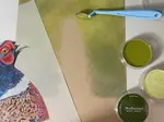
- Create your palette: Use cold-pressed watercolour paper as a temporary palette—its texture collects pigment beautifully
- Build pigment pool: Scribble your chosen colours heavily on the palette paper
- Collect pigment: Use white felt (only white—trust me on this) to pick up colour from your palette
- Apply to background: Work in circular motions, building colour gradually
- Control edges: Use card shields or masking for clean subject edges
Why white felt only?: I can see exactly what colours I've picked up, preventing unwanted colour contamination. Nothing worse than accidentally adding red to a blue sky because you couldn't see what was on your applicator

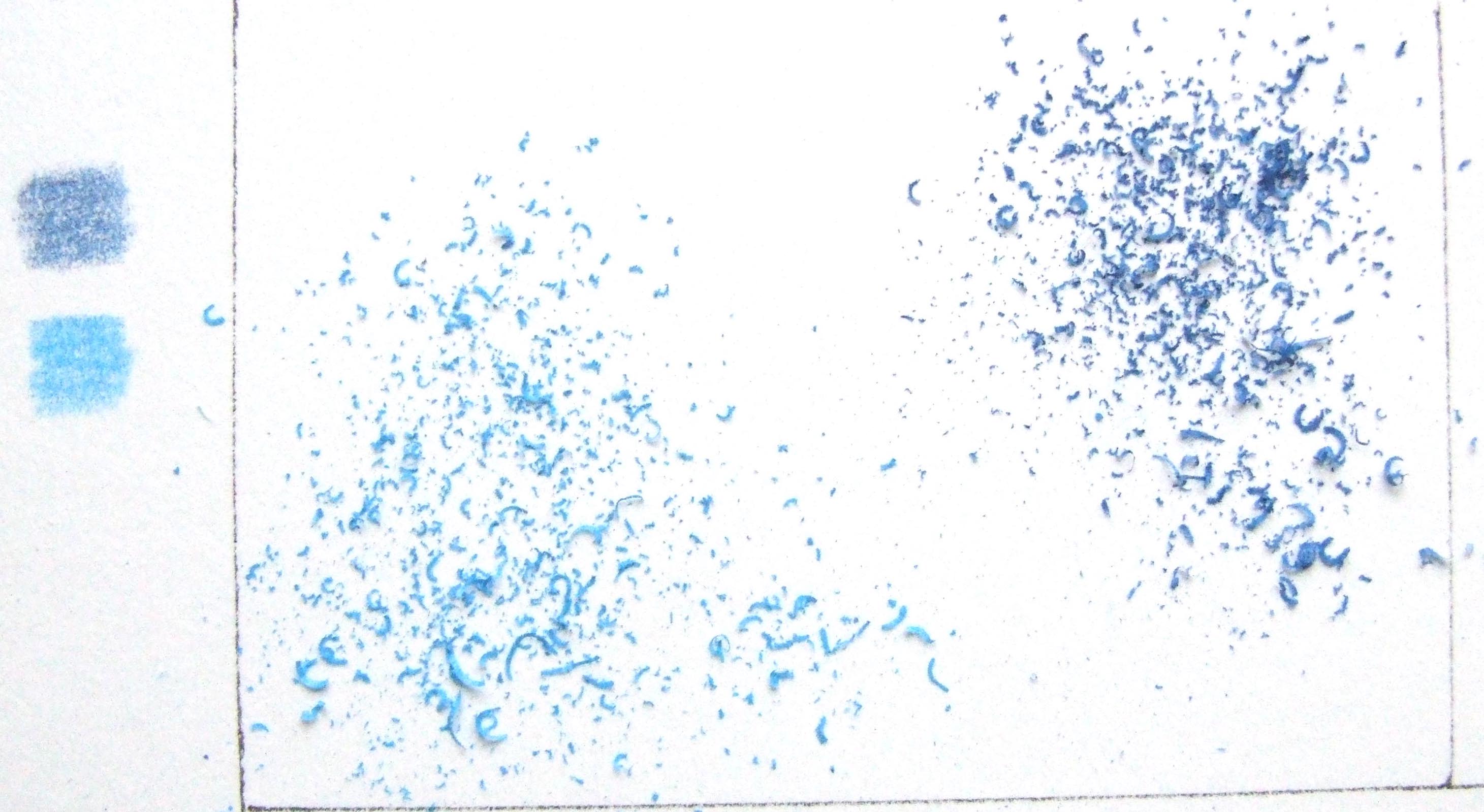
Scraped Pigment Method (For Ultra-Smooth Results)
When I use this: When I need perfectly smooth, atmospheric backgrounds with no pencil texture showing
My technique:
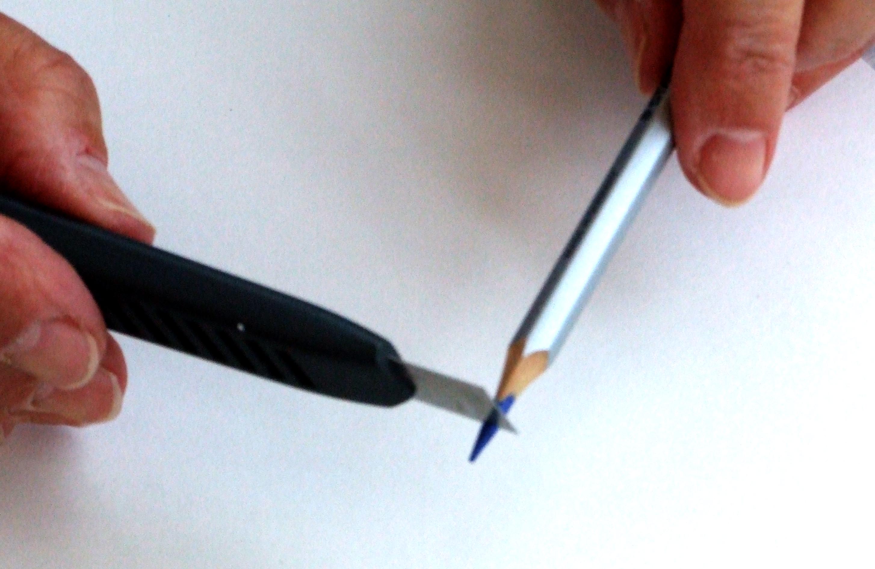
- Scrape pigment: Hold knife blade at right angle to pencil, scrape gently to create fine powder
- Alternative method: Rub pencil against metal tea strainer for similar results
- Apply with felt: Work powder into paper surface with gentle circular motions
- Build gradually: Multiple light applications work better than heavy single applications
Pro tip: This method gives you less control over placement but creates beautifully soft, diffused effects that are hard to achieve any other way.
Traditional Layering Method (For Controlled Backgrounds)
When I use this: When I need precise control over colour placement and intensity, or when working smaller areas
My approach:
- Light pressure initially: Build up colour gradually
- Consistent stroke direction: Usually diagonal or following the form
- Colour temperature awareness: Warm colours advance, cool colours recede
- Edge control: Use masking or very careful pencil control near subject edges
Semi-Wet Watercolor Pencil Method (For Painterly Effects)
Peter's discovery: "During a warm day demonstration, I found that watercolour pencils could be blended with just finger warmth—no water needed!"
The technique:
- Apply colours dry: Layer watercolour pencils like regular coloured pencils
- Blend with finger: Light finger pressure activates the binder slightly
- Build gradually: This semi-dry method gives you more control than full wet techniques
- Perfect for: Soft-focus backgrounds that suggest detail without competing with the subject
Why this works: You get the blending benefits of watercolour pencils without losing control through wet techniques. It's forgiving and allows for adjustments.
Why Do Backgrounds Go Wrong and How Do You Fix Them?
Problem: "My background looks muddy and lifeless"
Likely causes:
- Too many colours mixed together
- Working too heavily from the start
- Wrong colour temperature choices
Solutions:
- Limit yourself to 2-3 colour families per background area
- Build colour intensity gradually with multiple light layers
- Use cooler colours for receding areas, warmer for advancing areas
Problem: "The background overpowers my subject"
Likely causes:
- Background colours too intense or bright
- Too much detail or contrast in background areas
- Background edges too sharp or defined
Solutions:
- Soften background colours with light layers of neutral tones
- Reduce background contrast—keep values closer together
- Blur background edges slightly to push them into the distance
Problem: "I can't get clean edges around my subject"
Likely causes:
- Inadequate masking or protection
- Working toward the subject instead of away from it
- Using wrong application method for the edge complexity
Solutions:
- Always use some form of edge protection
- Work background colour AWAY from subject edges
- Choose simpler background techniques for complex subject edges
- Touch up edges with battery eraser or sharp pencil as needed
Problem: "My background technique isn't working on my paper"
Reality check: Not every technique works on every paper surface.
Solutions:
- Test techniques on paper scraps before committing
- Match your background method to your paper choice
- Smooth papers: powder methods, careful layering
- Textured papers: heavier layering, cross-hatching techniques
Prevention Is Better Than Fixing
Most background problems can be avoided with proper planning:
- Plan the background before starting the subject
- Test your chosen technique on scraps first
- Protect your subject adequately
- Work systematically, not randomly
- Build colour gradually rather than trying to achieve full intensity immediately
What Should You Practice This Week?
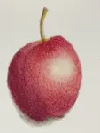
Choose a simple subject you've already drawn successfully—maybe a piece of fruit or a simple flower. This time, plan a background from the beginning.
Your Practice Steps
Sketch your subject lightly but don't detail it yet.
- Plan your background colour scheme (2-3 colours maximum)
- Create the background first using one of the methods above
- Then complete your subject working over the background
This exercise teaches you the proper sequence and helps you experience how much easier it is to work subject-over-background rather than trying to fit background around a completed subject.
Which Skills Support Good Background Work?
Master basic pressure control - Essential for gradually building background colours
Understand colour temperature - Crucial for creating depth and atmosphere
Perfect your layering technique - The foundation of rich, controlled backgrounds
What Advanced Techniques Build on Backgrounds?
Learn blending techniques - Smooth your background colours for professional results
Master edge control - The difference between amateur and professional presentation
Still Worried About Ruining Your Drawings?
The fear of background disasters is completely understandable—I've been there, watching hours of careful work potentially destroyed by a poorly planned background attempt.
But here's what I want you to remember: every professional drawing with a stunning background started exactly where you are now. The difference isn't talent or expensive materials, it's systematic approach and adequate protection methods.
What's your biggest background concern right now? Is it edge control? Colour choice? Technique selection?
I'd love to help you work through the specific challenge you're facing. Every question helps me create better guidance for artists like yourself.
Remember: backgrounds aren't about adding complexity—they're about creating the perfect setting for your carefully rendered subjects to shine. With proper planning and protection, they enhance rather than threaten your work.

I'm Carol Leather, a coloured pencil artist for over 15 years. Most of my teaching comes back to the same idea: realistic coloured pencil starts with structure, light and observation long before the colour goes down.
My work has featured in Ann Kullberg's Color Magazine, CP Magic and Color Pencil Treasures (vol 7). I'm a member of the UKCPS and was a prize winner in the Nature section of their Annual Open Exhibition in 2020.
You might like these
Top Meethods of. Blending Coloured Pencils Smoothly - Pencil Topics
Learn key methods for blending coloured pencils: stumps, blender pencils and solvents. Achieve smooth transitions for professional, realistic artwork.
How to Layer Coloured Pencils Without Mud: Techniques That Work
Master coloured pencil layering with proven techniques. Build rich, deep colours without muddy mistakes. Step-by-step tips for smooth, realistic results.

Copyright © 2009- pencil-topics.co.uk All rights reserved
Home | About Us | Contact Us | Privacy Policy