- Home
- Landscape drawing
- How to Draw Alum Bay Coloured Pencil
How to Draw Alum Bay and the Needles in Coloured Pencil
In short
A coloured pencil landscape built dry point on smooth paper, with an optional watercolour pencil wash for the sky and sea. Lay the soft sky and sea first, keep the chalk cliffs pale so they stay distant, then bring the heather and foreground foliage forward with layered greens, magenta and sepia.
Alum Bay sits at the western tip of the Isle of Wight, where the chalk ridge runs out to sea and breaks into the row of stacks we call the Needles. From the down above the bay you look across heather and gorse to pale cliffs and that famous line of white rock. It is a generous subject: a soft, simple distance and a busy, colourful foreground, with plenty of room to make decisions of your own.
I have drawn this scene two ways, and this page covers both. The original is worked entirely dry point, the pigment taken straight from the pencil. The second is a larger version where I laid a watercolour pencil wash for the sky and sea first, then finished the land dry point. Read the dry-point method as the main route, and treat the wash as an option for when you want a smoother, more even sky over a bigger sheet.
Free traceable outline: There is no need to draw the headland freehand. Download the outline (PDF), print it at the size you want, and transfer it to your paper before Step 1. Getting the horizon and the angle of the cliffs right at the start makes everything after it easier.
What you'll need
This was drawn with Faber-Castell Polychromos pencils. The colour names and numbers below are Polychromos, but any good range with a similar spread of greens, blues, a magenta and a dark sepia will do the same job. The point is the relationships between the colours, not the brand.
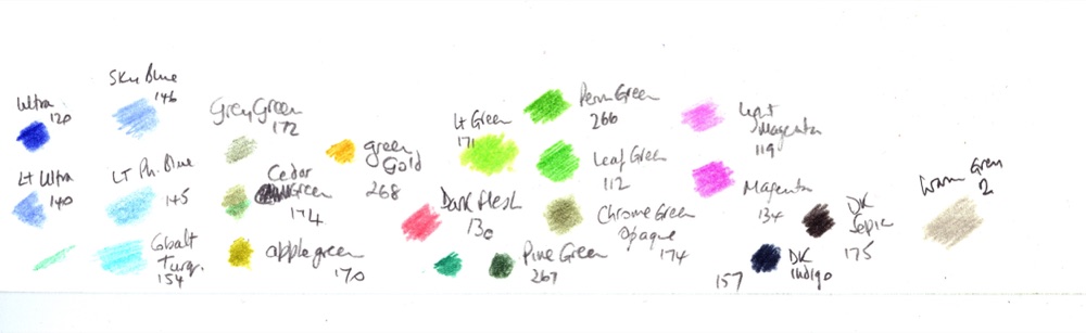
The working palette: Ultramarine 120, Light Ultramarine 140, Sky Blue 146, Light Phthalo Blue 145, Cobalt Turquoise 154, Grey Green 172, Cedar / Chromium Green Opaque 174, Apple Green 170, Green Gold 268, Light Green 171, Permanent Green 266, Leaf Green 112, Pine Green 267, Dark Flesh 130, Light Magenta 119, Magenta 134, Dark Indigo 157, Dark Sepia 175, Warm Grey II.
Paper. For the dry-point version I used a smooth printmaking-style paper, similar to Stonehenge. For the larger watercolour-pencil version, choose a smooth watercolour paper with a little surface size, such as a hot-pressed sheet. Note the one swap: Stonehenge takes dry pigment beautifully but does not take washes as well, so if you are going the wash route, pick the watercolour paper instead.
The scene, and where to start
Here is the photograph I worked from, taken from the down above the bay.
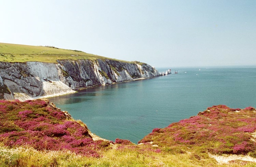
The reference: heather and foreground in front, pale cliffs sweeping round to the Needles in the distance.
Transfer the outline, or draw it lightly by hand. If you are drawing it, mark the horizon line first, then the angled line under the cliffs. With those two lines correctly placed, the rest falls into position much more easily. Erase your pencil guidelines as you go; a few faint lines will be absorbed by the colour later, but you do not want graphite sitting under a pale sky.
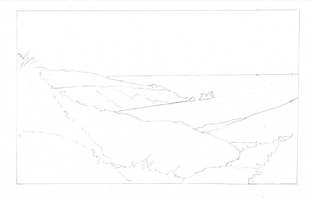
The outline. Horizon first, then the angled cliff line, then the foreground shapes.
The Needles themselves are small in this view but they are the point the whole picture leads to, so they have to be right. If you want more detail of those distant stacks and the lighthouse, work from this closer photo as well.
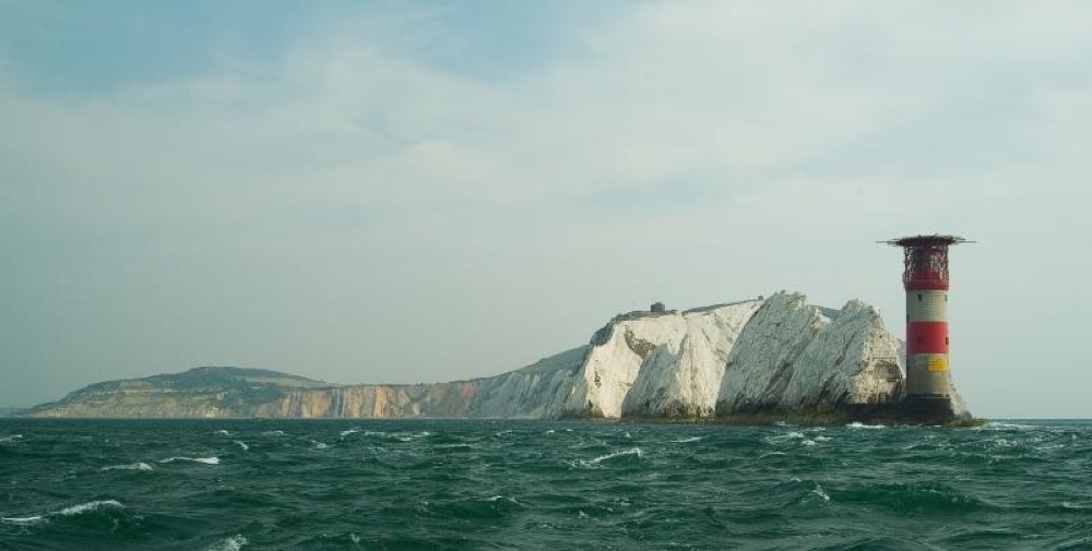
A closer photo of the Needles and lighthouse, for the small but critical detail in the distance.
Two ways to begin: the sky and sea
The point
The distance should stay soft and pale. Keep the clouds as bare white paper, work the blues lightly, and do not let the sky or the cliffs come forward and compete with the foreground.
The dry-point way. Rather than scribbling blue straight onto the sky, lay down dense Ultramarine on a scrap of paper, then lift that loose pigment with a piece of white felt and rub it gently onto your sky. This gives a soft, even, cloud-like film rather than pencil lines. Leave the fluffy clouds as white paper, and lift the tops of the clouds with an eraser afterwards to keep them light. Fill the deeper patches of blue with Light Ultramarine. If the sky looks uneven, you can settle it with a light burnish of white.
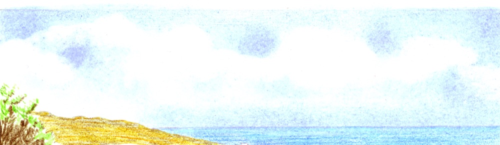
The sky: clouds left as white paper, soft blue lifted in around them, the cliff edge kept pale.
For the sea, work the blue in horizontal layers so the strokes read as flat water. Smooth the horizon line with a sharp point, and burnish it with white if it needs softening. Sometimes the horizon is lost in a heat haze, so do not be afraid to keep it faint. The darker band of shadow on the sea can go in later. As the water comes closer to you, swap to Cobalt Turquoise as an alternate shade, which warms and lifts the near water.
Studio tip
The whole distance, sky, sea and far cliffs, wants to stay paler and cooler than you think. If it competes with the foreground for attention, the depth collapses. When in doubt on the distance, use less colour, not more.
The watercolour-pencil way (for the larger version). On a bigger sheet, a dry-point sky can be hard to keep even, so I switched to a wash. Make up two thin blue washes on a palette, matching the sky, plus a warmer turquoise for the water. Wet the paper lightly so the wash does not dry too fast, then float a bead of thin colour across the top of the sky and work down to the land, taking it over the sea as well. Blot the clouds out with a tissue while it is damp. A second thin coat, worked around the clouds, deepens the upper sky.
Then mix a warmer thin blue for the sea and brush it in with careful horizontal strokes. Let everything dry completely flat before you go back in with dry pencils. If the horizon is too hard, lift it slightly with a small brush of clean water and a tissue, and add a rippled effect to the near water with dry-point colour once it is dry.
By the end of the opening stage you should have a soft sky, flat sea, and the first pale colour blocked onto the land. Lay the cliff tops and foreground in lightly so you have a base to build detail onto, but keep it gentle. Nothing here is finished; you are setting the stage.
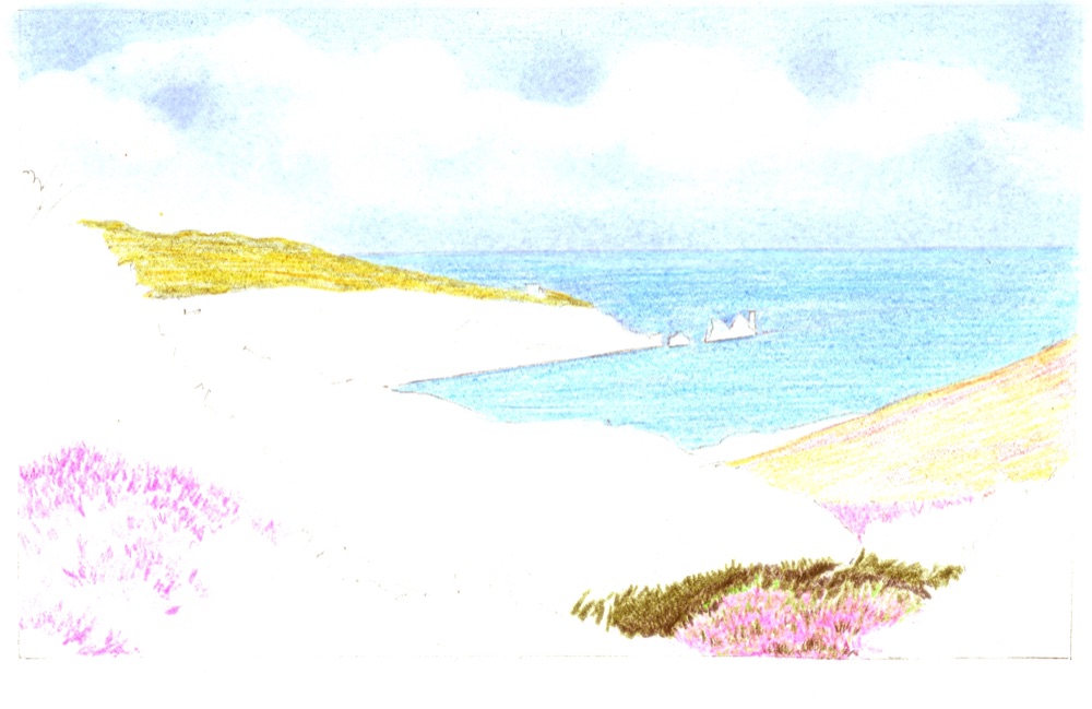
Stage 1: soft sky, flat sea, pale base colours on the cliffs, and the first blocks of heather and foliage.
The cliffs and the distance
For the cliff top I used three greens, layered light to dark. A Grey Green to start, a darker but similar grey green (Cedar / Chromium Green Opaque) over it, and Apple Green to add brightness where the light catches. A little Green Gold dropped in here and there adds interest and warmth without making it gaudy.
Keep the chalk cliff face itself pale. Warm Grey II with a touch of white is plenty. The moment the cliff gets too strong in colour it jumps forward and stops reading as distance, so go carefully, and keep the colour on the lighthouse very restrained for the same reason.
Heather and foreground foliage
Why this matters
This is where the picture lives. The first colour you put down takes precedence, so the order of your layers matters: lay the lilac undercoat before the magenta, and the green base before the darks.
Start by applying your greens and a lilac across the foreground with a light, even touch, just enough to give a base for the detail to sit on. Vary the direction of your strokes to suit what you are drawing; short upward flicks read as plants, flat strokes read as ground.
Here is the key habit for the heather: your first colour down is the one that shows through everything after it, so lay a lilac undercoat first, then build the heather over it. Work the flower with short upward strokes of Light Magenta, then overlay Magenta to deepen the colour. Form the base of the shadowed area with Sepia. That green-and-lilac base underneath is what keeps the heather colour alive even when you put darks on top.
Now build the darker shadowed foliage into and around the heather to get those detailed, broken edges. Lay a dark green base where the deepest shadow falls, and add loose, scribbled curves in the centre foreground where the light is catching the tops of the bushes. Feed dark green into the shadows so the heather sits among real foliage, not on top of it.
Where the bush line meets the distant cliffs, use a battery eraser to lift both the graphite line and a little of the colour in the water beyond, so the edge breaks up naturally instead of sitting hard.
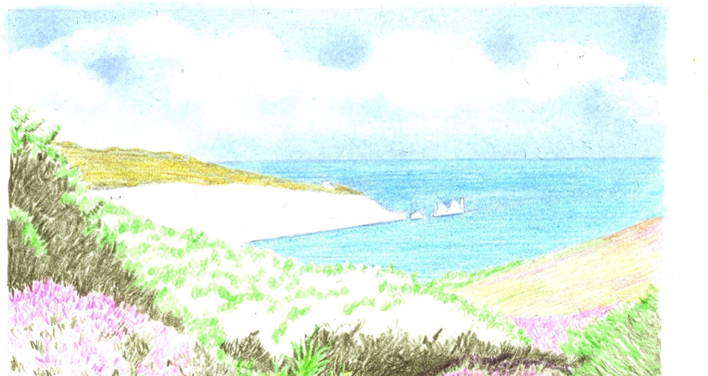
Stage 2: the foreground worked up. Heather over its lilac base, dark greens fed into the shadows, edges broken against the bay.
Carol's note
Notice how Peter protects what he has already done. When he works a dark over a finished patch of heather, he lays a sheet of clear acetate over the worked area first, so his hand and pencil never smear the pigment underneath. It is a small thing that saves a lot of heartache on a busy foreground like this one.
Building the darks
With the foreground established, build up the darkest accents. The exact shades of green do not matter much here; what matters is keeping your dark green base under the shadowed foliage and then putting Sepia, and finally a touch of black, on top for the genuinely dark spots. Work the bright highlighted edges back in with a fine point of black or sepia so the light reads against the dark.
On the left, I worked the heather with the two shades of magenta and shadowed it with dark green, then sepia, then Dark Indigo for the deepest notes. As you go, keep varying your pencil strokes to give interesting, irregular shapes; nothing in heather and gorse is tidy.
A habit worth copying: note in the margin of your page which colour you used where. When you come back to balance an area later, you can match it exactly instead of guessing.
Once the whole foreground is complete, turn to the cliffs and water and settle them against the finished foreground. Leave the final touching-in of the sky until the very end, when you can judge it against everything else. Working in this order, the busy foreground sets the level of contrast, and the soft distance is tuned to sit behind it.

The finished landscape: a soft, pale distance, and a foreground of layered heather and foliage carrying all the colour and contrast.
Carol's note: did you spot it?
Look back at the soft sky and sea, then at that rich foreground, and you can see the whole trick of this picture. Almost all the strong colour and dark live in the front; the distance is barely touched. That difference is what makes you feel you are standing on the down, looking out. If your own version feels flat, the answer is usually not more detail in the distance, it is more contrast in the foreground.
Common mistakes
Making the cliffs and sky too strong
The distance should stay pale and cool. Strong colour on the chalk cliffs or a heavy sky pulls them forward and flattens the depth. Use a light hand on everything behind the water.
Putting the heather colour down first
The first colour takes precedence. Lay a lilac undercoat before the magenta, and a green base before the darks, or the bright flower colour will look like it is sitting on the surface rather than growing out of the foliage.
Hard, cut-out edges between foliage and bay
Break the bush line up with a battery eraser, lifting both the line and a little colour beyond it. Real foliage edges are ragged, not sharp.
Smearing finished work as you reach across it
Lay clear acetate over a worked area before you build darks next to it. A busy foreground is easy to smudge with the side of your hand.
Carry on from here
More coastal and countryside scenes, and how to build distance, light and foreground in pencil.
The wash-first approach used for the larger sky and sea here, explained from the beginning.
Copyright © 2009- pencil-topics.co.uk All rights reserved
Home | About Us | Contact Us | Privacy Policy