- Home
- Mixed media
- Pastel drawing
Pastel Drawing Techniques: How to Blend Pastels and Coloured Pencils
As artists, isn’t it exciting when we discover a new way to stretch our creative wings? Combining pastel drawing with coloured pencils is one of those techniques that feels like uncovering a secret treasure.
With pastels lending their dreamy, velvety softness and coloured pencils offering precision and control, what more could you ask? It’s a way to bring out the best of both mediums, creating art that feels both expressive and detailed.
Whether you’re capturing the quiet drama of a portrait, the sweeping beauty of a landscape, or letting loose with abstract expressions, this mixed-media approach can add a whole new dimension to your art.
Ready to experiment? Let’s walk through how to get started and a few tips to make this dynamic duo shine in your next piece.
Why Combine Pastels and Coloured Pencils?
Pastels and coloured pencils each bring something unique to your creative process:
Pastels are ideal for covering large areas with soft, blendable colour. They’re perfect for building rich, textured base layers or creating gentle transitions that set the tone for your piece. In pastel drawing, their versatility makes them essential for foundational work.
Coloured pencils shine when it’s time to add the finer touches—think crisp edges, delicate highlights, or intricate details that bring your work to life.
Together, they create a beautiful balance: pastels lay the groundwork with bold, expressive strokes, while coloured pencils refine and enhance, adding layers of depth and precision you wouldn’t get with one medium alone.
Getting Started: Materials You’ll Need
Let’s talk supplies! The right tools can make all the difference when you’re combining pastels and coloured pencils. Here’s what to consider:
Types of Pastels
 Pastel pencils, soft pastel, pan pastel and tools
- Hard pastels: These are less messy and perfect for sketching or adding sharp lines to your piece. Think of them as the foundation builders.
- Soft pastels: Vibrant and oh-so-blendable, these are your go-to for creating rich textures and deep, expressive tones.
- Pastel pencils: If you want the precision of a pencil without giving up that pastel magic, these are your best friend—less mess, more control.
Choosing Coloured Pencils
When it comes to colored pencils, you have two main options:
- Wax/Oil-Based Pencils: Perfect for layering details over your fixed pastel base. They’re great for crisp edges and fine details that stand out.
- Watercolour pencils: For a softer, blended look, use these on unfixed pastel layers. Add water, and voilà—you’ve got a dreamy, watercolour effect.
The Right Surface
The surface you choose can greatly impact your final result.
- Watercolour Paper: A great choice if you’re using watercolour pencils or enjoy experimenting with wet effects.
- Pastelmat or Textured Paper: Designed for pastels, these surfaces handle layering and blending beautifully, giving your mixed-media work a real edge.
Pro Tip: Try different surfaces to see what clicks with your style. The texture, absorbency, and feel can completely change how your materials interact—and that’s half the fun!
Step-by-Step: How to Combine Pastels and Coloured Pencils
Ready to explore this technique? Here’s a simple guide to help you make the most of mixing pastels and coloured pencils.
1. Establish the Foundation with Pastels
Start by sketching your composition and using pastel drawing techniques to block in the basic shapes and tones.
Use light touches for areas you want to keep bright—it’s easier to add depth later than to bring back lost highlights.
Gradually layer pastels to deepen tones and add richness.
Preserve Your Whites: Always apply whites or light colours first. It’s much trickier to add light colours over dark pastels later.
2. Blend Your Pastels
Blending is where pastels really shine, and there’s no one “right” way to do it. Experiment with these techniques to see what feels natural to you:
- Use your fingers for soft, organic transitions.
- Try blending stumps or sponges if you want more precision and control.
3. Add Details With Coloured Pencils
Once your pastel base is complete, it’s time to refine and enhance:
- Fix the Pastel Layer: Lightly spray your work with fixative in a well-ventilated area, and let it dry. This sets your pastel without dulling it too much.
- Add Fine Details: Use wax-based coloured pencils to sharpen edges, add textures, and make key elements pop.
- Play with Watercolour Effects: For a soft, painterly touch, draw over unfixed pastel with watercolour pencils. Activate them with water for a blended, dreamy finish.
Advanced Techniques to Explore
Looking to refine your pastel drawing and coloured pencil work even further? These advanced techniques will help you create textures, layers, and finishes that truly stand out.
Creating Texture and Depth
Experiment with underpainting: Use a light pastel layer to sketch your design, then build textures with crosshatching or stippling using coloured pencils.
Add dramatic texture by using a palette knife or scraping tools to lift pastel layers, revealing the paper or underlying colours.
Try mixing techniques like blending soft pastels for backgrounds while using hard pastels for intricate line work.
Layering and Blending
- Combine brands: Mix wax-based and oil-based coloured pencils for varied effects, like smooth gradients or crisp highlights.
- Blend pastels with unconventional tools, like makeup sponges or dry brushes, for unique textures. Experiment to see what works best for your style.
- Build depth by alternating layers of pastel and pencil—fixing between layers—to create a rich, multi-dimensional look.
Fixing and Preserving Your Artwork
Test your fixative: Always test on a scrap piece to see how it affects your colours. Some fixatives can darken or dull —knowing how yours behaves will help avoid surprises.
Check this page for more on fixatives.
Use archival-grade materials to ensure your artwork stands the test of time. Acid-free paper, high-quality fixatives, and proper storage can keep your colours bright for years.
Protect finished pieces with interleaving sheets (like glassine) or frame your work under UV-protective glass to prevent smudging and fading. You can also use glassine to rest your hand on while drawing.
Troubleshooting: Common Challenges
Every creative process comes with its quirks, and combining pastels with coloured pencils is no different. Here are some common challenges and how to handle them:
Pastel Smudging
It happens to all of us! To keep your layers clean and defined, spray a light fixative between pastel applications. This prevents unintentional blending and keeps your work clean.
Coloured Pencils Not Adhering
If your pencils aren’t sticking, it’s likely because the pastel layer isn’t properly fixed. A quick spray of fixative creates a more stable surface for your pencil details to stick to.
Muddy Colours
Over-blending can quickly lead to dull or muddy tones. Keep an eye on your colour choices—sticking to complementary or analogous hues helps maintain vibrancy. And remember, sometimes less is more when it comes to blending.
Inspiring Examples and Real-World Tests
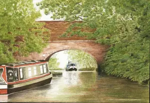
Watercolour pencil and pastel drawing - The Hill Farm
 The Hill Farm
Using cartridge paper, I combined Caran d'Ache hard pastels for the foundation and Staedtler Karat Aquarelle pencils for detail.
The result? A soft, watercolour-like effect with vibrant tones and rich depth.
Demonstration: Testing Pastel Drawing Techniques
Inspired by earlier success, I undertook a more elaborate test—a vibrant farmhouse scene full of colour.
Materials And Foundation Stage
Using cartridge paper (220gsm) as the base, I began by applying a white pastel layer across the entire surface. This white foundation created a soft, light tone that blended beautifully with the colors applied later. Rubbing pastel powder into the paper gave a rich, textured base to build upon.
INITIAL LAYERS

For the first stage, I worked with Derwent watercolour pencils—the hardest watercolour pencils in my collection.
While the colours blended well with the pastel base, they didn’t quite match the performance of the Staedtler Karat pencils I’d used in my earlier test.

At this point, sketch lines defined the shapes of trees and hedges, while the buildings were left untouched to retain their bright tone.
The watercolour effect enhanced the pastel layers beautifully, adding depth and stronger darks. For instance, shaping the trees on the right side involved layering darker tones and blending them into the pastel surface.

Balancing Color and Composition
The sky was kept mostly white to maintain a light, airy quality, with small openings revealing ultramarine blue.
When applying blue, I used a darker shade than expected, as the white pastel base naturally softened the colour’s intensity. Uniformity in large areas of sky proved challenging, so I avoided overextending the blue, leaving space for potential grey shadows to shape the clouds later.

Adjustments included deepening the sea’s blue intensity and balancing the composition by refining the large tree on the left. Tools like fingers or blending stumps helped integrate the pastel dust seamlessly into the paper.

Switching techniques
While Derwent watercolour pencils worked well initially, I transitioned to Caran d'Ache Museum Aquarelles for their softer texture and higher pigment concentration. These allowed for finer details and darker tones, especially for the trees.
However, as the piece developed, I realised it was caught between the lighter watercolour effect and the deeper tones typical of my landscape work.

To resolve this, I switched to Faber Castell Polychromos pencils. Their transparent yet intense colours blended well with the pastel surface, particularly on lighter layers.
These additions enhanced the existing colours but couldn’t fully meet my vision for the piece.
Final reflections
Ultimately, I decided to stop working on the artwork as it didn’t meet my standards.
While it served as a valuable technique test and demonstrated how watercolour pencils and pastel drawing can complement each other, it fell short as a finished piece.

Framed and mounted, however, it looks presentable and could still find a home.
Pan Pastel and Coloured Pencil Experiment
On Pastelmat paper, I blended Pan Pastels with Faber-Castell Polychromos pencils. The combination created smooth transitions and added sharp, detailed contrasts.

Since this painting, I've created several pictures using Pan Pastel with wax pencils, primarily on Clairfontaine Pastelmat paper.
Pastelmat is a card-based surface with fine cork powder, available in various colors. It's stable and accepts wet media well.
Many artists prefer Pastelmat for colored pencil work, as it allows quick color buildup. However, it's more expensive and slightly less suitable for fine details due to its mildly abrasive surface.
Hazel Taylor's Mixed Media Portraits
UK artist Hazel Taylor combines pastel backgrounds with oil-based coloured pencils for her stunning pet portraits. For example, her piece "Corrie" features:
- Pastelmat surface
- Carbothello and Caran d'Ache Pastel Pencils for the base
- Polychromos and Pablo coloured pencils for fine details
Her work showcases the potential of this mixed-media approach. Visit Hazel’s Facebook page for more inspiration.

Bring Your Vision to Life
Combining pastels and coloured pencils is a wonderful way to push your creativity and try something new.
Whether you’re exploring pastel drawing for the first time or are a seasoned artist eager to experiment, this mixed-media approach opens the door to endless possibilities.
Now it’s your turn!
Explore the techniques we’ve covered, let your imagination guide you, and see where the process takes you.
I’d love to see what you create—drop me an email using the contact page.
Happy drawing!

I'm Carol Leather, a coloured pencil artist for over 15 years. Most of my teaching comes back to the same idea: realistic coloured pencil starts with structure, light and observation long before the colour goes down.
My work has featured in Ann Kullberg's Color Magazine, CP Magic and Color Pencil Treasures (vol 7). I'm a member of the UKCPS and was a prize winner in the Nature section of their Annual Open Exhibition in 2020.
You might like these
Mixed Media with Coloured Pencil: Six Combinations That Work
Six ways to combine coloured pencil with another medium: watercolour, pastel, ink, acrylic, gouache and graphite. With the common mistakes to avoid.
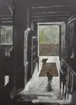
Drawing on black paper using pastels and coloured pencil
This drawing on black paper shows a Lake District cottage doorway - step by step in pastels and coloured pencils
Copyright © 2009- pencil-topics.co.uk All rights reserved
Home | About Us | Contact Us | Privacy Policy