- Home
- Pastel paper
- Velour Paper
Velour Paper Explored: My In-Depth Review of Hahnemühle's Unique Surface
Welcome to my deep dive into Hahnemühle Velour Pastel Paper, a truly distinctive surface in the world of pastel art!
My curiosity about velour paper was sparked by a childhood memory: two vibrant oil paintings on black velvet hung in my parents’ living room—a dramatic mountain scene and a colorful bird, perhaps a kingfisher or peacock.
The way the colors glowed against the plush surface left a lasting impression. I hoped velour paper might capture some of that magic for pastel pencils.
As I discovered, Hahnemühle Velour offers a different kind of beauty. Pastel pigments sink into its soft, flocked texture, creating a diffused, dreamy effect unlike the luminous pop of oil on velvet.
In this review, I’ll share my hands-on experience with Hahnemühle Velour (260gsm), tested with Cretacolor pastel pencils and Faber-Castell Polychromos.
You’ll find:
- My honest insights into its unique feel and performance.
- Close-up photos of my test swatches.
- The specific pros and cons I discovered for using pastel pencils on velour.
- My overall verdict on who this paper might suit best.
My aim is to give you a clear picture of what it's like to work on this specialist surface, helping you decide if it's something you'd like to try for your own pastel pencil art.
Let's feel the softness!
My In-Depth Review: Hahnemühle Velour Pastel Paper (260gsm)
Hahnemühle Velour stands apart from traditional grained or sanded pastel papers. Its soft, velvety surface, available in various colors, feels luxurious at 260gsm.
Here’s how it performed with pastel and colored pencils.
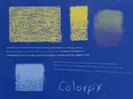
 Test swatches of Cretacolor pastel pencils and Polychromos dry coloured pencils on Hahnemühle Velour paper, illustrating the soft, diffused marks characteristic of this surface.
Performance with Pastel and Colored Pencils
Working on Velour required some adjustment.
With Cretacolor pastel pencils, gentle straight strokes worked best for initial layers; small circular strokes built color too quickly.
Once I found the rhythm, I created a soft gradient with five layers, and the paper seemed capable of taking more as pigment settled into the fibers.
Ruled lines were even but inherently soft-edged.
Finger blending, however, was ineffective—the velour fibers hold pigment firmly in place.
Faber-Castell Polychromos layered beautifully, with up to seven layers forming a smooth gradient, but colors appeared paler than on harder surfaces, requiring extra effort for intensity.
Ruled lines mirrored the pastel pencils’ soft, even quality.
A standout feature: the paper’s softness caused no wear on pencil tips for either medium, a significant advantage.
Pros of Hahnemühle Velour
- Gentle on Pencils: Virtually no wear on pastel or Polychromos cores.
- Soft, Diffused Effects: Ideal for smooth gradients and atmospheric, dreamy textures.
- Strong Layering Capacity: Handled 5+ pastel layers and 7+ Polychromos layers.
- Even Linework: Produces consistent, soft-edged lines.
Cons of Hahnemühle Velour
- Limited Detail: The flocked surface diffuses marks, making crisp lines or sharp details challenging.
- Blending Challenges: Traditional blending (e.g., finger blending) is ineffective; layering achieves optical blending.
- Muted Colours: Colors appear less vibrant initially, requiring more layers for intensity.
- Unique Feel: The velvety texture may take time to master.
- Less Forgiving: Erasing mistakes can disturb the pile, complicating corrections.
Suitability for Colored Pencils
Polychromos layered surprisingly well, but the muted colors and loss of crisp detail make Velour less ideal for traditional colored pencil techniques.
It shines for soft, atmospheric effects if you’re willing to build color patiently.
Best For
- Subjects like soft animal fur (think kittens!), misty landscapes, or clouds that suit a diffused, out-of-focus look.
- Artists who enjoy gentle layering for a soft-focus style.
- Those seeking a unique, velvety texture for specific effects.
My Tip and Verdict for Hahnemühle Velour Pastel Paper
Hahnemühle Velour is a specialist surface that rewards a light touch with stunningly soft, diffused effects.
It’s incredibly kind to pencil tips and excels at creating gradients and atmospheric textures. However, it’s not suited for crisp details, sharp lines, or vibrant, immediate color.
Traditional blending techniques also need rethinking - layering is key.
For subjects like delicate fur or dreamy scenes, Velour is magical. For projects needing definition or bold color, it may frustrate. My test swatches, despite a clear photo, capture the paper’s inherent softness in every mark.
Verdict: A unique, lovely paper for soft-focus pastel pencil effects. It demands patience and an embrace of its limitations, but for the right subject, it’s enchanting.
Final Thoughts
Hahnemühle Velour Pastel Paper occupies a special niche. Its velvety pile is unmatched for gentleness on pencils and creating soft, layered gradients.
It’s perfect for subjects that thrive on softness but requires adaptation for blending and building color intensity. If you’re drawn to its distinctive effects, like I was, and have a gentle subject in mind, Velour is worth exploring.
Where to Go From Here?
- To understand how velour fits into the broader spectrum of pastel surfaces, and for foundational knowledge on tooth, weight, and colour, do revisit my main Ultimate Guide to Choosing Pastel Paper for Artists.
- If you've decided that velour isn't quite right for your current style and you're looking for papers with more tooth for layering or sharper detail, you might want to explore my reviews of Sanded Pastel Paper & Other Specialist Surfaces.
- Alternatively, for a look at more classic surfaces, check out my guide to Traditional Pastel Papers.
- Read my in-depth thoughts on a perennial favourite in my Clairefontaine Pastelmat Card Review.
Thank you for joining me in this closer look at Hahnemühle Velour. May your own paper explorations lead you to surfaces that perfectly match your artistic vision!

I'm Carol Leather, a coloured pencil artist for over 15 years. Most of my teaching comes back to the same idea: realistic coloured pencil starts with structure, light and observation long before the colour goes down.
My work has featured in Ann Kullberg's Color Magazine, CP Magic and Color Pencil Treasures (vol 7). I'm a member of the UKCPS and was a prize winner in the Nature section of their Annual Open Exhibition in 2020.
You might like these
Sanded Pastel Paper & Specialist Surfaces: Artist Reviews & Tests
Discover the best sanded pastel paper & other specialist surfaces! Carol Leather's hands-on reviews cover UART, Colourfix, coated & textured options
Clairefontaine Pastelmat Pastel Paper: My In-Depth Review
Considering Pastelmat Pastel Paper for your art? Carol Leather reviews this Clairefontaine offering, covering layering, blending, pros & cons. See tests!
Underpainting coloured pencil
How to use underpainting to achieve colour density in a coloured pencil painting. We cover various methods of creating an underpainting.


Copyright © 2009- pencil-topics.co.uk All rights reserved
Home | About Us | Contact Us | Privacy Policy