- Home
- Mixed Media
- How to Draw a Farm in Mixed Media
How to Draw a Hill Farm in Coloured Pencil and Pastel
In short
A soft upland farm scene built in mixed media. A pastel pencil underlayer, rubbed into the paper, sets the misty hills behind; the trees go in with watercolour pencil; and the farm buildings and details are dry coloured pencil. The trick is keeping everything but the farm itself low in definition, so the farm stays the centre of interest.
This is a gentle, atmospheric landscape, and a lovely demonstration of why you don't have to stick to one medium. Peter Weatherill used pastel pencil for the soft background, watercolour pencil for the trees, and ordinary coloured pencil for the crisp detail on the farm.
There's no rigid step-by-step here. The working is simple, so think of it as a guided tour of how each part is made, and feel free to bring your own ideas to the finish.
Carol's note
Before you read on, look at the finished picture below. The fields in the foreground seem to tilt, as though the land is on a gentle slope, climbing from the left and away towards the farm. It's a lovely effect, and it's no accident.
Can you work out what Peter has done to give that impression of a slope? Keep it in mind as you go, and I'll tell you what I think near the bottom of the page.

Peter's finished hill farm: soft pastel hills, watercolour pencil trees, coloured pencil farm.
Surface: Peter used a white hot-pressed watercolour paper, but Pastelmat or any fairly smooth surface works. The key idea throughout: keep the background and the edges of the picture in low definition so the farmhouse and its trees stay the centre of interest.
What you will need
- Hard pastel pencils (including a white conté-type hard pastel for the underlayer)
- Watercolour pencils for the trees (greens, Indian red, oranges, burnt sienna, black)
- Coloured pencils (any type) for the farm detail: ochres, a black, lemon yellow and greens
- A smooth surface: hot-pressed watercolour paper or Pastelmat
- A torchon or finger for rubbing the pastel in, and a damp brush if you want to blend the tree colour
Free traceable outline: download the outline (PDF) and transfer it before you begin. The crucial elements to place are the farm itself and the trees that frame it.
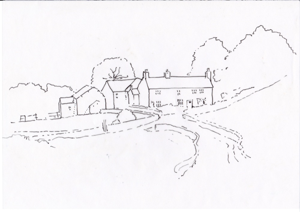
The trace: get the farm and its framing trees placed, the rest is loose.
How it's built, area by area
The background hills
Start with a base layer of white hard pastel across the background and foreground, working around the trees and the farm, and rub it well into the paper. This knocks back anything you lay on top, which is exactly what you want for distance.
Then block in soft pastel colour for the hills, keeping your strokes light and following the line of the slopes as they fall behind the farm. If it looks too strong, rub in a second light layer for a misty, faded feel. There's a hint of sky above and distant hills, nothing sharp.
The farm buildings
These are dry coloured pencil. Here Peter did not lay a white base: he wanted the feel of stonework, with the ochre hitting and missing the paper and leaving little white sparkles of grain.
Windows are simply careful dots of black, and a bit of greenery in front is lemon yellow with two greens. Notice how little detail there actually is: the dark tree shadow and the black shadow of the barn behind do most of the work, outlining the house and bringing it forward.
The trees
The trees are watercolour pencil, a blend of several greens with Indian red, some oranges, burnt sienna and a little black to deepen the darkest shadows. You can blend them with a damp brush if you like, but let the paper dry completely before carrying on. The autumn colour in the framing trees is what gives the scene its warmth.
Foreground and sheep
Some blended pastel colour goes over the white base in the foreground. The sheep are the simplest thing in the picture: little white blobs with a dot for the head and a touch of darker green shadow around them.
Place them wherever you like. Note the broken line of the fence on the left, nothing too neat, and let the picture fade out softly towards the edges of the paper.
Carol's note: did you spot it?
To my eye the field climbs from left to right, and three things do it. The strokes in the field run that way. Peter lets the colour stop higher up on the right-hand side, rather than carrying it level across. And the tree line on the right rises at an angle, pulling the ground up with it.
There's also no true horizon to tell your eye what is flat: the fells fill the top of the picture, so there's no level line to measure against. With nothing level to judge by, your eye reads the slope straight from those cues, helped along by the dry stone walls and the track tilting down to the bottom corners and gathering high up by the farm.
Lay one clear horizontal across the field, or show a glimpse of level horizon, and the whole thing would flatten out. It's a lovely reminder of how much we read from very small signals.
Make it your own
This scene is an invitation to ring the changes. Show the farm in spring or high summer instead of autumn. Turn the dry stone walls into hedges, or whitewash the farmhouse so it stands out against a darker background.
Or swap the valley behind for a coastal scene with a bay, as in the alternative trace below. Whatever you change, keep the background and edges low in definition so the farmhouse stays the star.
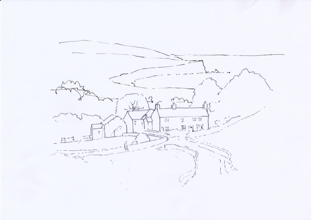
An alternative trace: the same farm set against a coastal bay.
Definition is a focusing tool
The whole atmosphere here comes from restraint. Sharp edges and strong colour pull the eye, so save them for the farm. Everything further away or nearer the edges stays soft and low-contrast, and the viewer's eye settles exactly where you want it.
Carry on from here
How to combine pastel, watercolour pencil and coloured pencil in one picture, and why each does a different job.
Combining Pastel and Coloured Pencil
A worked example of pastel pencil for the broad tones and coloured pencil for the sharp detail.
Copyright © 2009- pencil-topics.co.uk All rights reserved
Home | About Us | Contact Us | Privacy Policy