- Home
- Animals & Birds
- Draw a dog
How to Draw a Dog in Coloured Pencil
What you'll learn
How to draw a realistic dog in coloured pencil, from choosing the right photo to capturing the eyes and handling curly fur. I'll walk through it using a portrait of Louis, a cockapoo, but every step applies just as well to your own dog.
A dog portrait is one of the most rewarding things you can draw in coloured pencil, and one of the most forgiving places to start with animals. You already know your own dog's face better than any other subject you could choose, which means you will spot the moment a drawing starts to look like them. That recognition is what we are working towards.
I am going to take you through a portrait of Louis, a cockapoo, from the photo stage right through to his curly coat. Treat Louis as a stand-in for your own dog. The thinking is the same whether your subject is a smooth-coated whippet or a shaggy terrier.
Before you start: The single biggest decision in a pet portrait is made before you pick up a pencil. It is the photo you work from. A good drawing from a poor photo is almost impossible, so we will spend real time here first.
Choosing your reference photo
Gather a handful of photos rather than committing to the first nice one. You are looking for good light, sharp detail in the eyes, and clear fur texture. When I work this way I usually shortlist the best few, then look hard at why I am rejecting the rest. That habit of asking "why not this one?" is worth copying, because it trains you to see what a drawing actually needs.
Put a photo to one side if any of these are true:
- it is out of focus
- the dog is too far from the camera
- you cannot see detail in the eyes
- it was taken looking down at the animal from above
- other objects obscure part of the dog
- you can only see one ear
- it mixes indoor and outdoor light
Here are three of the photos Louis's owner sent. Each one is lovely, and each one I set aside for a specific reason. Training yourself to name the reason is the whole skill.
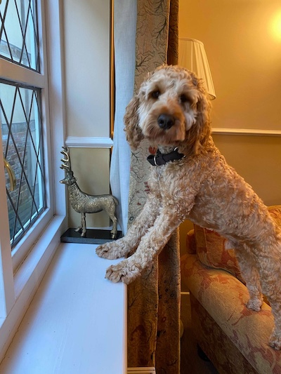
He is looking at us, but his eyes are too small to show real detail, his back end is cut off, and the pose only makes sense if I draw the whole window scene behind him.
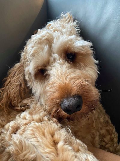
A lovely close-up, but one ear is hidden against the sofa. I would have to invent it, and invented detail never looks right.
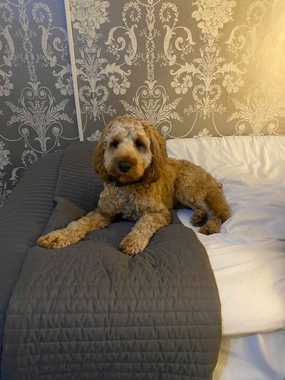
Sweet, but taken from too far back. On a phone photo, zooming in just lost the detail in his eyes.
The fourth photo was the one. His eyes were sharp and engaged, the light was even, his curly coat read clearly, and he looked relaxed rather than posed. His favourite ball had even rolled into shot, which handed me a touch of his personality for free. Notice it ticks off the whole list above: both ears, close enough, sharp eyes, even light, simple background.
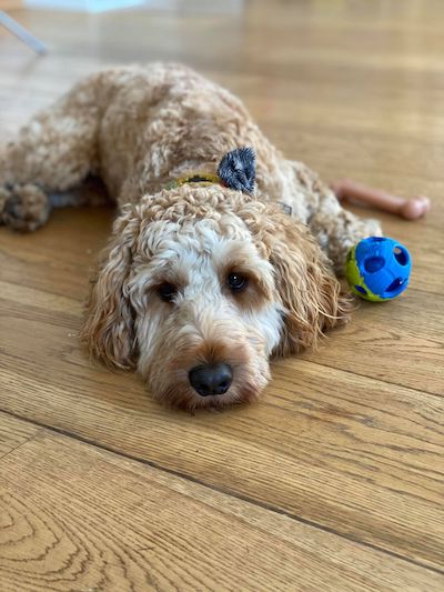
The chosen reference: sharp eyes, even light, a relaxed pose, both ears showing, and his favourite ball in shot.
Setting the pose and composition
Once you have your photo, decide how much of it to draw. You do not have to copy the whole frame. Louis was lying on the floor, so I kept a suggestion of the floor to make sense of the pose, but I let it fade out gradually rather than taking it hard to the edges of the paper. A soft fade keeps the attention on his face.
Aim for a portrait where the dog looks comfortable rather than posed. Drawing from a photo, you want to be accurate, but stay flexible enough to work with the way the animal is actually sitting or lying.
Studio tip
A simple prop can lift a portrait. Louis loves his toys, so we included his ball. One well-chosen object hints at the dog's personality without making the picture busy. Your dog's favourite blanket or tennis ball can do the same job.
Choosing your paper and pencils
Every surface is a compromise between how much pigment it holds and how fine a detail it allows. Smooth papers give you sharp detail but tire quickly and will not take many layers. Toothier papers drink up layer after layer but soften your finest marks. For Louis I settled on a medium-texture white paper called Stonehenge, which sits comfortably in the middle. More on choosing paper here.
For pencils, I pick colours from across the brands I use rather than staying loyal to one tin. Some brands are soft and buttery, others firm and good at holding a sharp point, and a portrait usually wants both. I started Louis with around 26 pencils, knowing I would reach for more as I went. By the end I had used 75. That is normal: you build the colours you need by layering, not by finding one perfect pencil. Wax and oil pencils behave differently as you layer, which is worth understanding before you start.
The pencils I pulled for Louis, a working selection from several brands, soft and firm together, with a couple of eraser pencils tucked in among them. I began with around 26 and had used 75 by the end.
Your erasers are drawing tools, not just for mistakes
People often ask whether I use an eraser. I do, but rarely to correct. Coloured pencil is stubborn and will not fully lift once it is down, so the eraser earns its place in other ways. A kneaded eraser, dabbed gently, lightens an area for effect. A harder Tombow Mono is perfect for lifting out individual whiskers and tiny highlights. Think of them as part of your drawing kit, sitting alongside the pencils. More on erasers for coloured pencil.
Starting the drawing: eyes and nose first
Begin with a light line drawing of the dog's overall shape and proportions. Keep it simple. You are just placing the face, the paws and the main colour patterns, so you can draw accurately before you worry about a single hair. I rough this in lightly with a graphite pencil, then move to coloured pencils for the detail.
Start with the eyes: Draw the eyes first and capture the expression as early as you can. If the expression is not right, you will never be happy with the finished piece, and it is far easier to fix now than after hours of fur. Get the life into the eyes and the rest follows.
The pupils are usually the darkest part of a dog portrait, so once they are in they tell you how dark you are allowed to go everywhere else. They set your range. If your dog has a dark nose like Louis, draw that next for the same reason.
Louis's eyes and nose go in first. The dark pupils set the darkest value for the whole drawing.
One practical point: work in a direction that protects what you have done. I am right-handed, so after the eyes and nose I move to the left of the drawing and work across to the right. That keeps my hand off finished areas and avoids smudging. If you are left-handed, work the other way.
Handling fur and curls
This is where coloured pencil comes into its own. It layers beautifully, and every layer adds depth, which is exactly what fur needs. Louis has several fur types in one face: soft curls on his forehead, longer locks in his ears, and short straight hairs around his nose. Because we had faded out his body, I kept the texture minimal there and put all the detail into his face and ears.
The biggest fur mistake is trying to draw every strand. Do that and you end up with something that looks like the dog has worms or spaghetti on its head. Realism does not come from drawing everything.
Outlining clumps of hair
An outline around a clump of fur gives a flat, colouring-book look and kills the realism. Let the fur edges stay soft and broken instead.
Here is the method that works. Position the most obvious curls or locks correctly first, then join those anchor points with looser, random pencil strokes. Keep every stroke lying in the same direction as the fur actually grows. Those well-placed signature curls are what make the owner recognise their own dog. Build each curl from several hues, layered slowly, with subtle shading and blending. A single curl is rarely one colour.
One more thing about a pale coat like Louis's: white fur is almost never bare paper. It is tempting to leave the light areas blank, but if you do, the dog ends up looking cut out and flat. Lay a very light layer over nearly all of it, and save the untouched paper only for the very brightest highlights, such as the shine on the nose or the lit top edge of an ear. Cream and white fur is full of soft cool greys and warm shadows once you start looking for them, and putting those down is what gives a white coat its roundness.
Building the curls in Louis's ear: anchor curls placed first, then joined with directional strokes in several layered hues.
Bringing it home
From here it is patience. Coloured pencil portraits take time, especially a long or curly-coated breed like a cockapoo, because the depth comes from many, many layers filling the tooth of the paper. Keep checking back against your photo, keep your strokes following the fur, and resist the urge to "finish" any one area too early. Nothing is done until the whole face holds together.
One reassurance for the early going: while those first layers are going down, the whole drawing will look faint, patchy and frankly unconvincing. Artists call this the ugly stage, and it is completely normal. Do not judge the piece by it. The colours and the likeness only arrive once enough layers are down, so keep going through it rather than starting over.

Louis, finished. 75 coloured pencils by the end, and every curl built in layers.
Draw your own dog the same way and you will surprise yourself. The likeness lives in two places above all: the expression in the eyes, and the way the signature curls sit. Get those right and you will see your dog look back at you from the paper.
Carry on from here
How to Draw a Cat in Coloured Pencil
The same approach applied to a cat, where the fur, eyes and nose ask slightly different questions.
The smooth-versus-toothy trade-off that decides how many layers of fur your paper will hold.
Copyright © 2009- pencil-topics.co.uk All rights reserved
Home | About Us | Contact Us | Privacy Policy