How to paint water in coloured pencils
Introduction and Background Information
This step by step will show you how to paint water in coloured pencils. It is based on a discussion posted on our old forums (that no longer exists) The work was painted by Daryl Cogavin. We'll let Daryl tell the story...
Materials and Preparation
I thought I would post the picture that I started with Peter Weatherill at Knuston Hall last weekend as a WIP (work in progress) for others to see and comment on. I am very happy to hear both positive and negative comments - its always useful to see things through other people's eyes.
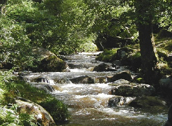
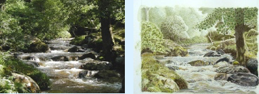
Reference photo: This is a photo that I took many years ago, somewhere in Wales (I think) but I really can't remember where it was.
Paper: Cotman Cold Pressed watercolour paper, 190gsm.
Pencils: Caran d'Ache water-soluble pencils for the initial wash, Prismacolors for adding depth, and Polychromos for detail work.
Step-by-Step Guide to Painting Water with Coloured Pencils
Step 1: Preparing the Base
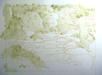
I used Peter's trace down method to transfer it onto my paper. Then I used Caran d’Ache pencils to lightly map out the tree areas, mixing a wash with water to block in initial tones.
Step 2: Adding the Darkest Areas
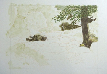
Next I changed over to Prismacolors to start putting in some of the darkest areas.
I find this works well for me, to get the darkest areas in first, as I tend to be a bit cautious with colour otherwise and end up having to go over everything again because it lacks depth and contrast.
By putting in the very dark areas first I can then see where I can have my mid tones and my lightest areas.
Step 3: Developing the Background
At this point I was keen to start working on the area that I felt least confident about - the water itself.
However, under Peter's guidance, I focused on completing the background rocks and foliage before tackling the water.
At this point I asked for feedback from the group
The discussion started as follows:
Comment from MT Lisa: Daryl it's beautiful! Looks like you have made an excellent start on it, and I will be interested to see how you tackle the water.
I replied: I'm going to be interested in how to paint water too!
But luckily Peter will be here hopefully to help me along. When I look carefully at the reference all I can see is a mind boggling swirl of colours and my brain has not yet worked out how to translate that into marks on paper.
I know that I need to keep it random and not try to replicate ever precise little shape, but I'm finding it very hard at the moment.
Peter's Expert Tips for Realistic Water Effects
The approach I usually take with water - especially fast moving or tumbling water like this - is to look closely at the colours and patterns in the reference photo.
In this case, perhaps you might enlarge the tumbling water area of the reference photo to the point where the image starts to pixelate (break up into little boxes of colour). At that stage, come back a step or two and look at the colours closely as they swirl. This may give you the break you need to find the method of how to paint water that suits you.
My own approach is to take a set of very sharp pencils in closely related colours and apply small curving marks that 'squirm' on the paper. I think it might be easier to demonstrate than explain, so give me a little time and I will see if I can post an example here.
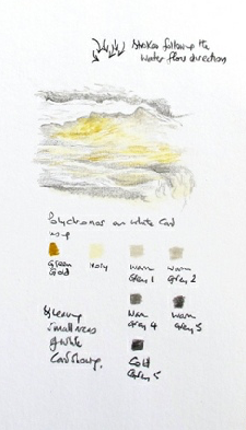
This quick sketch may get you going in the right direction.
I have taken a group of warm greys and Ivory from the Polychromos box and added the universal cure for all ills - Polychromos Green Gold.
The choice for you will need to be matched to the colours available in the brand you are using. See the sample here and tell me if this gets you started. No guarantees, of course!
Actually the green gold has come out a bit bright in the photo - must be down to the bright sunshine outside the window (or the glare off the snow!)
I replied: Oh, thank you for taking the time to do that, Peter, it looks like just the kind of recipe that I need.
I don't have time to give it a go now as I have a sackful of school work to do, but roll on next weekend and I'll give it a go.
Expert Feedback and Group Discussions
Lynn wrote: This is looking fabulous so far, Daryl. Fascinating as well as I want to learn how to paint water also.
MT Lisa commented: Thank you for the tips, Peter, its very helpful!
Nancy added: Hey Daryl! Love this picture and your progress! I can see I will learn a lot here just by watching. Its looking wonderful so far, keep up the good work!
I shared: Thanks Nancy. School finished yesterday for a two week break so I managed to get a bit more done today. I’ll get another picture on tomorrow when its daylight.
Next Wednesday we have an appraisal evening at my art group when Jean Canter is coming to give a critique of our work. I'd like to get this finished to hear what she has to say about it.
She's a past president of the SGFA and a member of the UKCPS. A google image search will show the kind of work she does. She does some amazing miniatures amongst other things, often of scenes in the Surrey countryside near where I live.
Nancy agreed: Your'e right, Daryl, Jean has done some fabulous work! I especially love her piece called "The Thames at Remenham". The way she renders skies and water is just incredible.
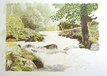
More progress on the painting
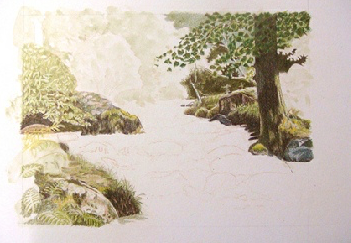
I made a bit of progress yesterday, but I am still finding it hard working out what colours to put where, and I can only manage short sessions at a time.
It's getting a bit easier though. Here's yesterday's photo...
... and a closer shot.

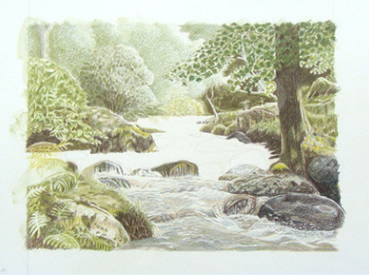
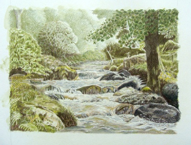
I'm done as far as covering all the paper, but now it needs tweaking so I'd really appreciate any comments, particularly about anything that jumps out as not quite right.
As usual my photo looks a bit blue. Bear in mind that the paper is actually white. I don't know if I need a better camera or just better skills.
Peter offered a critique
Hi Daryl, looking good! A lovely picture.
Firstly, I think that you need to decide what sort of an image you are looking for in the completed work. The picture 'as is' is a super version of the original photo in a light, fantasy way.
As I said originally when you were working an early stage, I can image a Unicorn coming out from behind that tree to drink from the steam.
Now for the weasel word ... however...
If we compare the original photo side by side with the image to date we can see that it lacks something.
To enhance the light on the foam, deepen the shadows in the foreground water. The darker values will create contrast and draw viewers into the scene. While the photo shows very dark shadows, you won't need to match that intensity.
To emphasize the lights in the focal area (the line of the stream) consider darkening the foreground water with warm greys. Then deepen the darker areas of rocks and foliage around the edges.
Keep the background light as is for now - you can reassess once you've adjusted the focal area's contrast.
I know this means more work when you thought you were done!
If you like that airy feel the picture has at the moment then I wouldn't argue with signing it off as done. If you feel, as I do, that it could do with a little more punch, then take the shadows slowly and reconsider at regular intervals.
I hope that helps, Daryl. As I said at the beginning, it is a lovely picture and you are certainly learning how to paint water! Cheers, Peter.
Final Touches And Refinements
Thanks Peter, that is very useful to see them side by side like that.
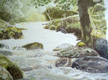
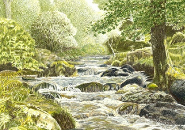
I have spent a bit of time darkening and strengthening a few areas, particularly the foreground water, the mossy rock on the bottom left corner and some of the other rocks.
I'm happier with the water but still not happy with the dark speckled tree leaves top right.
Jean Canter also focussed on that tree not being right, but said the water was ok.
I'm planning to take a lot of bluetac and an electric eraser to it when I get a minute. I think its too solid (needs some specks of light on the leaves) and also is maybe the wrong green compared to everything else.
I did some serious erasing on the tree then used some different greens to darken it but leaving more light patches than before. I think it looks better now.
This scan was done on the school photocopier so it is much better colour than my camera photos.
Peter Came Back to Me
I like it a lot, Daryl.
Jean Canter was right about the tree and leaves. Your efforts to create a more random effect in the leaf cover have succeeded.
I might have added darker areas where leaves overlap more densely, but there's always room to adjust.
Set the picture aside and look at it occasionally as you pass by. Within a day, you'll either be satisfied enough to sign it, or know exactly what needs changing. Take your time with the decision.
Postscript: A Successful Piece of Art
My husband tracked down the original photo of this on his computer and remembered it was taken in Ireland, near Glandalogh (not Wales as I had thought).
I entered it into the art group exhibition last week, and it SOLD!
Over to You!
Painting water is challenging but rewarding. Practice different techniques and learn from feedback to improve your work. Each piece you create helps you develop as an artist.
We’d love to see how you interpret these techniques! Share your work via email or tag us on social media. #PencilTopicsFeedback
Improve Your Pencil Art: Get Free Tips & Techniques
Sign up for our newsletter – just occasional emails packed with practical advice and inspiration for pencil artists like yourself
You might like these
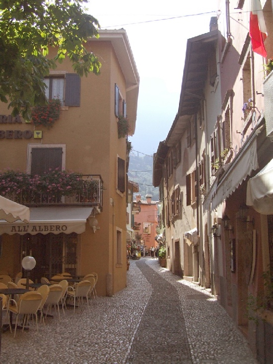
Watercolour pencil tutorial - Italian Street Scene
A step-by-step demonstration showing how to create an Italian street scene using watercolour pencils from Caran d'Ache
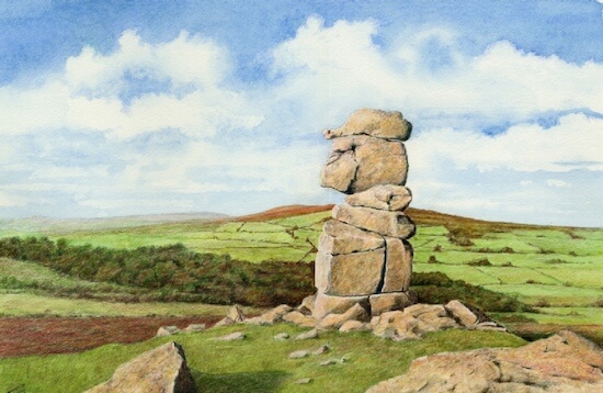
Dartmoor landscape drawing tutorial
This landscape drawing tutorial in coloured pencils shows the Bowerman Stone in Dartmoor, Devon, UK.
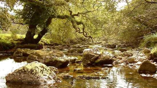
How to Draw a River with Realistic Rocks in colored pencils
Learn how to draw a river with Peter Weatherill's step-by-step guide, using Faber Castell Polychromos coloured pencils and create a realistic landscape
Copyright © 2009- pencil-topics.co.uk All rights reserved
Home | About Us | Contact Us | Privacy Policy