- Home
- Paper choices
- Black paper
- Black Paper for Coloured Pencils
Black Paper for Coloured Pencils: Four Papers Tested
The verdict
Fabriano Black Black is the darkest of the four and the one to buy first: the pencil sinks in and builds smoothly. Stonehenge Aqua runs it close. Plain Stonehenge feels lovely but the contrast is not there. Avoid craft black, which fades and takes your contrast with it.
Black paper does something white paper cannot. It hands you the shadows before you start, so the only thing left to build is the light. That is why a drawing on black can look lit from inside.
The catch is that not every black behaves. Some blacks drink pigment and give nothing back. Some are so smooth that a third layer just slides. And some are not really black at all after a summer near a window.
This page is what four papers did under the same pencils, plus what to expect from a fifth I have not tested. If you want the technique rather than the materials, the step by step for coloured pencil on black paper has a full demonstration.
The three I keep in the plan chest: Fabriano Black Black, Strathmore Artagain and Stonehenge Aqua Coldpress
Does black paper fade?
The point
Cheap black paper fades to a tired grey, and it takes your drawing's contrast with it. The paper has to be archival, not just black.
This is the question worth settling before you spend anything, because it is the one that cannot be fixed later. Your pencil work might be perfectly lightfast. If the paper underneath it lifts by two values, every highlight you built loses its punch.
Peter Weatherill's test is the simplest one I know, and you can start it today.
The window test: Put a sheet in your sunniest window for a month. If it comes back rich and dark, you have found a keeper. If it has gone grey or brownish, keep it for thumbnails and working things out, and buy something better for finished work.
Craft and scrapbook blacks are the usual culprits. They are dyed rather than pigmented, and dye is what fades. The four papers below are all archival, which is most of why they cost what they do.
The four papers
The point
One white Chromaflow pencil, five light layers, four different blacks. The paper changes how dark the ground stays, how brightly the white reads on it, and how much work your arm has to do.
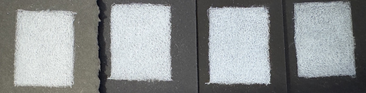
One white Chromaflow pencil, five light layers on each. Left to right: Stonehenge, Stonehenge Aqua Coldpress, Fabriano Black Black, Strathmore Artagain
This is the comparison worth having, and it is the one most reviews skip. Everything else on this page is one paper at a time. Here the pencil, the pressure and the layer count are all held still, so the only thing changing is what is underneath.
The thing that surprised me was how different the four felt under the hand, not just how they looked. Two of them took the pigment as though the paper wanted it. One of them fought me for five layers and never gave in.
Fabriano Black Black
The darkest of the four, and the pencil sinks gently into it and builds smoothly rather than sitting on top. A substantial 300gsm sheet that does not cockle under pressure, and easier to find in UK shops than Stonehenge, which counts for more than it should.
Best for: most things, and the one to buy first.
The name is not a typo. Fabriano called it Black Black because the sheet is darker than most papers sold as black, and side by side with three others it plainly is.
That matters more than it sounds. The darker the ground, the further your lightest whites can travel before they run out of contrast, so a denser black gives you more range to work in without doing anything differently.
It also feels right under the pencil, which I did not expect to matter as much as it does. The pigment goes down without effort and each layer sits on the last instead of skidding over it.
My white pencil brand test further down was swatched on this paper, and so was the pears still life below. It was an early attempt and it shows, but the paper is not what let it down.
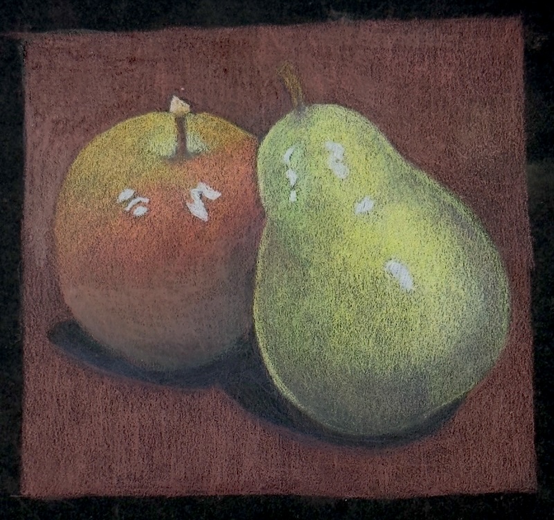
An early still life, on Fabriano Black Black
Legion Stonehenge, black
A soft, absorbent printmaking surface with a matte finish, and lovely to work on. But it is noticeably lighter than the other two good ones, a warm dark grey rather than a true black, and you feel the loss in the contrast.
Best for: the drawing experience, if you can live with less punch.
This is the one I have used most, and the strip test made me think about it again.
It feels lovely under the pencil. Nothing here is nicer to draw on. But it is the lightest black of the four by a clear margin, and when I laid the same five layers on all of them, the contrast on the Stonehenge was simply not there next to the Fabriano.
The zebra below is on it, and I still like the drawing. Knowing what I know now, I would be curious to see the same subject on the Fabriano.

Zebra, white coloured pencil on black Stonehenge. A lovely surface to work on, though not the darkest ground here
Peter used the same paper for his course studies, including the colour chart further down this page and the Crabapple Tea study, which is why so much of the work on this site sits on it.
Stonehenge Aqua Coldpress, black
Nearly as dark as the Fabriano, and it takes the pencil the same way: the pigment sinks in and builds smoothly. A completely different surface though, because this is a watercolour paper, not the printmaking Stonehenge. Cold pressed, so the tooth is pronounced.
Best for: mixed media on black, and texture you want to see.
Do not confuse the two: Stonehenge and Stonehenge Aqua are different papers from the same maker, and they are not even the same darkness. The plain Stonehenge is a smooth, lighter printmaking sheet. Aqua is a cold pressed watercolour sheet with a much more obvious grain and a far deeper black. If you order the wrong one expecting the other, you will notice on the first stroke.
The grain is the whole story here. On a smooth paper a white pencil lays a clean flat area. On Aqua it skips across the tooth and leaves the low points black, which is either a texture you wanted or a problem you have to solve. More on that below.
Strathmore Artagain, coal black
A hard surface at 160gsm, roughly half the weight of the other three. Acid free, 30% post-consumer fibre, in a generous 12 by 18 inch pad. The cheapest here, and the only one I will not be buying again.
Best for: nothing I would choose it for over the other three.
I will be blunt about this one, because a page full of papers that are all somehow fine is no use to anybody.
The surface is hard, and it did not want the Chromaflow pigment. On the very first of the five layers the pencil was skidding across it rather than laying anything down, and it never improved. By the fifth layer my arm was aching, and I was working lightly throughout. That is not effort going into the drawing. That is effort going into the paper.
Compare that with the two middle papers in the strip, where the pencil sank in gently and each layer built on the last without my having to lean on it.
What this tells you to check
When you try a new black paper, notice the first layer, not the fifth. If the pencil skids on layer one, it will still be skidding on layer five, and no amount of pressure will fix it. A paper that takes pigment does it straight away.
In fairness, it is large, cheap and half the weight of the others, so if you want something to fill with practice marks it will do that. I would rather spend a little more and enjoy it.
And one I have not tested: Canson Mi-Teintes
Mi-Teintes comes up constantly in this conversation, so it would be odd not to mention it. It has two very different sides, one of them a pronounced honeycomb texture, and it is the cheapest of the papers people recommend for this.
I do not own a black sheet of it, so I am not going to review it. When I do, this section will say what it did.
Which coloured pencils work best on black paper?
Quick answer
Softer, more heavily pigmented ranges cover in fewer layers, which is what black wants. Brand matters less than most people expect. Sticking to one brand matters more.
Peter charted eight brands on a single sheet of black Stonehenge, one to five layers of each colour, light pressure building to full coverage. The brands were Pablo, Supracolor, Polychromos, Prismacolor, Coloursoft, Luminance, Lyra Polycolor and Albrecht Dürer.
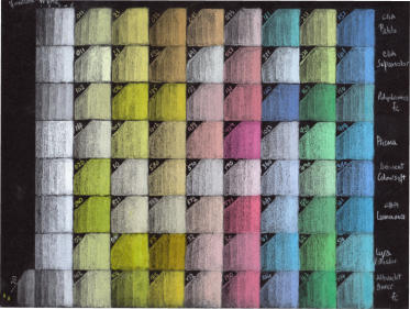
Peter's eight-brand chart on black Stonehenge, one to five layers of each
His conclusion was that the differences were smaller than expected, but three things separated them.
Prismacolor and Luminance covered best
They are the softest of the eight, and softness is what puts pigment down on a surface that swallows it.
Polychromos and Pablo gave the most choice
120 colours each, which matters when you are hunting for the one light value that will read against black.
Coloursoft and Lyra Polycolor held up despite smaller ranges
Neither was outclassed. The limited palette was the constraint, not the performance.
Peter worked his demonstration mainly in Pablo, borrowing a few Polychromos for their better reds. Pablo does greens, Polychromos does reds, and there is no rule against owning both.
Studio tip
Pick one brand and stay with it for a whole drawing rather than mixing four. On black you are learning how much pressure a given pencil needs to read, and that lesson does not transfer cleanly between brands.
Which white pencil shows up best on black paper?
Quick answer
Whites vary far more than colours do. The soft, opaque ones cover in two passes; the harder ones stay grey however hard you press. It is the one place brand genuinely decides the result.
This surprised me. I expected the colour brands to separate and the whites to be much of a muchness. It is the other way round.
I swatched ten whites on Fabriano Black Black: Derwent Drawing, Chromaflow, three Derwent Lightfast whites (Arctic, Oyster and White), Caran d'Ache Museum Aquarelle, Polychromos, Prismacolor, Supracolor II and Luminance.

Ten white pencils on Fabriano Black Black. The gap between the best and the worst is not subtle
If you have ever wondered why your white looks grey, this is usually the answer, and it is not your pressure. A hard, waxy white on an absorbent black will stay grey no matter what you do to it.
There is a whole family of near-whites worth knowing too. Derwent Drawing's range of pale greys and warm neutrals gives you Chinese White, Oyster, Arctic, Fossil Grey, Taupe, Granite, Cool Grey, Warm Grey, Carbon Grey, Platinum and Mist. On black those read as a set of usable light values rather than as greys.

The Derwent Drawing range on Stonehenge Aqua Coldpress. Note how the cold pressed grain breaks up each swatch
Peter rates one more that is not in either chart. He picked up a Stabilo 'ALL' white pencil (8052) from his sundries pot to compare against a new brand, and it beat most of the whites he had tried. It is sold as aquarellable and marked for paper, glass, plastic and metal, so it is not an art-shop pencil at all. Worth grabbing if you see one.
What surface texture does to your whites
The two Stonehenge sheets make this visible. On the smooth printmaking sheet, white lays down as a flat clean area. On the cold pressed Aqua, the pencil rides the high points of the grain and leaves the low points black, so a solid white becomes a speckle.
Peter hit exactly this on a Venice scene worked on a rougher black. The streetlamp reflections and the light on the footpath came out flecked, and fine railings against them were close to impossible.
The problem: grain breaking up the lightest areas
The fix: white pastel blocked in and blended into the grain first
His solution was to stop fighting the paper. Block the light areas in with white soft pastel, blend it down into the grain, then work coloured pencil over the top. That gives a base solid enough to draw fine dark lines back into.
It is a genuinely useful trick and it has its own worked example: a cottage doorway built pastel first, coloured pencil second.
Four ways to waste money on black paper
Buying craft black because it is cheap
It is dyed, not pigmented, and it fades. Use it for thumbnails and buy one archival sheet for anything you want to keep.
Ordering Stonehenge Aqua when you wanted plain Stonehenge
Same maker, different papers. Aqua is a cold pressed watercolour sheet. Check the word Aqua before you click.
Buying a full set of pencils before testing one white
Whites vary more than colours on black. One good white teaches you more about the paper than sixty colours will.
Choosing a black paper on how black it looks
The surface matters as much as the shade. The Artagain here is dark enough, and I still would not use it, because the pencil skids instead of sinking in. Judge how it takes pigment, not just how it photographs.
Now stop reading about paper: I lost a fortnight to this once, comparing surfaces I had never drawn on. What moved me on was buying one sheet, ruling it into strips, and laying five layers of the same white down each one. You will learn more about a black paper in an afternoon of swatching than in a month of pages like this one.
Where to go next
How to use coloured pencil on black paper
The method, and a full step by step demonstration of a glass sweet jar with the reference photo to download.
Pastel first, coloured pencil second
A cottage doorway worked on black paper with a pastel underpainting, for when the grain is fighting you.
Choosing paper for coloured pencil
Five surfaces tested and compared, plus what weight, sizing and surface change about your drawing.
How to build colour in passes so it stays clean, which matters more on black than anywhere else.
Copyright © 2009- pencil-topics.co.uk All rights reserved
Home | About Us | Contact Us | Privacy Policy