- Home
- Pastel Pencils
- Breton Boat Pastel Pencil
How to Draw a Breton Boat in Pastel Pencil
In short
A pastel pencil landscape on Lana paper: a Breton fishing boat on the shore at sunset. You build the sky first, blend it soft with a scrap of foam, then work down through the water reflections to the boats. A satisfying few hours once you have a project or two behind you.
Pastel pencils sit somewhere between drawing and painting, and this little Breton harbour scene is a lovely way to feel that for yourself. The sky does most of the work, a warm sunset glow behind a bank of cloud, and the still water carries that light back down to the boats waiting on the shore.
You will use a mix of hard pastel sticks for laying colour down quickly and pastel pencils for the detail, and you will spend as much time blending as you do drawing.
Carol's note
Take a slow look at the finished painting below. What catches your eye first? And, just as interesting, why do you think it lands there before anywhere else?
Hold that thought as you work through the steps. I'll tell you what pulls my eye, and what gives it that pull, near the bottom of the page.

Where we are heading: the finished pastel, sunset sky glowing behind the cloud and reflected in the wet shore.
It is offered here in landscape format. The method is the same if you would rather work it tall, and you can change the right-hand side as you like, with rocks, a marker post and a different waterline.
Take it steadily, and treat it as a chance to try the techniques rather than to produce a flawless masterpiece.
Use the smooth side of the paper: Canson has one heavily textured side, so use the smoother reverse. Lana's two sides are very similar, so just pick the smoother of the two. Either blends well. A mid grey or other neutral paper is ideal, because it lets both the sunset lights and the cloud darks show against it.
What you will need
Any pastel brand will work, and your colours do not need to match Peter's exactly. He used Cretacolor pencils here.
- A combination of hard pastel sticks (faster for foundation layers) and pastel pencils (easier for detail). The pastel is the same; one just has a wood surround
- A spread of warm sunset colours: white, cream, orange-yellow, light red or rose, pale blue, plus greys, purples, violet, rose madder, indigo, black and a brown (bister) for the shore
- Lana or Canson paper in a mid grey or neutral tone, smoother side up
- A hard pencil or white pastel pencil for transferring, and an HB graphite for a light freehand redraw
- Blending tools: a small piece of foam pipe insulation (cheap from any DIY shop, keeps your hands clean), a paper torchon (stump), and your finger
- A Faber-Castell pastel eraser for lifting colour back out cleanly
Free traceable outline: the boat's angle is the trickiest part to judge, so trace it rather than draw it freehand if you would rather. Download the outline (PDF), print it at the size you want, and transfer it to your paper as in Step 1.
Step by step
Get the main outlines onto the paper, keeping every line as light as you can, because pastel and graphite do not get on and you want the bare minimum mark underneath. Don't use a soft, greasy pencil.
Peter laid white pastel pencil over the back of the trace to mark the positions, then re-drew the picture freehand on the front with an HB and a light touch. You are after a guide, not a finished drawing, and you needn't follow every detail of the trace.
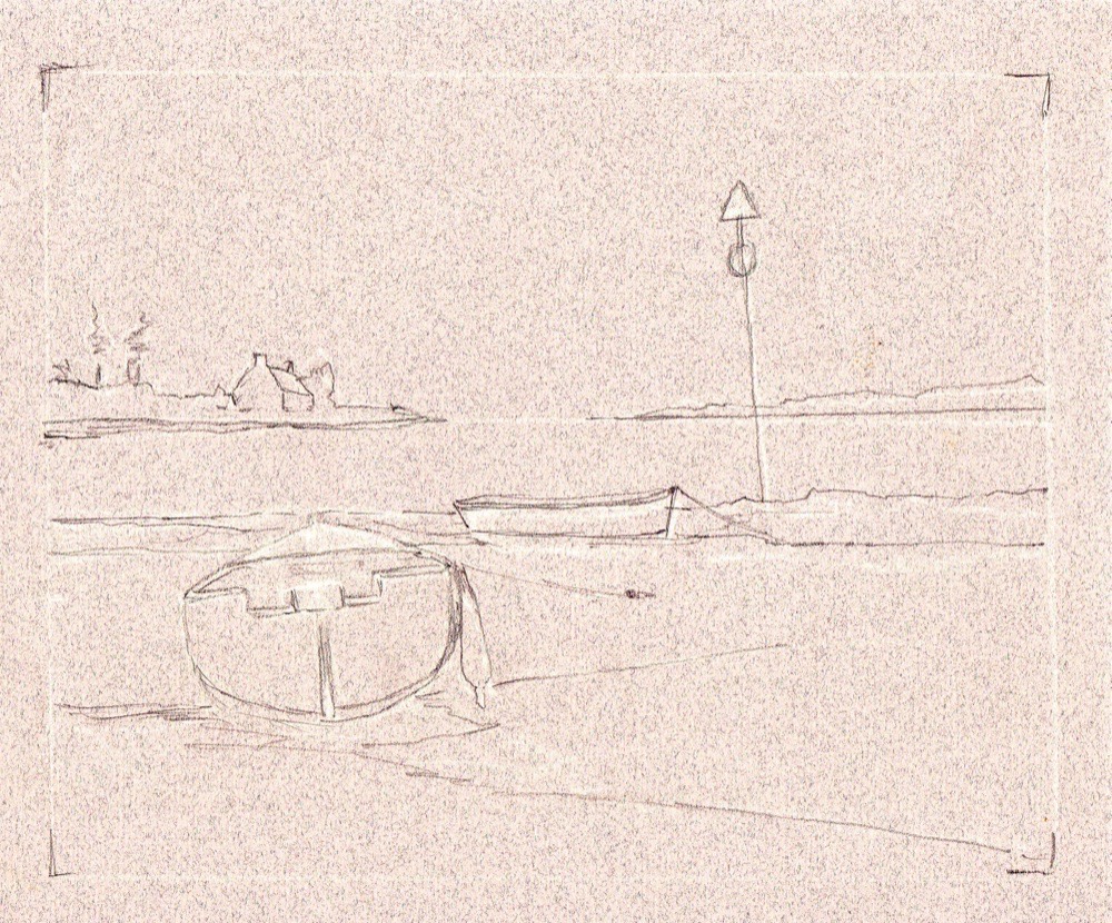
Step 1: the outline kept faint. Enough to place the boat and horizon, no more.
Decide where the light is coming from, then lay a foundation of your lightest pastels over the brightest parts of the sky: white, cream, orange-yellow, light red and pale blue. The sticks let you cover ground quickly.
Work the colour into the paper to bed it down as a base, knowing detail goes on top later. Protect the white of the cottage now by putting a little white on its walls, and pop in a touch of reflected light on the water.
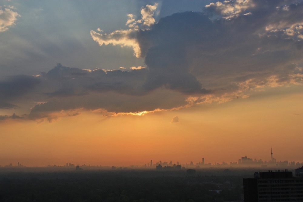
A sky reference. You needn't copy it exactly, but keep the direction of your lights and shadows constant throughout.
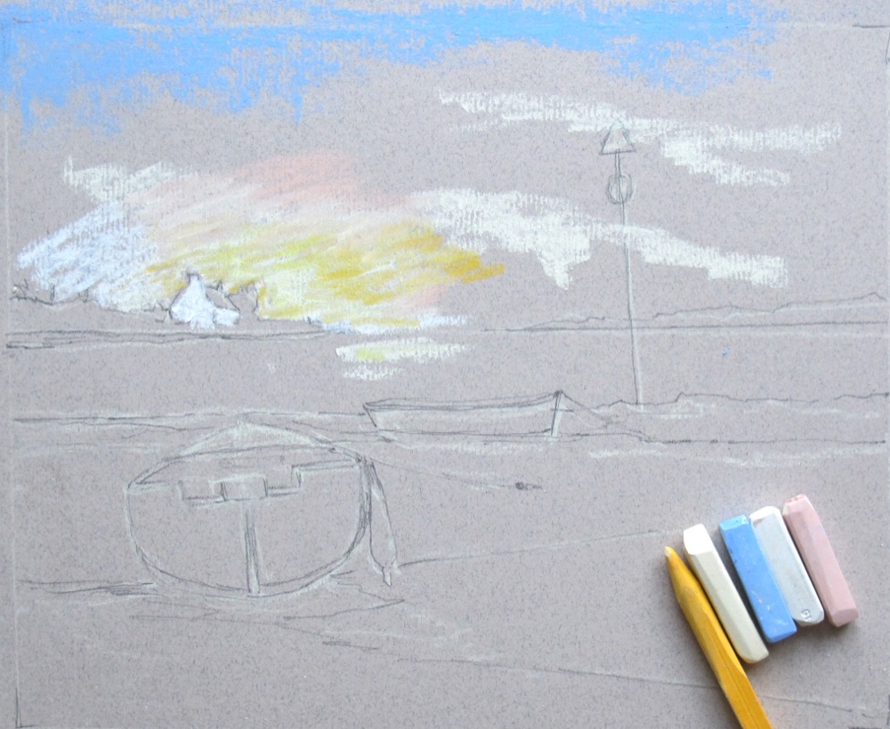
Step 2: the lightest sky colours laid in loosely with the sticks.
Find your darkest sky areas and lay a darker foundation where the clouds sit, usually greys and purples, and intensify them where you need to.
A little light grey across the top left tones down any over-bright blue. Don't blend yet, and leave the lower half of the picture for now. You are just getting the right band of colour into roughly the right place.
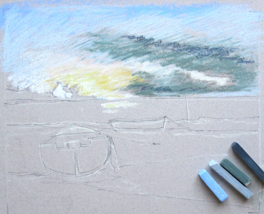
Step 3: cloud darks laid in over the light foundation, not yet blended.
Blend with a small piece of foam pipe insulation, worked in little circles. It picks up and beds down the colour and keeps your hands clean. Blend the light parts of the sky first, then the darks, working light into dark and keeping your highlights clean.
Don't chase cloud detail yet, pastel is opaque and later layers cover earlier ones. Then set the dark line of far land on the right, working black into the paper with a sharp-pointed torchon for a dense black, and add a light line along its base plus a little shadow in the water. That gives you something to judge the sky against.
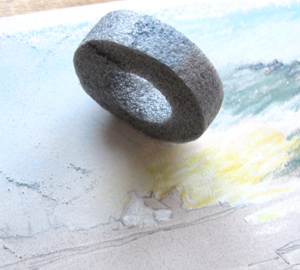
Step 4: a scrap of foam pipe insulation is the secret to soft, clean pastel blends.
Now work back into the sky with the pencils for a truer rendering. Add violet and rose madder into the cloud, bring the orange and creams back up, and blend lightly as you go, building and softening until the sky pleases you.
Because pastel is fragile, do as much as you can in the top half before you start lower down, so your hand never rests on finished work.
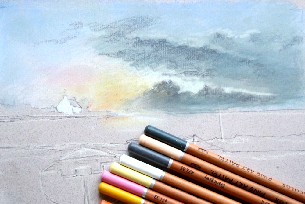
Step 5: pastel pencils bring the glow up and sharpen the colour in the cloud.
Add the land on the left with its cottage. Peter laid dark grey here first, planning to take green over the top for a deep green later.
This land is closer, so it wants more colour, and dropping the waterline a little lower on the paper helps it read as nearer to you. Get the colour levels right down to the waterline before moving on.
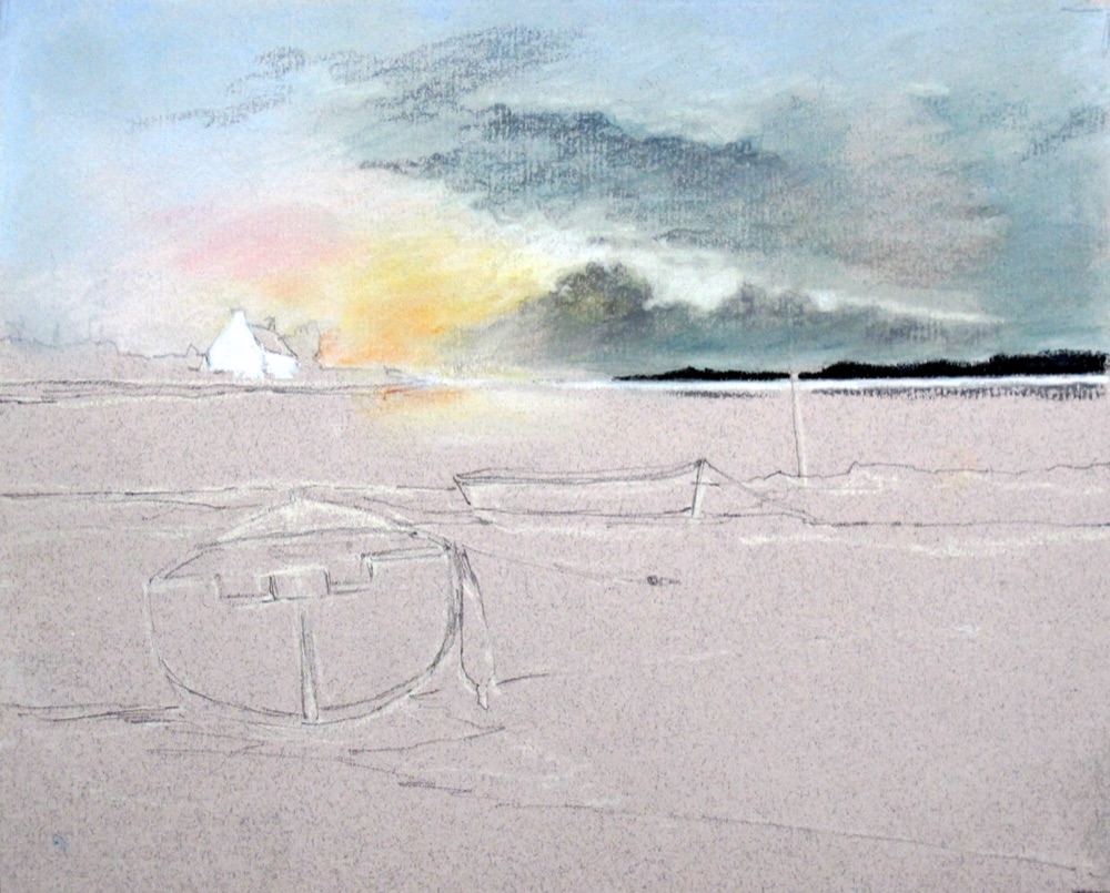
Step 6: the sky finished and the near land and cottage established.
Lay horizontal strokes of light blue across the water, with white directly below the sunset, then take a little white over the blue so it blends to a lighter shade. Bed it in with a finger or the foam. Now add colour on top, but leave the boats and the spit of rocks for the moment.
Keep the small patch of clean light water between the main hull and its hanging fender, that bright note is the focus of the whole picture, and lift any stray colour with the pastel eraser if you stray into it.
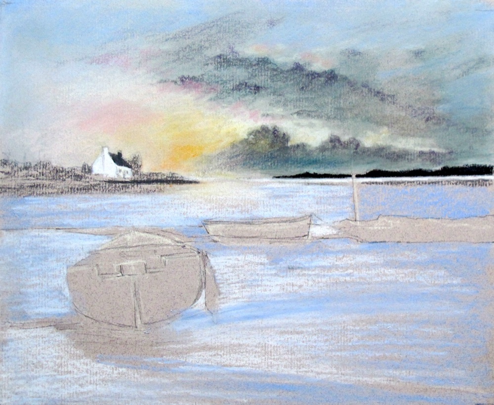
Step 7: the water laid in, carrying the sunset glow back down the picture.
Work the main boat last but one. Preserve the light tones at the stern, lay a light black on the shadowed areas as a foundation (colour can go over the top and the black keeps it dark), and define the boat's edge with stronger black in the water beneath it. Where you want colour but darker, lay the colour then add darks on top and blend, keeping the hue but dropping the tone.
Add a few stones on the shore, brown (bister) into the wet sand, and white on the sand triangle so it lightens as it nears you. Save the marker post and the mooring lines until the very end. Then compare with your reference, add any missing oranges, sharpen your pencils and crisp up the edges that need it.
Protect your pastel as you work
Pastel is fragile and smudges at a touch, so keep your hand off finished areas. Work the top of the picture before the bottom, and if you have to reach across worked pastel, lay a clean sheet of paper over it and hold it still so it cannot slide and smear.
On fixing: if you fix this picture, do it once the base colour is down, not at the very end. Fixative darkens pastel and kills the highlights, so this paper exercise is best left unfixed. A specialist surface like Pastelmat holds the powder so well it needs no fixing at all.
The finished pastel: a Breton boat at rest on the shore, low tide, the last of the light.
Carol's note: what caught your eye?
For most of us it's the warm patch of sunset light low in the sky, and the streak of it reflected straight down the wet shore. In a picture made almost entirely of cool greys, mauves and blues, that is the one warm note and the lightest light, and the eye is always pulled to warmth and to brightness, especially where the two meet.
Then look at the three tiny patches of pure white: the cottage on the far headland and the two little boats out on the water. They act as stepping stones, carrying your eye across the picture and down to the larger boat in the foreground, which Peter has caught with a bright rim of light running along its back. Small as they are, those whites do a lot of quiet work.
Here's a lovely detail: those two distant boats aren't in Peter's step photos at all. It looks as though they were an afterthought, dropped in right at the end. A useful reminder in itself, that a small accent to lead the eye can be added at the very finish, once you can stand back and see what the picture needs.
There's one more gentle pull, too: the small patch of clean light water he keeps beside that main boat. Once the glow has caught you, the eye travels down the reflection, is passed along by the whites, and settles on the boat. It's a lovely lesson in leading the viewer, a handful of small light notes doing most of the work.
Carry on from here
Pastel Pencils: the full guide
What pastel pencils are, how they differ from hard sticks, and the techniques behind blending them cleanly.
Pastel Pencil Tutorial: a Simple Vase
A gentler first project in pastel pencil, if this seascape feels like a stretch. Layering, blending and shading on one simple form.
How to Draw a Boat That Floats
The three things that stop a boat hovering above the water: hull shape, waterline placement and reflections.
The same love of boats in a very different technique: loose pen line plus watercolour pencil washes. A nice contrast with this soft pastel.
Copyright © 2009- pencil-topics.co.uk All rights reserved
Home | About Us | Contact Us | Privacy Policy