- Home
- Core Coloured Pencil Techniques
- Limited color palette challenge
Limited colour palette challenge
Welcome! If you're looking for a really practical and insightful way to see several core coloured pencil techniques in action, you're in for a treat.
This popular challenge, originally created by Pencil Topics founder Peter Weatherill, is a fantastic exercise in making the most of a deliberately restricted set of pencils.
As you work through Peter's steps to create the seaside hut, I encourage you to pay special attention to:
- How he achieves a full range of colours, especially greens and darks, through careful layering and optical mixing from just six primary-based hues.
- The way he controls value and intensity with this limited palette
- His use of burnishing with white to enhance vibrancy.
Viewing this constraint as an opportunity is a powerful way to deepen your understanding of how your coloured pencils really work. Enjoy the challenge!"
The Power of Constraints
Setting artistic boundaries, like taking on this limited color palette challenge with just six pencils for our seaside hut, might seem daunting at first. But these limitations? They're actually fantastic opportunities that can spur remarkable creativity and growth!
Working with fewer options encourages you to:
- Think more critically about every colour choice.
- Be intentional, carefully considering how each hue will contribute to your overall composition.
- Explore innovative ways to achieve the effects you desire, often pushing you beyond your comfort zone.
- Discover new possibilities and techniques you might not have found otherwise
This principle isn't just about artistic exploration; it can be practical too.
If you're trying a new medium for the first time or are mindful of your budget, it's empowering to see the impressive results you can achieve with a small, well-chosen set of pencils. You might be surprised at the magic you can create.
This becomes especially useful in shadows, where the colour shift matters just as much as the darkness, as I explain in What Colour Is a Shadow?
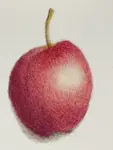
The challenge photo
I have placed Peter's notes into grey boxes throughout the page to make it clear where he is talking. Here he explains why the sketch and photo differ.
Your mission should you choose to accept it, is to recreate this photo of a seaside hut. To get you started we have simplified the process for you by providing a sketch.
In the provided sketch, you'll see I've intentionally left out some elements from the original photograph, like that cluster of antique machinery.
Why this simplification?
Because for this limited colour palette challenge, we're not aiming for a literal, detail-for-detail recreation. The art of omission is key here, allowing us to concentrate our six pencils on the essential forms and colours that convey the spirit of the scene.
But don't worry, I haven't stripped the scene of all its charm. I've added a few intriguing dark posts in the foreground, creating depth and a sense of mystery.
I've also nudged the roofline just a tad higher than the skyline. It's all in the name of keeping my compositional eye, and hopefully yours, too, happy.


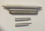
Your limited color palette contains...
As a beginner, you may not have the same pencils that Peter uses here but that doesn't matter. You can work with similar colours from your own collection. As Luminance are soft pencils, you could substitute Prismacolor which are more economical. The important thing is to have a 'pure' hue for each colour and one that is darker or duller (in the case of the yellow).
If your pencils differ from Peter's, a colour comparison chart can help you find close matches in your own brand before you start the exercise.
The six colors we will use for this challenge are primary colours - two red, two yellow and two blue. It would be helpful if pencil manufacturers would supply this selection in a small tin, however their idea of useful colors to include in a set can be a bit baffling at times.
Therefore, you will need to buy these pencils individually if you don't already have them to hand. This does give you the opportunity of ensuring that the ones you use all have good lightfastness ratings.
The pencils used for the example here are Caran d’Ache Luminance. These lightfast pencils with a high wax content have a soft touch and handle smoothly on the 300gsm hot pressed surface. Those chosen were...
- Permanent Red 061
- Russet 065
- Middle Cobalt Blue 660
- Prussian Blue 159
- Bismuth Yellow 810
- Yellow Ochre 04
I also added a White 001 for blending purposes.
If you want to replace these with a more economical brand try to pick colors as close to those given as possible.
No greens?
Having a limited palette means you have to adapt. If you are using different pencils to Peter, I advise testing each mix on a scrap piece of paper, or the edge of the one you are working this study on, to see if you get a similar result. It doesn't have to match exactly!
You will note a profusion of lush, vibrant greens in the photo, but our palette does not include a single green pencil! We will create our own by layering the other colors and fooling our eyes into believing they are seeing green.
We won't use a black pencil either. Just saying...
How I use the limited color palette
The photos below show my process for tackling this limited color palette challenge. I tend to work over the whole drawing, but the steps below take each element at a time.
The building
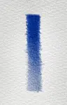
As Peter doesn't have a dark green pencil handy, which is the complimentary colour to red, you will note he uses dark blue to add the shadows to the roof. The paler blue is also used here to add value to the shadowed wall.
I start with several light layers of Permanent Red on the roof, then add Russet and Prussian Blue to the edges for shadow.
I apply White to the shadowed wall (leaving the lighter wall bare paper). With a very light hand I add a touch of Cobalt Blue into the white. This will need smoothing out with a further layer of White.

The door
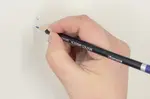
Notice the order in which Peter applies the colours in this next section, and how many light layers he uses. In this small area he uses both layering and burnishing.
With the precision of sharply pointed pencils, I add some depth to the picture by crafting the wheel above the door using Prussian Blue and Russet. Then I add just a touch, a hint, a smidgeon of White to create the highlight.
The real magic starts now: it's time to add shadows. Applying Prussian blue to the door edges is my secret ingredient here. This step will allow me to achieve a beautifully dark shadow.
To complete the door, I use Permanent Red pigment. But not just one layer - oh no, it needs three! These thin layers, worked across each other, ensure a smooth, even application that enhances the depth of color.
Next, I bring in the magic - the white pencil. This might seem a bit unusual, but trust me on this - the white pencil makes all the difference. I use it to burnish the red, pressing the color into the paper. This not only solidifies the color but also gives it a certain vibrancy that stands out.
Lastly, I add a top layer of red over the door surface. This acts as a final touch, enhancing the red finish and giving it a strong, yet even look. The result? A rich, deep, and compelling red door that takes your breath away.
To learn more about burnishing colored pencil click this link.
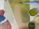
The green areas

Don't try to get things perfect - flat areas of colour don't tend to look realistic, so often uneven layers are better! Layering colours in this way enables you to get natural looking grass with little effort.
After studying the green areas I start with the foreground grass. This is a great strategy as it helps to understand how the green hues will evolve from the colors in our limited color palette.
I decide that alternating light layers of Prussian Blue and Yellow Ochre will ensure that the shading doesn't end up featureless.
One technique I use is to withhold the dark yellow from the shadowed area beside the hut, letting it emerge nearly blue. Repeating this along the edge of the grass nearest to the viewer helps to give depth to the verge so it appears to be raised off the road surface.
I continue to work very light layers over the foreground grass and then burnish with White, (see the section below the door) and then finally work back over the area with the Prussian Blue and Yellow Ochre again (see the right hand side).
For the lighter green hillside in the distance I use the Middle Cobalt Blue and Bismuth Yellow in uneven layers. In some areas I leave just the light yellow showing, and in others I add some Yellow Ochre, to give variation.
The posts, road and water
Peter shares some interesting tips here. Test out using a white layer under a colour on the edge of your paper. Compare what happens when you miss out this step.
Were you wondering from the beginning how you would achieve the grey of the road and it's texture?
For the dark posts I alternately layer the Russet over the Prussian Blue (three layers of each).
The water has a base of White to protect the paper surface from being stained by the more saturated Cobalt Blue on top. White over that smooths it out.
Finally the road consists of light layers of all six colors, worked in succession. This is left unburnished so that the grain of the paper still shows to represent the road texture.
Challenge achieved?
Peter finishes up with some powerful encouragement about the importance of hands-on practice to truly master these techniques...
I sincerely hope you've tried your hand at this limited color palette challenge!
You'll find that the experience is much more immersive and rewarding when you're not just passively reading through my instructions, but actively applying them.
It's one thing to read about blending colors, but it's a completely different experience when you witness the magic unfold right in front of your eyes. As you watch the colors merge and mix, the technique truly sinks in and becomes part of your artistic arsenal. The next time you're faced with a blank piece of paper and a set of colored pencils, you'll instinctively know how to use this skill.
Remember, it's not just about comprehending the steps, but truly internalizing the lessons. So, grab those pencils and dive right into the challenge. The beauty of art is in the doing, and I can't wait for you to experience it! Let's get those creative juices flowing and release the power of the limited color palette!
Key Learnings and Your Next Steps
Well done for exploring this limited palette challenge! Whether you followed along with Peter's steps in detail or are planning to try it soon, I hope you can see how powerful working with these kinds of constraints can be for your artistic development.
This seaside hut exercise beautifully demonstrates several core coloured pencil techniques I focus on here at Pencil Topics:
- Mastering Optical Mixing: You've seen how a full spectrum of colours, especially those sometimes tricky greens and rich darks, can be created through the thoughtful layering of just a few essential hues. This is a fundamental skill!
- Controlling Value and Intensity: Working with a limited set of pencils forces you to be incredibly intentional about how you achieve your lights and shadows, deepening your understanding of value and colour intensity.
- Effective Burnishing: Peter's use of a white pencil for burnishing is a great example of how you can unify layers and significantly boost the vibrancy of your colours.
The principles you've practiced (or observed) in this challenge aren't just for working with a limited palette; they are foundational to all coloured pencil art. Mastering them will greatly enhance your work, even when you have every colour imaginable at your fingertips!
Ready to explore further on Pencil Topics?
- Study the specifics by re-visiting our detailed guides on Layering Coloured Pencils and Burnishing Explained.
- Perhaps refresh your understanding of Colour Basics to make even more informed choices in your future projects.
- Or, if you're eager for another drawing exercise, why not try a different project from our Tutorials section or explore other applications within the Core Techniques Hub?
Keep experimenting, keep practicing, and most importantly, keep enjoying your coloured pencil journey. Every drawing you create is a valuable step forward.
Happy Drawing,
Carol (and Peter)

I'm Carol Leather, a coloured pencil artist for over 15 years. Most of my teaching comes back to the same idea: realistic coloured pencil starts with structure, light and observation long before the colour goes down.
My work has featured in Ann Kullberg's Color Magazine, CP Magic and Color Pencil Treasures (vol 7). I'm a member of the UKCPS and was a prize winner in the Nature section of their Annual Open Exhibition in 2020.
You might like these
How to Burnish Coloured Pencils: Tools, Technique & Common Mistakes
Burnish coloured pencils for smooth, intense colour without wrecking your layers. The right tools, timing, technique, and how to fix common mistakes.
Top Meethods of. Blending Coloured Pencils Smoothly - Pencil Topics
Learn key methods for blending coloured pencils: stumps, blender pencils and solvents. Achieve smooth transitions for professional, realistic artwork.
Copyright © 2009- pencil-topics.co.uk All rights reserved
Home | About Us | Contact Us | Privacy Policy