- Home
- Paper choices
- Match Pencils to Paper
How to Match Coloured Pencils to Paper
In short
You've chosen your coloured pencils, now you're wondering what paper to pick. The two together need to work for you, not someone else. Whether it's the sound the pencils make, the number of layers you need, the amount you want to spend or where you are going to draw, you’ll find all are part of the decision.
I grabbed one of each type of pencil sitting in the pot beside me and the nearest pad of paper. It turned out to be a rough Arches watercolour pad. "There's always a first time," I told myself. The minute the Lightfast pencil moved across the surface I knew I'd made a mistake.
That noise! Like a garden broom drawn over rough cement, assaulting my ears. I tolerated it long enough to swatch the pencil. I exhaled when the Luminance was quieter then sighed softly when I could feel the vibrations from the Pablo but the noise abated.
The sound of the pencil on the paper might not affect you, but my neurodiversity makes it a big issue. I can't imagine drawing a picture on such a combination.
But something else also ruled the paper out for me, and probably would for you. All those white specks! I tend to leave rough papers for watercolour pencil work rather than my normal coloured pencils.
When you consider all the different pencil brands that I had bought to test (ahem) along with the variety of papers, matching one to the other was a major undertaking when I started.
I soon found that asking other artists was not the solution. Trying them out myself was necessary. So why am I writing a page giving you my findings? I can’t make the choice for you, but I can tell you what I take into account when making the decision.
Start with your pencils, not the paper
I ended up with pencils of varying softness in my “I can’t do without these” pile. We’ll ignore those that sit in their tins unused since their first auditions.
Some reminded me of my long-distant schooldays. The ones where you had to press super hard to get any pigment down, while trying to avoid ripping the paper.
The nearest thing I have experienced in my adult life was the tin of Conté I bought on holiday, desperate to do some drawing, that produced a tiny puffin in a silky smooth sketchpad from the same shop.
Many brands in my collection sit around the middle of the hard-to-soft scale. These include Pablo and Polychromos, my most used pencils. Where I want something a little softer still, I reach for the Lightfast or Luminance sets. My original set of Prismacolor seem to squidge onto the paper, their tips melting under the lightest of pressure.
Anyway, on to the paper, the less sexy part of the duo for new artists.
What I check when I match a pencil to a paper
Sitting at the table ready to start a new piece, I reach out my left hand for the box of paper pads. The inevitable pain reminds me that reaching up that high hurts my shoulder, preventing me from lifting it down. “Ouch, I should know by now. Why oh why didn't I put the drawers and doors in the cubby holes above?”
As I stand up with a grunt I glance behind me at the built-in cupboard. I run my eyes over the pile of larger pads. "Will I need watercolour or smooth paper for this?" More often than not I turn back to the box and grab two particular pads from it. A Khadi pad for swatching and my favourite Lightfast paper. Oh, but you don't have a favourite yet, so let's take a step back.
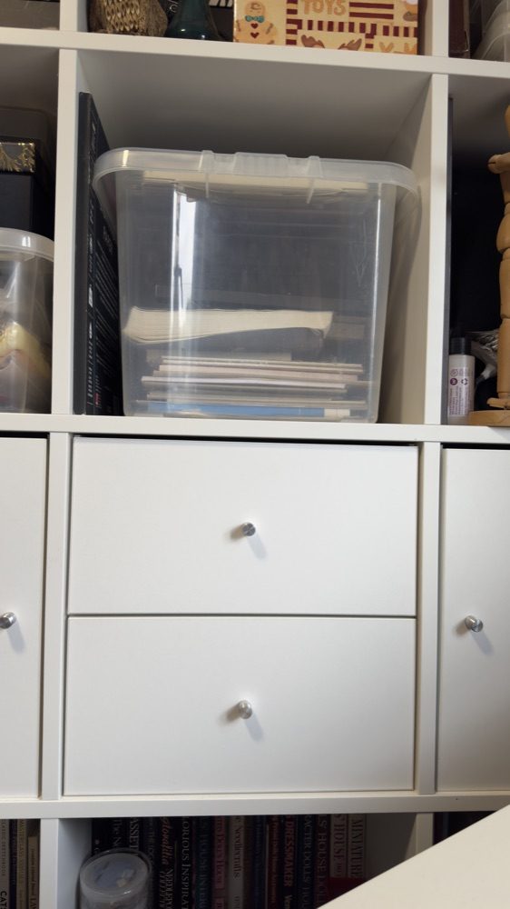
I keep my smaller paper pads in a box on the large Kallax unit.
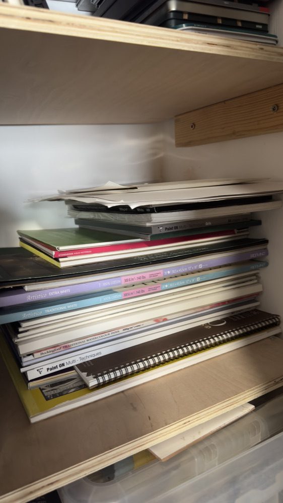
While the large pads sit on one of the shelves my husband added to the built-in cupboard for me.
Layers
I misunderstood layers when I first turned to coloured pencils, thinking they were a flat coverage of a single colour. Once I learned it just meant overlapping previous pencil strokes with more, I was off and running. Now my layers can be a light feathering of a colour in a tiny area, with the next overlapping some but not all of it.
Even a single pencil stroke could be called a layer in my drawings. This does make it impossible to count layers, but as long as the paper I choose allows for plenty, I am okay. I have a couple of tips up my sleeve if I find I've made the wrong choice.
The first is Brush & Pencil’s Touch-Up Texture. A tiny bottle of fluid that you brush on overworked or accidentally burnished areas that won’t take any more pencil.
Or for slightly bigger areas where this has happened I make a mask from torn paper (so there are no straight edges) and use a working fixative to allow for a few more layers. I found both solutions scary the first time, but was surprised how well they worked.
These magic wands can’t rescue every problem though.
Once I was drawing a portrait of my niece on cream Stonehenge and I managed to wear through the paper in a very important spot: the pupil of her eye. That piece is still sitting in my drawer instead of hanging on her wall.
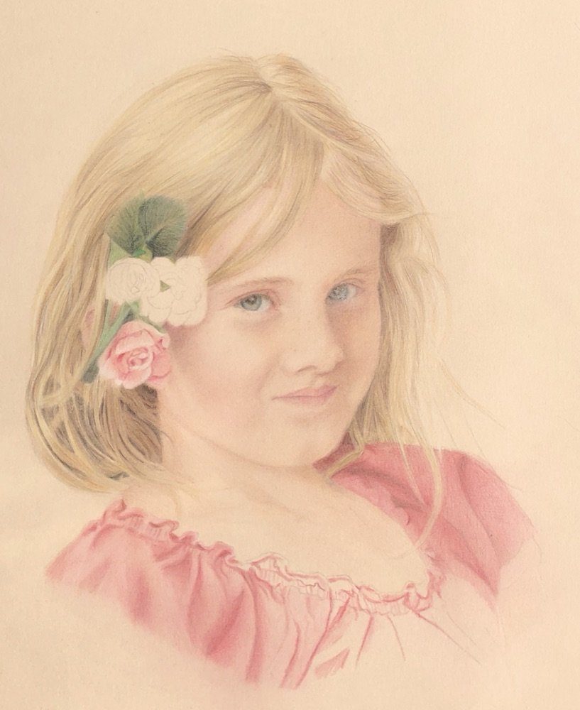
It wasn't possible to rescue Katie's portrait as I wore through the paper on the iris and pupil of her left eye while drawing.
How the paper takes the pigment
We've already dismissed the rough watercolour paper. The next one I picked up was a pad of Smooth Bristol, bought years ago on my mentor's advice for graphite drawings. Strathmore themselves state that it has little to no tooth, but also say it's ideal for detailed coloured pencil work.
For my test, I used the same pencils. Although I managed to lay down 10 layers with the Pablo and Polychromos, the softer pencils started skidding after around 4 to 5 layers without reaching the depth of colour I liked by then. I tend to mix brands in the same artwork, so the Bristol went back on the shelf.
If you prefer an illustrative style, it could work if you plan your layers meticulously before you start.
Derwent Inktense paper I normally use only for the pencils that share its name. I decided to try non-soluble coloured pencils on this surface. There was plenty of tooth this time, but it wasn’t as rough as the Arches. This reduced the number of white specks and allowed more intense colour from all the pencils I had been testing.
The last paper that had not yet been returned to my studio was the UART 800 grit surface. Their website described it as “velvety smooth”. I happened to have a velvet bag on my desk so I was able to make a direct comparison. The velvet felt sensual, whereas the texture of the paper wasn’t something I would want to touch for pleasure. I had drawn on it before, so wasn’t going to waste a sheet on a test as I could corroborate their claim that Polychromos pencils flow across it.
Forgiving mistakes and seeing through it
One of my most used tools when drawing with graphite is an eraser. Used carefully, I can bring the white paper back if I make a mistake. Removing coloured pencil is not as simple. Although you can lighten an application it never disappears entirely.
This is why one of the surfaces I enjoy working on is Pastelmat. Not only can I layer and layer and layer but I can cover up my mistakes by working light over dark. It almost feels like oil painting to me.
It's not perfect for every drawing though. For one thing, you can't see through it to trace the outlines.
I saw that look on your face! Honestly, don't worry about tracing. Lots of coloured pencil artists use this method and aren't ashamed to say so. I even wrote a page all about How to Use Tracing Paper.
If features need to be in the right place I pick Lightfast paper that I can place on my light pad. When I turn it on I can see just enough to not 'cheat'.
For example, this portrait of my friend Sharon's horse, Balsam, needed only the eyes and nostrils traced, and a rough outer indication of where the top of the head and mane were situated. The other elements, like the shadows that indicated the skull under the skin and the locks of his mane, needed to give an impression, not strand-by-strand accuracy. If I got his eyes wrong it wouldn't be him, and misplaced nostrils would be caught by any horseman immediately!
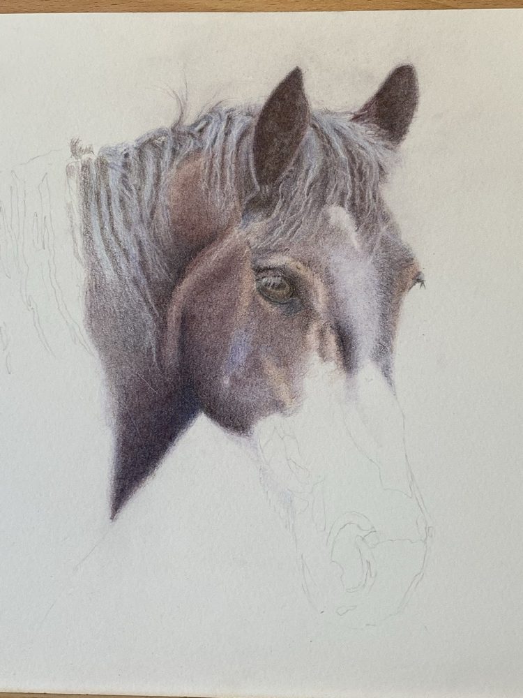
Balsam in progress, showing the few guide lines I trace to position the main features.
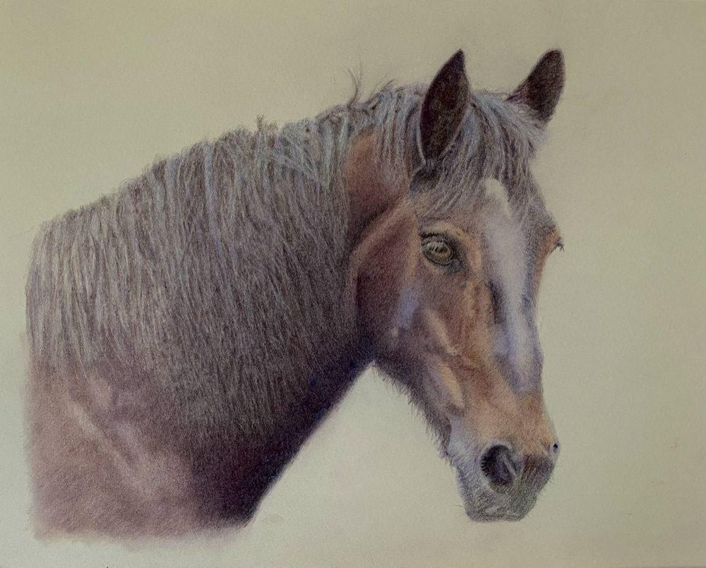
Balsam completed.
Base colour
I picked up an online tutorial, done on black paper, for my 50th birthday and enjoyed it. So much so, that I signed up for others from the same tutor. But friction grew as the lessons progressed. Her rule was that you use coloured pencil on coloured paper, leaving the paper bare where the tone was just what was needed. I admired her work, but there was a problem. She was in the USA and I was here in England. What she found easy to obtain was difficult for me.
I did my best, finding an equivalent to her Mi-Teintes, but either the paper was wrong or my scan was and I was forever trying to adjust colours to match what she expected to see. I also found it too thin and often ran out of layers, resulting in failed artwork.
In time I reverted to white or cream paper where I felt happier. Although for some reason I've hardly ever used white Pastelmat, preferring the greys or sandy colours. Hmmm, that just came to mind while writing this.
Format, prep and price
I buy Pastelmat by the sheet instead of in a pad, which makes it more economical. However, I don’t have any furniture in my room that I can store the full sheets in, so it stays in the cardboard box it was delivered in, tucked behind the door.
Talking of storage, I can’t avoid the elephant in the room. Each time I go to the cupboard I am faced with moving a long, heavy roll of Fabriano paper encased in its plastic sheath to keep it clean, so I can access the shelves.
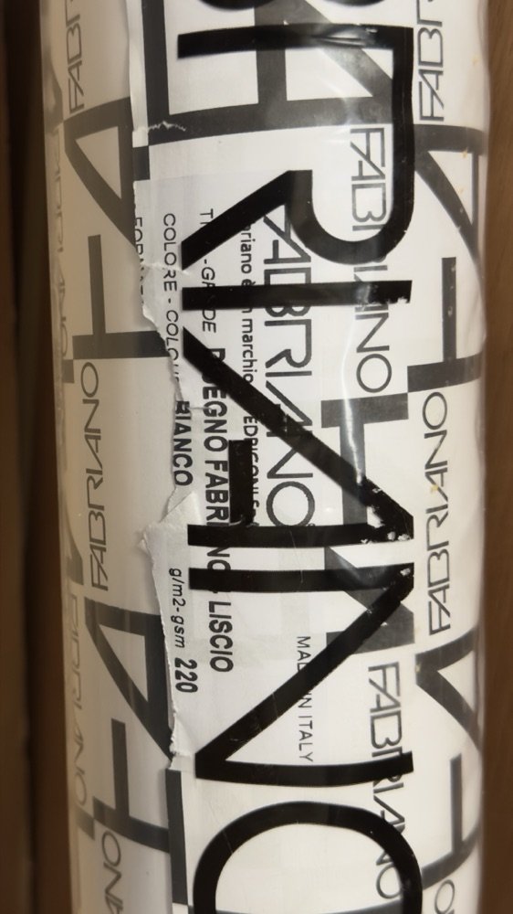
Still safely encased in its protective wrapping, the roll of Fabriano paper that stands by the cupboard.
It never gets any lighter, as the rigmarole involved in clearing the entire desk, manoeuvring the beast into a recumbent position and then marking and cutting off a length to draw on is too much like hard work. So it stands there leaning casually against the wall, taunting me with its promise of saving me money.
Over the years I have used more sensible ways of economising when testing new papers, of course. Like buying small pads to try out first. Easy to store, no prep before getting to the drawing process and no regret if we don't enter into a love affair.
Paper love found and lost
My favourite paper and I first met when I was scouring the Internet for something of more quality than the unbranded cartridge paper I had been playing around with. I saw the Lightfast paper and, after gulping at the price, ordered a pad. If it’s expensive it must be good eh? I had a shock when it arrived. It was much smaller than expected. Duh, Carol, check the size before you order!
I was nearly put off by the creamy tone when I had expected a bright white surface, but it was in my hands by then, so I grabbed a Polychromos pencil. It was love at first… stroke?
I jumped onto Amazon to give you the exact sizes without heading to the studio. “What! Where is the Lightfast paper? Why doesn’t a search for it by name bring it up? Perhaps they no longer stock it because of the price?” No worries, I’ll go straight to the horse’s mouth and check on the Derwent site. “Not here either? This isn’t looking good.”
I couldn’t find it anywhere, apart from eBay. Not a good start to the day. Thank goodness I still have two, mostly full pads “in stock” right now.
I guess the time has come to unwrap that huge roll? Maybe I should go scribble on the edge to remind myself how we work together.
You might like these
Five papers, tested side by side
Pastelmat, Fabriano Artistico, Langton, Stonehenge Kraft and cartridge, with what each one suits.
Three pencils on fifteen papers
Polychromos, Coloursoft and Pablo layered on fifteen surfaces, one block at a time.
Is Pastelmat worth the box behind the door?
The surface that lets me layer and layer, and work light over dark.
How I transfer the features that have to be in the right place.
Copyright © 2009- pencil-topics.co.uk All rights reserved
Home | About Us | Contact Us | Privacy Policy