- Home
- Choosing pencil brands
- Derwent Pencils
- Derwent Chromaqua Pencil Review
Derwent Chromaqua Review: Same Colours, Less Lightfast
What this covers
Derwent Chromaqua is a new watercolour pencil range. I swatched the colours, compared them with the Chromaflow range and now share my first impressions of these pencils compared to Derwent's original watercolour pencils.
Why did I want to test the Chromaqua? I have three generations of the original Derwent Watercolour pencils and although they have improved over the years, I have never been totally happy with them. The colours seemed weak and wishy washy, and the pencil lines rarely dissolved completely.
When I heard about these new pencils in October 2026 I was curious. I tried to resist, really I did, but at the beginning of November I gave in and ordered the 72 colour tin. Why not the 150 version? They were out of stock! It seemed lots of people shared my curiosity.
What Chromaqua is
Chromaqua is Derwent's water-soluble partner to Chromaflow. Every Chromaqua pencil has a Chromaflow twin with the same name and number, so Scarlet is 0500 and Blue is 1300 in both ranges. This allows you to start with the Chromaqua, add water, then the detail with Chromaflow over the top.
At the point of writing this article I am unsure of whether these new pencils replace the old ones or are an addition to the range, as information on the web is conflicting and Derwent themselves don't seem to state this on their site.
How I tested them
I worked with the 72 tin of Chromaqua alongside my Chromaflow pencils, on an Arches hot pressed watercolour block. Hot pressed paper has a smooth, hard surface, which shows up any difference in colour or texture quickly.
For each colour I laid down a strip of Chromaqua, varying the pressure from light on the left to heavier on the right, and activated it with a water brush. Once it was dry, I drew a band of the matching Chromaflow over the bottom half at full strength. That way every swatch shows the wash and the dry pencil below. I find that more useful than separate charts.
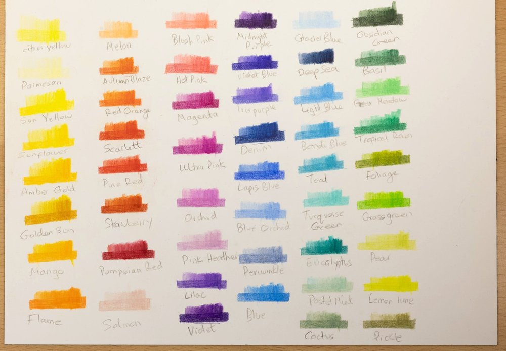
The bright colours: a Chromaqua wash from light to heavy, with the matching Chromaflow drawn over it once dry
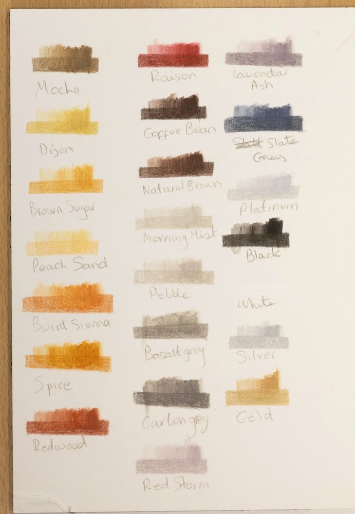
The Chromaflow Deep Sea has gone missing somewhere in my studio, so that one is still to test.
Do the colours match?
Yes, very closely. Once the Chromaqua had been wetted and dried, it sat right alongside the dry Chromaflow. Periwinkle matches exactly. Blue Orchid and Denim are very close matches, and Lemon Lime was so nearly identical that I hardly needed to layer the Chromaflow at all. Pear is worth a mention just for its name: it is such a close match to the colour of real pear flesh!
The one colour I would call distinctly different is Gold. Gold and Silver are metallics, and Silver matched, so it isn't a general metallic problem. I would rarely use either, so it's not a major issue for me.
I thought Pastel Mint was a mismatch at first. It turned out to be my mistake: I hadn't cleaned my brush properly after the Eucalyptus, and the darker, bluer colour came through at the start of the swatch. A clean re-swatch matched.
Does Chromaqua change colour when you wet it?
Many watercolour pencils do shift when water goes on. With Chromaqua I saw very little change. I tested this directly on one colour, Pure Red, laying it down dry and wetting half of it. In my eyes it stays the same colour, just brighter.
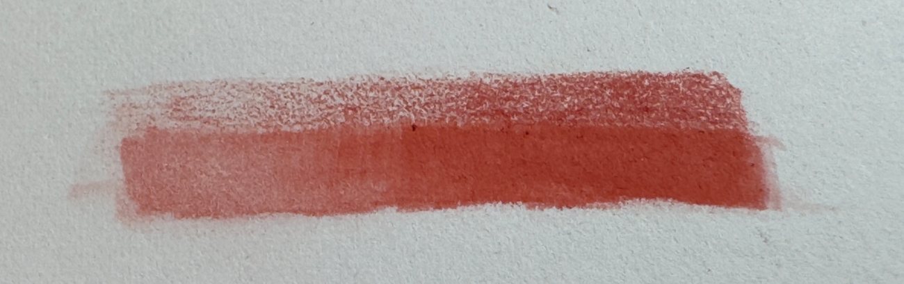
Pure Red: dry pencil along the top, the wetted half below. The same colour, just brighter
How it dissolves and lifts
Chromaqua dissolves well. Whether I laid an even coat or scribbled with small gaps between the strokes, the water brush moved the pigment around to cover the bare patches, and the result was a smooth coat of colour with no graininess. Where my pencil marks were far apart, I can still see traces of the pencil lines once it dries.
For comparison I tried Caran d'Ache Museum Aquarelle on the same paper with the same water brush. It did a better job of dissolving the pencil marks, leaving hardly any impression of where the pencil had been.
Of course this would depend on the amount of pressure used when laying down the marks.
Painting a sky from the pencil tip
You don't have to draw with the pencil to use Chromaqua. For this sky I shaved some pigment off the tip of Blue 1300 into the lid of the tin, dissolved it in water, and painted it onto damp paper. While it was still wet I lifted out paler areas with a tissue. Then I mixed a tiny bit of Scarlet 0500 into the leftover blue puddle to make a greyish shadow colour, and added it to the bottom of the cloud shapes.
That shadow mix was a guess, and the colour names are why. Pear and Strawberry sound lovely, but they give no hint of the pigments used, and as an artist I prefer to know. Ultramarine Blue and Cadmium Red mixed together give a lovely mauve shadow, but here I had to guess which pencils were closest to those two colours. Only three of the 150 names even sound like a traditional pigment (Burnt Sienna, Sienna Gold and Deep Vermilion), and there's no Ultramarine or Cadmium among them.

Blue 1300 shaved, dissolved and painted onto damp paper, with paler areas lifted while it was wet
My first attempt lifted pigment to create paler areas, but they didn't really look like clouds.
So I left the work to dry then came back armed with a waterbrush of fresh water and some clean tissues. I wanted to see how well the dried pencil pigment would lift.
I squeezed the waterbrush, over the inside of the tin lid to avoid accidents, then with a thoroughly wet tip I gently wiped it over an area until the colour started moving around. I then dabbed firmly with the tissue until no more colour was removed.
I repeated this a few times, on the right hand side of the sky, to join cloud areas together and remove some of the mistakes from the first attempt. For example there was a grey outlined shape with a spot to the right of it just above the middle of the sky. It came out completely which surprised and delighted me. So I moved onto the blue area below the main cloud formation. This also disappeared leaving more of a bank of clouds instead of two smaller fluffy blobs.

After the wet lift

After lifting the dried colour
I continued until some of the coloured areas in the original came back to almost white paper. Chromaqua definitely passed that test!
A Chromaqua wash under Chromaflow saves layers
The most useful thing I found is how the two ranges work together. On clean paper (slightly creamy, to be honest), it took me roughly three or four layers of Chromaflow to match the depth of colour at the dark end of a Chromaqua swatch. Over the wash, I needed far fewer, because the colour is already there underneath.
That saves time, and it saves wrist power, which matters to me. Laying a Chromaqua wash first gives you the base colour in a few minutes, and the Chromaflow on top only has to add the finish. If you have not tried working over a wash before, my page on underpainting explains the idea.
The Chromaflow felt no different over the wash than over bare paper, with one exception: Spice. It didn't feel as nice to work over, with a slight drag, and while I was working the colours didn't seem to match. Looking at the finished swatch, they are the same colour. It just didn't feel like it at the time. I think my ratio of pigment to water was too much when laying the Chromaqua for that colour.
Lightfastness: the catch
Lightfastness is how well a colour resists fading in light. Derwent rates each pencil on the Blue Wool Scale, where 8 is the most lightfast and 1 the least. These ratings are Derwent's, from their published colour charts, not my own test.
The colour names match across the two ranges, but the ratings don't:
- Chromaqua is rated lower than its Chromaflow twin on 93 of the 150 colours, the same on 40, and higher on 17.
- 71 Chromaqua colours rate 6 or above, against 103 in Chromaflow.
- 38 Chromaqua colours rate 3 or below, against 16 in Chromaflow.
- The biggest drops are Butterscotch, Dusky Purple and Picotee Blue (8 in Chromaflow, 3 in Chromaqua) and Parmesan (5 to 1).
The Blue 1300 I used for my sky is rated 7 in Chromaflow and only 4 in Chromaqua.
So the colours match today, but a Chromaqua wash and a Chromaflow layer of the same name may not age the same way. For sketchbook work and practice pieces that won't matter. For a drawing you plan to frame or sell, look up each colour on Derwent's chart first. My lightfastness test page explains why this matters and how to check.
Handling: grip, barrel and sharpening
I find these pencils quite thin to hold and grip with my wonky wrist. Both ranges feel the same thickness to me, definitely thinner than the 8mm I am used to from Derwent.
Derwent doesn't give a barrel size for Chromaqua on its own pages. Blick, a US art retailer, lists it as a 7.2mm barrel with a 3.5mm core, and Derwent gives Chromaflow as 7.2mm with a 3.5mm core too, so the two ranges are the same thickness. The shape is different, and you can see it in my photo below: Chromaqua has a hexagonal barrel, Chromaflow a round one.
I sharpened the Chromaflow carefully with a Derwent Super Point. It tends to crumble a little if I take it to a really sharp point, so I have to be a little careful there.
I don't sharpen watercolour pencils to as sharp a point. However, when they arrive, they are all too blunt for me. Rather than use the Derwent Super Point I use my Mitsubishi KH-20 hand crank sharpener to produce a point that is less brittle. Even so I managed to snap off the point and had to resharpen the Lemon Lime pencil.
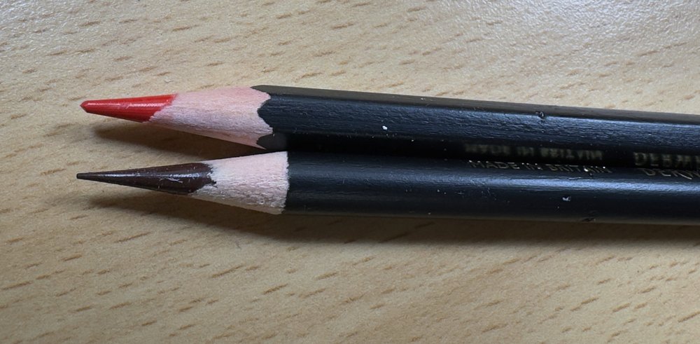
Chromaqua (red point, top) has a hexagonal barrel and was sharpened with the KH-20. Chromaflow (brown point) is round, sharpened with the Super Point
Prices and sets
When I checked in November 2026, Derwent's UK site listed Chromaqua tins at £22.49 for 12, £44.99 for 24, £67.49 for 36, £134.99 for 72 and £284.50 for the full 150, with single pencils at £1.90. Art shops vary a lot: Cult Pens had the 150 tin at £220, and Cass Art had it on offer at £185. Prices change, so check before you buy.
Because single pencils are sold, you can try a few colours before committing to a tin. If you mostly want a wash under Chromaflow, a small tin of the colours you use most is a cheaper way in than the full set.
My verdict
So would I swap my original Derwent Watercolour pencils for Chromaqua? Yes. I felt the Chromaqua dissolved more fully than my old pencils ever did, and dried colour lifts back almost to white paper. I haven't yet tested the two ranges side by side, so that's my next job, especially on similar colours, along with a list of the old colours I might miss.
I am delighted that Derwent's new line of watercolour pencils has been released. They give me a more affordable set to play with than the Albrecht Durer or Caran d'Ache Museum Aquarelles I normally use. And if it wasn't for the lightfastness, they would likely be the ones I reach for. Having a set of dry coloured pencils that match (similar to the Polychromos and Albrecht Durer) is definitely a benefit.
The only thing that disappoints me is the lightfastness of the Chromaqua. Granted, they are probably aimed at a more general market than, say, the Derwent Lightfast range, but Chromaflow scores better, and it's aimed at a similar user.
Despite my concerns I look forward to playing more with these pencils.
Where to go next
Techniques, tutorials and supply guides for working with water-soluble pencils.
Coloursoft, Procolour, Chromaflow, Lightfast and the rest, and which one suits what you want most.
Derwent Inktense: colour that stays put
Once dry, Inktense won't re-wet, so you can layer over it. How to use it on paper and fabric.
A watercolour pencil underpainting, step by step
Lay the wash first, then build coloured pencil over the top.
My real-sun lightfastness test of coloured pencils, and which colours faded.
Sharpen without snapping the point
Why points break, and how to sharpen soft pencils without wasting them.
Copyright © 2009- pencil-topics.co.uk All rights reserved
Home | About Us | Contact Us | Privacy Policy