How to Draw a River Scene in coloured pencil
By Peter Weatherill
In this demonstration, I'll show you how to draw a river scene in coloured pencils. You'll learn layering techniques to render realistic textures of water, rocks, grassy riverbanks, and foliage
I depicted the River Tavy on the Devon and Cornwall border, using Faber Castell Polychromos pencils. As the artist, I took artistic liberties, such as opening up the sky between the trees and adding more vegetation on the right.

 Completed drawing of Tavy Rocks
Starting the drawing using polychromos pencils
Although I used Faber Castell Polychromos pencils, you can replicate comparable results with other high-quality oil-based or wax-based coloured pencils from brands like Caran d'Ache Pablo, Derwent Coloursoft, or Prismacolor. Carefully select hues within the green and brown colour ranges.

I transferred the outline sketch to the paper, then drew the main elements with a grey coloured pencil, using light pressure to avoid indenting the paper or staining the fibres.
Next, I applied more grey to identify shadow areas, keeping the shading strokes even and following the shape of each feature (horizontal for water, and surface lines for rocks).

I also used some green and brown to identify the foliage in the background and the shadow of the rocks under the brown peaty water.
Notice how I elongated the composition to create a more rectangular format.

The next step is to gradually build up the depth and intensity of colour using a limited palette of around 5-7 pencils in various green, brown, and earth tones.
Let's take a closer look at the right side of the image, focusing on the grasses along the river bank
In my interpretation, I added more grass than what is shown in the original photo. I also emphasised the contrast between two key elements: the tall, slender strokes representing the grass and the rounded, dry stones situated next to the grass.
By increasing the amount of grass and highlighting the difference in shape between the grass and stones, I made the river bank scene more visually striking and detailed compared to the original photograph.
I worked the background trees down towards the grass tops and darkened the lower leaf areas to highlight the sunlit grass stalks.
I created the background tree foliage by applying three or four overlapping colours using scribble strokes.
I used jagged downward strokes for the edge adjoining the grass. I worked the grass itself upwards towards the same jagged edge.

This close shows how I developed the shadows in the dry rocks below the grass stems, as shown by the large foreground rock on the right.
I selectively omitted or rearranged some rocks in the water to simplify the scene, making it easier for the viewer to understand the overall composition.
I used artistic licence on the left, opening up the grassed area to introduce light behind the riverside trees. I used a strong light green pencil here.


I retained the essential twisted branch from the photo that comes down over the water, keeping its corkscrew shape. I introduced a flesh red and orange to the water to give it a peaty feel.
I kept the distant center trees light, adding blue-green for depth.
To heighten the sun on the tree in the centre, I darkened the leaves on the foreground tree. I layered sepia, dark green, and green gold pencils on the centre tree trunk.
Green gold is an incredibly useful colour for landscape drawing. It is unique to the Polychromos pencil brand. This translucent colour has the ability to warm up other colours in your artwork, making it perfect for layering and blending.
I reduced the distant foliage on the left to introduce more sky. It's easier to add overall colour and then lift out highlights than work around white areas.
I created a focal point by adding some very warm colours to the centre of the water. If areas become too bright, you can tone them down with additional layers.

When working on the rocks and water, ensure the reflections match the rocks above. Deepen the shadows and sharpen up the edges of the rocks. At this stage, ensure your picture makes sense without strictly following the reference photo.
 Tavy Rocks
Key Points
- Use an eraser to lift out highlights.
- Rearrange elements to improve composition.
- Use stronger colours in the foreground and muted colours in the distance to create depth.
Additional Resources
Learn to Paint Water: A Step-by-Step Guide with Expert Feedback
Drawing a boat - tips and guidelines
Composing a canal scene with reflections
Improve Your Pencil Art: Get Free Tips & Techniques
Sign up for our newsletter – just occasional emails packed with practical advice and inspiration for pencil artists like yourself
You might like these
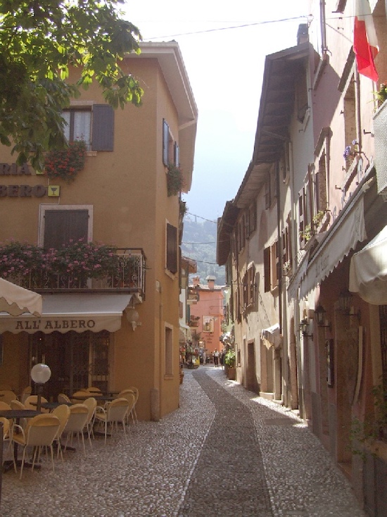
Watercolour pencil tutorial - Italian Street Scene
A step-by-step demonstration showing how to create an Italian street scene using watercolour pencils from Caran d'Ache
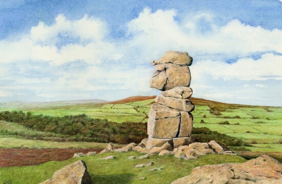
Dartmoor landscape drawing tutorial
This landscape drawing tutorial in coloured pencils shows the Bowerman Stone in Dartmoor, Devon, UK.
Coloured pencil drawing step by step
Coloured pencil drawing step by step demonstrations by Peter Weatherill - watch how he tackles different drawings
Copyright © 2009- pencil-topics.co.uk All rights reserved
Home | About Us | Contact Us | Privacy Policy