- Home
- Pencil comparison charts
Coloured Pencil Conversion Charts: Substitute Any Brand
When following a coloured pencil tutorial that uses a brand you don't own, you will find a colour comparison chart invaluable. This chart allows you to match the tutorial's colours with your own pencils, ensuring you get the closest possible shades.
For instance, Prismacolor pencils are widely available in the US, but harder to find in the UK, where Faber-Castell Polychromos pencils are more common. If a tutorial specifies a brand that's unavailable or inaccessible, you need to find an alternative. This can be challenging if you're new to a brand and struggle to find equivalent colours or understand how the pencils blend and layer.
Although you may initially replicate the artwork, it may not match the tutorial or book exactly. However, you'll still learn the essential techniques.
The first colour comparison charts

A group of artists and teachers, frustrated with matching Prismacolor colours to European brands, created a guide in 2010 to help British artists find suitable alternatives. Led by Bob Eldon and Peter Weatherill, the guide was made available through the UKCPS.
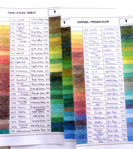
Peter later developed a second set of charts, published on this website, which could be downloaded for free. The idea was simple: print, cut out, and match colours across charts to find the closest match to the one in your tutorial.
However, with the emergence of new brands, these charts are now outdated and no longer comprehensive.
Karen Hull's colour comparison charts
Australian coloured pencil artist Karen Hull offers free downloadable comparison charts on her website, as well as a spiral-bound printed version for purchase.
Her comprehensive 55-page charts cover nine brands, including Derwent, Faber Castell, Prismacolor, and Caran D'Ache, and demonstrate how different paper surfaces affect the results.

With comprehensive colour comparison charts already available, I won't recreate the wheel – kudos to those who've done it well, like Karen!


