- Home
- Landscape drawing
- How to Draw Brick and Stone Walls in Coloured Pencil
How to Draw Brick and Stone Walls in Coloured Pencil
In short
A convincing brick or stone wall is less about perfect brickwork than about giving the viewer enough to believe it. Indent the mortar lines, vary the colour brick to brick, keep the light consistent, and place your shadows with care. The eye fills in the rest.
Brick and stone walls look like the kind of thing that would need endless patience. Hundreds of near-identical little rectangles, every mortar line ruled in, every stone accounted for. That picture is exactly why so many of us leave walls out of a scene altogether.
You do not have to draw every brick.
A wall reads as a wall from a few well-chosen cues: convincing edges, a believable grid of mortar, colour that shifts across the surface, and shadow that agrees with the light. A handful of those does far more than a hundred carefully drawn bricks, because your viewer's eye completes the pattern on its own.
Once I understood that, walls stopped being a chore and became one of the most satisfying things to render.
This guide covers how to suggest brick and stone walls in coloured pencil, from mortar and colour through to a garden archway and dry stone walls, so they belong in the landscape rather than taking it over.
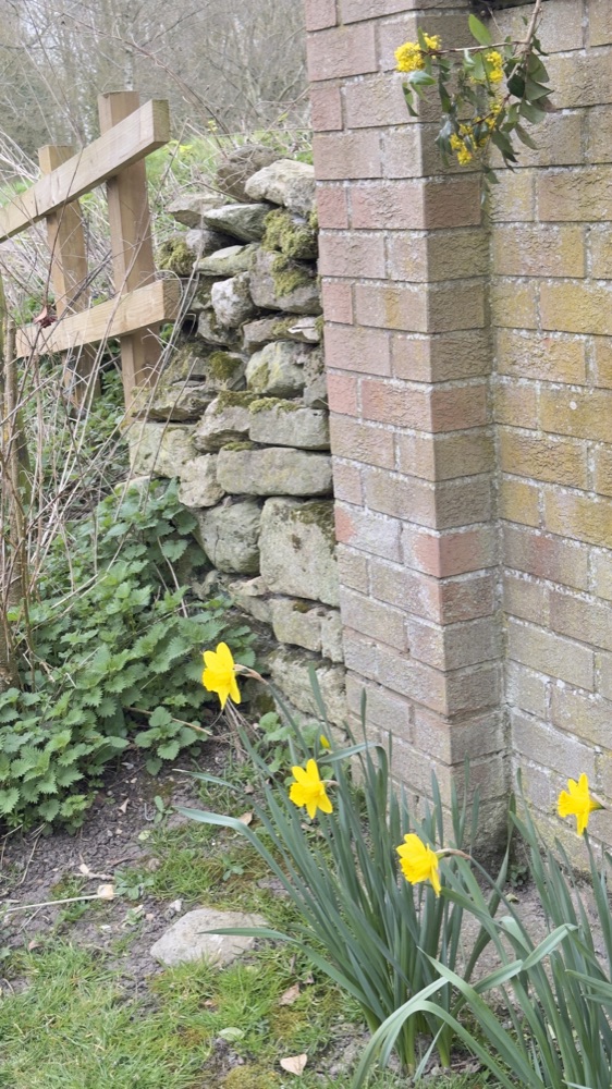
A dry stone wall meeting a brick pier in my own village. Two kinds of wall, one setting, and the whole of this guide in a single view.
Look before you draw
The most useful thing you can do happens before the pencil comes out.
Spend some time studying the walls around you. Photograph sections of wall in different light, morning, midday, low evening sun, and build yourself a small reference collection. It costs nothing and it will teach you more than any single tutorial.
What you notice, once you start looking, is that real bricks are far more varied than the neat terracotta rectangles most of us carry in our heads.
Edges crumble and round with age. Colours shift from brick to brick. Mortar lines run from deep, shadowed grooves to thin marks you can barely see. Some walls have gaps where the mortar has fallen away completely.
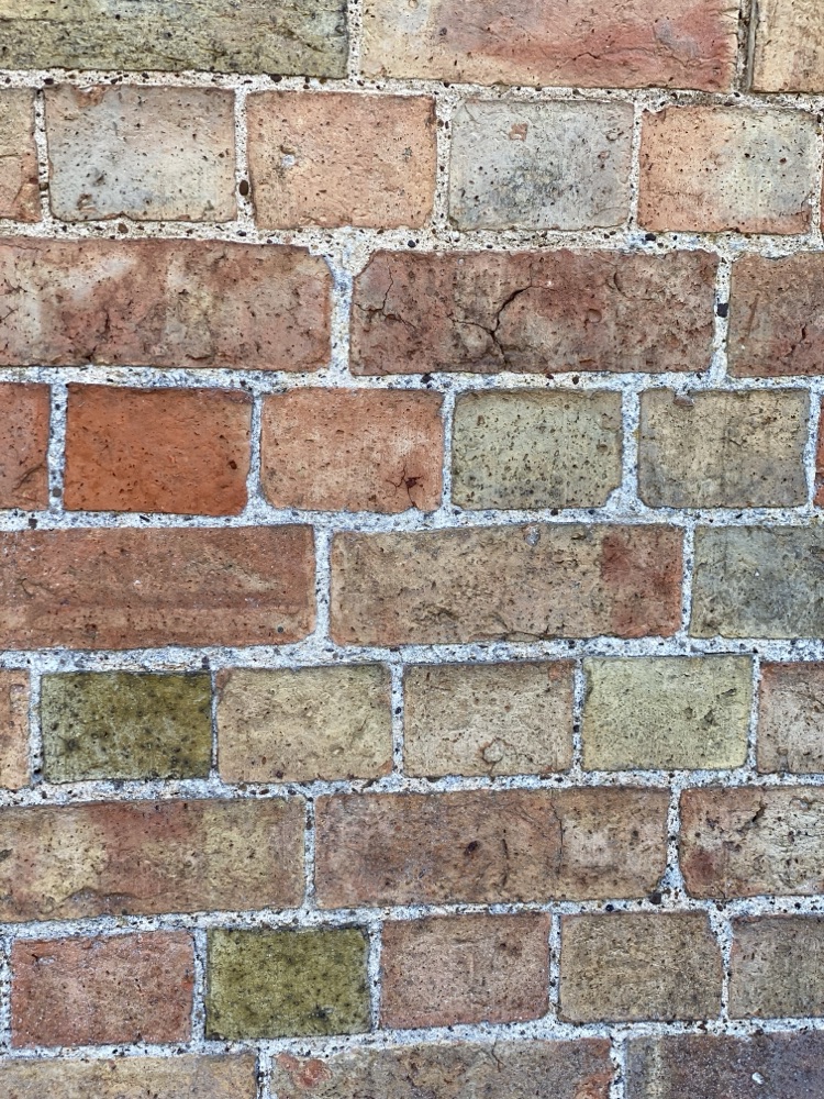
A single wall holds far more colour than we picture: buffs, yellows and greens among the reds, all separated by pale mortar.
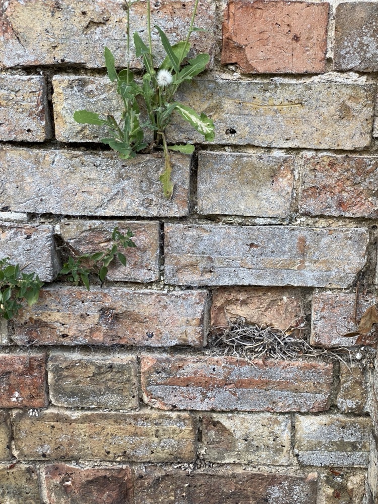
An old salvaged-brick wall. Plants, and even a bird's nest, have found the gaps where the mortar has gone.
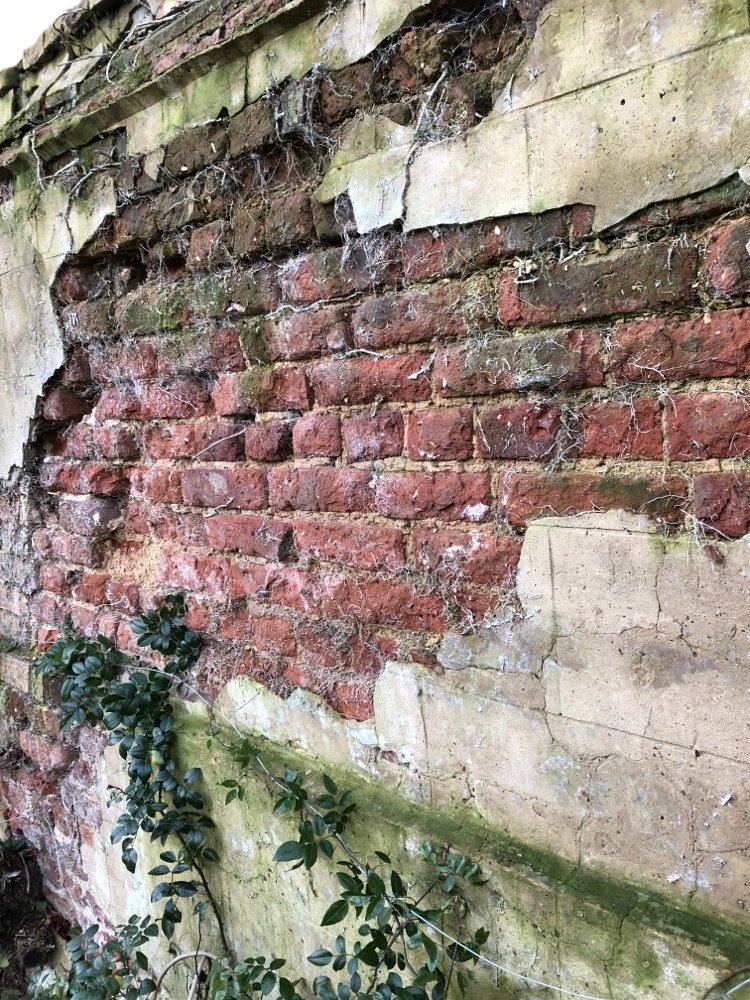
Where old render falls away, the brick beneath is exposed, broken and patched. Age gives you texture to work with.
What to capture for your references
The overall colour variation between individual bricks. Whether the bricks are new or old, salvaged or weathered. How deep the mortar sits, and what colour it is. Where the shadows fall at the edges of each brick. And how all of it changes as the light moves.
Compare walls in different areas, too, if you can. A Victorian terrace in a city centre looks nothing like a country cottage. Those differences come from the materials available locally, how the bricks were fired, and how many decades of weather they have absorbed. The more of that variety you have in your references, the less you will ever need to invent.
Not just the bricks: the mortar matters too
Mortar is not the gap between the interesting parts. It is around 18% of a brick wall's surface, nearly a fifth of everything you are looking at, so it deserves to be part of your drawing rather than an afterthought. This caught me off guard when I first started paying proper attention.
The colour and depth of the mortar change the entire character of a wall. Deep-set mortar throws strong shadow lines in sunlight. Shallow mortar with a white mix makes the grid pattern stand out even without much shadow.
Older walls often have tight joints with barely visible mortar, which gives them a completely different feel from modern construction. Get the mortar right and the bricks almost draw themselves.
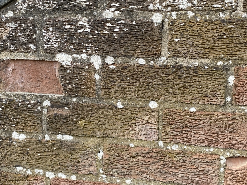
Deep-set mortar catches its own shadow in raking light, and lichen adds another layer of colour across the brick faces.
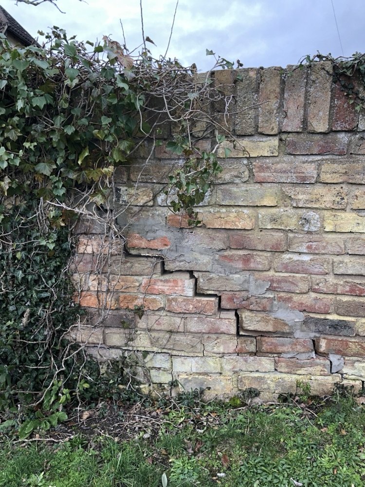
An old garden wall patched over the years. The grey cement repairs sit paler and flatter than the original mortar, a reminder that mortar has its own colour and age.
The technique: suggesting bricks, not drawing every one
Here is the approach that works well for a wall in a landscape scene. It is built around suggestion, not reproduction.
Press the mortar lines into the paper with a ballpoint pen, a stylus or a bone folder. Firm enough to make a groove, but not so hard that you tear the surface.
Work your colour with the pencil held at an angle, so the pigment skips over the indented lines and leaves them showing through. You get the whole mortar grid without painting carefully around every line, which is the part that used to defeat me.
Change the tone and colour from brick to brick. Add shadow to the lower and side edges, where each brick stands proud of the mortar, and let the lit top edge stay bright where the sunlight catches it.
Reach for darker reds and violets, or the complementary colour, green for a red brick, rather than black. Black flattens everything it touches, while a coloured shadow keeps the wall feeling alive.
Check that every brick agrees on which side the light comes from. It is easy to flip this by accident when you are absorbed in one small area, and it is the kind of mistake that quietly ruins an otherwise good wall.
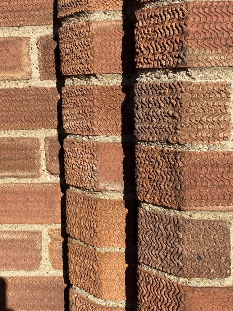
Low sun rakes across the textured brick on my own house. Every lit edge agrees on the same light direction, and that agreement is what gives a wall its depth.
The same suggestion approach works for a mortared stone wall, where the courses are less regular than brick.
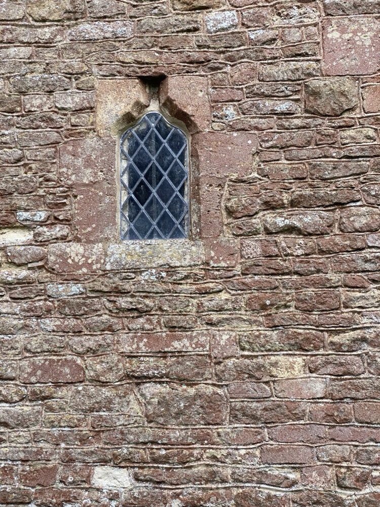
A coursed stone church wall. The blocks vary in size and colour far more than brick, but the principle is the same: suggest the pattern, do not draw every stone.
Drawing an archway
An archway is simply a wall with a curve in it, and it brings a couple of extra challenges worth knowing about before you start. The one shown in the tutorial is a freestanding garden wall built in brick, not part of a building.
As the bricks follow the curve, the angle of the light changes on each one, and the mortar lines fan outward rather than running in neat parallels. That fanning is what sells the curve, so it is worth getting right.
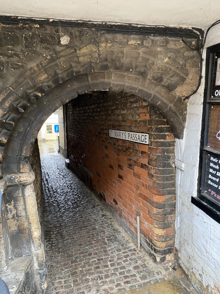
A stone archway I found in Stamford. The wedge-shaped stones fan around the curve, and the brick wall behind shows how the two materials work together.
Go further: Our Garden Arch tutorial walks you through a full coloured pencil archway step by step, including how to handle the light changing around the curve and how to keep the brickwork looking natural rather than mechanical. See the Garden Arch tutorial.
A word on perspective
If you are drawing a wall straight on, the mortar lines stay horizontal and life is simple. The moment the wall sits at an angle to you, those lines start converging toward a vanishing point, and you need to account for it.
You do not need to calculate anything precisely. A few light guide lines sketched in early will keep your brickwork tracking correctly. The important thing is to get those guide lines down before you start rendering bricks. Fixing perspective after you have built up layers of colour is not something you want to attempt. I have learned that one the hard way.
Never got the hang of perspective? I have laid it out simply in my basic perspective drawing guide, with companion pages on one point and two point perspective.
Dry stone walls
Dry stone walls are built without any mortar at all. The stones are fitted together by hand, relying entirely on the skill of the waller to make a solid structure from whatever the local land provides. Larger stones form the base, with progressively smaller stones fitted and wedged above them.
You will find them across Scotland, Northern England and Wales, often running for miles across open hillside. When they are well built, they last centuries with almost no maintenance.
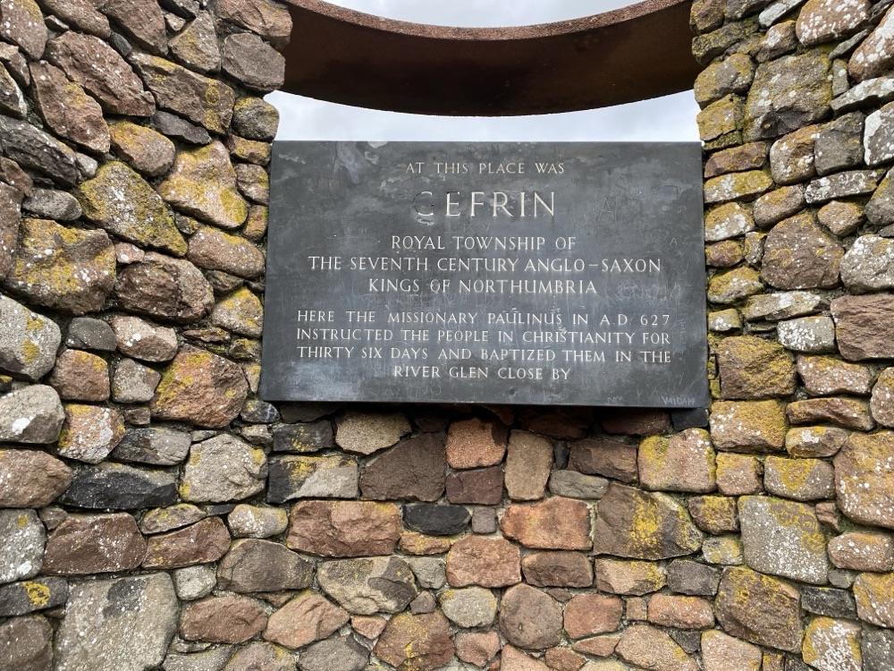
Rounded field stones of many colours, fitted together without a scrap of mortar.
What makes them a pleasure to draw is the variety. Every stone sits at a slightly different angle and catches the light differently. The gaps between stones create their own pattern of deep shadows. And because the materials come from the local landscape, the wall always looks like it belongs in the scene.
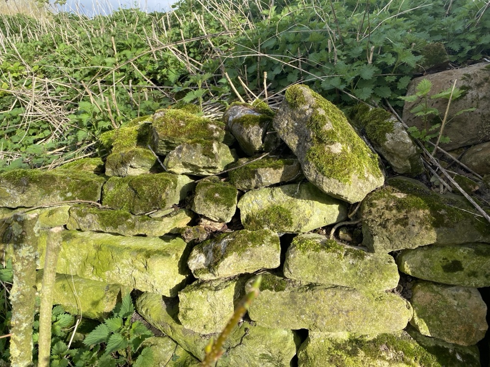
Moss and lichen colonise the top stones, adding greens and greys you would never guess at from a distance.
If you would like to take that same texture work further, our Dartmoor stone tutorial shows how to draw realistic rock surfaces as the focus of a full scene.
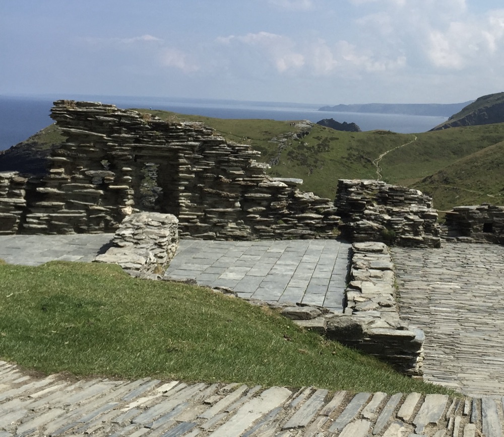
Dry-laid slate at Tintagel, running through open coastal hillside. The flat courses catch the light quite differently from rounded stone.
The technique is more forgiving than brickwork, because here the irregularity is the point. No perfectly straight mortar lines to keep, no consistent shapes to match.
Start with your lightest colours and work through progressively darker tones, finishing with your deepest shadows in the gaps between the stones. As with brickwork, try to avoid black. Darker versions of the stone colours, deep browns, blue-greys and purples, will look far more natural.
Paper choice makes a difference here. A sheet with some tooth to it, hot-pressed watercolour paper works well, lets the pigment catch unevenly across the surface, which mimics the gritty texture of stone almost by itself.
Pay attention to the direction of your strokes, too. Grass around the base of the wall wants long vertical marks. The wall stones work better with horizontal strokes that follow the line of construction. That contrast in stroke direction is what separates the two textures for the viewer.
And look for contrast in your reference. A wall where the lower section sits in shadow, with sunlit grass in the field beyond, gives you far more to work with than one lit flatly and evenly.
Where to go next
Tiles, slate and thatch. The surface above the walls, handled the same suggestive way.
Drawing buildings in a landscape
How a whole building sits in a scene: shape, solidity and where the walls belong.
Realistic stone: a Dartmoor scene
Natural rock rather than walls, worked up as the focus of a full drawing.
Coloured pencil landscape guide
How walls, buildings, trees, skies and water fit together in one complete scene.
Copyright © 2009- pencil-topics.co.uk All rights reserved
Home | About Us | Contact Us | Privacy Policy