- Home
- Tutorials
- Venice Grand Canal
- The Buildings
Page 5: The Venice Buildings
Credit: This tutorial series is based on original work by Peter Weatherill, restructured and expanded for Pencil Topics.
Venice Grand Canal Project Menu:
Overview & Materials : Preparing Your Drawing : Colour Mixing : The Sky : The Buildings : Water, Trees & Gondola : Finishing & Comparison
This is where the scene starts to take shape.
We'll work on the buildings in two stages: the sunlit buildings on the left side first (a good warm-up), then the shadowed buildings and bridge on the right.
I've used two different approaches for the two sides, partly because they need different treatment, and partly because it's useful for you to see both methods.
The left side uses a colour foundation built up from light washes. The right side uses a grisaille (grey) underpainting. Both work well for Venetian architecture. By the end of this page, you'll have a feel for which approach suits you


Why Start with the Left Side?

I chose this area deliberately. It's peripheral to the composition, relatively minor in importance, and makes a good warm-up exercise. If your colour goes on a bit too strongly or your brushwork is a little clumsy here, it won't ruin the picture. You're exploring the techniques on a forgiving part of the scene before moving to the areas that matter more.
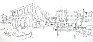
The outline sketch for this area doesn't need every fine detail. The reference photos are there for that. Your outline just needs to ensure proper proportions and positioning. Fine details come later, with a sharp pencil point and a steady hand.
Left Side: Choosing Your Foundation Colours
The main building shows light terracotta walls with creamy white decorative pillars framing the windows. The roof uses darker terracotta. The eaves, with their block ornamentation, sit in shadow. A diagonal shadow crosses the wall toward the left archway. The darkest tones appear in the lower window openings and the archways themselves.
The market stall coverings are as bright as the paper, so leave those areas white. Don't touch them with colour.
This area should lack strong colours or harsh contrasts. Everything here is secondary to the main focal point of the composition.

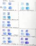
For the Staedtler version, two foundation colours did the job:
- Light pink (Peach 43) for the walls
- Darker brown (Fawn 49) for roof tiles and the shadowed market stall area
Testing these on scrap paper first confirmed that the pink works well at low strength, while the brown is much stronger when wet. Knowing this means you can adjust how much dry pigment you lay down.
Left Side: Applying the Foundation

Apply the foundation colours dry, very lightly. Remember the golden rule from Part 3: less is more. You can always add another layer.
The brown also goes into the shadowed market stall area. Don't worry about it looking too dark at this stage. It will disappear under subsequent layers of dry colour.
Now, with clean kitchen paper ready to catch any excess, apply a damp brush. Use a size 4 or size 2 brush and preserve the white areas where the white pillars appear on the fascia. Be careful and deliberate here. The white of the paper is precious. Once you've coloured over it, getting it back is difficult.
Once the first colour layer has fully dried, any remaining graphite drawing lines can be gently erased. Rougher paper handles this better than smooth paper, and some residual marks will simply absorb into the detail of the scene.
Left Side: Building Up Detail
With the foundation dry, sharpen your pencils and add grey and dark brown as dry work in the left corner. This colour receives selective damp brush treatment as needed, not an overall wash.

This small area serves as practice for the techniques you'll use across the rest of the painting. Some colour remains dry on top of the underlayers. Shadowed areas receive damp brush treatment. The two approaches create different textures that make the buildings look more convincing.
The dark statue on the main building corner gets a suggestion rather than careful detail. At this stage, we're building a foundation. We will come back and apply more layers of colour later, and with a fine point on the pencil, define detail much better. Don't try to finish any area completely at this stage.
The Fish Market Building: The Derwent Version
Now for the main event. The central fish market building, with its arches, red blinds, white pillars, and the bridge beside it, is the dominant feature of the whole composition. Working with the Derwent pencils on Clairfontaine Etival paper, let's tackle it step by step.
Selecting Your Colours
Put out some of the colours you used for the sky, along with some similar but paler versions. Parts of this building are in stronger sunlight, so you'll need those lighter tones.
The Derwent set includes a colour called Venetian Red, which is worth having ready. It makes an excellent base for the bridge and the shadowed buildings behind it.
You may add one or two more colours as you go along. Before starting, test your selections on a piece of the same paper. Notice how the yellow, brown, and orange colours make a real leap in strength when wet, but the Pink Madder Lake, which you might want for the sunlit blinds, stays very much a pale colour. This may prove a problem later, so it's good to know now.

Applying Dry Colour
Apply your selected colours in a thin dry layer. Don't rush to add water yet. Keep the amount of dry pigment thin for the moment, until you're ready to commit to the brush.
Have a clean pad of kitchen paper ready before you start brushing. If any colour gets too enthusiastic, you'll want to lift it quickly before it dries and sets into the paper.

Working Light to Dark
This is important. When you apply water with a brush, work from the lightest areas toward the darker ones.
Start with a relatively dry brush on the most sunlit part of the brickwork and the lightest parts of the sunlit blinds. The shadows will darken the tops of the blinds quite a bit later, so keep them pale now.
By using a barely damp brush, you leave a lot of white paper showing through. This will serve as the brickwork texture without needing to add further dry colour.
Always work from light to dark with the brush. If you start at a dark area and brush toward a light one, excess pigment pushes ahead of the brush like snow in front of a plough, darkening areas that were meant to stay pale.
I call this the "snowplough effect." It has its uses, but not here where we need the tones to stay light.

Working Down from the Roof Edge
Now work from the roof edge, where the light is catching it, down into the darker shadow under the eaves. The colour in the area at the top of the wall, which is in light shadow, can go too strong once the water brings up the tone.
If this happens, try reducing the strength with a brush of clean water and a dry pad of kitchen paper to lift the excess. If that doesn't fully correct it, don't worry. Later layers of dry colour will calm it down.

The Bridge
When applying water to the bridge, go carefully. Preserve the line of white stone along the top of the bridge and the area where the bridge nameplate is situated. These small preserved whites make a big difference to the finished look.
The colour on the bridge should even out nicely with clean water and a pad of kitchen paper to lift any excess. Once it's dried, the next step is to add some dry colour to bring the brickwork shadow into line and put in the shadows over the blinds.

Adding Shadows, Figures, and the Boat
Before finishing this side of the building, position the boat and the two figures. You want them in place before doing any final work on the surrounding area, so that everything relates properly.
Add Derwent Blue Grey for the shadow on the brickwork, the far distant windows, and the shadow on the water under the bridge.

If your boat shape doesn't look quite right (the front should sit a little higher from the water), you can correct it once the paper is fully dry.
Using the flat edge of a sharp scalpel blade, carefully remove a layer of colour from the paper. The 300gsm paper will take quite a bit of this treatment without damage.
Then apply a layer of white pencil over the scraped area to seal down the paper surface again.
The outline of the back of the boat can be redrawn, and a final round of dry pencil tidying-up actions and this section is nearly there.
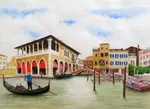
Standing Back
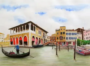
The picture below shows where this section stands now. It isn't looking too bad when you stand back and see it as a complete picture.
That's always the test.
Details that worry you up close often dissolve into the whole when you view from a distance.

Right Side: The Grisaille Approach
Now for something different.
Instead of building the shadowed buildings on the right with coloured foundations, we'll use a grisaille underpainting. This involves building up a subtle grey foundation first, then adding colour on top.
Why grey?
The buildings on the right are largely in shadow. Starting with a grey foundation gives you the tonal structure (the pattern of light and dark) before you introduce any colour at all.
When transparent watercolour pencil colour goes over a grey base, it produces a more subdued, atmospheric look than starting on bright white paper. That suits shadowed Venetian architecture beautifully.

Choosing Your Greys
Select two grey pencils from your set: one deep, cool grey and one warmer, lighter grey.
Grey isn't just grey.
It's a blend of blue and brown in varying proportions, so different grey pencils have subtly different characters.
- A cool grey leans blue.
- A warm grey leans brown.
Using both gives your shadows depth and variety.

Building the Grey Foundation
Keep your brush moist but not oversaturated.
Apply the grey pencils dry, then activate with the damp brush, creating blends of warm and cool grey across the building facades.
Work cautiously, building layers gradually to preserve the paper texture. The grain of the paper is part of the effect here.

Once the grey foundation is established and dry colour on top, working in this order: Fawn (49) first for depth and dimension, then Golden Ochre (16) to intensify the warmth, and finally Burnt Sienna (73) on selected edges for earthiness.
If you are using Staedtler Karat pencils, these numbers will help you find the right sticks. For other brands, match the character rather than the name, as colour names vary between manufacturers.
If you decide to experiment with complementary colours instead of grey, be aware that the order matters.
Layering green over red works wonders, producing rich, complex darks. But layering red over green tends to overpower the weaker green pigment, leaving you with something that just looks red.
Always put the stronger, more dominant colour on top where you can control how much shows through
Use vertical brushstrokes for blending. The colour sits over the grey in a way that creates a convincing impression of old, weathered plaster and stone.

Compare the dry result with the wet result as you go. The grey underpainting anchors everything, preventing the colours from looking too bright or cheerful for a shadowed wall.
A Note on This Stage
Looking at your painting now, it might feel like a patchwork of half-finished areas. The left side has its foundation but lacks detail. The right side has its grey underpainting with some colour on top. Nothing looks complete.
This is completely normal. At this stage in any complex painting, there's an uncomfortable period where it doesn't look like much. The temptation is to rush ahead and finish one area to reassure yourself. Try to resist. The picture comes together as a whole, and the relationships between areas matter more than any single section looking polished.
We'll come back and refine everything in the finishing stage.
Bringing the Scene to Life
With both sides of the buildings established, it's time for the elements that bring the Venice scene alive: the trees, the water, the gondola, and the figures.
[Continue to Part 6: Water, Trees, Gondola & Figures →](venice-project-water-trees-gondola.html)
Venice Grand Canal Project Menu:
Overview & Materials : Preparing Your Drawing : Colour Mixing : The Sky : The Buildings : Water, Trees & Gondola : Finishing & Comparison

I'm Carol Leather, a coloured pencil artist for over 15 years. Most of my teaching comes back to the same idea: realistic coloured pencil starts with structure, light and observation long before the colour goes down.
My work has featured in Ann Kullberg's Color Magazine, CP Magic and Color Pencil Treasures (vol 7). I'm a member of the UKCPS and was a prize winner in the Nature section of their Annual Open Exhibition in 2020.
You might like these
Finishing Your Venice Painting: Details and Brand Review
Final details, correction techniques, and a side-by-side comparison of the same Venice scene drawn with Derwent, Faber-Castell, and Staedtler pencils
Venice Water, Trees and Gondola in Watercolour Pencil
How to paint convincing water, foliage, and a gondola with watercolour pencils. Horizontal blending, reflection techniques, and foliage colour mixing.
Preparing Your Venice Drawing: Reference and Outline
How to assemble your reference photo, correct perspective distortion, and transfer the outline onto watercolour paper for the Venice project.
Copyright © 2009- pencil-topics.co.uk All rights reserved
Home | About Us | Contact Us | Privacy Policy