- Home
- Tutorials
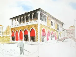
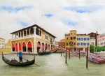
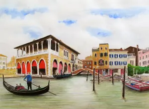
- Venice Grand Canal
- Colour Mixing
Colour Mixing with Watercolour Pencils
Credit: This tutorial series is based on original work by Peter Weatherill, restructured and expanded for Pencil Topics
Venice Grand Canal Project Menu:
Overview & Materials : Preparing Your Drawing : Colour Mixing : The Sky : The Buildings : Water, Trees & Gondola : Finishing & Comparison
Colour Mixing with Watercolour Pencils
Whether you're following the Venice project or starting your own watercolour pencil piece, understanding how your colours mix and behave when wet is one of the most important things you can learn. It's also the area where watercolour pencils spring the most surprises on people who are new to them.
So before we put colour to paper on the Venice scene, let's spend some time getting to know your pencils properly. This will save you far more time than it costs.
Before diving into wet mixing, it helps to understand the wider colour basics for coloured pencil artists that sit behind these colour relationships.
The Trap That Catches Everyone
I need to warn you about something. When you apply watercolour pencil dry, the colour looks one way. When you add water, it looks completely different. Usually much stronger. Sometimes dramatically so.

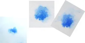
Look at this chart. The first line of each sample shows the colour worked dry, with light shading first and then heavier shading. The second line shows what happens when a damp brush hits the same pigment.
The difference can be startling, especially with darker colours. They have more pigment in them, so the shift from dry to wet is more pronounced.
This is the trap that catches everyone who tries watercolour pencils for the first time. You lay down what looks like a gentle amount of colour, add water, and suddenly it's far more intense than you intended.
The solution? Before you start on any picture, test your colours on a piece of the same paper you'll be using. Not a different paper, not any old scrap. The same paper. Different surfaces absorb pigment differently, so your test needs to match your working conditions.
This will alert you to any major shifts in colour intensity and guide you over the amount of dry pigment to apply. Five minutes of testing will save you from the sinking feeling of watching a carefully planned area go much darker than you wanted.
The Golden Rule
If there's one thing to remember from this entire page, it's this:
Always use less dry colour than you think you need. It is easier to add than take away.
Building up colour in pale, gentle layers gives you control. You can always add another layer once the first has dried. But removing colour that's too strong? That's difficult, stressful, and sometimes impossible.
This applies to every watercolour pencil project, not just this one.
The 6-Colour Principle
Now, you might think that having a huge set of pencils is essential for mixing the right colours.
It helps, certainly. But you can achieve a remarkable range from surprisingly few pencils if you understand how colour mixing works.
You can push this further by trying a limited colour palette, which trains you to create a wider range of effects from fewer starting colours.
When Caran d'Ache introduced their Museum Aquarelle pencils, they released an introductory pack containing just six pencils. Artists entered a competition using only those six colours, and the resulting artwork was stunning. Six pencils. That's all.
The set contained:

- 350 Purplish Red (leans toward blue)
- 560 Light Cadmium Red (leans toward orange)
- 530 Gold Cadmium Yellow (leans toward orange)
- 240 Lemon Yellow (leans toward green)
- 670 Permanent Blue (leans toward green)
- 640 Ultramarine Blue (leans toward purple)
Notice the pattern? Two reds, two yellows, two blues. But each pair has one that leans one way and one that leans the other.
This is the key to the whole thing.
How Related Colours Mix
When you combine two colours that both contain a shared element, you get bright, clean results.
Examples: Mix Lemon Yellow (which leans green) with Permanent Blue (which also leans green). Both contain a touch of green in their character. The result? A bright, vivid green.
Now try mixing Gold Cadmium Yellow (which leans orange) with the same blue. You still get green, but it's less vibrant because the yellow is pulling slightly away from green.
And if you mix Gold Cadmium Yellow (orange-leaning) with Ultramarine Blue (purple-leaning)? Now neither colour contains much green at all. The result is a dull, earthy tone. Which might be exactly what you want for an old stone wall or a muddy path.
How Opposite Colours Mix
This is where it gets really useful.
When you mix colours that don't share a common element, you get dark, muted, earthy results. Browns, deep shadows, subtle greys. The colours you actually need most in a realistic drawing.
Non-neighbouring combinations on the colour wheel produce diverse hues that cover most of what you'll need for a picture. Bright, saturated colours are lovely, but most of a realistic drawing is made up of the quieter tones in between.
Choosing Your Venice Palette
For the Venice project, six colours from the Derwent set were selected to demonstrate these principles:
- A: Ultramarine (reddish blue)
- B: Spectrum Blue (greenish blue)
- C: Primrose Yellow (modest green, weak pigment)
- D: Cadmium Yellow Deep (orange-leaning yellow)
- E: Deep Vermillion Red (orange-tinged)
- F: Madder Carmine (purple-red)

These produce strong purples when the purple-leaning colours combine, interesting darker greens when the orange-leaning colours meet the blues, and a wide range of warm browns and ochres for the Venetian buildings.
Of course, you don't have to limit yourself to six colours.If you have a set of 36, 72, or 120, use them.
But understanding these mixing principles means you'll know why certain combinations work and others produce mud. And when you need a colour that isn't in your tin, you'll know how to mix it rather than wishing you'd bought a bigger set.
If you’re working in a different brand, a colour comparison chart can help you choose the closest pencils for the same mixes.
Different Brands, Different Blues
One more thing to be aware of: different manufacturers have different ideas about what "Ultramarine Blue" actually looks like. Or any named colour, for that matter.
The Derwent Ultramarine, the Staedtler version, and the Faber-Castell version are noticeably different from each other. None of them is wrong. They're just different interpretations.
This means you can't simply follow a colour list from a tutorial and expect identical results with a different brand. Use the colour names as a guide, but trust your own eyes and your own tests on your own paper. Your version of this Venice scene will look different from mine, and that's exactly as it should be.
Scroll back up to the chart above which shows different blues.
Testing Your Colours for the Venice Scene
Before you start painting, do this:
- Take a piece of the same watercolour paper you'll be using for the project
- Select the colours you think you'll need for each area (sky blues, building pinks and browns, water greens, shadow greys)
- Apply each colour dry, in both a light and a heavy layer
- Brush clean water over each sample
- Let them dry completely and look again
Pay particular attention to:
- How much the colour shifts from dry to wet (some barely change, others transform completely)
- How strong the colour becomes with heavy application plus water
- What happens when you layer two colours and then add water
This test sheet will be your reference throughout the project. Keep it next to your drawing so you can check before committing colour to the actual piece.
On to the Sky
Now that you understand how your colours behave, it's time to put them to work. The sky is the lightest, most delicate part of the Venice scene, and it's where we'll start painting.
Continue to Part 4: Painting the Sky →
Venice Grand Canal Project Menu:
Overview & Materials : Preparing Your Drawing : Colour Mixing : The Sky : The Buildings : Water, Trees & Gondola : Finishing & Comparison

I'm Carol Leather, a coloured pencil artist for over 15 years. Most of my teaching comes back to the same idea: realistic coloured pencil starts with structure, light and observation long before the colour goes down.
My work has featured in Ann Kullberg's Color Magazine, CP Magic and Color Pencil Treasures (vol 7). I'm a member of the UKCPS and was a prize winner in the Nature section of their Annual Open Exhibition in 2020.
You might like these
Venice Buildings: Colour Foundations and Grisaille
Two approaches to painting Venetian architecture with watercolour pencils. Colour foundations for sunlit walls, grisaille underpainting for shadow
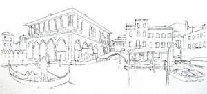
Preparing Your Venice Drawing: Reference and Outline
How to assemble your reference photo, correct perspective distortion, and transfer the outline onto watercolour paper for the Venice project.
Venice Water, Trees and Gondola in Watercolour Pencil
How to paint convincing water, foliage, and a gondola with watercolour pencils. Horizontal blending, reflection techniques, and foliage colour mixing.
Copyright © 2009- pencil-topics.co.uk All rights reserved
Home | About Us | Contact Us | Privacy Policy