Venice Grand Canal Project: A Watercolour Pencil Tutorial in Seven Parts
There's something about Venice that makes you want to pick up a pencil. The light on the water, the crumbling ochre buildings, the gondolas rocking gently against their poles. It's a city that practically begs to be drawn.
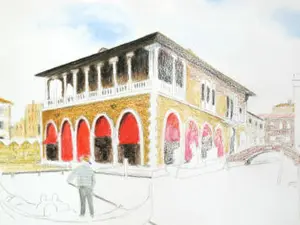
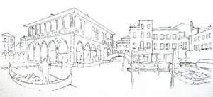
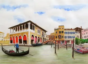
This project takes you through an entire Venice Grand Canal scene, step by step, from the first pencil mark to the finishing touches. It's based on a composite reference photo of buildings near the Rialto Fish Market, complete with a gondolier in the foreground and that gorgeous blue-green Venetian water.
I'll be honest with you: this isn't a weekend project. It's ambitious. But that's rather the point.
Each part focuses on one area of the scene, so you can work through it at your own pace without feeling overwhelmed.
If a section takes you two evenings or two weeks, it doesn't matter in the slightest. The buildings will wait for you. Venice has been waiting for centuries. It can manage a few more days.
What Makes This Project Different
The same scene was drawn three times, using three different watercolour pencil brands: Derwent (72 colours), Faber-Castell Albrecht Durer (120 colours), and Staedtler Karat (just 36 colours).
So as well as learning how to tackle a complex scene, you'll see how different brands and set sizes handle exactly the same subject.
The results might surprise you. The 36-pencil Staedtler set held its own remarkably well against the larger collections, which is reassuring if you don't own a huge set.
 The Staedtler Karat version
 Worked in Derwent Watercolour pencils
 Created with Albrecht Durer aquarelle pencils
The Seven Parts
Here's what we'll cover. You can work through them in order, or jump to a specific section if you're revisiting:
Part 1: Overview & Materials (you are here)
Everything you need before you start: pencils, paper, brushes, and sizing your drawing.
[Part 2: Preparing Your Drawing](venice-project-preparing-your-drawing.html) Assembling the reference photo, correcting perspective distortion, and transferring the outline onto your paper.
[Part 3: Colour Mixing with Watercolour Pencils](colour-mixing-watercolour-pencils.html)
How to get the colours you need from whatever set you own. The 6-colour principle that changes how you think about mixing.
[Part 4: Painting the Sky](painting-the-sky.html)
Choosing the right blue, managing wet vs dry intensity, and two practical techniques for painting sky on textured paper.
[Part 5: The Buildings](venice-project-buildings.html)
Working both sides of the scene: colour foundations on the left, grisaille underpainting on the right.
[Part 6: Water, Trees, Gondola & Figures](venice-project-water-trees-gondola.html)
Bringing the scene to life with foliage, reflections, boats, and the gondolier.
[Part 7: Finishing Touches & Brand Comparison](venice-project-finishing-and-comparison.html)
Final details, correction techniques, and a side-by-side look at how all three brand versions turned out.
What You'll Need
Watercolour Pencils
Any decent quality watercolour pencil brand will work for this project. The tutorial was originally completed using:
Derwent Watercolour (72 colours) - soft, blendable, lovely to work with. Make sure you have the modern formula with dark blue barrels. The older grey-barrelled or turquoise-barrelled Derwent watercolour pencils are harder and don't dissolve as well.
Faber-Castell Albrecht Durer (from a set of 120) - slightly drier feel than Derwent, but beautifully precise. The colour range is vast.
Staedtler Karat (36 colours) - proof that you don't need a massive set to produce excellent work. At under £35, this is a very accessible starting point.
Other quality brands that would work well include Caran d'Ache Supracolour or Museum Aquarelles.
What to avoid: Derwent Inktense pencils (too strongly pigmented and permanent for this approach) and very cheap own-brand or budget imports, which tend to have too little pigment and poor colour mixing.
You're going to spend quite some time on this project, so it's worth using good pencils. If you're not sure which brand to choose, have a look at my watercolour pencils guide.
Paper
This is important. You need 300gsm (140lb) cold-pressed watercolour paper with a moderate surface grain, both internally and externally sized.
Why cold-pressed? Hot-pressed paper gives you a smooth surface that's wonderful for fine detail, but cold-pressed has a grain that creates textured effects with watercolour pencils. When you apply dry pigment and then brush over it with water, the grain leaves a pattern of colour and white paper that you simply can't achieve any other way. It's one of the loveliest things about this medium.
Why 300gsm? Heavier paper accepts alterations without damage and resists buckling when wet. You'll be applying water multiple times across multiple sessions, so you need paper that can take it.
Why cold pressed paper matters for this project: Cold-pressed paper does something rather special with watercolour pencils.
If you lay down a thin layer of dry colour and then lightly wash it in to create an even surface, you can wait for the paper to dry thoroughly and then apply more dry colour over the top.
When you wash that second layer in, the two layers interact through the paper grain to produce a depth and subtlety you simply cannot get any other way.
It is this layering ability that makes cold-pressed paper the right choice for a project like this, where we build colour gradually over several sessions.
Recommended brands: Canson, Daler Rowney, Strathmore, Fabriano, or Clairfontaine. The tutorial used Clairfontaine Etival cold-pressed 300gsm, which has a different surface on each side. The smoother side was chosen for this project.
Do you need to stretch your paper? On 300gsm paper, stretching isn't strictly necessary for the amount of water we'll be using. But it does leave you with all your options open, and it prevents any slight buckling. If you're comfortable with stretching watercolour paper, it's worth doing. If not, don't let it stop you from starting.
Brushes and Other Supplies
You don't need expensive brushes for this. Two or three budget watercolour brushes in different sizes (roughly sizes 2, 4, and 6) will do the job. Nylon is fine. See my watercolour brush guide for more detail.
You'll also need:
- A quality pencil sharpener (a spiral cutter type is ideal, as watercolour pencil cores can be softer than regular coloured pencils)
- Kitchen paper (you'll use a lot of this for lifting excess colour and softening edges)
- Clean water in a jar
- A piece of scrap watercolour paper for testing colours before committing to your drawing
How Much Water
If you have painted in traditional watercolours before, you may be surprised by how little water this technique uses.
We are not flooding the paper or working wet-into-wet in the traditional sense.
The brush needs to be damp rather than wet, carrying just enough moisture to dissolve the dry pigment sitting on the surface. Keep kitchen paper within reach to wick away any excess.
Less water gives you more control, and control is everything when you are building colour in layers.
How Big?
The original trial measured 18 x 12 inches on a board-mounted sheet. For practical purposes, a finished size of approximately16 x 12 inches works well and fits standard pad and sheet sizes.
The reference photos and outlines are available as a single PDF file:
Venice project combined references
The Pen and Wash Option
There's an alternative approach worth mentioning. The original trial also included a version drawn with black fineliner ink, creating a pen and wash effect. The ink lines add a lovely crispness, and it's a more forgiving approach in some ways because the line work carries the drawing even if the colour isn't perfect.
If you'd like to try this route: draw the sketch in pencil first, complete your watercolour pencil work, then add the ink lines afterwards. Remove any visible graphite before adding colour. You can use a ruler for the architectural lines if you want clean edges.
This is entirely optional. The main tutorial works without ink.
Ready to Begin?
Before you pick up a pencil, the next step is to get your reference image sorted and your outline onto the paper. That's what Part 2 covers.
Continue to Part 2: Preparing Your Drawing →
Venice Grand Canal Project Menu:
Overview & Materials : Preparing Your Drawing : Colour Mixing : The Sky : The Buildings : Water, Trees & Gondola : Finishing & Comparison
This tutorial series is based on original work by Peter Weatherill, restructured and expanded for Pencil Topics.
You might like these
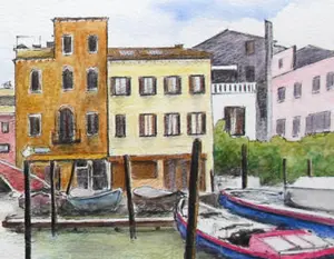
Venice Buildings: Colour Foundations and Grisaille
Two approaches to painting Venetian architecture with watercolour pencils. Colour foundations for sunlit walls, grisaille underpainting for shadow
Painting the sky above our Venice scene
Painting the sky - the second page in our watercolour pencil tutorial featuring the Venice Rialto Fish Market scene
Preparing Your Venice Drawing: Reference and Outline
How to assemble your reference photo, correct perspective distortion, and transfer the outline onto watercolour paper for the Venice project.
Copyright © 2009- pencil-topics.co.uk All rights reserved
Home | About Us | Contact Us | Privacy Policy